IS428 2017-18 T1 Assign Wan Mei Ying
Links
Credits
This assignment was done in collaboration with Ng Jia Jun and Tan Kun Sheng.
Overview
Mistford is a mid-size city is located to the southwest of a large nature preserve. The city has a small industrial area with four light-manufacturing endeavors. Mitch Vogel is a post-doc student studying ornithology at Mistford College and has been discovering signs that the number of nesting pairs of the Rose-Crested Blue Pipit, a popular local bird due to its attractive plumage and pleasant songs, is decreasing! The decrease is sufficiently significant that the Pangera Ornithology Conservation Society is sponsoring Mitch to undertake additional studies to identify the possible reasons. Mitch is gaining access to several datasets that may help him in his work, and he has asked you (and your colleagues) as experts in visual analytics to help him analyze these datasets.
Mitch Vogel was immediately suspicious of the noxious gases just pouring out of the smokestacks from the four manufacturing factories south of the nature preserve. He was almost certain that all of these companies are contributing to the downfall of the poor Rose-crested Blue Pipit bird. But when he talked to company representatives and workers, they all seem to be nice people and actually pretty respectful of the environment.
In fact, Mitch was surprised to learn that the factories had recently taken steps to make their processes more environmentally friendly, even though it raised their cost of production. Mitch discovered that the state government has been monitoring the gaseous effluents from the factories through a set of sensors, distributed around the factories, and set between the smokestacks, the city of Mistford and the nature preserve. The state has given Mitch access to their air sampler data, meteorological data, and locations map.
Overview
Companies
Roadrunner Fitness Electronics produces personal fitness trackers, heart rate monitors, headlamps, GPS watches, and other sport-related consumer electronics.
Kasios Office Furtniture manufactures metal and composite-wood office furniture including desks, tables, and chairs.
Radiance ColourTek produces solvent based optically variable metallic flake paints with the lowest volatile organic compounds in industry.
Indigo Sol Boards produces skateboards and snowboards and has seen modest growth in recent years.
Chemicals
Appluimonia is an airborne odor is caused by a substance in the air that you can smell. While it does not cause serious injury, long-term health effect, or death to humans or animals, it may affect the quality of life and sense of well-being.
Chlorodinine is a corrosive that can attack and chemically destroy exposed body tissues as soon as it touches the skin, eyes, respiratory tract or digestive tract. It is thus harmful if inhaled or swallowed. Chlorodinine is used as a disinfectant and sterilizing agent as well as other uses.
Methylosmolene is a trade name for a family of volatile organic solvents. Several studies have documented the toxic side effects of Methylosmolene in vertebrates, and the use of it in manufacturing is strictly regulated. Liquid forms of Methylosmolene are required by law to be chemically neutralized before disposal.
AGOC-3A has been developed under new environmental regulations and consumer demand for low-VOC and zero-VOC solvents. It is less harmful to human and environmental health.
Data
Map of Lekagul Wildlife Preserve Area
The factories and sensors locations are provided in terms of x,y coordinates on a 200x200 grid, with (0,0) at the lower left hand corner (southwest). The sensors map shows the locations of the sensors and factories by number for the sensors and by name for the factories.
Factory Locations
The following are the factory locations:
- Roadrunner Fitness Electronics: 89,27
- Kasios Office Furniture: 90,21
- Radiance ColourTek: 109,26
- Indigo Sol Boards: 120,22
Sensor Locations
Factory locations are provided in an excel workbook with these information:
- 62,21
- 66,35
- 76,41
- 88,45
- 103,43
- 102,22
- 89,3
- 74,7
- 119,42
Meteorological data
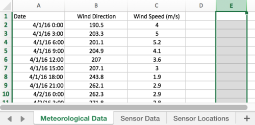
Meteorological data is provided in an excel workbook, containing information on the date/time of reading, direction where the wind is originating from and wind speed at time of reading. A direction of 360/000 is the true north. For three months (April, August and December), meteorological data is collected every three hours.
Sensor data
Sensor data is provided in an excel workbook, containing information on the date/time of reading, chemical being detected, sensor which picked up the reading and reading in parts per million. For three months (April, August and December), sensor data is collected on an hour basis.
Data Integration and Cleaning
Using Excel
In Meteorological Data, column E contains information on elevation. This can be removed since it does not help in our tasks.
Using Tableau
First, we created three data sources using the edited excel files, and created a left join between Sensor Data and Sensor Locations. We changed the ‘Monitor’ column from Sensor Data to a dimension, and changed the ‘X’ and ‘Y’ columns in Sensor Locations to longitude and latitude, respectively.
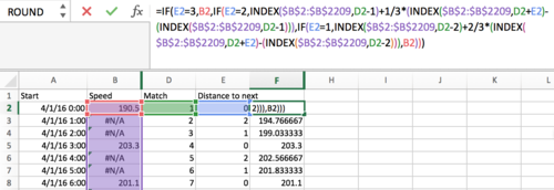
Next, we created a left join between sensor data and meteorological data. This would keep all the sensor data, even if there’s no corresponding meteorological data. These null values would need to be filled in using calculated fields.............
. . . . .
Problems
Problem #1
Characterize the sensors’ performance and operation. Are they all working properly at all times? Can you detect any unexpected behaviors of the sensors through analyzing the readings they capture? Limit your response to no more than 9 images and 1000 words.
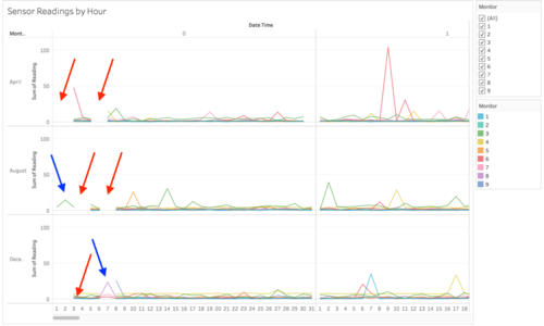
To answer this problem, we plotted the hourly sensor readings against the date and time as a cyclic plot, using the sensor as a filter. This is the result:
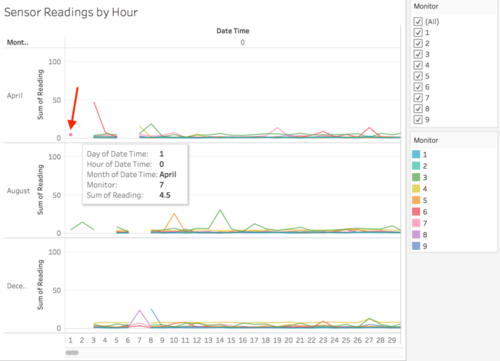
From the cyclic plot, we can see that at the start of each month, there seems to be a few days where there are missing records for at 0000 hours (red arrows). For April, those days are 1st - 2nd and 5th - 7th. However, upon closer inspection of the data, we found that there are actually records for 1st April. They are not getting displayed only because there is no data point in 2nd April for them to connect to:
The cyclic plot also shows us that from 1st - 3rd August and 6th - 8th December, most sensors did not collect any readings, except for sensors 3, 6, 7 and 8 (blue arrows).
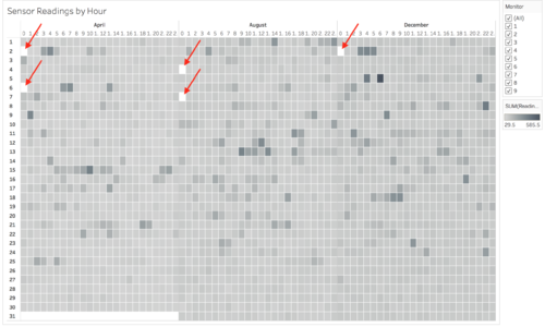
Besides the misleading visualization on missing information, the cyclic plot is also difficult to read with so many lines overlapping, and with too much scrolling needed to scroll through the lines for 24 hours. Thus, we came up with the another visualization using the calendar heatmap:
Like the cyclic plot, this heatmap shows the readings recorded by all the nine sensors for each hour, with a filter on the side for the sensors. With this heatmap, we can see immediately that readings exist for 0000 hrs on 1st April, but not 2nd April. Thus, the heatmap is superior to the cyclic plot. In summary, on 0000 hrs on 2nd April, 6th April, 4th August, 7th August and 2nd December, all sensors had no readings (sensors are not working properly). There was probably a power outage in Lekagul Wildlife Preserve Area or some maintenance going on.
When we filtered the observations according to sensors, we found another interesting trend. On 2nd August, all sensors had no readings, except sensor 3. And on 7th December, only sensors 6, 7 and 8 had readings.
We performed a further drilldown 2nd August and 7th December to reveal which chemicals were being released on 0000 hrs during these two days:
Problem #2
Now turn your attention to the chemicals themselves. Which chemicals are being detected by the sensor group? What patterns of chemical releases do you see, as being reported in the data? Limit your response to no more than 6 images and 500 words.
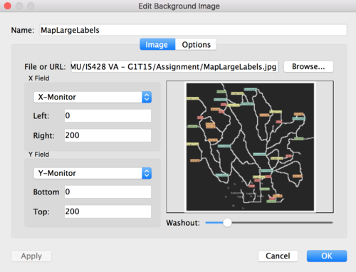
To answer this question, we created a geographical map with ‘X’ and ‘Y’ from sensor locations, toggled the background maps to ‘None’, and added in a background image as such:
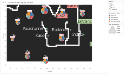
Now that we have the base map, we added in ‘Reading’ to size, ‘Chemical’ to colour and ‘Monitor’ to label. We also added a filter for ‘Date Time’ based on months. Then we changed the mark type to ‘Pie’ and increased the pie size. Here are the results:
From this visualization, we can tell that sensors 3 and 4 have monitored the most chemical emissions, while sensors 1 and 2 monitored the least. The chemicals seem to be equally measured at each sensor, except for AGOC-3A, which seems to be monitored in higher volumes at sensors 3, 4, 5, 6 and 9.
Next, we were curious if there were any trends in the chemical release with regards to date. To find out, we plotted a calendar heatmap for each of the chemicals.
Problem #3
Which factories are responsible for which chemical releases? Carefully describe how you determined this using all the data you have available. For the factories you identified, describe any observed patterns of operation revealed in the data. Limit your response to no more than 8 images and 1000 words.
