IS428 2017-18 T1 Assign Tan Kun Sheng
Contents
- 1 Tableau Public Link
- 2 Background
- 3 Objectives
- 4 Tasks
- 4.1 Task #1
- 4.2 Task #2
- 4.3 Task #3
- 4.3.1 Data Prep
- 4.3.2 Monitors Chemical Origin Tri Hourly Wind Plume
- 4.3.3 Monitors Chemical Levels Tri Hourly
- 4.3.4 Potential Culprits for Methylosmolene Emissions
- 4.3.5 Potential Culprits for Chlorodinine Emissions
- 4.3.6 Potential Culprits for Appluimonia Emissions
- 4.3.7 Potential Culprits for AGOC-3A Emissions
- 5 References
Tableau Public Link
Background
Mistford is a mid-size city is located to the southwest of a large nature preserve. The city has a small industrial area with four light-manufacturing endeavors. Mitch Vogel is a post-doc student studying ornithology at Mistford College and has been discovering signs that the number of nesting pairs of the Rose-Crested Blue Pipit, a popular local bird due to its attractive plumage and pleasant songs, is decreasing! The decrease is sufficiently significant that the Pangera Ornithology Conservation Society is sponsoring Mitch to undertake additional studies to identify the possible reasons. Mitch is gaining access to several datasets that may help him in his work, and he has asked you (and your colleagues) as experts in visual analytics to help him analyze these datasets.
Mitch Vogel was immediately suspicious of the noxious gases just pouring out of the smokestacks from the four manufacturing factories south of the nature preserve. He was almost certain that all of these companies are contributing to the downfall of the poor Rose-crested Blue Pipit bird. But when he talked to company representatives and workers, they all seem to be nice people and actually pretty respectful of the environment.
In fact, Mitch was surprised to learn that the factories had recently taken steps to make their processes more environmentally friendly, even though it raised their cost of production. Mitch discovered that the state government has been monitoring the gaseous effluents from the factories through a set of sensors, distributed around the factories, and set between the smokestacks, the city of Mistford and the nature preserve. The state has given Mitch access to their air sampler data, meteorological data, and locations map. Mitch is very good in Excel, but he knows that there are better tools for data discovery, and he knows that you are very clever at visual analytics and would be able to help perform an analysis.
Objectives
The four factories in the industrial area are subjected to higher-than-usual environmental assessment, due to their proximity to both the city and the preserve. Gaseous effluent data from several sampling stations has been collected over several months, along with meteorological data (wind speed and direction), that could help Mitch understand what impact these factories may be having on the Rose-Crested Blue Pipit. These factories are supposed to be quite compliant with recent years’ environmental regulations, but Mitch has his doubts that the actual data has been closely reviewed.
The primary job for Mitch is to determine which (if any) of the factories may be contributing to the problems of the Rose-crested Blue Pipit. Often, air sampling analysis deals with a single chemical being emitted by a single factory. In this case, though, there are four factories, potentially each emitting four chemicals, being monitored by nine different sensors. Further, some chemicals being emitted are more hazardous than others. The task is to detangle the data to help Mitch determine where problems may be.
Tasks
Task #1
Characterize the sensors’ performance and operation. Are they all working properly at all times? Can you detect any unexpected behaviors of the sensors through analyzing the readings they capture?
Figure 1.1
Cyclic Hourly Readings Across Days in Months
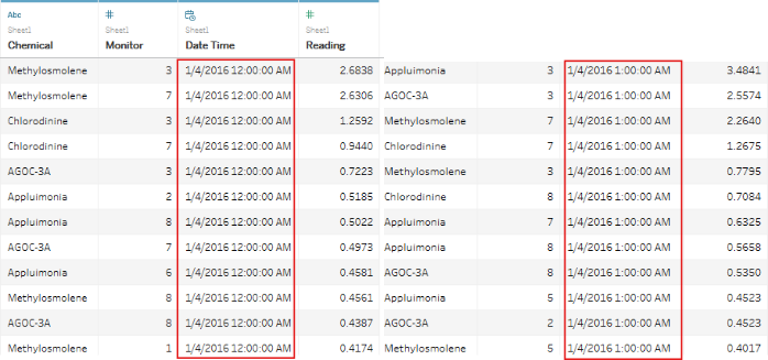
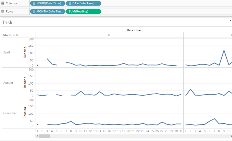
Figure 1.1 displays the records in Sensor Data.xlsx. Each record captures the Chemical, Monitor, Date Time, Reading and the values in the Date Time column signifies that the monitors capture readings on an hourly interval. With these information, a cycle plot that plots through the hours by days in month to examine the readings captured at each hour over the all the days in the three months revealed some discontinuation of readings.
Figure 1.2
Figure 1.2 shows that there are breaks in the line graphs meaning that not 12am readings are not available on certain days of the months. This warrants more investigation as there might be more gaps in other hours.
Figure 1.3 (hour 0:00 compared to others)
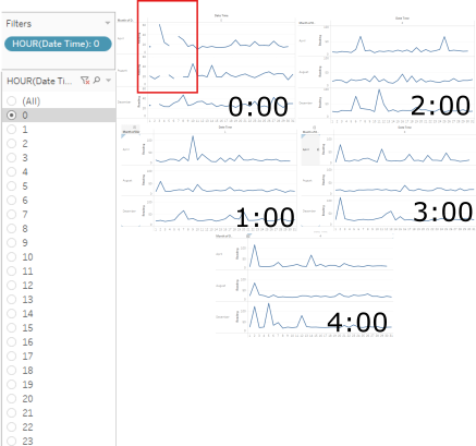
Filtering by hours to examine the readings specifically at each hour, it is discovered that 12am (0:00) readings are the only one with gaps. Figure 1.3 illustrates some comparisons with different hourly readings with no gaps. Not 24 hours are displayed on figure 1.3 for brevity's sake, but no line breakages are seen except for readings recorded at 12am (0:00). Also note that the line breakage at the end of April (Top Line Graph) is not an error as April 2016 does not have a 31st day unlike August 2016 and December 2016. As these values on the line graphs are aggregated (summed) readings, let's break them down by monitor readings to uncover the details of each monitor.
Figure 1.4 (some monitors captured readings when others did not)
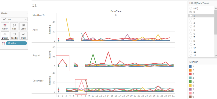
Figure 1.4 uncovers some interesting observations. Whilst there are instances where all monitors failed to record readings such as hour 0 of day 2 in April and December for example, there were also instances where one or a few monitors managed to record readings when others did not. Take for example, monitor #3 were the only one to record a reading on hour 0 day 2 in August while all other monitors failed to record anything at all.
Hourly Heatmap Readings by Monitors in Months
With the cyclic plot above, we were able to determine that not all monitors failed to capture readings altogether. At the 0 hour of certain days on certain months, some monitors managed to record readings where others did not. As there are overlapping lines that represent each monitor above, it may be difficult to tell which monitors are working and which ones are not. A heatmap may be more apt at conveying such information.
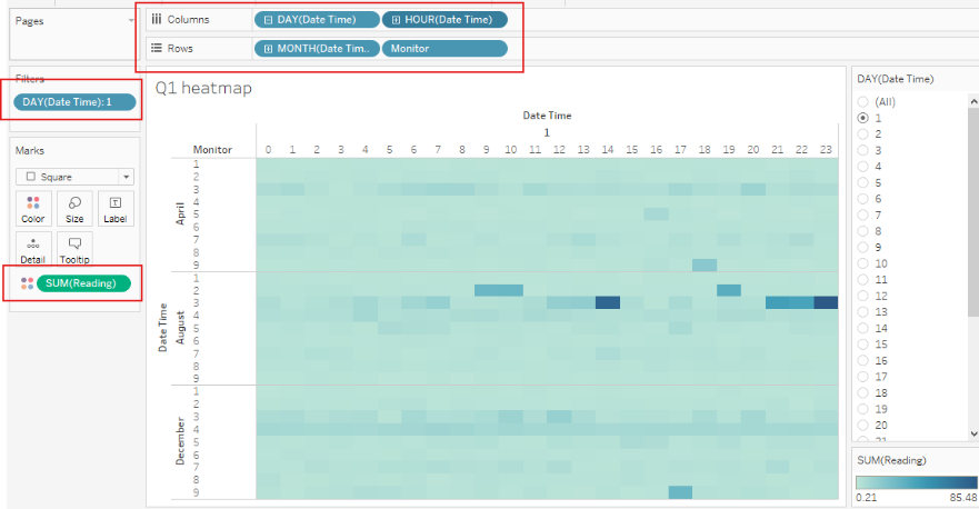
Figure 1.5 (hours by days in months, filtered by days)
Columns : Days followed by Hours, Rows: Months followed by monitors and an additional filter that filters by days. With this heatmap, monitors' readings are shown as a cell for each hour of the day. We can step through the days and attempt to find out which monitors are not working (empty cell) and at which hour.
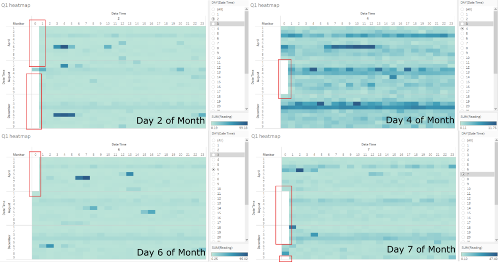
Figure 1.6 (day 2, 4, 6 and 7)
Stepping through days 1-31, it is discovered that days 2, 4, 6 and 7 are missing readings at midnight 12am (0:00). The findings are can be summarized as
- 12am readings are missing on day 2 of all three months except on monitor #3 on day 2 in August
- 12am readings are missing on day 4 for the month of August across the board for all monitors #1 through #9
- 12am readings are missing on day 6 for the month of April across the board for all monitors #1 through #9
- 12am readings are missing on day 7 for the month of August across the board for all monitors #1 through #9
- 12am readings are missing on day 7 for the month of December except monitors #6, #7 and #8
Task #2
Now turn your attention to the chemicals themselves. Which chemicals are being detected by the sensor group? What patterns of chemical releases do you see, as being reported in the data?
Figure 2.1
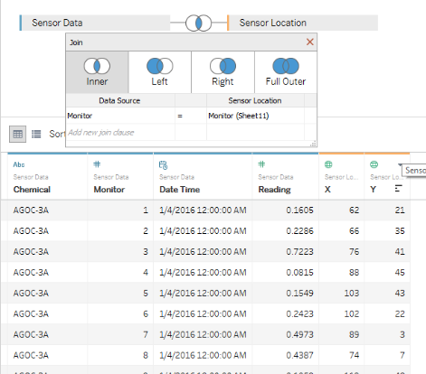
Before beginning task #2, we bring in sensor location data in Sensor Location.xlsx and inner join it into the Sensor Data we already had on monitor names. The aim is to visualize the locations of the sensors over a 2d map and display chemical readings over their placements. Figure 2.1 shows an example of the process.
Chemical Pie Chart
Figure 2.2
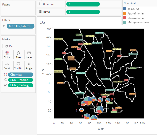
Next, we convert X's geographical role into Longitude and Y's geographical role into Latitude. Plotting them into columns and rows. We then turn off Maps > background maps > none and select Maps > background images and bring in MapLargeLabels.jpg. Drag chemical into color and readings into size to have a pie chart generated next to each monitor to represent the different amounts of each chemical recorded by each monitor on the 2d map. Annotations are added to display the monitor numbers and a filter is added to select a specific month for viewing. Refer to figure 2.2 for an example. Filtering through months Apr, Aug, to December, sensor 4's total readings of all chemicals seemed to be increasing at an astonishing rate although the composition of the 4 chemicals make up across the months seemed to vary not much. It is hard to tell observe any patterns as the proportion of between the 4 types of chemicals picked up across the monitors seem to vary ever so slightly. Sensor 6 however seemed to picked up a higher proportion of AGOC-3A and Methylosmolene on Dec at 35.50% and 35.17% respectively.
Calendar Heatmap by Chemical Across Monitors
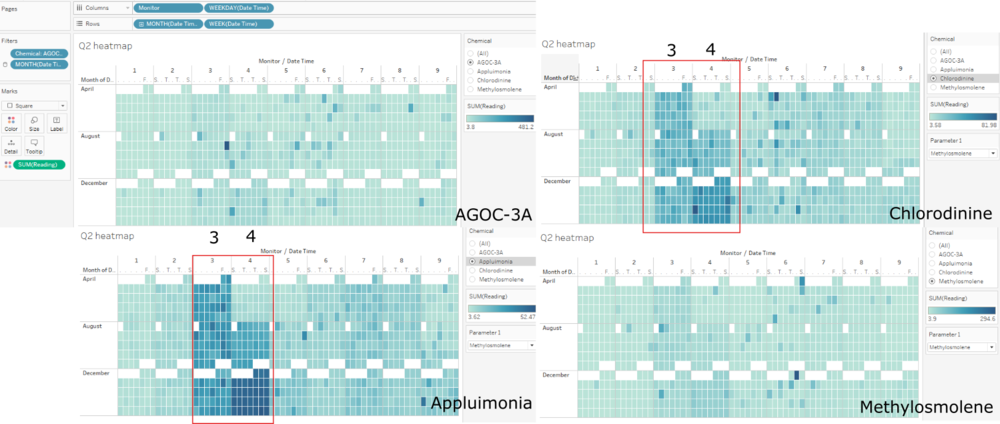
Figure 2.3 (chemical levels across monitors comparison)
Figure 2.3 compares the each of the chemical type and the levels picked up across all monitors. It is observed that monitors 3 and 4 seemed to have picked up higher levels of Appluimonia and Chlorodinine as compared to other monitors. The difference is even more accentuated with the passing of months between April, August, to December.
Barchart by Chemical Across Monitors
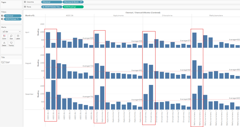
Figure 2.4
Referring to the bar chart comparison of chemical readings across monitors over the period of three months, monitor 4 stood out as it seemed to have captured a sharp increase in chemical readings across all chemical types. The rate of increment is alarming as it shot through the averages captured across all monitors for each chemical and it is especially pronounced in the month of December where it captured record high readings of all chemical types across all monitors. There may be two reasons to this cause
- The area in which monitor 4 is situated has been exposed to great volumes of all four chemical types over the months probably due to wind direction (to be investigated in Task #3) or
- Monitor 4 needs to be inspected as the rate of increment for all its readings is unusually high which may be an indication of technical failure or even tampering.
Besides this, monitor 3 seemed to have consistently recorded higher than average readings across all chemical types over the three months with only slight fluctuations. Monitor 6 recorded higher than average AGOC-3A readings consistently over the three months and higher than average readings for Methylosmolene in months April and December.
Task #3
In order to visualize wind direction and strength visually on an hourly basis to relate to the hourly monitor readings of chemicals, some data massaging and manipulation is required to estimated the wind direction for the two hour gap in between wind readings in the meteorological data provided.
Data Prep
Figure 3.1
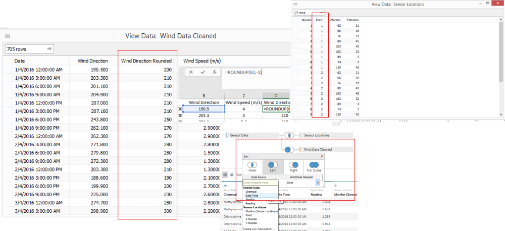
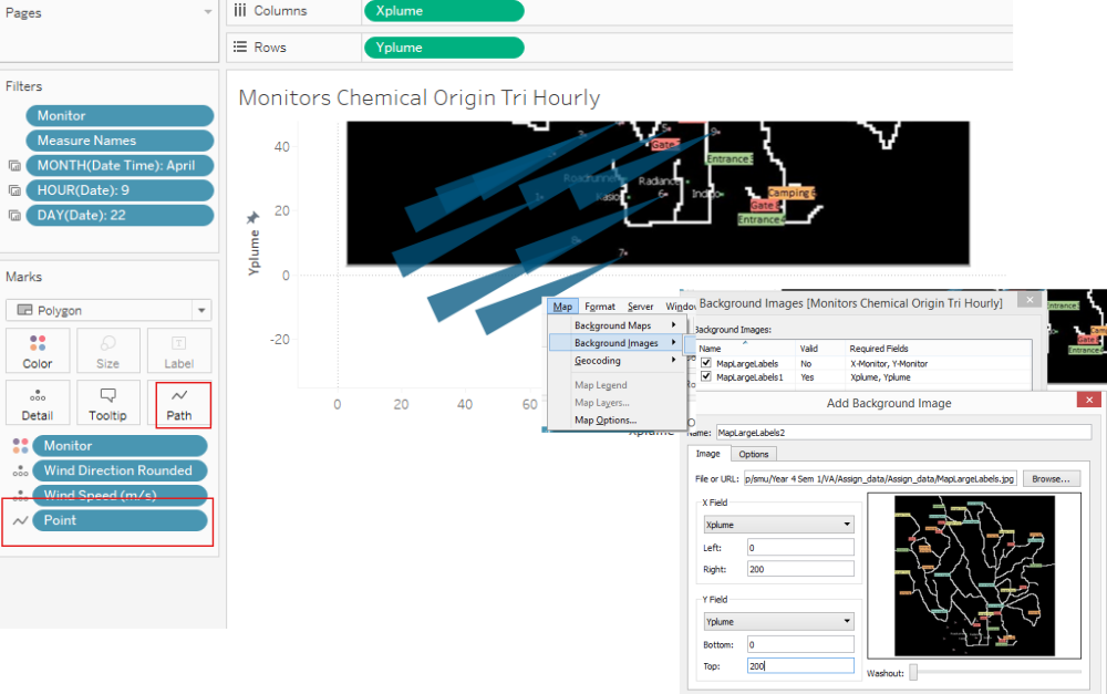
Before utilizing meteorological data, we round up wind directions to a whole number using excel ROUNDUP and join it back into sensor data set on datetime. Next, an additional column called point which stores 1,2 and 3 as data for each monitor is required as we would be using these 3 points for each sensor to draw a polygon area to visualize wind direction. Points value can be manually added for into sensor location as there are only 27 rows required, refer to figure 3.1.
Figure 3.2
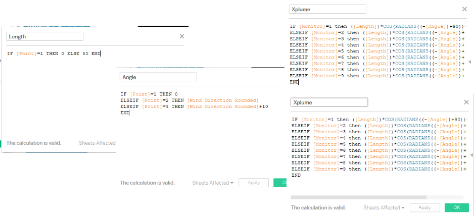
A few more calculated fields are required to draw the polygons for visualizing wind direction. We need the length of the sides of the polygon which we fixed at 50 and 10 degrees for the angle (arc) of the polygons. We also defined two more calculated fields xplume and yplume which we use to calculate the three points (vertices) of the polygon in order connect them with lines.
Monitors Chemical Origin Tri Hourly Wind Plume
Figure 3.3
We draw an air plume polygon for each of the monitors with each three hour interval's wind readings as the inputs. Three points are required for each monitor, refer to figure 3.2 for the formula for plotting the x and y points of each polygon. The default angle for the spread is 10 degrees.
Monitors Chemical Levels Tri Hourly
Figure 3.4
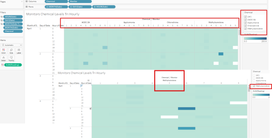
We use a chemical heatmap to observe each chemical's detection on all 9 monitors by month, by day, by three hour intervals. Columns -> Chemical, Monitor. Rows -> Month, Day, Hour. Heatmap colors reflect the intensity based on reading amounts and filters by month, day and hours are provided along with chemical type filtering. With this heatmap, we first identify heat spots (above mean readings, > (max reading/2)) and record down its month, day, hour, and monitor. We do this for each chemical and inspect the wind direction with the Monitors Chemical Origin Tri Hourly Wind Plume for each of these scenarios to find out clues on which factories are culpable.
Potential Culprits for Methylosmolene Emissions
Figure 3.5
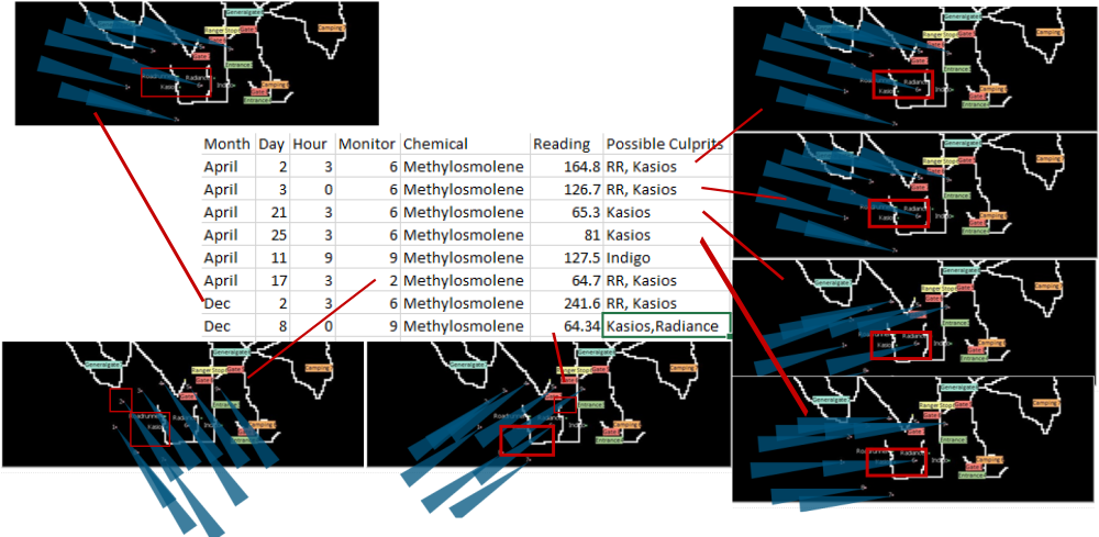
Picking up dense spots from Monitors Chemical Levels Tri Hourly heatmap, we pick out month, day and hour where higher levels of Methylosmolene were detected across monitors. 8 sample data points were picked from April and December with observed high Methylosmolene readings and the wind direction at these certain time frames visualized on the Monitors Chemical Origin Tri Hourly Wind Plume shows high possibilities that RoadRunner and Kasios are the culprits. The wind directions pinpoints Kasios as a likelier suspect however, the close proximity of both factories make it hard to determine the real culprit beyond reasonable doubt. Moreover, both are in the business of manufacturing which produces Methylosmolene as a by product. Thus, it would be wise to inspect both RoadRunner and Kasios for further evidence.
Methylosmolene Suspects : Kasios (high) & RoadRunner (possible)
Potential Culprits for Chlorodinine Emissions
Figure 3.6
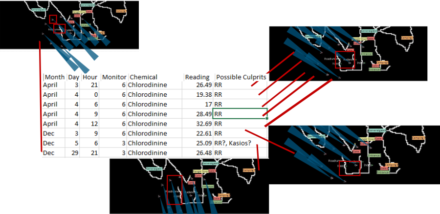
Once again, monitor 6 picked up the most readings on Chlorodinine emmisions. We select days and hours for months April and December where emissions levels were higher as marked by dark blue spots on the heatmap. RoadRunner seems to be the sole culprit for Chlorodinine emissions in this case. It is worth noting that on April 4th between 0 to 12 hours, a north western wind direction persisted and the readings in that time frame picked up by monitor 6 recorded increasing levels of Chlorodinine coming from the direction of RoadRunner.
Chlorodinine Suspects : RoadRunner (high)
Potential Culprits for Appluimonia Emissions
Figure 3.7
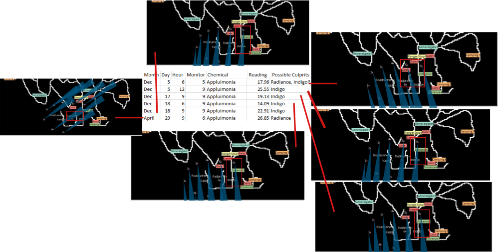
Monitor 9 picked up high levels of Appluimonia levels, particularly so in the December period. The wind directions at these hours points to the direction of Indigo as the source but it's closest factory neighbour Radiance may be a potential suspect as well. For example, on April 29th on the 9th hour of the day, monitor 6 picked up high readings on Appluimonia with the wind direction originating from the source of Radiance. However, due to the proximity of Radiance and Indigo, it is hard to determine a single culprit but latest data in December seemed to point the finger solely on Indigo. Nevertheless, it would be wise to investigate Radiance as well.
Appluimonia Suspects : Indigo (high), Radiance (possible)
Potential Culprits for AGOC-3A Emissions
Figure 3.8
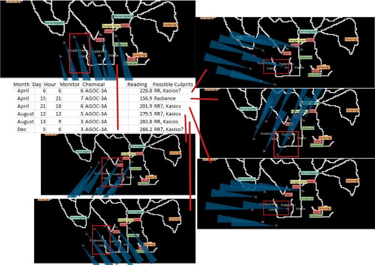
AGOC April high emissions detected on April largely points to both RoadRunner and Kasios as the culprits. However, on April 15th 21st (9pm) hour, high levels of AGOC-3A was read by monitor 7 from a blowing north-eastern wind. The only suspect in that direction would be Radiance but it was strange that monitor 6 along the same direction failed to pick up similar high levels of AGOC-3A readings.
AGOC-3A Suspects : RoadRunner (high), Kasios (high), Radiance (possible)
References
Special thanks to detectives Wan Meiying and Ng Jia Jun.
