IS428 2017-18 T1 Assign Wan Mei Ying
Contents
Links
Tableau Public Submission
Overview
Mistford is a mid-size city is located to the southwest of a large nature preserve. The city has a small industrial area with four light-manufacturing endeavors. Mitch Vogel is a post-doc student studying ornithology at Mistford College and has been discovering signs that the number of nesting pairs of the Rose-Crested Blue Pipit, a popular local bird due to its attractive plumage and pleasant songs, is decreasing! The decrease is sufficiently significant that the Pangera Ornithology Conservation Society is sponsoring Mitch to undertake additional studies to identify the possible reasons. Mitch is gaining access to several datasets that may help him in his work, and he has asked you (and your colleagues) as experts in visual analytics to help him analyze these datasets.
Mitch Vogel was immediately suspicious of the noxious gases just pouring out of the smokestacks from the four manufacturing factories south of the nature preserve. He was almost certain that all of these companies are contributing to the downfall of the poor Rose-crested Blue Pipit bird. But when he talked to company representatives and workers, they all seem to be nice people and actually pretty respectful of the environment.
In fact, Mitch was surprised to learn that the factories had recently taken steps to make their processes more environmentally friendly, even though it raised their cost of production. Mitch discovered that the state government has been monitoring the gaseous effluents from the factories through a set of sensors, distributed around the factories, and set between the smokestacks, the city of Mistford and the nature preserve. The state has given Mitch access to their air sampler data, meteorological data, and locations map.
Companies
Roadrunner Fitness Electronics produces personal fitness trackers, heart rate monitors, headlamps, GPS watches, and other sport-related consumer electronics.
Kasios Office Furtniture manufactures metal and composite-wood office furniture including desks, tables, and chairs.
Radiance ColourTek produces solvent based optically variable metallic flake paints with the lowest volatile organic compounds in industry.
Indigo Sol Boards produces skateboards and snowboards and has seen modest growth in recent years.
Chemicals
Appluimonia is an airborne odor is caused by a substance in the air that you can smell. While it does not cause serious injury, long-term health effect, or death to humans or animals, it may affect the quality of life and sense of well-being.
Chlorodinine is a corrosive that can attack and chemically destroy exposed body tissues as soon as it touches the skin, eyes, respiratory tract or digestive tract. It is thus harmful if inhaled or swallowed. Chlorodinine is used as a disinfectant and sterilizing agent as well as other uses.
Methylosmolene is a trade name for a family of volatile organic solvents. Several studies have documented the toxic side effects of Methylosmolene in vertebrates, and the use of it in manufacturing is strictly regulated. Liquid forms of Methylosmolene are required by law to be chemically neutralized before disposal.
AGOC-3A has been developed under new environmental regulations and consumer demand for low-VOC and zero-VOC solvents. It is less harmful to human and environmental health.
Data
Map of Lekagul Wildlife Preserve Area
The factories and sensors locations are provided in terms of x,y coordinates on a 200x200 grid, representing a 12x12miles area, with (0,0) at the lower left hand corner (southwest). The sensors map shows the locations of the sensors and factories by number for the sensors and by name for the factories.
Factory Locations
The following are the factory locations:
- Roadrunner Fitness Electronics: 89,27
- Kasios Office Furniture: 90,21
- Radiance ColourTek: 109,26
- Indigo Sol Boards: 120,22
Sensor Locations
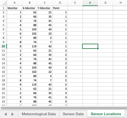
Factory locations are provided in an excel workbook with these information:
- 62,21
- 66,35
- 76,41
- 88,45
- 103,43
- 102,22
- 89,3
- 74,7
- 119,42
Meteorological Data
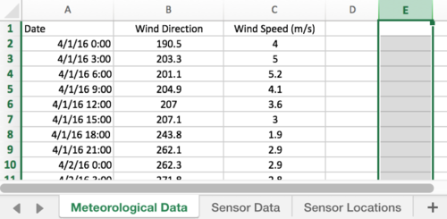
Meteorological data is provided in an excel workbook, containing information on the date/time of reading, direction where the wind is originating from and wind speed at time of reading. A direction of 360/000 is the true north. For three months (April, August and December), meteorological data is collected every three hours.
Sensor Data
Sensor data is provided in an excel workbook, containing information on the date/time of reading, chemical being detected, sensor which picked up the reading and reading in parts per million. For three months (April, August and December), sensor data is collected on an hour basis.
Data Integration and Cleaning
Using Excel
I merged the three excel workbooks for convenience.
Meteorological Data
Column E contains information on elevation. This can be removed since it does not help in our tasks. We then remove blanks in Meteorological Data.
To avoid confusion on the dates, ‘Date’ was renamed to ‘Wind Date’ in Meteorological Data, and ‘Date Time’ to ‘Sensor Date’ in Sensor Data.
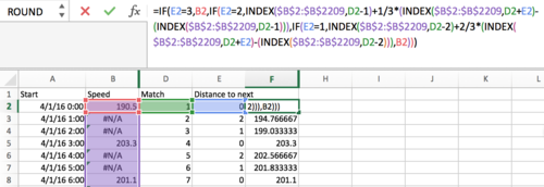
Next, to match the hourly sensor reading to the 3-hour wind reading, some computations need to be done. First, I copied the list of sensor dates to an empty worksheet and removed any duplicates. This gives me the unique hours for all three months. Next, I used vlookup to retrieve wind speed for those unique hours. If a cell returned “#N/A”, that means wind speed was not recorded for that hour. To fill in those cells with “#N/A” wind speed, I did the following:
- Use a column to store the row number of each unique date using
match. - Use a column to store the distance of each date from the next date with a valid wind reading. For instance, at 0000 hours, the distance would be 0 (from itself). And at 0100 hours, the distance would be 2 (to 0300 hours).
- Fill in the next column with the fomula as shown in Image0-2. This formula basically computes the wind direction with the assumption that each hour, wind direction changes proportionately in the same direction. That is, if we have wind readings for 0000 hours and 0300 hours, wind direction for 0100 hours would be:
direction@0000 + (direction@0300 – direction@0000)*1/3. And wind direction for 0200 hours would be*2/3instead. - With this, we can keep just the dates, wind direction and wind speed values.
Then I rounded the computed wind directions to the nearest 10.
Sensor Locations
We created a new column called ‘Point’, such that each sensor will have points 1, 2 and 3 (a total of 27 records). We also renamed X and Y to X-Monitor and Y-Monitor.
The rationale for the above changes would be further explained in Problem #3.
Using Tableau
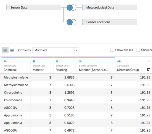
We created a data source using the merged excel file, and used a left join between Sensor Data and Sensor Locations on ‘Monitor’. We changed the Sensor Data’s ‘Monitor’ column to a dimension. Then we left-joined Sensor Data and Meteorological Data on ‘Sensor Date’ and ‘Wind Date’.
Problem #1
Characterize the sensors’ performance and operation. Are they all working properly at all times? Can you detect any unexpected behaviors of the sensors through analyzing the readings they capture? Limit your response to no more than 9 images and 1000 words.
This problem requires only sensor data.
Cyclic Plot
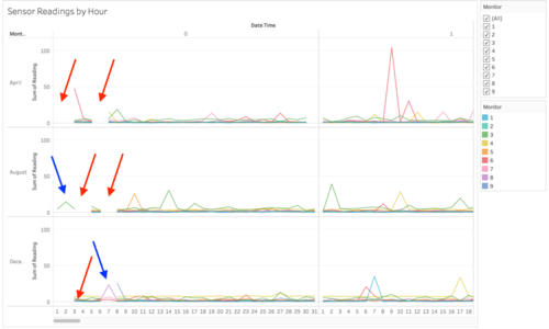
To answer this problem, we plotted the hourly sensor readings against the date and time as a cyclic plot, using the sensor as a filter. This is the result:
- Columns: Hour(Sensor Date), Day(Sensor Date)
- Rows: Month(Sensor Date), SUM(Reading)
- Filters: Monitor
- Color: Monitor
- Label: Monitor
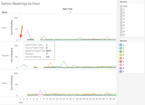
From the cyclic plot, we can see that at the start of each month, there seems to be a few days where there are missing records for at 0000 hours (red arrows). For April, those days are 1st - 2nd and 5th - 7th. However, upon closer inspection of the data, we found that there are actually records for 1st April. They are not getting displayed only because there is no data point in 2nd April for them to connect to:
The cyclic plot also shows us that from 1st - 3rd August and 6th - 8th December, most sensors did not collect any readings, except for sensors 3, 6, 7 and 8 (blue arrows).
Calendar Heatmap
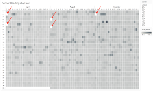
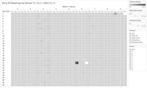
Besides the misleading visualization on missing information, the cyclic plot is also difficult to read with so many lines overlapping, and with too much scrolling needed to scroll through the lines for 24 hours. Thus, we came up with the another visualization using the calendar heatmap:
- Columns: Month(Sensor Date), Hour(Sensor Date)
- Rows: Day(Sensor Date)
- Filters: Monitor
- Color: Sum(Reading)
Like the cyclic plot, this heatmap shows the readings recorded by all the nine sensors for each hour, with a filter on the side for the sensors. With this heatmap, we can see immediately that readings exist for 0000 hrs on 1st April, but not 2nd April. Thus, the heatmap is superior to the cyclic plot. In summary, on 0000 hrs on 2nd April, 6th April, 4th August, 7th August and 2nd December, all sensors had no readings (sensors are not working properly). There was probably a power outage in Lekagul Wildlife Preserve Area or some maintenance going on.
Curious about the days where we spotted only 1 or 2 sensors with readings in the cyclic plot, we did a filter on the heatmap and found another interesting trend. On 2nd August, all sensors had no readings, except sensor 3. And on 7th December, only sensors 6, 7 and 8 had readings.
We performed a further drilldown 2nd August and 7th December to reveal which chemicals were being released on 0000 hrs during these two days:
Anomaly Detection with Control Charts
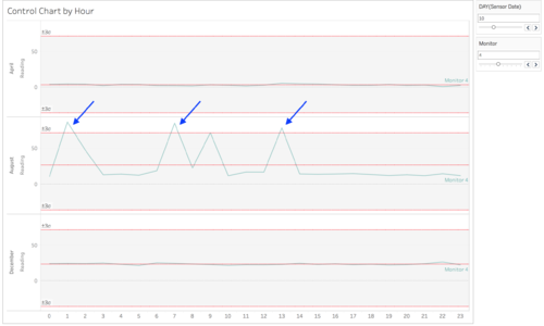
Another concept we initially utilized was that of a control chart to detect any unexpected behaviours of the sensors. Control charts are commonly used for anomaly detection and quality improvement in a production process.
A control chart has the three following lines:
- Upper control limit (UCL) – typically three process standard deviations above the average.
- Average – the sum of all the input data divided by the total number of data points.
- Lower control limit (LCL) – typically three process standard deviations below the average.
The area between the UCL and LCL represent the probability in which the next reading for a sensor would fall within that range – a ±3σ about the mean represents a 99.7% chance that all the readings from a stably functioning sensor will fall within the UCL and LCL.
If a reading falls within the UCL and LCL, that is ‘expected’ and any variations about the average is known as ‘common cause variation’. If a reading falls outside the UCL or LCL, the variation is ‘unexpected’ and is a known as a ‘special cause variation’.
Therefore, when observing a stably functioning sensor, you may notice that the sensor’s readings fluctuate about the average, but always within the upper and lower control limit. Such a sensor is known to be in control. On the other hand, a faulty sensor would have its readings fluctuating outside of the control limits (only 0.3% chance of occurring).
- Columns: HOUR(Sensor Date)
- Rows: MONTH(Sensor Date)
- Rows: SUM(Reading)
- Filters: Monitor, DAY(Sensor Date)
- Color: Monitor
- Label: Monitor
- Reference line on readings > Line > Value: SUM(Reading) > Average
- Reference line on readings > Distribution > Entire Table > Value: -3,3 Standard Deviation
However, we realised that the use of a control chart to analyse which sensors are not functioning properly is inappropriate. That is because the spikes noted in the control chart may represent a real increase in chemical emission, rather than a sign of malfunction.
Problem #2
Now turn your attention to the chemicals themselves. Which chemicals are being detected by the sensor group? What patterns of chemical releases do you see, as being reported in the data? Limit your response to no more than 6 images and 500 words.
This problem requires sensor data and sensor location data.
Pie Chart Map
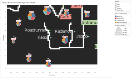
To answer this question, we created a pie chart map, which will tell us the distribution of chemicals monitored by each sensor.
- Columns: X-Monitor
- Rows: Y-Monitor
- Filters: Month(Sensor Date)
- Color: Chemical
- Size: Sum(Reading)
- Label: Monitor
- Mark type: Pie
- Background maps: None
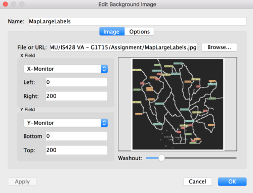
- Background image: On MapLargeLabels.jpg using X-Monitor and Y-Monitor
From this visualization, we can tell that sensors 3 and 4 have monitored the most readings, while sensors 1 and 2 monitored the least. The chemicals seem to be equally measured at each sensor, except for AGOC-3A, which seems to be monitored in higher volumes at sensors 3, 4, 5, 6 and 9.
Calendar Heatmap
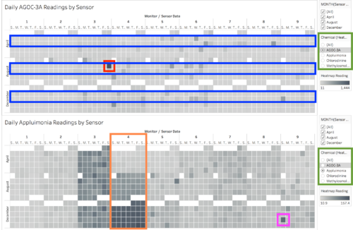
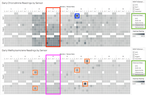
Next, we were curious if there were any trends in the chemical release with regards to date. To find out, we plotted a calendar heatmap showing the daily chemical emissions recorded by each sensor. The heatmap also shows that sensors 3 and 4 have monitored the most readings (highlighted in red):
- Columns: Monitor, Weekday(Sensor Date)
- Rows: Month(Sensor Date), Week(Sensor Date)
- Filters: Month(Sensor Date), Chemical
- Color: Sum(Reading)
Next, we cycle through each chemical and observe their individual trends.
For AGOC-3A, we noted that on the second Friday of August, emission is highest at about 480 units (highlighted in red). While there are no other days where the chemical emission is exceptionally high, more of this chemical appears to be produced during the second and third weeks of each month (highlighted in blue).
For Appluimonia, over the months, emission has been steadily increasing. This is especially noted in sensor 4 (highlighted in orange), where daily readings are at about 5 units in April, about 25 units in August, then rising to about 50 units in December. If the trend were to continue, it may severely impact the Rose-Crested Blue Pipit’s quality of life. There is also a sudden spike in reading picked up by sensor 9 in the fourth Sunday of December (highlighted in pink)
Sensor 4 has also measured a steady increment in daily emission of Chlorodinine (highlighted in red), from about 7 units in April, to about 20 units in August, and about 50 units in December. This is worrying as Chlorodinine is a hazardous chemical which can destroy body tissues just through inhalation. The highest daily emission of Chlorodinine was in the first Monday of April, captured by sensor 6 (highlighted in blue).
Methylosmolene is another chemical with toxic side effects on vertebrates. The daily emission for this chemical is generally low, but the highest daily emissions (ranging from 129 to 294 units, highlighted in orange) are all captured by sensors 3 and 6. And again, sensor 4 has measured an increment in daily emission of Methylosmolene (highlighted in red), from about 7 units in April, to about 25 units in August, and about 48 units in December (highlighted in pink).
Overall, seeing as the average daily emission of environmentally friendly AGOC-3A is higher than the average of hazardous chemicals like Chlorodinine and Methylosmolene, it seems that the factories in Lekagul Wildlife Preserve Area have indeed taken steps to make their processes more environmentally friendly. However, the increased readings of hazardous chemicals like Chlorodinine and Methylosmolene at sensor 4 is something that Mitch should further investigate.
Problem #3
Which factories are responsible for which chemical releases? Carefully describe how you determined this using all the data you have available. For the factories you identified, describe any observed patterns of operation revealed in the data. Limit your response to no more than 8 images and 1000 words.
This problem requires all three datasets.
Wind Rose Compas
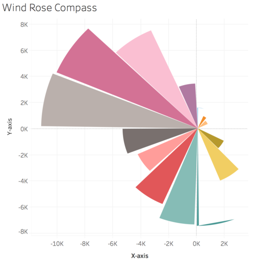
The initial idea was to plot a wind rose compass on each of the sensors’ locations. This would show us the wind direction and speed at each hour, and from there we can deduce which factories are responsible for which chemical releases. With some help from the online Tableau community, we were able to achieve the following:
However, we had difficulties displaying the compass by hour, and also plotting nine of it on a single sheet.
Air Plume Model
With advice from Professor Kam, we used an air plume model instead:
- Columns: X-Plume
- Rows: Y-Plume
- Filters: Month(Wind Date), Day(Wind Date), Hour(Wind Date), Monitor
- Color: Monitor
- Detail: Wind Direction Rounded, Wind Speed
- Background maps: None
- Background image: On MapLargeLabels.jpg using X-Plume and Y-Plume
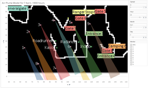
The direction of the plume represents the wind direction, and will be plotted at each of the nine sensor locations. This would help us visualize which factories’ pollutants are being blown towards each of the nine sensors. Note that a plume is basically a 3-point polygon. This is why earlier in data cleaning and integration, we created the ‘Point’ column in Sensor Locations.
In order to plot the plumes, we have to create five calculated fields:
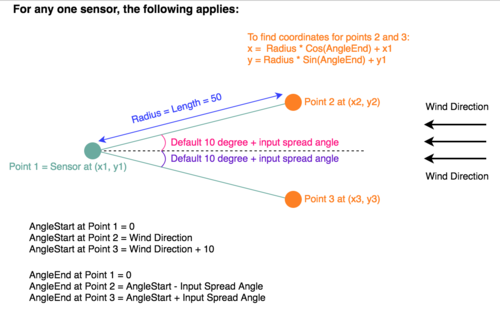
- AngleStart: This field would indicate the default spread (10 degress) of our air plume polygon.
- AngleEnd: This is calculated based on AngleStart plus any spread angle inputted by the user. It is used to calculate the x-y coordinates of points 2 and 3. We chose to let users input additional spread angle because the spread of the polygon affects our findings. This will be demonstrated later.
- Length: This is the radius of the circle about the sensor. Since our map grid is only 200x200, and the sensor and factories are all clustered on the bottom half of the map, we only need a range of 50 to visualize the reach from sensor to factory.
- X-Plume: This is the x-coordinates of all the 3 points for each air plume polygon. It is computed using trigonometry as shown in Image3-3. This website was particularly helpful in jolting our long-forgotten knowledge of trigonometry.
- Y-Plume: This is the y-coordinates of all the 3 points for each air plume polygon. It is computed using trigonometry as shown in Image3-3.
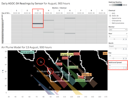
With the above, we managed to plot the air plume model as shown in Image3-2. As the air plume model does not tell us which chemicals are being monitored by the sensors, we need another chart to cross-reference to the air plume model. We will use a variation of the calendar heatmap from Problem #2:
- Columns: Monitor, Chemical
- Rows: Day(Sensor Date)
- Filters: Hour(Wind Date), Month(Wind Date), Chemical, Monitor
- Color: Sum(Reading)
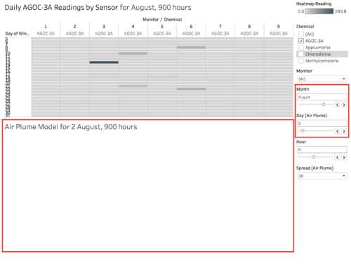
Now we can put the two visualizations on a single dashboard with linked filters and move on to analyse the results. Let’s pick a random day and see what we can observe.
Missing Wind Records
While solving Problem #1, we noted that missing/lacking wind for certain days, including 2nd August. Thus, despite knowing that high levels of AGOC-3A and other chemicals were released on 2nd August, we were unable to cross-reference it to the air plume model and identify which factory was responsible.
We edited the filters such that only relevant values will be displayed.
AGOC-3A
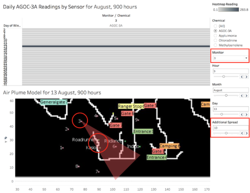
On 13th August, 0900 hours, we notice from the heatmap that sensor 3 has the highest readings, particularly for AGOC-3A, at 283.8 units. When we cross-reference to the air plume model, we see that the sensor 3 is receiving pollutants from the south-east, and Roadrunner is the only company captured by the air plume.
But notice, as we increase the spread of the polygon just by 10 degrees, Kasios immediately becomes a possible culprit of releasing high levels of AGOC-3A too. This is why we decided to provide a parameter for users to toggle the plume’s spread.
To determine who really is/are responsible for releasing high levels of AGOC-3A, we picked other hours with high readings of AGOC-3A. Note that companies in each observation record are ranked by nearness to centre of the spread (observed with 20 degree input spread).
| Date | Hour | Sensor | Units Read | Companies |
|---|---|---|---|---|
| 13th August | 0900 | 3 | 283.8 | Roadrunner, Kasios, Radiance |
| 5th December | 0600 | 3 | 268.2 | Kasios, Roadrunner |
| 9th December | 0700 | 6 | 233.9 | Kasios, Roadrunner |
| 15th April | 0600 | 6 | 228.8 | Radiance |
| 18th December | 0900 | 4 | 223.1 | Kasios, Roadrunner |
Table3.1. Findings for AGOC-3A
The above table shows that Roadrunner, Kasio and Radiance are responsible for the emission of AGOC-3A. By following the same deduction steps for the other three chemicals (observed with 20 degree input spread).
Appluimonia
| Date | Hour | Sensor | Units Read | Companies |
|---|---|---|---|---|
| 5th December | 1200 | 9 | 25.55 | Indigo |
| 7th December | 0100 | 6 | 23.77 | Indigo |
| 18th December | 0900 | 9 | 22.91 | Indigo |
| 20th April | 2300 | 3 | 20.78 | Roadrunner, Kasios |
| 24th December | 1300 | 9 | 19.03 | Indigo |
Table3.2. Findings for Appluimonia
Although Roadrunner and Kasios was part of the observation on 20th April 2300 hours, they are likely to be contributing only a small portion to that hour’s readings, seeing as Indigo alone contributes more than 19 units on other observed timings.
Chlorodinine
| Date | Hour | Sensor | Units Read | Companies |
|---|---|---|---|---|
| 23th December | 0500 | 6 | 45.12 | Roadrunner |
| 18th December | 0800 | 4 | 43.77 | Roadrunner, Kasios |
| 27th April | 0000 | 6 | 38.53 | Roadrunner |
| 9th April | 1500 | 6 | 35.39 | Roadrunner |
| 4th April | 1000 | 6 | 34.47 | Roadrunner |
Table3.3. Findings for Chlorodinine
Although Kasios was part of the observation on 18th December 0800 hours, it is likely to be contributing only a small portion to that hour’s readings, seeing as Roadrunner alone contributes more than 32 units on other observed timings.
Methylosmolene
| Date | Hour | Sensor | Units Read | Companies |
|---|---|---|---|---|
| 8th December | 2200 | 6 | 302.3 | Roadrunner |
| 9th April | 0100 | 6 | 283.0 | Kasios, Roadrunner |
| 2nd April | 0400 | 6 | 265.6 | Kasios, Roadrunner |
| 2nd December | 0400 | 6 | 254.9 | Kasios, Roadrunner |
| 15th April | 2200 | 7 | 165.5 | Kasios, Roadrunner, Radiance |
Table3.4. Findings for Methylosmolene
Although Radiance was part of the observation on 15th April 2200 hours, it is likely to be contributing only a small portion to that hour’s readings, seeing as Roadrunner and Kasios alone contributes more than 250 units on other observed timings.
Deduction
We arrived at the following conclusion on whether each company is responsible for the release of each chemical:
| Companies | AGOC-3A | Appluimonia | Chlorodinine | Methylosmolene |
|---|---|---|---|---|
| Roadrunner | Yes | No | Yes | Yes |
| Kasios | Yes | No | No | Yes |
| Radiance | Yes | No | No | No |
| Indigo | No | Yes | No | No |
Table3.4. Conclusion
Credits
This assignment was done in collaboration with Ng Jia Jun and Tan Kun Sheng.
Comments
…
