IS428 2017-18 T1 Assign Ng Jia Jun
Contents
Links
Overview & Objectives
Overview
Mistford is a mid-size city is located to the southwest of a large nature preserve. The city has a small industrial area with four light-manufacturing endeavors. Mitch Vogel is a post-doc student studying ornithology at Mistford College and has been discovering signs that the number of nesting pairs of the Rose-Crested Blue Pipit, a popular local bird due to its attractive plumage and pleasant songs, is decreasing! The decrease is sufficiently significant that the Pangera Ornithology Conservation Society is sponsoring Mitch to undertake additional studies to identify the possible reasons. Mitch is gaining access to several datasets that may help him in his work, and he has asked you (and your colleagues) as experts in visual analytics to help him analyze these datasets.
Mitch Vogel was immediately suspicious of the noxious gases just pouring out of the smokestacks from the four manufacturing factories south of the nature preserve. He was almost certain that all of these companies are contributing to the downfall of the poor Rose-crested Blue Pipit bird. But when he talked to company representatives and workers, they all seem to be nice people and actually pretty respectful of the environment.
In fact, Mitch was surprised to learn that the factories had recently taken steps to make their processes more environmentally friendly, even though it raised their cost of production. Mitch discovered that the state government has been monitoring the gaseous effluents from the factories through a set of sensors, distributed around the factories, and set between the smokestacks, the city of Mistford and the nature preserve. The state has given Mitch access to their air sampler data, meteorological data, and locations map.
Objectives
The four factories in the industrial area are subjected to higher-than-usual environmental assessment, due to their proximity to both the city and the preserve. Gaseous effluent data from several sampling stations has been collected over several months, along with meteorological data (wind speed and direction), that could help Mitch understand what impact these factories may be having on the Rose-Crested Blue Pipit. These factories are supposed to be quite compliant with recent years’ environmental regulations, but Mitch has his doubts that the actual data has been closely reviewed. Could visual analytics help him understand the real situation?
The primary job for Mitch is to determine which (if any) of the factories may be contributing to the problems of the Rose-crested Blue Pipit. Often, air sampling analysis deals with a single chemical being emitted by a single factory. In this case, though, there are four factories, potentially each emitting four chemicals, being monitored by nine different sensors. Further, some chemicals being emitted are more hazardous than others. Your task, as supported by visual analytics that you apply, is to detangle the data to help Mitch determine where problems may be. Use visual analytics to analyze the available data and develop responses to the questions below.
Problem #1
Q1: Characterize the sensors’ performance and operation. Are they all working properly at all times? Can you detect any unexpected behaviors of the sensors through analyzing the readings they capture? Limit your response to no more than 9 images and 1000 words.
Dataset involved:
- Sensor Data.xlsx
In order to determine whether if the sensors are working properly, sensors should be able to receive readings when they are deployed. There should not be any anomaly in all the readings as well.
Cyclic Plot
A cyclic plot of all the chemical readings by all sensors is made using Tableau with the field following fields:
- Columns
- Hour
- Day
- Rows
- Month
- Readings
- Filter
- Hour
- Color
- Monitor
Image 1.1 - Cyclic Plot
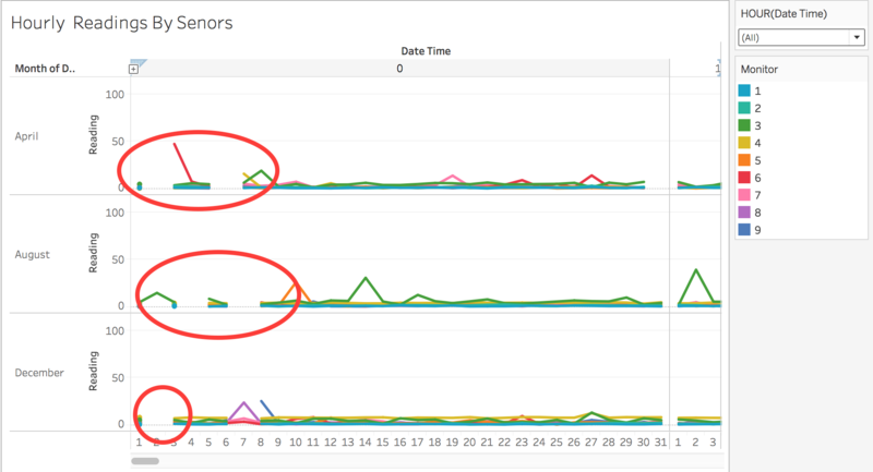
Image 1.1 is a cyclic plot which shows an overview of all the chemical readings by 9 sensors in the three months (April, August and December) as given in the dataset. According to cyclic plot, it shows that there were missing records at 0:00 hour. During April and December, in Day 2, there were a few cases where all the sensors have failed to capture any readings at 0:00 hour. During August, in Day 2, only sensor #3 had reading at 0:00 hour. Hence, I can conclude that there are a few sensors which are already not working properly at the beginning of April. However, the cyclic plot does not review the non-working sensors accurately because of the overlapping lines. Thus, a heat map is created to conduct further analysis on all the sensors.
Heat Map
The heat map is prepared using the following fields:
- Columns
- Day
- Hour
- Rows
- Month
- Monitor
- Filter
- Day
- Color
- Readings
Image 1.2 - Heat Map
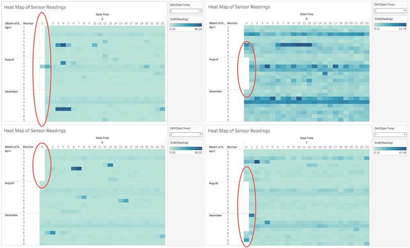
Image 1.2 is a heat map which shows an overview of all the chemical readings by 9 sensors in the three months. The color and its density represent the amount of the chemicals detected by sensors. Using the heat map, I have looked through the total of 31 days for the three months and found out that there were 7 days where the sensors were not operating properly. Firstly, On 2nd and 6th April, all sensors could not detect chemical reading at 0 hour. Then, on 2nd August, at 0 hour, only sensor #3 was able to detect reading whereas the other 8 sensors were not able to. On 4th and 7th August, all sensors could not detect chemical reading at 0 hour. Last, on 2nd December, all sensors could not detect chemical reading at 0 hour; and on 7th December, only sensor #6, #7 and #8 were able to detect chemical readings at 0 hour. This findings has shown a strange pattern particular at 0 hour and it occurs once and twice throughout the 3 months. One of the possible reasons could be engineers are maintaining the sensors at that timing.
Anomaly Detection
The heat map is prepared using the following fields:
- Columns
- Hour
- Rows
- Month
- Readings
- Readings - Dual Axis
- Filter
- Monitor
- Color
- Reading Anomaly (calculated field)
Image 1.3 - Reading Anomaly (calculated field)
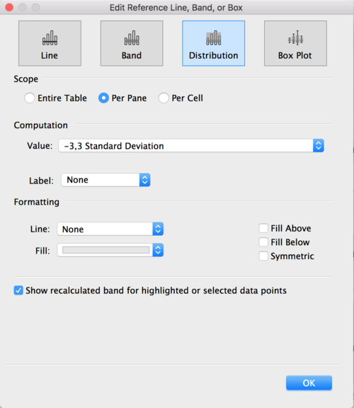
Reference distributions of standard deviation 3,-3 have been added. I understand that the chemical readings have different ranges thus I defined anomalies as being at least 3 standard deviation from the mean.
Image 1.4 - Reference distributions
Image 1.5 - Line Graph
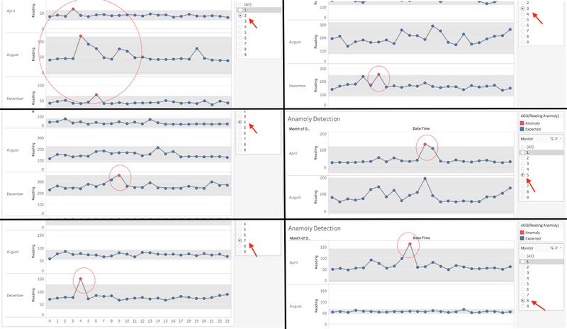
Image 1.5 is a line graph which shows extremely high readings from at 3 standard deviation from the mean. There was a total of 6 extremely readings and are questionable as they deviate from the mean to a large extent. One of the possible reasons for the anomalies could be due to wind.
Key findings:
- Sensor #2, one extremely high reading in April, August and December.
- Sensor #3, #4 and #7, one extremely high reading in December.
- Sensor #5 and #8, one extremely high reading in April.
Problem #2
Q2: Now turn your attention to the chemicals themselves. Which chemicals are being detected by the sensor group? What patterns of chemical releases do you see, as being reported in the data? Limit your response to no more than 6 images and 500 words.
Dataset involved:
- Sensor Data.xlsx
- Sensor Location.xlsx
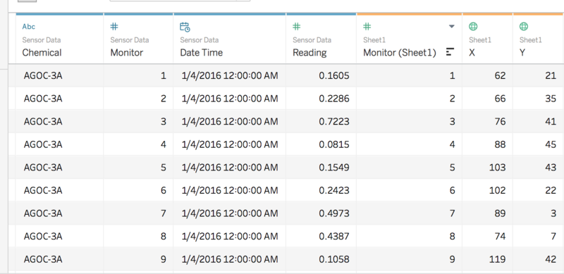
Image 2.1 - Tableau Data Source
Drag both Sensor Data.xlsx and Sensor Location.xlsx into the Tableau Data Source. Using these two data sets, I can analyse the patterns of chemical releases based on the sensor location and which sensors are detecting certain chemicals.
Pie Chart Map
The pie chart map is prepared using the following fields:
- Columns
- X (Change Geographical Role to Longitude)
- Rows
- Y (Change Geographical Role to Latitude)
- Color
- Chemical
- Size
- Reading
- Label
- Monitor
Also, the background image has to be changed to MapLargeLabels.jpg via Map -> Background Images. The setting is set to Left:0, Right:200, Bottom:0 and Top:200.
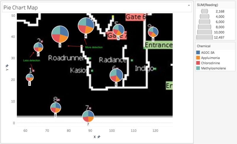
Image 2.2 - Pie Chart Map
Image 2.2 is a pie chart map which shows chemical releases proportion to a relative whole. At a glance, sensor #3 and #4 detected the most chemical readings whereas sensor #1 and sensor #2 detected the least. Most sensors were able detect the four different chemicals proportionally. Sensor #5, #6 and #9 have high detection on AGOC-3A. Further analysis has to be conducted to determine the patterns of chemical releases.
Chemical Release Calendar
The calendar is prepared using the following fields:
- Columns
- Monitor
- Weekday
- Rows
- Chemical
- Month
- Week
- Filter
- Chemical
- Color
- Reading
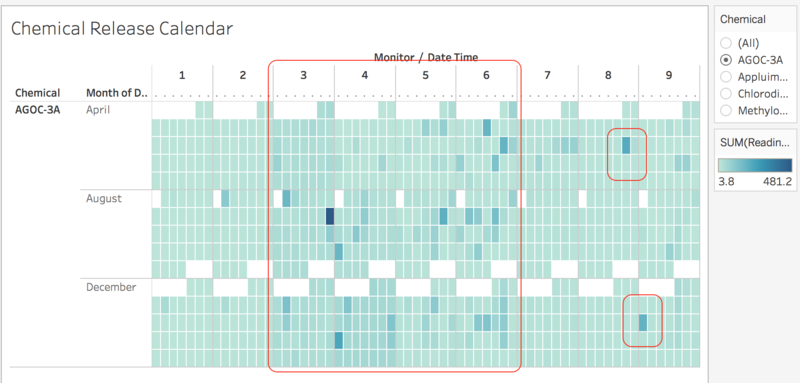
Image 2.3 - Chemical Release Calendar (AGOC-3A)
Image 2.3 shows a chemical release calendar of AGOC-3A. Sensor #3, #4, #5, #6 have a higher detection of AGOC-3A. Sensor #3 has the highest reading of 481.2 on the second Saturday in August. Both sensor #8 and #9 have one occurrence of higher detection of the chemical throughout the three months.
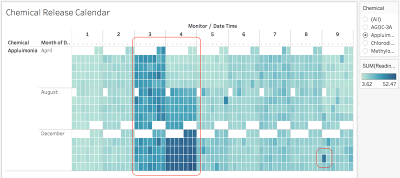
Image 2.4 - Chemical Release Calendar (Appluimonia)
Image 2.4 shows a chemical release calendar of Appluimonia. Sensor #3 has a relatively high detection of Appluimonia throughout the 3 months (April, August and December). Sensor #4 has a incremental increase in the detection from April to December. Also, it has detected the highest amount of release for the whole month of December. Sensor #9 detected the highest release on third Sunday in December. Comparing with all the sensors, sensor #3 has the highest reading of 52.47 on the last Friday in December.
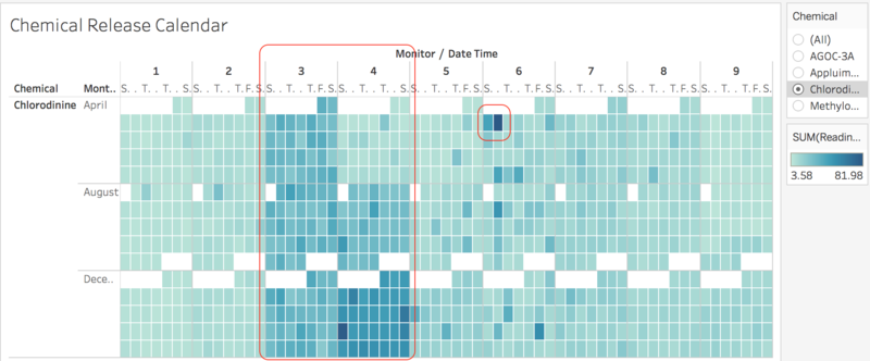
Image 2.5 - Chemical Release Calendar (Chlorodinine)
Image 2.5 shows a chemical release calendar of Chlorodinine. Once again, sensor #3 has a relatively high detection of Chlorodinine throughout the 3 months (April, August and December). Sensor #4 also has a incremental increase in the detection from April to December. Sensor #4 has the highest detection of release on third Sunday in December. Particularly for Sensor #6, it has highest detection of 81.98 and is the highest among all the sensors.
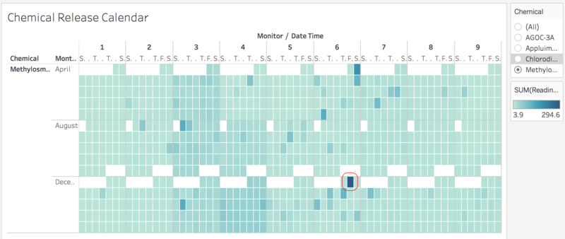
Image 2.6 - Chemical Release Calendar (Methylosmolene)
Image 2.6 shows a chemical release calendar of Methylosmolene. The detection of this chemical release follows an average pattern throughout all the sensors. Sensor #6 has the highest readings of 294.6 on first Friday in December.
In conclusion, sensor #3 and #4 have a similar pattern when detecting Appluimonia and Chlorodinine. Sensor #3 has a average pattern of detection whereas Sensor #4 has a incremental detection of the chemical release from April, August and December. The rest of the sensors have a lower readings when compared to sensor #3 and #4. In terms of detecting AGOC-3A and Methylosmolene, all sensors have a average pattern of detection with sensor #3 has the highest reading of AGOC-3A on the second Saturday in August and sensor #6 has the highest reading of Methylosmolene on first Friday in December.
Problem #3
Q3: Which factories are responsible for which chemical releases? Carefully describe how you determined this using all the data you have available. For the factories you identified, describe any observed patterns of operation revealed in the data. Limit your response to no more than 8 images and 1000 words.
In order to find out which factories are responsible for the chemical releases, heat map is used to find out the Month, Day and Time of the highest detection of the chemical. Using the Month, Day and Time; an air plume model is used to determine which factory is responsible. Polygons will be plotted onto the 9 locations of the sensors. Each polygon represents where the wind is originating from, from the sensors' perspective. If the factories fall into their trajectories, it has a high possibility that the factory is releasing that chemical.
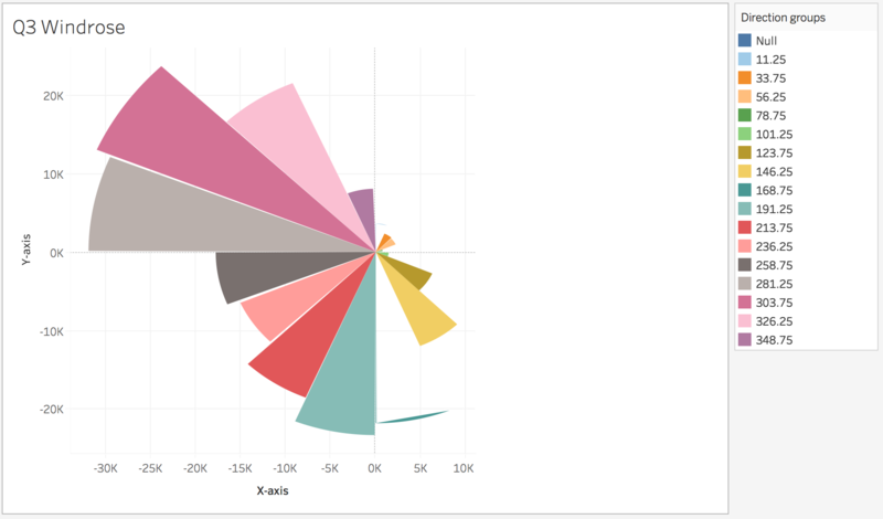
Image 3.1 - Wind rose plot
Initially, a wind rose plot was planned to plot onto the map to deduce the wind direction and wind speed but there were some difficulties in plotting 9 wind rose plots onto the map.
Dataset involved:
- Sensor Data.xlsx
- Sensor Location.xlsx
- Meteorological Data.xlsx
Heat Map Calendar & Air Plume Model
The heat map calendar is prepared with the following:
- Columns
- Monitor
- Rows
- Day
- Filters
- Month
- Hour
- Chemical
- Color
- Readings
The air plume model is prepared with the following:
- Columns
- X-axis (Air Plume)
- Rows
- Y-axis (Air Plume)
- Filters
- Month
- Day
- Hour
- Monitor
- Color
- Monitor
- Detail
- Wind Direction Rounded
- Wind Speed
Additional calculated fields:
- Angle: This field would indicate the default spread (10 degress) of the air plume polygon.
- Length: This is the radius of the circle about the sensor. Since the map grid is only 200x200, and the sensor and factories are all clustered on the bottom half of the map, only a range of 50 is needed to visualize the reach from sensor to factory.
- X-axis (Air Plume): This is the x-coordinates of all the 3 points for each air plume polygon. It is computed using trigonometry.
- Y-axis (Air Plume): This is the y-coordinates of all the 3 points for each air plume polygon. It is computed using trigonometry.
AGOC-3A
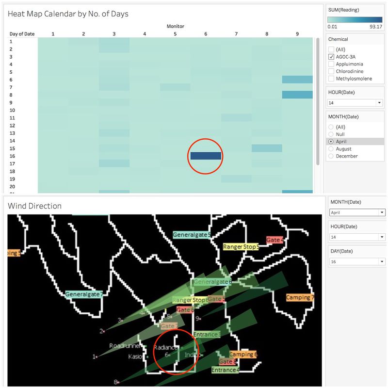
Image 3.2 - Dashboard for 16th April at 14:00 hour
According to Image 3.2, sensor #6 detected the highest amount of AGOC-3A release, 93.17 and the air plume model shows that as wind was blowing towards sensor #6, Radiance was in its trajectory. This gives a hint that Radiance was releasing AGOC-3A.
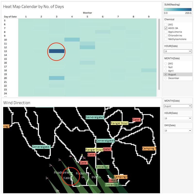
Image 3.3 - Dashboard for 13th August at 13:00 hour
According to Image 3.3, sensor #3 detected the highest amount of AGOC-3A release, 269.6 and the air plume model shows that as wind was blowing towards sensor #3, Roadrunner and Kasio were in its trajectory. Hence, Roadrunner and Kasio are responsible for the release of AGOC-3A. Other dates and hours are picked to determine which factory responsible.
| Date | Hour | Sensor | Units Read | Factories |
|---|---|---|---|---|
| 13th August | 0900 | 3 | 283.8 | Roadrunner, Kasios, Radiance |
| 5th December | 0600 | 3 | 268.2 | Kasios, Roadrunner |
| 9th December | 0700 | 6 | 233.9 | Kasios, Roadrunner |
| 15th April | 0600 | 6 | 228.8 | Radiance |
| 18th December | 0900 | 4 | 223.1 | Kasios, Roadrunner |
Table3.1 Summary for AGOC-3A
Appluimonia
| Date | Hour | Sensor | Units Read | Factories |
|---|---|---|---|---|
| 5th December | 1200 | 9 | 25.55 | Indigo |
| 7th December | 0100 | 6 | 23.77 | Indigo |
| 18th December | 0900 | 9 | 22.91 | Indigo |
| 20th April | 2300 | 3 | 20.78 | Roadrunner, Kasios |
| 24th December | 1300 | 9 | 19.03 | Indigo |
Table3.2 Summary for Appluimonia
Chlorodinine
| Date | Hour | Sensor | Units Read | Factories |
|---|---|---|---|---|
| 23th December | 0500 | 6 | 45.12 | Roadrunner |
| 18th December | 0800 | 4 | 43.77 | Roadrunner, Kasios |
| 27th April | 0000 | 6 | 38.53 | Roadrunner |
| 9th April | 1500 | 6 | 35.39 | Roadrunner |
| 4th April | 1000 | 6 | 34.47 | Roadrunner |
Table3.3 Summary for Chlorodinine
Methylosmolene
| Date | Hour | Sensor | Units Read | Factories |
|---|---|---|---|---|
| 8th December | 2200 | 6 | 302.3 | Roadrunner |
| 9th April | 0100 | 6 | 283.0 | Kasios, Roadrunner |
| 2nd April | 0400 | 6 | 265.6 | Kasios, Roadrunner |
| 2nd December | 0400 | 6 | 254.9 | Kasios, Roadrunner |
| 15th April | 2200 | 7 | 165.5 | Kasios, Roadrunner, Radiance |
Table3.4 Summary for Methylosmolene
Deduction
| Factories | AGOC-3A | Appluimonia | Chlorodinine | Methylosmolene |
|---|---|---|---|---|
| Roadrunner | Yes | No | Yes | Yes |
| Kasios | Yes | No | No | Yes |
| Radiance | Yes | No | No | No |
| Indigo | No | Yes | No | No |
Table3.5 Deduction
References
Credits
This assignment was done in collaboration with Wan Mei Ying and Tan Kun Sheng.
