IS428 2017-18 T1 Assign Peh Jing Yuan
Link to assignment: Assignments
Link to dropbox: Assignment Dropbox
Peh Jing Yuan IS428 Assignment Backup link
Contents
Overview
Mistford is a mid-size city is located to the southwest of a large nature preserve. The city has a small industrial area with four light-manufacturing endeavors. Mitch Vogel is a post-doc student studying ornithology at Mistford College and has been discovering signs that the number of nesting pairs of the Rose-Crested Blue Pipit, a popular local bird due to its attractive plumage and pleasant songs, is decreasing! The decrease is sufficiently significant that the Pangera Ornithology Conservation Society is sponsoring Mitch to undertake additional studies to identify the possible reasons. Mitch is gaining access to several datasets that may help him in his work, and he has asked you (and your colleagues) as experts in visual analytics to help him analyze these datasets.
Mitch Vogel was immediately suspicious of the noxious gases just pouring out of the smokestacks from the four manufacturing factories south of the nature preserve. He was almost certain that all of these companies are contributing to the downfall of the poor Rose-crested Blue Pipit bird. But when he talked to company representatives and workers, they all seem to be nice people and actually pretty respectful of the environment.
In fact, Mitch was surprised to learn that the factories had recently taken steps to make their processes more environmentally friendly, even though it raised their cost of production. Mitch discovered that the state government has been monitoring the gaseous effluents from the factories through a set of sensors, distributed around the factories, and set between the smokestacks, the city of Mistford and the nature preserve. The state has given Mitch access to their air sampler data, meteorological data, and locations map. Mitch is very good in Excel, but he knows that there are better tools for data discovery, and he knows that you are very clever at visual analytics and would be able to help perform an analysis.
The Task
General Task
The four factories in the industrial area are subjected to higher-than-usual environmental assessment, due to their proximity to both the city and the preserve. Gaseous effluent data from several sampling stations has been collected over several months, along with meteorological data (wind speed and direction), that could help Mitch understand what impact these factories may be having on the Rose-Crested Blue Pipit. These factories are supposed to be quite compliant with recent years’ environmental regulations, but Mitch has his doubts that the actual data has been closely reviewed. Could visual analytics help him understand the real situation?
The primary job for Mitch is to determine which (if any) of the factories may be contributing to the problems of the Rose-crested Blue Pipit. Often, air sampling analysis deals with a single chemical being emitted by a single factory. In this case, though, there are four factories, potentially each emitting four chemicals, being monitored by nine different sensors. Further, some chemicals being emitted are more hazardous than others. Your task, as supported by visual analytics that you apply, is to detangle the data to help Mitch determine where problems may be. Use visual analytics to analyze the available data and develop responses to the questions below.
The Specific Tasks
- Characterize the sensors’ performance and operation. Are they all working properly at all times? Can you detect any unexpected behaviors of the sensors through analyzing the readings they capture?Limit your response to no more than 9 images and 1000 words.
- Now turn your attention to the chemicals themselves. Which chemicals are being detected by the sensor group? What patterns of chemical releases do you see, as being reported in the data? Limit your response to no more than 6 images and 500 words.
- Which factories are responsible for which chemical releases? Carefully describe how you determined this using all the data you have available. For the factories you identified, describe any observed patterns of operation revealed in the data. Limit your response to no more than 8 images and 1000 words.
Background Information
The four manufacturing factories south of the nature preserve which Mitch is suspicious of the chemical releases and these are their coordinates:
| Factory | X | Y |
|---|---|---|
| Roadrunner Fitness Electronics | 89 | 27 |
| Kasios Office Furniture | 90 | 21 |
| Radiance ColourTek | 109 | 26 |
| Indigo Sol Boards | 120 | 22 |
In addition, these are the chemicals detected by the sensors and their following descriptions are below:
- AGOC-3A – New environmental regulations, and consumer demand, have led to the development of low-VOC and zero-VOC solvents. Most manufacturers now use one or more low-VOC substances and Mistford’s plants have wholeheartedly signed on. These new solvents, including AGOC-3A, are less harmful to human and environmental health.
- Appluimonia – An airborne odor is caused by a substance in the air that you can smell. Odors, or smells, can be either pleasant or unpleasant. In general, most substances that cause odors in the outdoor air are not at levels that can cause serious injury, long-term health effects, or death to humans or animals. However, odors may affect your quality of life and sense of well-being. Several odor-producing substances, including Appluimonia, are monitored under this program.
- Chlorodinine – Corrosives are materials that can attack and chemically destroy exposed body tissues. Corrosives can also damage or even destroy metal. They begin to cause damage as soon as they touch the skin, eyes, respiratory tract, digestive tract, or the metal. They might be hazardous in other ways too, depending on the particular corrosive material. An example is the chemical Chlorodinine. It has been used as a disinfectant and sterilizing agent as well as other uses. It is harmful if inhaled or swallowed.
- Methylosmolene – This is a trade name for a family of volatile organic solvents. After the publication of several studies documenting the toxic side effects of Methylosmolene in vertebrates, the chemical was strictly regulated in the manufacturing sector. Liquid forms of Methylosmolene are required by law to be chemically neutralized before disposal.
The Data
The data available consists of sensor readings from a set of air-sampling sensors and meteorological data from a weather station in proximity to the factories and sensors. The factories and sensors locations are provided in terms of x,y coordinates on a 200x200 grid, with (0,0) at the lower left hand corner (southwest). The sensors map shows the locations of the sensors and factories by number for the sensors and by name for the factories. The datasets given will go through some data cleaning in order to be visualized using Tableau:
- Sensor Data.xlsx
- Sensor Location.xlsx
- Meteorological Data.xlsx
Data Cleaning
The following are the steps to clean the datasets as mentioned above:
| No. | File | Steps Taken |
|---|---|---|
| 1 | Meteorological Data.xlsx | |
| 2 | Meteorological Data.xlsx | |
| 3 | Sensor Location.xlsx | Change the file name to Location Data.xlsx |
| 4 | Location Data.xlsx | |
| 5 | Location Data.xlsx | |
| 6 | Location Data.xlsx | |
| 7 | Location Data.xlsx | |
| 8 | Sensor Data.xlsx |
Data Configuration (Tableau)
Minor configuration needs to be done in order to build and link the data sources to one another effectively. Below are the steps:
| No. | File | Steps Taken |
|---|---|---|
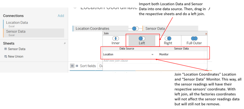
| 1 | Location Data.xlsx, Sensor Data.xlsx | |
| 2 | Meteorological Data.xlsx |
Interactive Visualization
The dashboard is built for screen resolution width of 1366. Please ensure your screen resolution width is set to this in order to have the best experience.
The following are some of the interactivity elements and charts used throughout the dashboards and the rationale behind them. User can read this or simply skip into using the visualization tool as instructions will be given in each dashboard.
Homepage
| Feature | Usage | How to build? |
|---|---|---|
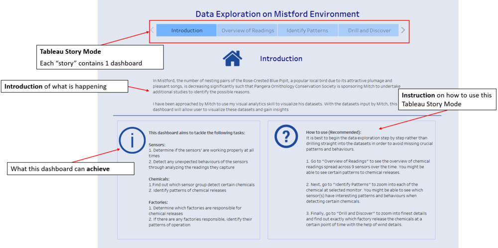
| Tableau Story Mode | To provide user the flexibility of moving from one dashboard to the other easily. Control shows the flow of how this visualization tool should be used. | Create new story on tableau Add 4 “stories” on the story and make the first story an introduction and other 3 stories containing one dashboard each |
| Introduction | Introduce why this visualization is made | Simply insert a text object. |
| Aim to achieve | Inform user what this visualization tool aims to achieve | Simply insert a text object. |
| Instruction | Teach the user how to use this visualization tool | Simply insert a text object. |
Overview
| Feature | Usage | How to build? |
|---|---|---|
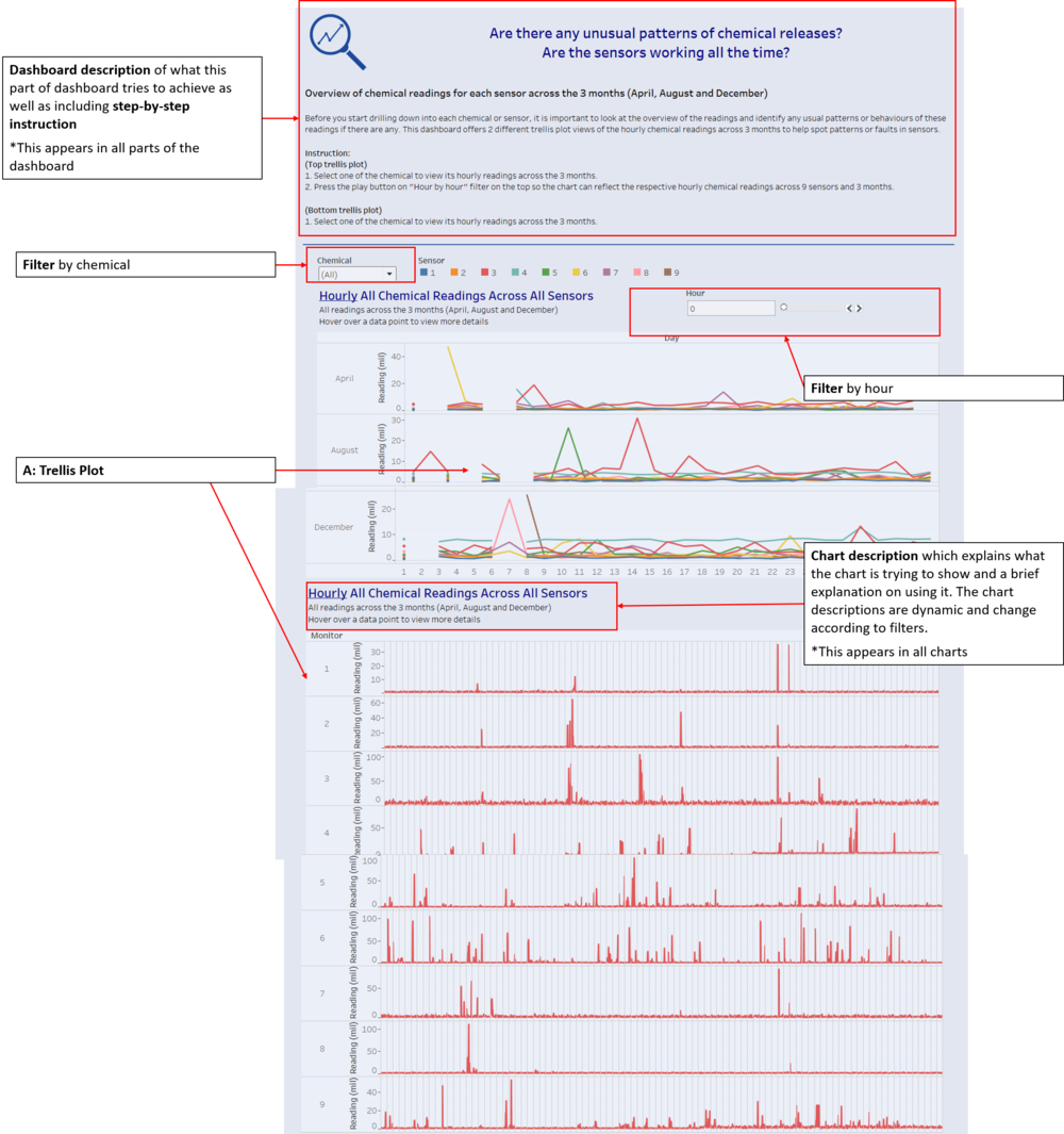
| Dashboard description | To provide user some information of what this current dashboard aims to do and includes an instruction on using it. Each dashboard has its respective dashboard description. |
Simply insert a text object. |
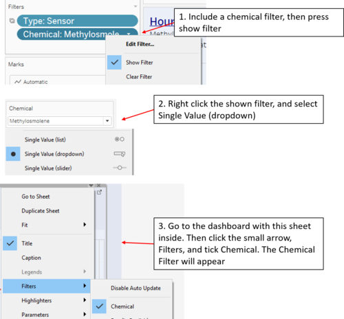
| Filter by chemical | To allow user to filter the data by chemical. If the user wants to view the chemical readings of a certain chemical, he can simply select from the dropdown list and choose that chemical. Therefore, the use of this filter allows the user to analyze each chemical’s readings instead of summation of all the chemicals’ readings. |
|
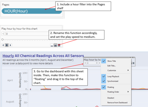
| Pages by hour | To allow user to look at the top trellis plot chemical readings hour by hour. When the user move the slicer and select the hour, the chart will update the hourly readings accordingly. Therefore, the use of this slicer button allows user to analyze each hour chemical readings’ across 3 months to spot any potential patterns. | |
| Chart description | To provide user some information what this chart shows and includes an instruction on how to see more details. Each chart has its respective chart description. | Simply edit the title of the chart. |
| A: Trellis Plot | This trellis plot allows the user to visualize the selected chemical’s readings across the 9 monitors. The readings are in hours and across the 3 months’ worth of data collected. | - |
Identifying Patterns from Different Perspective
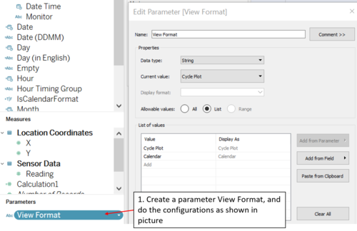
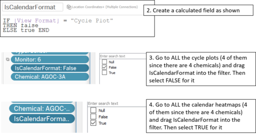
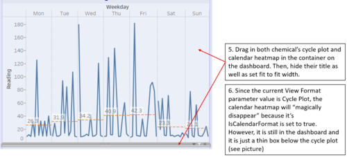
Cycle Plot
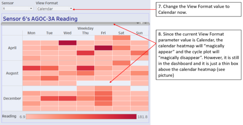
Calendar Heatmap
| Feature | Usage | How to build? |
|---|---|---|
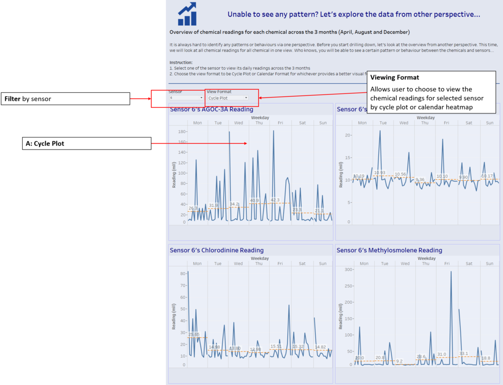
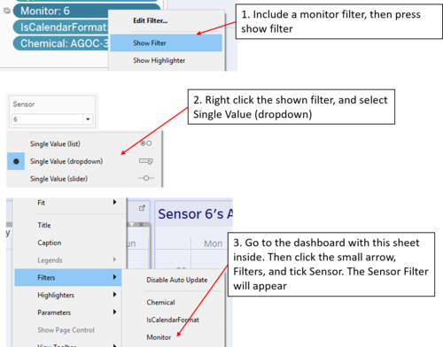
| Filter by sensor | To allow user to filter the data by sensor. If the user wants to view the chemical readings of a certain sensor, he can simply select from the dropdown list and choose that sensor. Therefore, the use of this filter allows the user to analyze chemical readings from each sensor instead of summation of all the chemicals’ readings. |
|
| Viewing Format | To provide user another alternative to view the Weekday/Week cycle plot by having a “calendar heatmap” |
|
| A: Cycle Plot | These cycle plots of each chemical allow the user to visualize the selected sensor’s chemical readings. With cycle plots, it may be easier to identify certain patterns to these chemical readings. |
- |
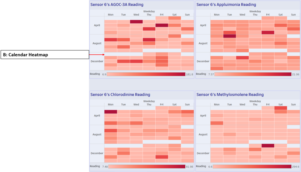
| B: Calendar Heatmap | These calendar heatmap of each chemical allow the user to visualize the selected sensor’s chemical readings. With calendar heatmap, it may be easier to identify certain patterns to these chemical readings. This is another alternative to the cycle plot as some user prefers to view in heatmap. | - |
Drill and Discover
| Feature | Usage | How to build? |
|---|---|---|
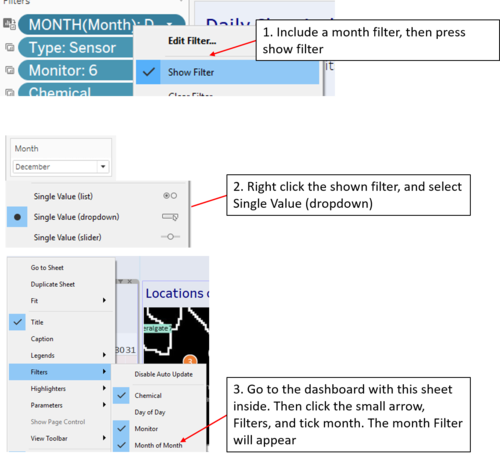
| Filter by month | To allow user to filter the data by month. In this part of the dashboard, we want to drill down as much as possible to find out exactly which factories are releasing the chemicals. The user can select the month of chemical readings and the heatmaps will update accordingly. |
|
| Filter by sensor | To allow user to filter the data by sensor. In this part of the dashboard, we want to drill down as much as possible to find out exactly which factories are releasing the chemicals. The user can select the month of chemical readings and the heatmaps will update accordingly. |
|
| Filter by chemical | To allow user to filter the data by sensor. Because heatmaps are used in this dashboard with chemicals as the categories, some of the chemical readings may be very high but seems normal due to other chemicals’ readings. Therefore, the user needs to use this filter to hide away other chemicals’ readings that may hinder the colour intensity of the chemical readings. |
|
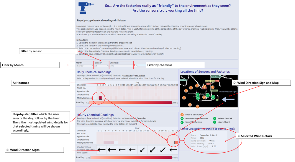
| A: Heatmap | There are 2 heatmap, daily chemical readings and hourly chemical readings |
- |
| B: Wind Direction Signs | Shows the user at the certain hour of the day, what is the wind direction and the size of the signs are scaled by wind speed. User can hover over to see more details such as wind bearing and speed. |
|
| C: Selected Wind Details | Shows the user the latest updated wind details at a selected time. (More will be explain on step-by-step filter) | - |
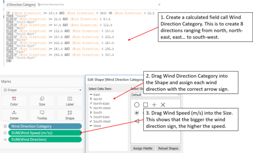
| D: Wind Direction Sign and Map | Shows the user the latest updated wind direction sign at a selected time on the map. Therefore, the user can see the wind direction and finds out whether a sensor’s high chemical readings are from a particular factory. For example, if sensor 4 on a certain timing has high AGOC-3A reading and the wind direction is north, it is likely that Roadrunner Fitness Electronics or Kasios Office Furniture is releasing high amount of AGOC-3A. |
Make the wind direction sign sheet to be “floating” on the dashboard and drag it to the bottom right corner of the map. |
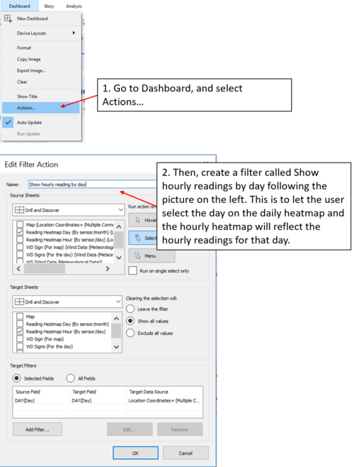
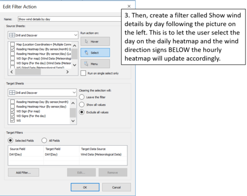
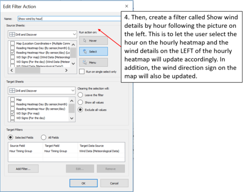
| Step-by-step filter | When the user selects a day on the daily heatmap, the hourly heatmap will reflect the hourly chemical readings of that day. Next, the user can then select a particular hour of that day. The filter will then do its work and show the latest updated wind details of that hour. For example, if the user selects 7th hour which is 7am, the latest wind details which is 6am will be shown on the right. In addition, the wind direction sign on the map will be updated so user can see which potential factories might be releasing the chemicals. |
|
Link to my dashboard
Peh Jing Yuan IS428 Assignment
Task #1
Characterize the sensors’ performance and operation. Are they all working properly at all times? Can you detect any unexpected behaviors of the sensors through analyzing the readings they capture?Limit your response to no more than 9 images and 1000 words.
Discover #1 (Missing readings at certain time):
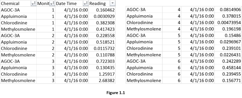
Figure 1.1 displays the records in Sensor Data.xlsx. Each record captures the Chemical, Monitor, Date Time and Readings. The Date Time column shows that the sensors capture chemical readings on an hourly interval. With these information, I decided to do trellis plot for 3 months and readings for every single day in the month. At the same time, each day is going to show hourly reading based on the “Play hour by hour” function. Therefore, we can see if there are any missing hourly data.
Based on figure 1.2, I have set to view all hourly chemical readings across 3 months. The red circles indicated that this certain hour which is hour 0 (12am), there are chemical readings which are completely missing for all sensors. On the 2nd and 6th of April, 4th and 7th of August, and 2nd December, all chemical readings are completely missing on 12am. The exact reason for this is not known but for now we can assume that the sensors are somehow not working at times when it is early part of the month and 12am. Based on the orange circles, you can see that all chemical readings are missing for most of the sensors. Again, it is at 12am and the reason for this is unknown. So far, there are only missing data and no unexpected behaviours of the sensors. Therefore, the conclusion for this discovery is not conclusive and we can only assume the sensors are sometimes down at the 0 hour of the early days in each month.
Discover #2 (Missing Methylosmolene readings across all sensors):
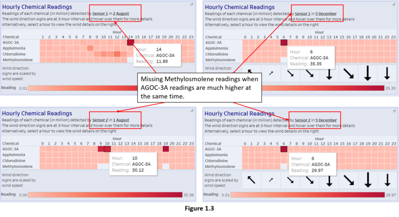
Based on figure 1.3, there is an obvious pattern. Based on sensor 1 and sensor 2, whenever the AGOC-3A readings are much higher than the rest of the chemical readings at certain hour, the Methylosmolene readings will become null and disappear. This phenomenon does not only happen for sensor 1 and 2, but for all other sensors as well. As there are many of such occurrences, figure 1.4 (sensor 3 – 6) and figure 1.5 (sensor 7 – 9) show some of the examples of such incidents at different timing.
I can confirm that these incidents happen regardless of the sensors and the timing of the incidents (happens across different months, days and hours). However, I need to check whether the methylosmolene readings are completely missing or misclassified into other chemicals. I can check the dataset itself.
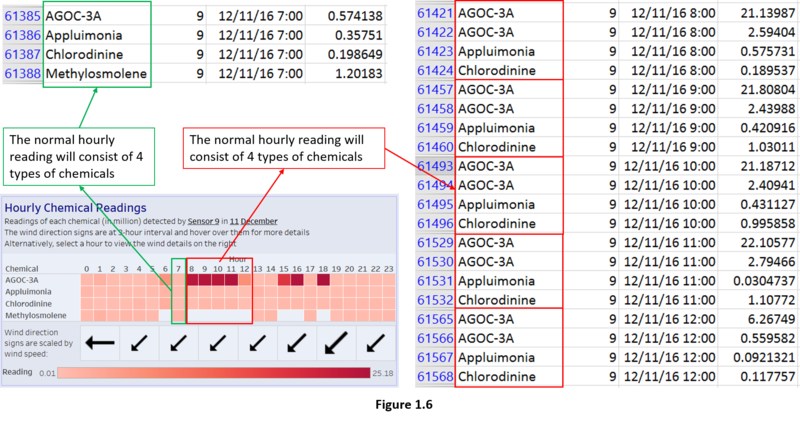
As I have check the dataset in figure 1.6, I can see that if the hourly reading is normal, all 4 different types of chemical readings are available for that hour (see the 7th hour of figure 1.6). However, from the 8th hour to 12th hour, when the AGOC-3A readings are high, the methylosmolene readings are missing and they are missing from the dataset. Instead, AGOC-3A will appear twice in each hour (see the red boxes in figure 1.6). I can conclude that the methylosmolene readings are not missing, just that the sensors read them as AGOC-3A and save the readings.
I look through other occurrences and I found this interesting incidence to point out. At the 22nd hour in figure 1.7, you can see that methylosmolene reading is 55.16 while the AGOC-3A is 5.60. But if I look at the 21st hour, there are 2 AGOC-3A readings and one is so much higher than another. Since these 2 hour are together, it is hard to tell whether the 21st hour high AGOC-3A reading is truly AGOC-3A’s or methylosmolene. However, it is very likely all high AGOC-3A readings in figure 1.3, 1.4, 1.5 are truly AGOC-3A becaused based on the patterns, if methylosmolene readings are high, they will be captured. But at the same time, it is important to take note that AGOC-3A is least harmful among the 4 chemicals while methylosmolene is the most harmful as it can cause damage to the Rose-Crested Blue Pipit. Thus, it may be possible someone tried to tamper all the sensors to not read methylosmolene properly and hide the fact that they are causing the reduce in Rose-Crested Blue Pipit population. Therefore, I can firmly conclude that AGOC-3A affects methylosmolene readings and the sensors need to be repaired to detect and read methylosmolene effectively.
Task #2
Which chemicals are being detected by the sensor group? What patterns of chemical releases do you see, as being reported in the data? Limit your response to no more than 6 images and 500 words.
Discover #1 (Sensors 4, 5 and 9 have increasing readings over the time):
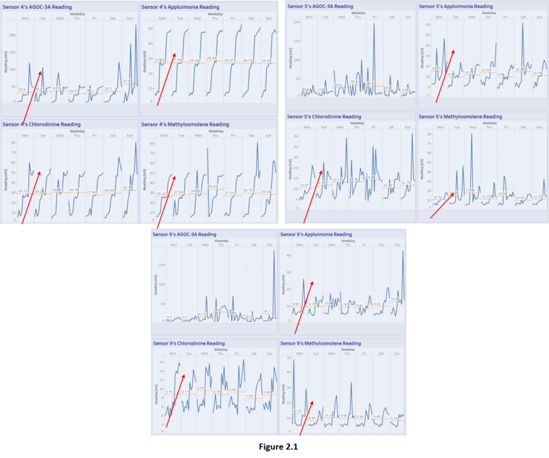
In figure 2.1, I can see that there is an increasing trend of almost all chemical readings over the 3 months regardless of the weekdays for sensors 4, 5 and 9 except AGOC-3A readings in sensors 5 and 9 did not increase significantly. It is important to take note that sensors 4, 5 and 9 are the north sensors of these 9 sensors built around the 4 factories. Therefore, when sensors 4, 5 and 9 detect increase in appluimonia, chlorodinine and methylosmolene, there is likely a chance that they all detect the chemicals from the same sources that produce these chemicals.
Discover #2 (All sensors detect high methylosmolene readings between 0 – 5am and 10 – 11pm while detecting high AGOC-3A readings between 6am – 9pm):
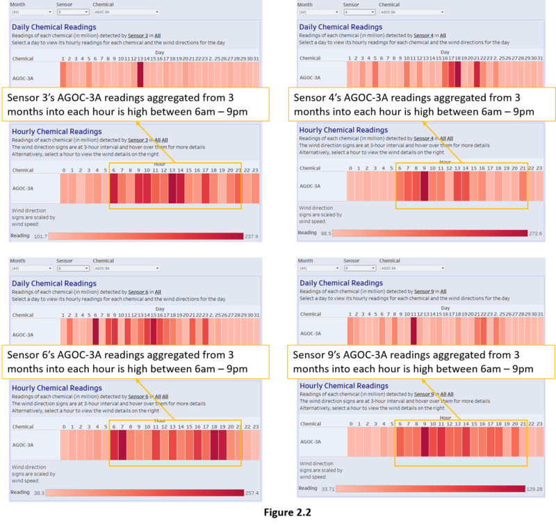
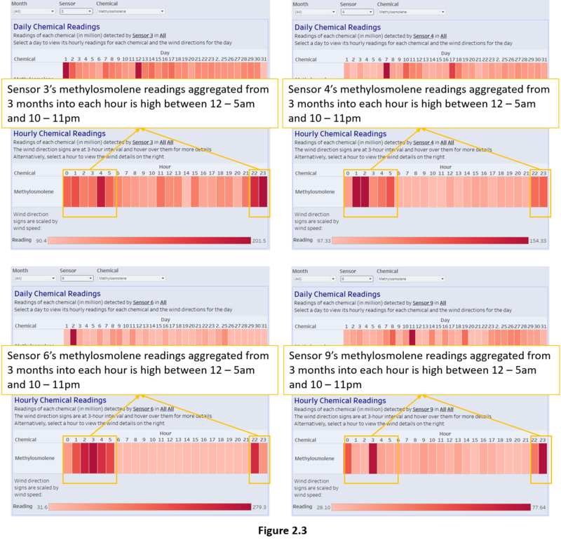
In figure 2.2, it shows some of the examples (sensors 3, 4, 6 and 9) of the AGOC-3A readings across 3 months being aggregated into hourly. Then, I can see that the high AGOC-3A readings are concentrated between 6am to 9pm. This is similar for all the remaining sensors that are not shown in figure 2.2. Then, in figure 2.3, it shows the same examples but it is for methylosmolene readings instead. I can see that the high methylosmolene readings are concentrated between 0 to 5am and 10 to 11pm. There is a strong pattern such that when the AGOC-3A readings are high, the methylosmolene readings are low and vice versa. This may be either due to the malfunctioning or tampering of sensors as mentioned in task #1 discover #2. Figure 2.4 shows a clearer view of this pattern. I can conclude that while some sensors’ readings might not be very obvious to show this pattern, all sensors will detect high methylosmolene readings between 0 – 5am and 10 – 11pm while detecting high AGOC-3A readings between 6am – 9pm.
Task #3
Which factories are responsible for which chemical releases? Carefully describe how you determined this using all the data you have available. For the factories you identified, describe any observed patterns of operation revealed in the data. Limit your response to no more than 8 images and 1000 words.
Discover #1 (Roadrunner Fitness Electronics and Kasios Office Furniture release high amount of methylosmolene and AGOC-3A):
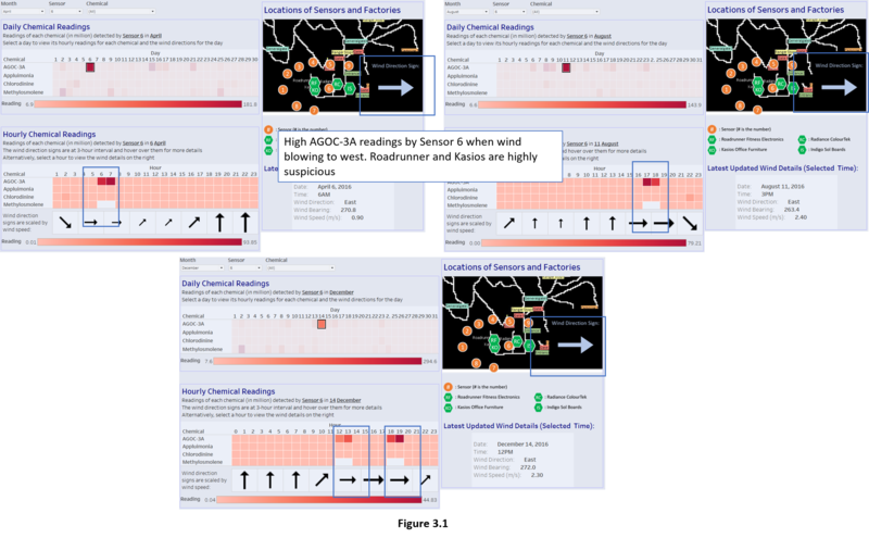
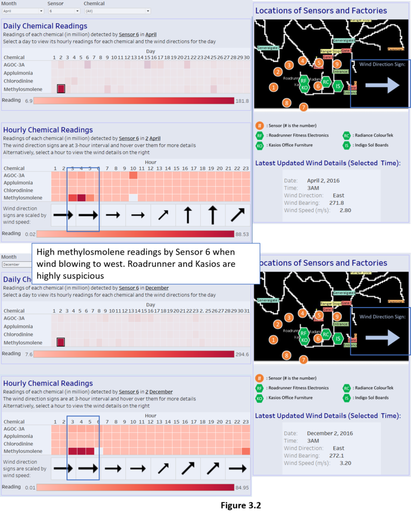
Figure 3.1 shows the high readings of AGOC-3A at certain timing at sensor 6. Coincidentally, these high readings occurred when the wind is blowing towards east. Figure 3.2 shows the high readings for methylosmolene for sensor 6. Also, these high readings occurred when the wind is only blowing towards east. When the wind is blowing towards east and have high readings on sensor 6, Roadrunner Fitness Electronics and Kasios Office Furniture are the culprits because sensor 6 is at their east.
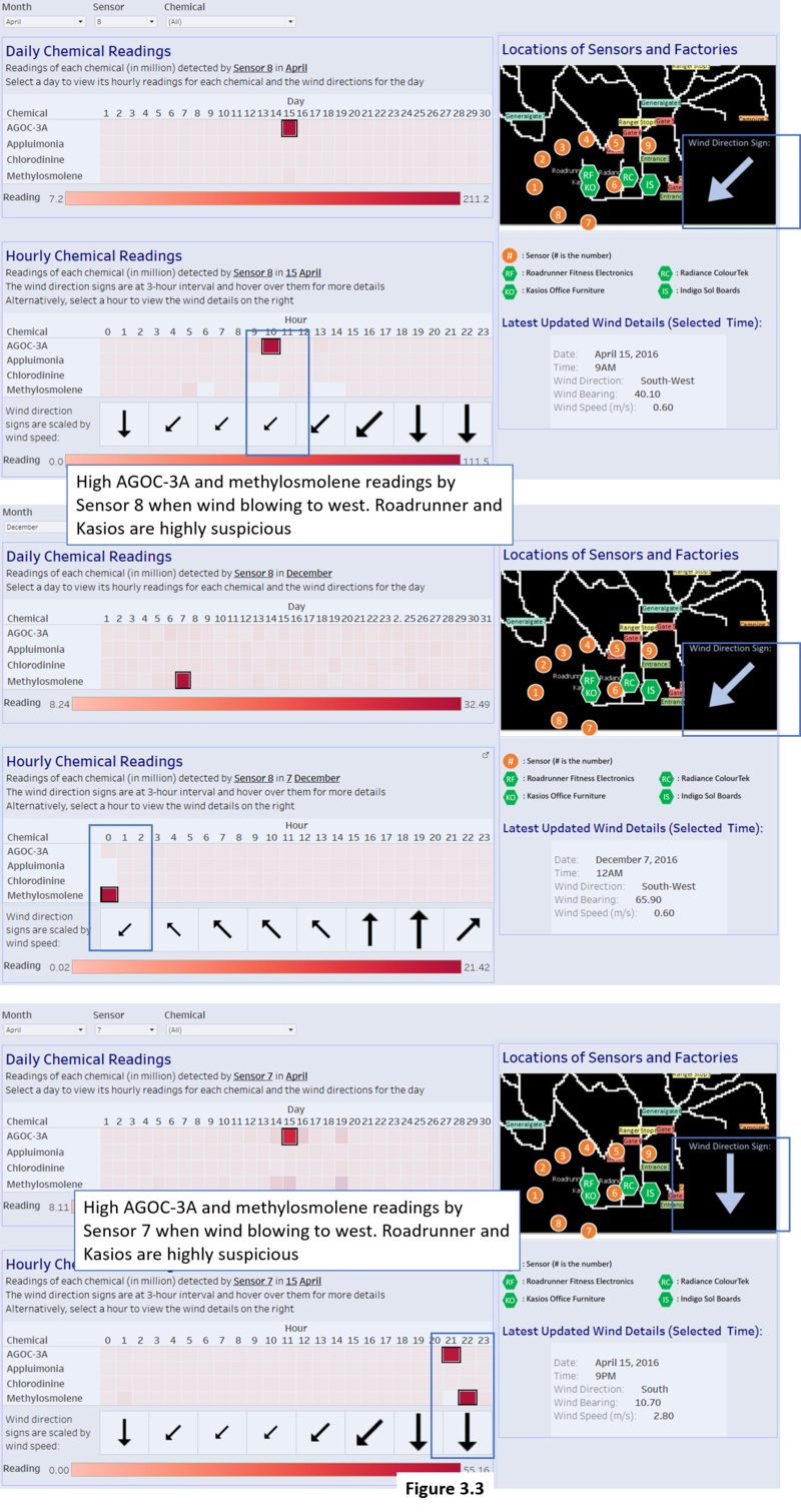
Figure 3.3 shows the high readings of AGOC-3A and methylosmolene at certain timing at sensor 7. Coincidentally, these high readings occurred when the wind is blowing towards south. This also happens in sensor 8 as well when the wind is blowing towards south-west. When the wind is blowing towards south and south-west and have high readings on sensor 7 and 8 respectively, Roadrunner Fitness Electronics and Kasios Office Furniture are the culprits.
I can conclude that Roadrunner Fitness Electronics and Kasios Office Furniture are releasing AGOC-3A and methylosmolene.
The table below shows most of the obvious timings when AGOC-3A and methylosmolene readings are high. There are concrete evidences that they have been releasing AGOC-3A and methylosmolene.
| Sensor | Date | Time | Chemical with high reading | General wind direction | Culprits |
|---|---|---|---|---|---|
| 3 | 17 April | 6am – 7am | AGOC-3A | North-West | Roadrunner and Kasios |
| 3 | 13 August | 9am – 1pm, 5pm | AGOC-3A | North-West | Roadrunner and Kasios |
| 3 | 5 December | 6am | AGOC-3A | North-West | Roadrunner and Kasios |
| 5 | 12 August | 11am – 1pm | AGOC-3A | North-East | Roadrunner |
| 5 | 8 December | 11am, 3pm – 4pm | AGOC-3A | North-East | Roadrunner |
| 6 | 6 April | 6am – 7am | AGOC-3A | East | Roadrunner and Kasios |
| 6 | 21 April | 6pm – 7pm | AGOC-3A | East | Roadrunner and Kasios |
| 6 | 8 August | 8am – 11am | AGOC-3A | East | Roadrunner and Kasios |
| 6 | 11 August | 5pm – 6pm | AGOC-3A | East | Roadrunner and Kasios |
| 6 | 23 August | 6am – 7am | AGOC-3A | East | Roadrunner and Kasios |
| 6 | 13 December | 3pm – 4pm | AGOC-3A | East | Roadrunner and Kasios |
| 6 | 14 December | 1pm – 2pm, 6pm – 7pm | AGOC-3A | East | Roadrunner and Kasios |
| 3 | 17 April | 6am – 7am | Methylosmolene | North-West | Roadrunner and Kasios |
| 3 | 12 December | 2am – 5am | Methylosmolene | North-West | Roadrunner and Kasios |
| 5 | 10 August | 11pm | Methylosmolene | North-East | Roadrunner |
| 5 | 20 December | 1am | Methylosmolene | North-East | Roadrunner |
| 6 | 2 April | 3am – 5am | Methylosmolene | East | Roadrunner and Kasios |
| 6 | 9 April | 1am | Methylosmolene | East | Roadrunner and Kasios |
| 6 | 25 April | 2am – 3am, 5am | Methylosmolene | East | Roadrunner and Kasios |
| 6 | 2 December | 3am – 5am | Methylosmolene | East | Roadrunner and Kasios |
| 6 | 8 December | 10pm | Methylosmolene | East | Roadrunner and Kasios |
| 6 | 11 December | 2am | Methylosmolene | East | Roadrunner and Kasios |
| 6 | 24 December | 10pm | Methylosmolene | East | Roadrunner and Kasios |
| 7 | 15 April | 9pm | AGOC-3A | South | Roadrunner and Kasios |
| 7 | 15 April | 10pm | Methylosmolene | South | Roadrunner and Kasios |
| 8 | 15 April | 10am | AGOC-3A | South-West | Roadrunner and Kasios |
| 8 | 7 December | 12am | Methylosmolene | South-West | Roadrunner and Kasios |
Discover #2 (Roadrunner Fitness Electronics releases high amount of chlorodinine):
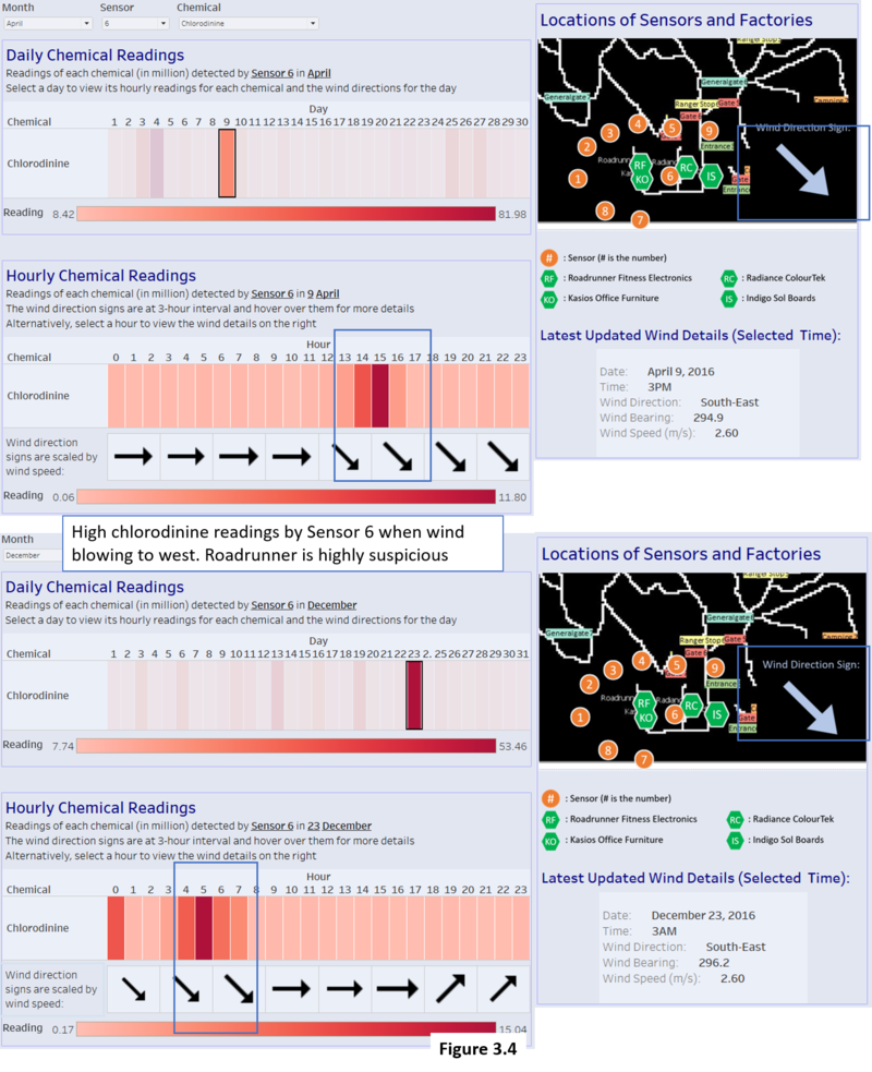
Figure 3.4 shows the high readings of chlorodinine at certain timing at sensor 6. Coincidentally, these high readings occurred when the wind is blowing towards south-east. When the wind is blowing towards south-east and have high readings on sensor 6, Roadrunner Fitness is the culprit because sensor 6 is at its south-east position.
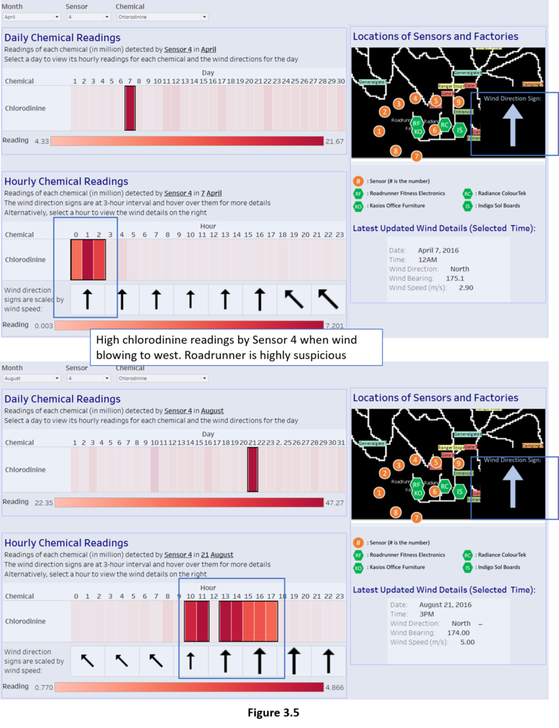
Figure 3.5 shows the high readings of chlorodinine at certain timing at sensor 4. Coincidentally, these high readings occurred when the wind is blowing towards north. When the wind is blowing towards north and have high readings on sensor 4, Roadrunner Fitness and Kasios Office Furniture are the culprit because sensor 4 is at their north.
I can conclude that Roadrunner Fitness Electronics is releasing chlorodinine. For Kasio Office Furniture, the evidence is not strong enough because there are too little occurrences to show that it releases chlorodinine.
The table below shows most of the obvious timings when chlorodinine readings are high. There are concrete evidences that Roadrunner Fitness Electronics have been releasing chlorodinine.
| Sensor | Date | Time | Chemical with high reading | General wind direction | Culprits |
|---|---|---|---|---|---|
| 3 | 5 December | 6am | Chlorodinine | North-west | Roadrunner |
| 4 | 7 April | 12am – 2am | Chlorodinine | North | Roadrunner, Kasios |
| 4 | 21 August | 10am – 5pm | Chlorodinine | North | Roadrunner, Kasios |
| 4 | 18 December | 5am – 8am | Chlorodinine | North | Roadrunner, Kasios |
| 6 | 4 April | 6am – 8am | Chlorodinine | South-east | Roadrunner |
| 6 | 9 April | 3pm – 4pm | Chlorodinine | South-east | Roadrunner |
| 6 | 25 April | 8am – 6pm | Chlorodinine | South-east | Roadrunner |
| 6 | 8 August | 12am – 6am | Chlorodinine | South-east | Roadrunner |
| 6 | 22 August | 1am – 2am | Chlorodinine | South-east | Roadrunner |
| 6 | 27 August | 3pm – 6pm | Chlorodinine | South-east | Roadrunner |
| 6 | 13 December | 7am – 10am | Chlorodinine | South-east | Roadrunner |
| 6 | 19 December | 1am – 2am | Chlorodinine | South-east | Roadrunner |
| 6 | 23 December | 12am – 7am | Chlorodinine | South-east | Roadrunner |
Discover #3 (Radiance ColourTek releases high amount of AGOC-3A):
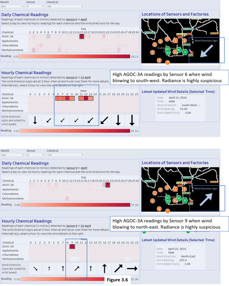
Figure 3.6 shows the high readings of AGOC-3A at certain timing at sensor 6. Coincidentally, these high readings occurred when the wind is blowing towards south-west. When the wind is blowing towards south-west and have high readings on sensor 6, Radiance ColourTek are the culprit because sensor 6 is at their south-west. Also, in figure 3.6, the reading is high at sensor 9 when the wind is blowing towards north-east. When the wind is blowing towards north-east and have high readings on sensor 9, Radiance ColourTek are the culprit because sensor 9 is at their north-east.
I can conclude that Radiance ColourTek is releasing AGOC-3A.
The table below shows most of the obvious timings when AGOC-3A readings are high. There are concrete evidences that Radiance ColourTek has been releasing AGOC-3A.
| Sensor | Date | Time | Chemical with high reading | General wind direction | Culprits |
|---|---|---|---|---|---|
| 6 | 15 April | 6am – 1pm | AGOC-3A | South-west | Radiance |
| 6 | 15 April | 6am – 1pm | AGOC-3A | South-west | Radiance |
| 6 | 5 December | 4am | AGOC-3A | South-west | Radiance |
| 9 | 21 April | 1pm – 2pm | AGOC-3A | North-east | Radiance |
| 9 | 22 April | 9am – 10am | AGOC-3A | North-east | Radiance |
| 9 | 24 August | 8pm | AGOC-3A | North-east | Radiance |
| 9 | 11 December | 8am – 12pm, 3pm – 6pm | AGOC-3A | North-east | Radiance |
Discover #4 (Indigo Sol Boards releases high amount of AGOC-3A):
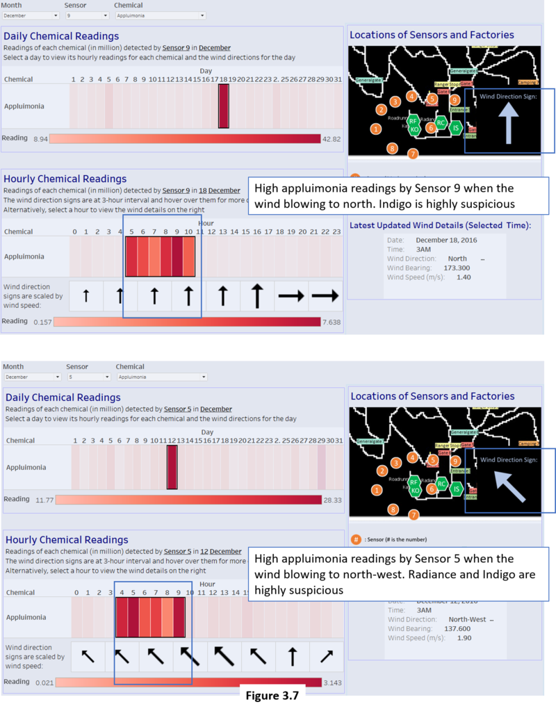
Figure 3.7 shows the high readings of appluimonia at certain timing at sensor 5 and 9. Coincidentally, these high readings occurred when the wind is blowing towards north-west and north respectively. When the wind is blowing towards north-west with high readings on sensor 5, Radiance ColourTek and Indigo Sol Boards are the culprits because sensor 5 are at their north-west position.
Likewise, when the wind is blowing towards north with high readings on sensor 9, Indigo Sol Boards is the culprit because sensor 9 is at its north position. I can conclude that Indigo Sol Boards is releasing appluimonia. For Radiance ColourTek, the evidence is not strong enough because there are too little occurrences to show that it releases appluimonia.
The table below shows most of the obvious timings when appluimonia readings are high. There are concrete evidence that Indigo Boards Sol has been releasing appluimonia while Radiance ColourTek may be suspicious of it too.
| Sensor | Date | Time | Chemical with high reading | General wind direction | Culprits |
|---|---|---|---|---|---|
| 5 | 5 August | 9am – 1pm | Appluimonia | North-west | Radiance, Indigo |
| 5 | 12 December | 4am – 9am | Appluimonia | North-west | Radiance, Indigo |
| 9 | 7 April | 12am – 2am | Appluimonia | North | Indigo |
| 9 | 10 August | 2am | Appluimonia | North | Indigo |
| 9 | 21 August | 1pm – 4pm | Appluimonia | North | Indigo |
| 9 | 18 December | 5am – 10am | Appluimonia | North | Indigo |
Conclusion
It is known that appluimonia is the least harmful chemical given that high amount of it only gives a bad odour but not harm living things. The next least harmful chemical is AGOC-3A as they are supposed to be the less harmful to human and environmental health among the VOC solvents.
Therefore, there is a need to take note of chlorodinine and methylosmolene as they are recognized to be harmful if inhaled and toxic to vertebrates (Pipit is vertebrate) respectively. So, factories that releases these chemicals are like to be main factories that are responsible for lowering the population of this pipit.
Summary table of which factories release the chemicals:
| AGOC-3A | Appluimonia | Chlorodinine | Methylosmolene | |
|---|---|---|---|---|
| Roadrunner Fitness Electronics | Yes | No | Yes | Yes |
| Kasios Office Furniture | Yes | No | Unlikely | Yes |
| Radiance ColourTek | Yes | Likely | No | No |
| Indigo Sol Boards | No | Yes | No | No |
In conclusion, Roadrunner Fitness Electronics is the main culprit contributing to lower population of Rose-Crested Blue Pipit because it is confirmed that it releases high amount of chlorodinine and methylosmolene.
The 2nd biggest culprit is followed by Kasios Office Furniture, as there is a chance they released high amount of chlorodinine and they definitely released high amount of methylosmolene.
Radiance ColourTek Senior Vice President Arthur Donner said they have the lowest VOCs in the industry and they really did released high amount of AGOC-3A which is known to have lower VOCs. Although they did what they said, it is still important to reduce the amount of release since they are still harmful.
Indigo Sol Boards only released high amount of appluimonia which is least harmful to the pipit. Therefore, they are not responsible for the lower population of pipit.
All factories are not as friendly as they seems to the environment when Mitch interviewed them, since they all played a part in releasing high amount of different chemicals.
Comments
Any comments are welcomed.
Credits
Special thanks to Vincent Tan Zhi Chong (Link) for discussing and sharing insights for the tasks.


