ISSS608 2016-17 T3 Assign ANGAD SRIVASTAVA Visualizations
|
|
|
|
|
|
|
|
The visualizations covered in this section are in order of creation and presentation on the live dashboard. The dashboard investigative journal is compartmentalized into 5 chapters. For each chapter, a brief description of each of the visualizations created is summarized below:
Chapter 1
1. Calendar Plot:
The calendar plot is a representation of a monthly calendar to show the number of observations captured by each Sensor for the months of April, August and December 2016.
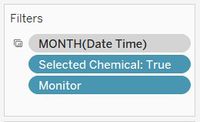
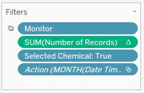
To make the above plot, the fields added to Tableau rows and columns and the filters applied are shown below:
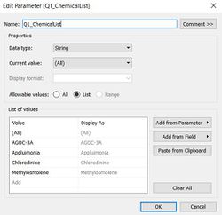
Users are given the option to filter by Month (April, August and December), Monitor (Sensors 1 to 9) and the calculated field – Selected Chemical, which enforces the option to select any or all chemicals to view in the Calendar chart. Selected Chemical is a calculated field that leverages on the user selection of one or more chemicals using a user input Tableau Parameter called Q1_ChemicalList. The calculations for both are as follows:
As shown above, the DateTime field was modified to show the month, week and weekdays in the respective columns and rows.
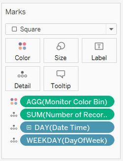
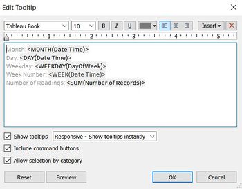
The Marks card and Tooltip configuration in Tableau for this chart is shown below:
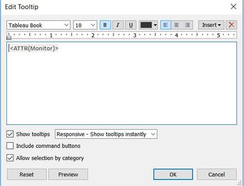
The SUM(Number of Records) are filled in this calendar plot. All the fields in the Marks card except for Monitor Color Bin are used to configure the tooltip which provides more detail on hovering through this chart.
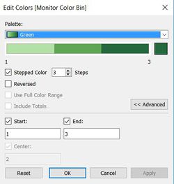
The use of stepped colors allows the audience to differentiate between lesser than expected number of observation, expected number of observations and greater than expected number of observations on that day.
The Monitor color bin calculated field helps in doing so. The calculation and usage of this field to color the calendar plot is shown below:
2. Hourly Heatmap of Chemical Readings:
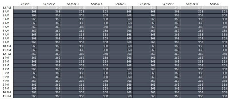
Similar to the Calendar chart described above, the Hourly heatmap data table chart uses the Monitor and Hours of the day fields in the respective Rows and Columns section as shown below.
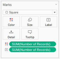
The Marks section in Tableau for this chart is shown below. Labelling and coloring of this chart is configured by the field SUM(Number of Records) and the selected shape type is Square.
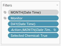
This chart allows for filtering on all the fields shown below and also by a particular day. The reason for doing so is to interactively link this hourly readings heatmap with the Calendar chart described above to show the hourly readings of any selected day.
3. Deviation by Chemical: Line Chart:
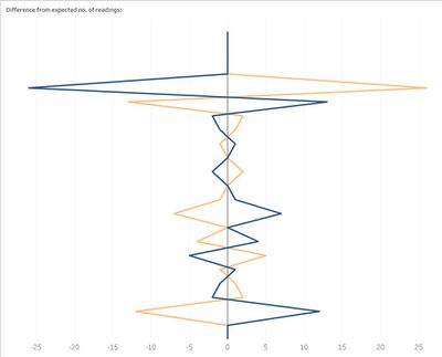
The purpose of this graph is to show deviation in the number of observational readings captured for each chemical on any day. The line graph shows hourly deviations, if any.
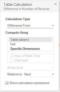
Hours of the day and the SUM(Number of records) have been plotted on the rows and columns. Instead of showing the absolute value of number of records, a table calculation to show the deviation in number of records has been made; as shown below:
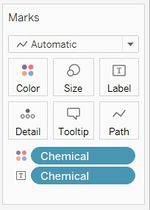
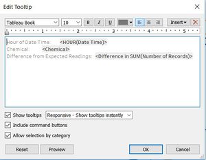
The Marks section and tooltip configuration is shown below. The Chemical field has been for the detail and coloration of this chart.
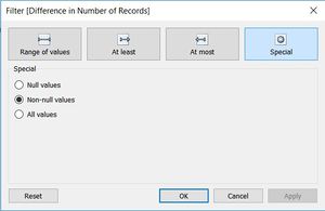
Similar to filters applied in the previous two graphs, this chart also filters on monitor, time-period and selected chemical. The additional filter added to SUM(Number of Records) is to remove null values if any.
Chapter 2
1. Dynamic Horizon Chart:
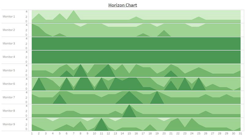
The dynamic Horizon Chart is used to show the magnitude of chemical readings for monitors or chemicals and for any given time-period.
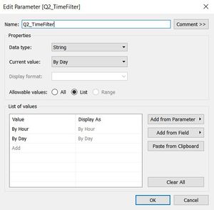
Audiences are encouraged to choose their Y and X axis to decide whether they want to plot the Horizon chart by chemical or by sensor and either by hours of the day or days of the selected month.
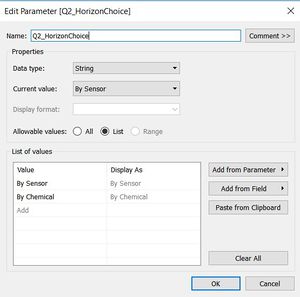
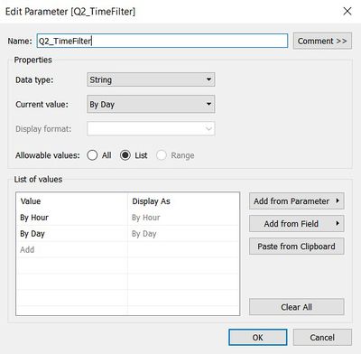
This is achieved by using the following two parameters.
Two corresponding calculated fields have been created which leverage on the user input through the above parameters. The fields are:
Based on the above fields, the fields of X and Y axis can be dynamically selected. Thus, the rows and columns of this chart include the following fields:
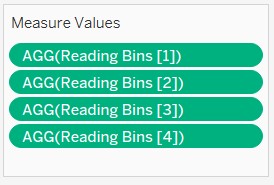
As shown above, the Measure Values fields are a part of the rows of this chart. The Measure values have been carefully selected by creating new calculated fields which consist of binned values of Chemical Readings.
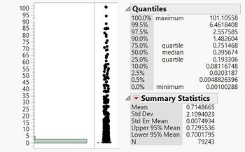
For the purpose of this illustration, 4 bin fields have been created. Chemical readings have been binned based on the percentile and quantile values of ‘Chemical Readings’, based on the univariate analysis as covered in the Data Preparation section.
Therefore, the border conditions of the 4 Reading Bin fields has been calculated as:
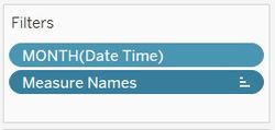
This chart is filtered by month and using only the above previously mentioned Measure Names.
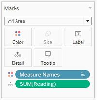
The Marks card contains the detail of SUM(Reading) which is then colored by the Measure Values which primarily consists of the 4 Reading bin values.
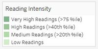
Finally, the titles resultant color legend of the resultant Horizon chart thus created was renamed to make the legend descriptions more readable.
Chapter 3
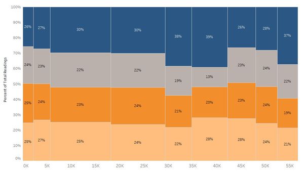
1. Marimekko Chart - Base:
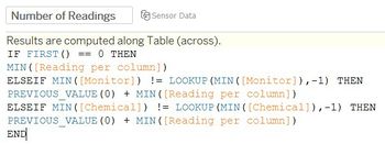
In order to create the base part Marimekko chart, two new calculated fields were created.
Based on the above 2 fields, the Number of Readings and SUM(Readings) fields were placed on columns and rows respectively.
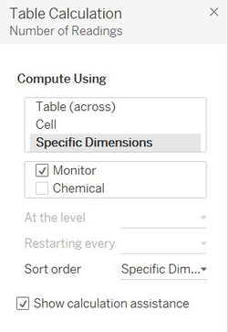
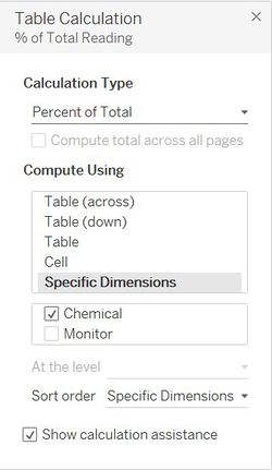
However, table calculations were added for these fields in order to show the Readings as a percent of total readings and to ensure that the Number of Readings was calculated separately for each monitor.
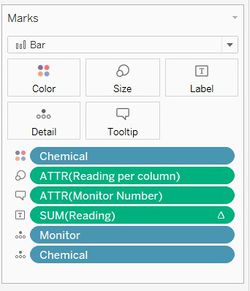
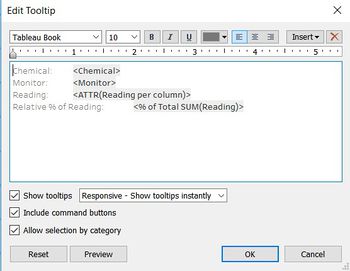
The Marks card, as shown in the figure below, consisted of coloring by Chemical, labelling by percentage SUM(Reading) and size by Reading per column. All other fields in details were used for the tooltip configuration.
Finally, this chart was filtered by months in order for the audience to see the distribution of chemical readings across monitors for each month.
2. Marimekko Chart - Header:
The Marimekko header which consists of the Sensor names has to be placed on top of the Marimekko base with the exact width size of each sensor. In order to achieve this, the SUM(Readings) and a hardcoded title was plotted on Columns and Rows.
The following fields were added to the Marks section, with the corresponding tooltip configuration.
Finally, this header too was filtered by Selected Month as the width of each sensor heading should change as per its monthly chemical readings.
3. Dot Plot - Chemical Readings:
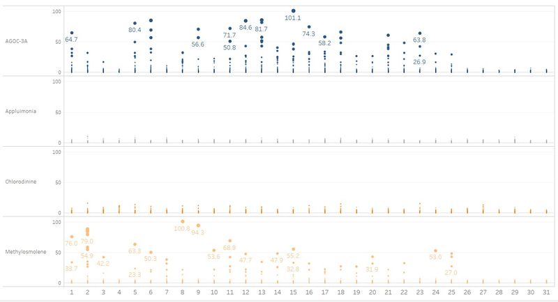
The dot plot chart shows the chemical readings across hours of the day or days of the month depending on user selection.
Similar to the Horizon chart, the X axis is dynamic based on the Q2_TimeFilter parameter and calculated field.
Therefore, the columns and rows for this chart are as follows:
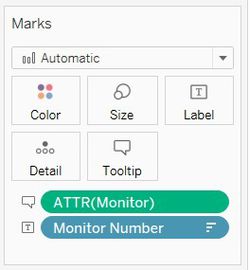
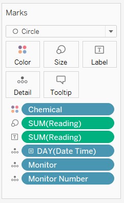
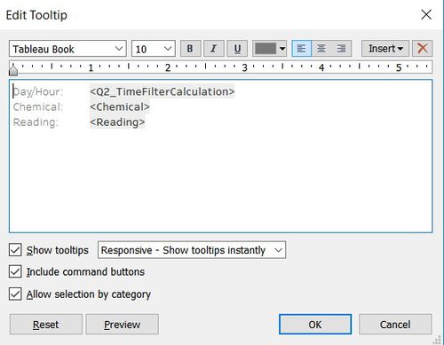
The Marks card configuration is shown below. The SUM(Readings) is used to configure the label and size of the circles in this chart. The plot is also colored by Chemical and the remaining fields in the details pane are used to configure the tooltip.
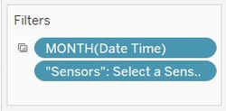
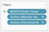
Finally, this chart is filtered on months and actions have been defined to filter this plot based on selections made on the Marimekko chart.


