ISSS608 2016-17 T3 Assign ANGAD SRIVASTAVA Visualizations 2
|
|
|
|
|
|
|
|
This section contains a brief description of the creation of 6 dashboards - Introduction, Chapter 1, Chapter 2, Chapter 3, Chapter 4 and Chapter 5.
The details of visualizations used in these dashboards has been comprehensively covered in the previous section. The information in this section is limited to the wireframes of each dashboard and the Actions used to facilitate interactivity between different visualizations within the same dashboard chapter.
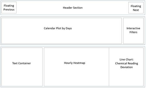
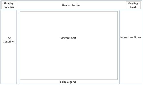
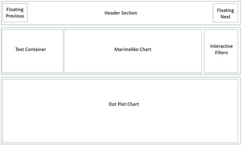
The wireframe layout refers to the Tableau dashboard containers that have been used. They are highlighted in Blue. The Gray bordered sections in the wireframe are a reference to the visualization worksheets.
Introduction
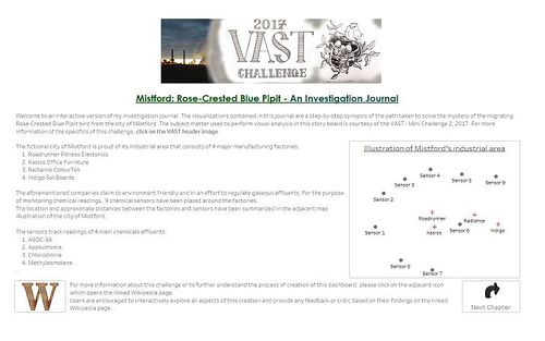
This dashboard consists of Introductory text which provides a brief background on VAST Challenge, 2017: Mini Challenge 2.
The wireframe and corresponding dashboard are shown below:
As shown above, this dashboard has interactive links to the VAST challenge page and this Wikipedia page.
There is only one Tableau action defined for this dashboard, as shown below:
- Next Chapter: The next button (image) runs on select (clicking) the image and it is referenced to any of the visualizations in Chapter 1. The purpose of this is to move to the next tab (Chapter 1).
Chapter 1
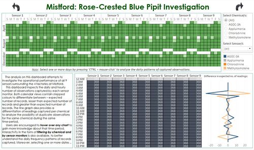
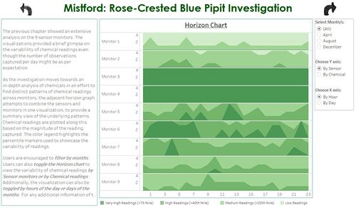
This dashboard primarily focuses on the Sensor (monitor) level analysis. The wireframe design and corresponding dashboard is shown below:
As shown above, this charts are inter-related with common filters. The dashboard has interactive links to the next and previous tabs.
There are 4 Tableau actions defined for this dashboard, as shown below:
- Filter on Calendar: This selection based Action filters the Hourly Heatmap and Chemical Deviation Line Chart based on user selections made on the Calendar chart. The DAY and MONTH are the selected filtering fields for this interactivity.
- Next Chapter: The next button (image) runs on select (clicking) the image and it is referenced to any of the visualizations in Chapter 2. The purpose of this is to move to the next tab (Chapter 2).
- Previous Chapter: The previous button (image) runs on select (clicking) the image and it is referenced to any of the visualizations in Introduction. The purpose of this is to move to the previous tab (Introduction).
- Date Highlight on Calendar: This highlighting filter is used on the Calendar chart and is based on the DAY and MONTH fields. Whenever the user clicks on any day on any one of the sensors, this action will highlight the same day and month on all other sensors.
Chapter 2
This dashboard is a depiction of the transition between Sensor analysis to Chemical analysis. There is only one visualization on this dashboard. The wireframe and corresponding dashboard is shown below:
This dashboard also has interactive links to the next and previous tabs due to which there are 2 Tableau actions defined for this dashboard:
- Next Chapter: The next button (image) runs on select (clicking) the image and it is referenced to any of the visualizations in Chapter 3. The purpose of this is to move to the next tab (Chapter 3).
- Previous Chapter: The previous button (image) runs on select (clicking) the image and it is referenced to any of the visualizations in Chapter 1. The purpose of this is to move to the previous tab (Chapter 1).
Chapter 3
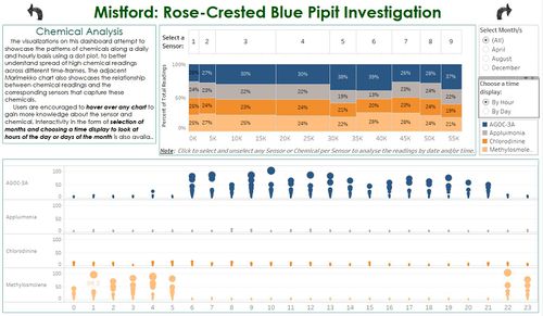
This dashboard primarily focuses on the analysis of chemical readings. The wireframe design and corresponding dashboard is shown below:
As shown above, this charts are inter-related with common filters. The dashboard has interactive links to the next and previous tabs.
There are 4 Tableau actions defined for this dashboard, as shown below:
- Chemical & Monitor to DateTime: This selection based Action filter is used to filter the dotplot which displays the chemical readings by hours of the day or days of the month. This action is invoked when the user clicks on the base stacked-bar component of the Marimekko chart so that the user can analyse the readings of the selected chemical for the selected Sensor.
- Monitor to DateTime: This selection based Action filter is used to filter the dotplot and is invoked when the user clicks on one or more sensors in the header component of the Marimekko chart. This is done so that the user can analyse the readings of all chemicals for the selected Sensor.
- Next Chapter: The next button (image) runs on select (clicking) the image and it is referenced to any of the visualizations in Chapter 4. The purpose of this is to move to the next tab (Chapter 4).
- Previous Chapter: The previous button (image) runs on select (clicking) the image and it is referenced to any of the visualizations in Chapter 2. The purpose of this is to move to the previous tab (Chapter 2).
- Marimekko Header to Base: This highlighting filter is used on the Marimekko chart to highlight all the chemicals of a particular sensor that is selected by the user.
- Marimekko Base to Header: This highlighting filter is used on the Marimekko chart to highlight the sensor for which a particular chemical has been selected by the user.
Chapter 4
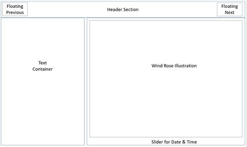
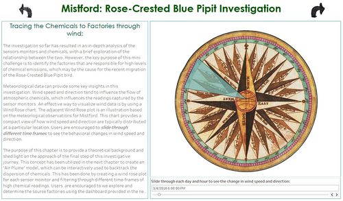
This dashboard is a theoretical introduction to the analysis of meteorological data using a Wind Rose chart. There is only one visualization on this dashboard. The wireframe and corresponding dashboard is shown below:
This dashboard also has interactive links to the next and previous tabs due to which there are 2 Tableau actions defined for this dashboard:
- Next Chapter: The next button (image) runs on select (clicking) the image and it is referenced to any of the visualizations in Chapter 5. The purpose of this is to move to the next tab (Chapter 5).
- Previous Chapter: The previous button (image) runs on select (clicking) the image and it is referenced to any of the visualizations in Chapter 3. The purpose of this is to move to the previous tab (Chapter 3).
Chapter 5
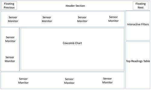
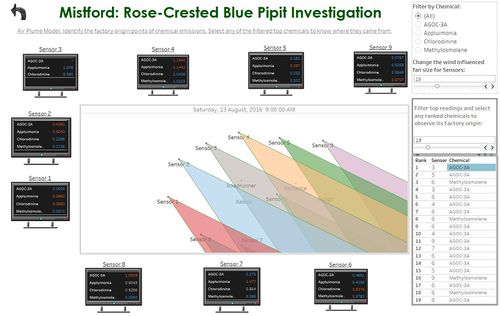
This dashboard is used as a dynamic and interactive interface to filter out top chemical readings captured by sensors and utilizing on the meteorological data to analyse the source factories that may be responsible for the recorded high chemical emissions.
The wireframe and corresponding dashboard is shown below:
This dashboard also has an interactive link to the previous tab. There are 2 filter-based Actions defined on this dashboard:
- Date across Dashboard: This action is used to filter the date across the Coxcomb chart and all Sensors so that the wind direction and corresponding Sensor readings are updated together for a particular instance of time. This change in date is invoked from user selection on any of the entries in the Top Chemical Readings table.
- Previous Chapter: The previous button (image) runs on select (clicking) the image and it is referenced to any of the visualizations in Chapter 4. The purpose of this is to move to the previous tab (Chapter 4).

