ISSS608 2016-17 T3 Assign ZHANG YANRONG Visualization
 VAST Challenge 2017 MC3
|
|
|
|
|
|
|
Please view Visualization for MC3 on Tableau Public
Contents
Background Knowledge
Spectral Bands

Derived Measurement

Visualization Tool
Tableau
![]()
Graphs
Choropleth Graph
- A choropleth chart is a thematic chart in which areas are shaded or patterned in proportion to the measurement of the statistical variable being displayed on the graph.
- Since we have many measurements such as NDVI, NDWI, NDMI, BSI and AVI, we use Choropleth to represent these measurements on the graph.
- In order to relate each measurement with its actual meaning, we select appropriate color to show on the Graph.
- For example, NDVI represent the health of plants so we choose to use Divergence of Orange and Green.
- Blue for Water, brown for soil, so on and so forth.

Line Graph
- Each of the lines in the line graph shown below represent the factor making up the relevant measurement and their average value by month.
- In this case, we choose NDVI as measurement and the formula of NDVI is (B4-B3)/(B4+B3). Therefore the two factors of NDVI are B4 and B3.
- From the graph, we can see that there is little difference between B4 and B3 on February, March, November and December.
- In order to get a clear and obvious outcome, we need to analyze data on other months which differentiate the factors.

Area Graph
- The X-axis of Area Graph is the bin of measurement such as NDVI and the Y-axis is the number of pixels in the image.
- By looking at the Area Graph, the area with high NDVI value can more or less reflect the health condition of the plant on particular date.
- By comparing two Area Graphs in the same coordinates, we can tell whether the overall health condition of the plant is getting better or not.
- We can use Plant Region as filter to focus our analysis on the Plant Region.
- In this graph, the main area with high NDVI value is shifting left from 2014-08-24 to 2015-09-12, which means that health condition of plant is getting worse from 2014 to 2015.

Histogram
- We use the bin of measurement such as NDVI as X-axis and number of pixels in the image.
- It's the bar chart form of Area graph, but we can use it the do some interactions with histograms with other measurement.
- There are two obvious spikes in this Histogram which could be the possible features in the image.

Dashboard
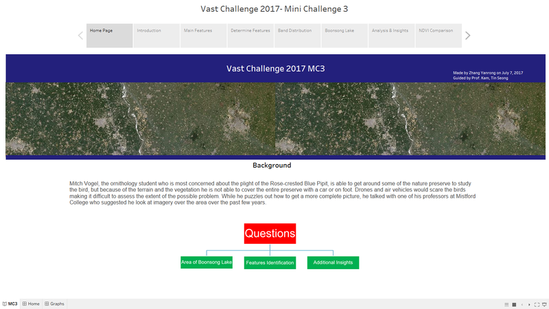
Home Page
- The "Home Page" Dashboard shows the background and three questions of this Mini Challenge 3.

Introduction
- This "Introduction" Dashboard shows the 12 images processed by QGIS with their date and cloud coverage.
- The table is a description of the 6 bands information in the image.

Main Features
- The "Main Features" Dashboard shows the clustering result of the features in the image.
- The left one is processed by QGIS and the right one is processed by Tabelau.
- The legend shows that there are five main features in the Preserve, which are Plant Region, Water Region, Paths, Farmland and Construction area.

Determine Features

Band Distribution

Boonsong Lake

Analysis&Insights

NDVI Comparison

Interactive Techniques
| Name | User Interface | Description |
|---|---|---|
 |
Blank | |
  |
Blank | |
 |
Blank | |
   |
Blank | |
 |
Blank | |
 |
Blank |
Story

QGIS

Image Processing


