ISSS608 2016-17 T3 Assign ZHANG YANRONG Answer
|
|
|
|
|
|
|
Contents
Question1
Area of Boonsong Lake
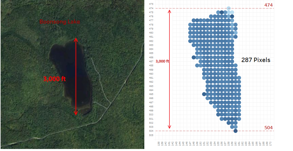
The left image is the RGB image of Boonsong Lake. As we can see in the graph, the vertical length of Boonsong Lake is 3,000 feet. After using NDWI as the measure to identify the feature of Water Region, we focus on the coordinates involving Boonsong Lake only, which is shown on the right. The range of Y coordinate in the filtered graph is from 474 to 504. So the length of 30 pixels (504 minus 474) are 3,000 feet in the real world. Then the length of each pixel is 100 feet (3000 divided by 30) and the area of each pixel in the real world is 10,000 sqaure feet(100 ft × 100 ft). Besides, there are 287 pixels so the area of Boonsong Lake is 2,870,000 sqf which is around 27 hectares.
Question2
Feature Identification
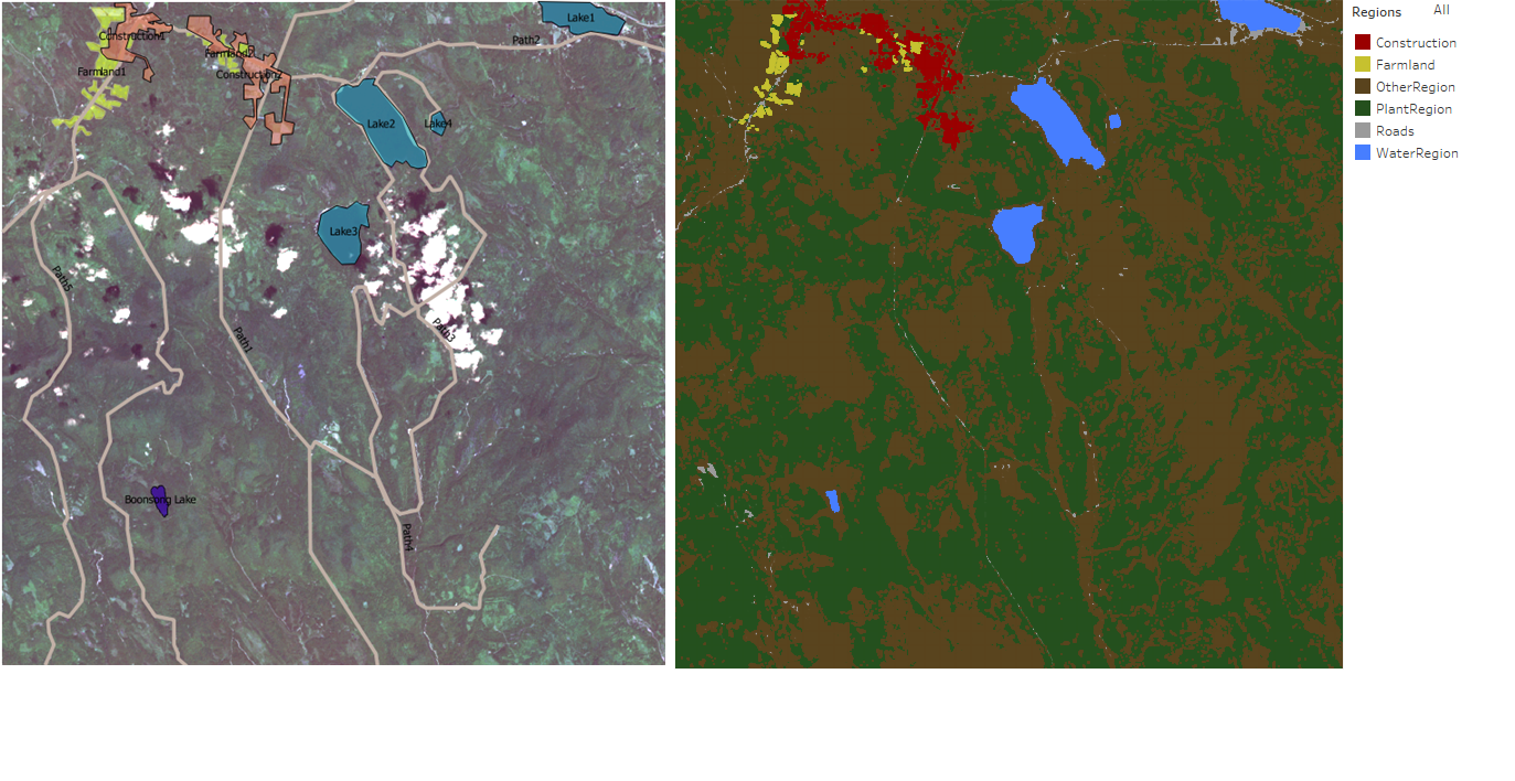
By using derived measurement, we can identify features such as Plant, Lake, Cloud, Path, Farmland and Construction.
Overview
Graph on the left was processed by the QGIS. Graph on the right was processed by Tableau filtered by Region.
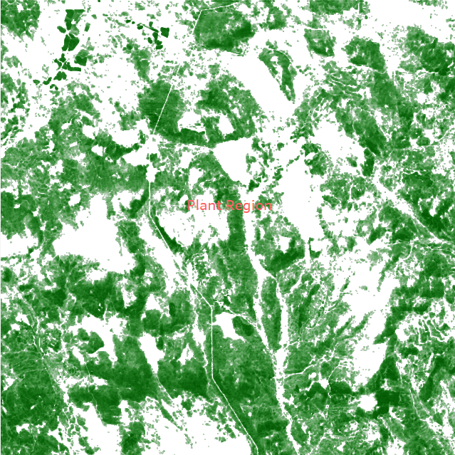
Plant Region
By using NDVI value as filter, range from 0 to 1, the outcome is the Plant Region.
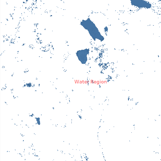
Water Region
By using NDWI value as filter, range from 0.6 to 1, the outcome is the Water Region.
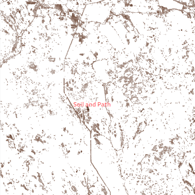
Soil and Path
By using BSI value as filter, range from 0.1 to 0.49, the outcome is the Soil and Path.
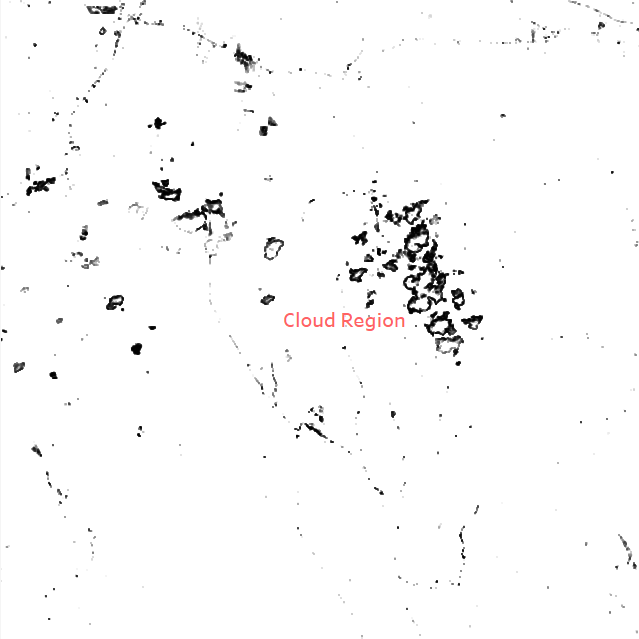
Cloud Region
By using AVI value as filter, range from 124 to 160, the outcome is the Cloud Region.
Farmland
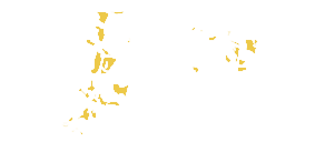
By using NDVI value as filter, range from 0.3 to 1, for certain area, the outcome is the Plant Region.
Construction
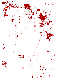
By using BSI value as filter, range from 0.08 to 1, for certain area, the outcome is the Plant Region.
Question3
Additional Insights
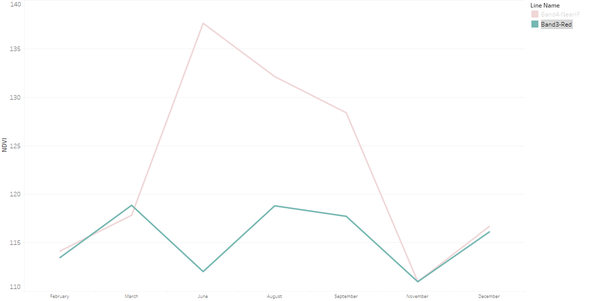
- Line chart shows performance the B4-NearIF and B3-Red which are the two factors in the formula of NDVI by month.
- From the line chart, there is obvious difference between two factors from June to September.The result would be significant if we choose month among them for comparison.
- We use NDVI as our measure. The higher NDVI value is, the healthier or denser the plant is.
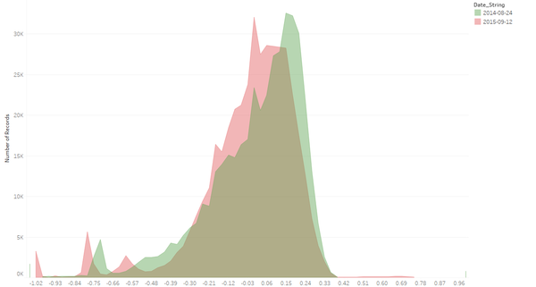
- We compare the performance of NDVI on September from 2014 to 2015. There is obvious shift towards left from 2014 to 2015, which means the plant became less denser and the preserve is less healthier for some certain reasons. And it might be the possible cause of the decreasing of the Pipit Birds. It deserves a deeper research for that.
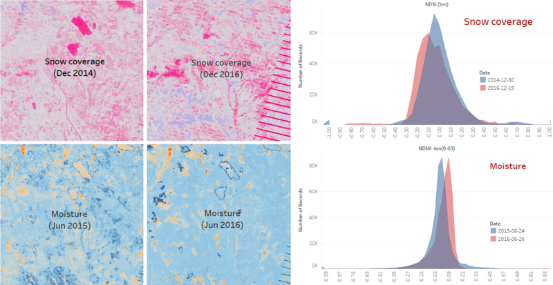
- The below graph shows the climate change in the preserve. It shows that the snow coverage became smaller, which means the temperature became higher. In addition, the moisture became higher.
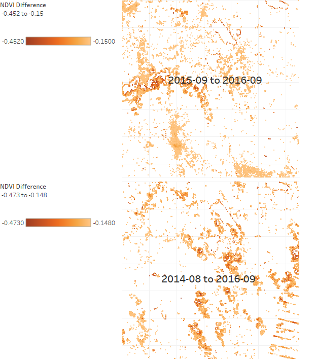
- Because the habitat for Pipit might be grassland rather than tall trees.Certain areas with relatively low NDVI could be the key factors. Although the overall NDVI can be improved, further research is required to focus more on the target areas that can be the habitat of Pipit.

