Difference between revisions of "ISSS608 2016-17 T3 Assign AKANGSHA BANDALKUL Feedback References"
| Line 111: | Line 111: | ||
=Feedback 3= | =Feedback 3= | ||
| + | <div style="padding-left:15px; text-align:left"> | ||
Hi Akangsha, | Hi Akangsha, | ||
<br/> | <br/> | ||
| Line 134: | Line 135: | ||
-[[User:Sumalikak.2016|Sumalikak.2016]] ([[User talk:Sumalikak.2016|talk]]) | -[[User:Sumalikak.2016|Sumalikak.2016]] ([[User talk:Sumalikak.2016|talk]]) | ||
| + | </div> | ||
<br/> | <br/> | ||
Revision as of 09:50, 16 July 2017
Akangsha Bandalkul VAST Challenge - MC2
|
|
|
|
|
|
|
|
Feedback
Feel free to leave your feedback on my project in this section:
Feedback 1
Hi Akangsha,
Great job on your visualizations and detailed answers for all the VAST questions. Here are some points for your consideration:
Question 1:
Clarity: Nice job in providing a background context using JMP Pro 13 before answering the question. I like the use of stepped colors, although I wonder if you would consider showing lesser than 5 steps of color to avoid extra color categories of readings.
Aesthetics: Very nice work in using different shades of the same color scheme. Consider increasing the font size of chart titles. A very minor adjustment can also be made in reformatting hours of the day to show 12AM, 1AM etc. instead of 0,1,2 etc; to improve readability.
Question 2:
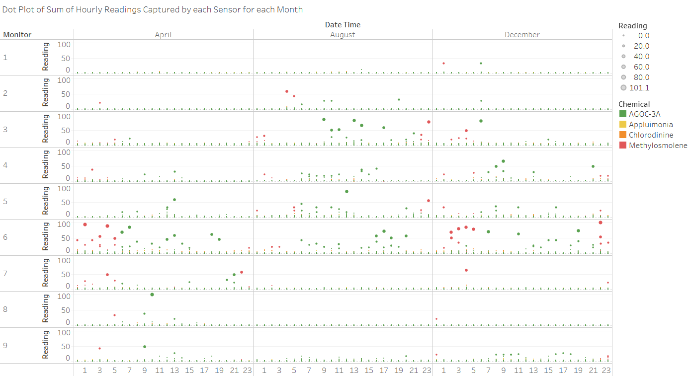
Clarity: Good use of the dot plot and Horizon chart to highlight the basis of your findings. If it fits your preference, consider the use of annotations and highlighting the relevant part of your analysis while taking screenshots to answer the VAST questions. Also, you can look into renaming the column labels from DateTime to something more meaningful.
Aesthetics: Nice use of colors and size on the dotplots to show the magnitude of readings. Consider rotating the labels of chemicals to horizontal orientation to improve readability.
Question 3:
Clarity: Nice work in backtracking the chemical readings to its Factory origin point. The use of the line graph is particularly smart because it highlights the magnitude of readings and the intended audience and select the high points to gauge the source of the chemical emissions. For readability purpose, consider reformatting the date displayed on your dashboard. Also, a color legend for your line graph might help in identifying the chemicals displayed.
Aesthetics: Nice contrast of colors and the use of the table heatmap to showcase the chemical readings at any give time frame. Consider adding borders to your dashboard, especially the section that shows the geographical illustration of the factories and sensors at Mistford.
Great job in visualizing your investigative journey and thank you for your feedback and inputs during the course of this assignment!
--Angads.2016 (talk) 00:19, 14 July 2017 (SGT)
Feedback 2
Hi Akangsha
Great work in the viz, i really like how you approached each mini challenge, the visualization you used for each question, and the presentation of the findings. I have some points that you may want to consider in some of the viz:
Question 1: Horizon Plot Overall I think the horizon plot is nice as you were able to show how the reading for Sensor 3 and 4 differed against the other sensors but I feel that the current scale that you are using is giving the impression that all the values above 80ppm are the same, I honestly haven't done the EDA on the data set to know the actual range of values but creating more bins to accommodate the range thus adding more details in your horizon plot.
Question 2: Dot Plot
Again this is a great visualization, but the viz below somehow feels cluttered with details. It has too many dimensions in it that now put the details of the readings are unreadable.
I personally think that after you had set and shown the patterns of the different chemicals through out the day you can just focus on the max emission in this 2nd viz just to focus on a certain aspect of the data rather than forcing to show everything.
But I just want to reiterate that I enjoyed reviewing your viz and I personally think you did a great job overall.
Thanks.
Sef
Feedback 3
Hi Akangsha,
Great job on the assignment! Thoroughly analyzed, well written, and visually appealing. Few points that you could consider:
Aesthetics:
1. (Q1) The first two charts( Calendar plots) explain the overall sensor performance very clearly, however the sheet title and axis titles are small making it hard to read. You could increase the font or enhance the font by making it bold or enlarge the picture.
2. (Q1) The "Key Findings" for each section is not consistent with the other sections in terms of using breakline (br/).
Clarity:
1. (Q1, Q2) Good analysis with horizon plots. Clearly explained the harmful effects of each chemical.
2. (Q2) Many images have Date Time mentioned which can be labelled in a better way.
3. (Q3) On the coxcomb dashboard, i dont understand what the right most elements( 30 and the arrow bar) refers to. A label describing it will help understand better.
GOOD WORK!!!
References used
- http://www.vacommunity.org/VAST+Challenge+2017
- https://www.tableau.com/about/blog/2016/4/visualizing-dense-data-how-cut-and-superpose-areas-52839
- http://colaweb.gmu.edu/dev/clim301/lectures/wind/wind-uv.html
- https://community.tableau.com/thread/121236
- https://boraberan.wordpress.com/2014/03/30/creating-coxcomb-charts-in-tableau/
- https://community.tableau.com/thread/121310
- http://onlinehelp.tableau.com/current/pro/desktop/en-us/help.htm#maps_howto_origin_destination.html
- http://onlinehelp.tableau.com/v10.3/pro/desktop/en-us/help.htm#extracting_data.html
- Dashboard menu design: https://wiki.smu.edu.sg/1617t1IS428g1/IS428_2016-17_Term1_Assign3_Gwendoline_Tan_Wan_Xin
Acknowledgement of guidance and discussions
- Prof Kam Tin Seong
- Angad Srivastava
