IS428 2016-17 Term1 Assign3 Gwendoline Tan Wan Xin
Contents
- 1 Problem & Motivation
- 2 Dataset Analysis & Transformation Process
- 3 Dataset Import Structure & Process
- 4 Interactive Visualization
- 4.1 Home Dashboard
- 4.2 Employee Movement Dashboard
- 4.3 HVAC Control System & Chemical Levels (Heating)
- 4.4 HVAC Control System & Chemical Levels (Natural Ventilation)
- 4.5 HVAC Control System & Chemical Levels (Mechanical Ventilation)
- 4.6 HVAC Control System & Chemical Levels (Air-Conditioning)
- 4.7 HVAC Control System & Chemical Levels (Chemicals)
- 4.8 Power Consumption in Kronos Office Building
- 5 Interesting & Anomalous Observations
- 6 References
- 7 Comments
Problem & Motivation
After the successful resolution of the 2014 kidnapping at GAStech’s Abila, Kronos office, GAStech officials determined that Abila offices needed a significant upgrade. At the end of 2015, the growing company moved into a new, state-of-the-art three-story building near their previous location. The new office is built to the highest energy efficiency standard, but as with any new building, there are still several HVAC issues to work out. Each zone is instrumented with sensors that report building temperatures, heating and cooling system status values, and concentration levels of various chemicals such as carbon dioxide (abbreviated CO2) and hazium (abbreviated Haz), a recently discovered and possibly dangerous chemical. Staff members are also given proximity cards which will register their movements in the building by fixed proximity sensors in each zone and Rosie, a robotic mail delivery system equipped with proximity sensors.
With the huge amount of data collected by the various sensors installed in the building, there is a need to build an interactive data visualization tool to help the management efficiently identify typical patterns and issues of concern in building operations.
The interactive visualization can be targeted at employees from the following departments:
- Security Department: To track movement of employees within the building so as to ensure that employees are not entering prohibited zones/areas
- Facilities Department: To understand building operations and the respective building data elements so that anomalies can be spotted quickly
- Executive Department: To understand power usage of the new building so as to properly plan ahead on possible policies to implement (e.g. campaigns to save power consumption)
Dataset Analysis & Transformation Process
Before the analysis began, the dataset given is analysed to identify its respective format and attributes. There were 6 different zip files provided in the assignment and each has its own unique ways to process and make sense of the data to bring value to the analysis. This section will elaborate on the dataset analysis and transformation process for each dataset in order to prepare the data for import and analysis on an interactive visualization.
Fixed/Mobile Proximity Data & Employee List
There are 2 main types of proximity detectors installed in the building to enhance the safety and security of its employees. These detectors include fixed proximity sensors installed in each zone of the building and a mobile proximity sensor that is attached to Rosie, a robotic mail delivery system. Data will be captured when employees, holding their own proximity card, pass a proximity sensor in the building.
The formats of the captured data by both the fixed proximity sensor and mobile proximity sensor are similar. However, the fixed proximity sensor provides the zone in which employees pass through while the mobile proximity sensor provides the exact coordinates of the employee’s location. The following shows the main differences between the two different types of data captured:

The following section illustrates the issues faced in the data analysis phase leading to a need to transform the data into a specified format.
Issue: Because of the differences in the types of data captured, the data cannot be correlated with each other for display in the same chart. For example, one can plot employee’s exact location using the X/Y coordinates (from the mobile proximity sensor) but the zone coordinates (from the fixed proximity sensor) were not known and hence, could not be plotted. This will present an issue during the analysis since we are unable to clearly identify which area the employees are present on the map.
Solution: To resolve this issue, the coordinates for each zone has to be identified. This is done using an online tool that allow analysts to get coordinates for custom polygons on a map. By plotting these custom polygons on a map, we will be able to get the centre point coordinates of the zone. This will then allow us to plot the employees’ location on each zone. The following details the process of getting individual zone coordinates.
- Download the online tool from the link: https://github.com/bryantbhowell/tableau-map-pack/blob/master/draw_tableau_polygons_on_background_image.html
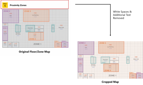
- Open the tool and choose the map to be plotted. In the zone maps given, there were white spaces and additional text that were not part of the map itself. As such, the map has to be cropped to get the actual map itself only. The following shows the cropping of maps and this process is repeated for each of the 3 levels.
- Open the map using the online tool and plot each of the custom polygons. During the process of plotting, the following assumptions were made:
- For some areas with multiple zones separated on the map, a small area of the zone is being selected. For example, zone 4 have 3 different segments in level 1. However, they all refers to the elevators and stairs. By plotting only one of the zones, we will still be able to know that the employee is taking the stairs/elevators. There isn’t a need to identify which stairs or elevators they took. As such, for zone 4, only one of the custom polygon is drawn.
- For areas that were too big, only a small segment of the zone was plotted. For example, zone 1 encompasses the entire corridor spaces. If all the corridor spaces are drawn, the centre point will not be situated in zone 1. Therefore, only one part of the zone is drawn. As long as employees are within the same zone, they are in the corridor areas.
The outcome of plotting these polygons will result in the following display on the online tool. The same process is repeated for each of the 3 levels.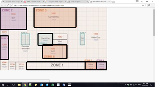
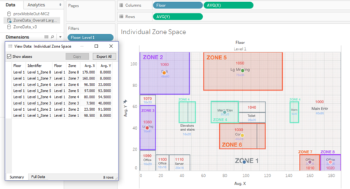
- After the polygons have been plotted, the results can be exported into a .csv file format for analysis in Tableau. Once the data has been imported into Tableau, the centre coordinates of each zone can then be retrieved. The following shows the centre points that were plotted on the chart and the ability to export the data. This will then allow us to retrieve the coordinates for each zone to be plotted onto the map.
- However, in level 2 and 3, shapes of each zones were not consistent and this has resulted in errors in the centre point of the zone. The following shows the errors that has been encountered during the process.
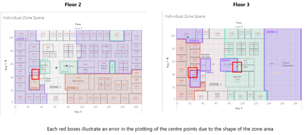
- In order to resolve this error, a manual task has to be performed to get the coordinate point of each erroneous zone coordinate. This can be performed in Tableau using the annotate function. The following shows an example of how the annotate function can provide the X/Y coordinate values. The process is repeated for each of the erroneous centre points.
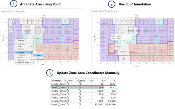
- After the completion of this process, the issue of lacking individual zone coordinates will be resolved.


Issue: Currently, the data for the fixed proximity sensors and mobile proximity sensors are in 2 separate spreadsheets. This makes the analysis process difficult with the need to blend or join data in Tableau.
Solution: To simplify the process of analysis, both the data from the fixed and mobile proximity sensors are combined into one single file. With the above process completed, we are also able to get the coordinates for each of the zone to be plotted on the chart. However, we do not have the zone information for the mobile proximity sensor. In this analysis, it does not matter as we are only interested in plotting the zone coordinates onto the chart. The following shows the data format of the transformed data:

Issue: During the process of correlating the zone data and the coordinates, the dataset has a zone that stated “Server Room”. However, there is no point coordinate for this zone on our generated polygons.
Solution: To resolve this issue, the annotate function is also used to help us get the centre point coordinate of the server room. This result is then, updated into the file for analysis.
Issue: With the zone coordinates and the X/Y coordinates from the mobile proximity sensor, the data can be plotted onto a map to identify where employees are located. However, with only the proximity ID in the captured data, we are unable to correlate the employee with each proximity ID. The employee list provided in the dataset also does not show the mapping between their name and the proximity ID.
Solution: Upon close observation of the employee name and the proximity ID, a correlation can be identified. The proximity ID is derived from the first letter of the employee’s first name and the entire string of the last name. The last three numbers refer to the number of times each employee request for a new pass. By default, the count starts from 001. The following formula is then applied to identify a correlation between the employee and the proximity ID:

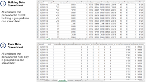
Building Data Elements (HVAC Sensor Readings & Status Information)
The building data elements provide multiple readings collected from different sensors in the entire building. However, the data is not structured in a way that allows for flexibility in the choice of sensor readings to be analysed and to apply filters by different floors and zones. As a result, there is a need to reshape the data to provide for this flexibility.
There are 3 main categories of data in the building data dataset:
- Overall Building Data (e.g. Drybulb Temperature, Pump Power etc.)
- Floor Data (e.g. Air Loop Inlet Temperature, Cooling Coil Power etc.)
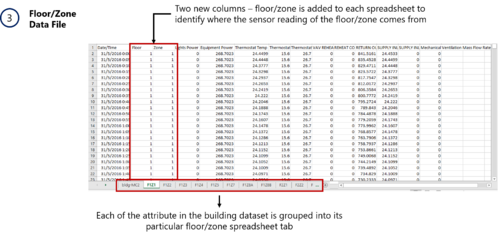
- Floor/Zone Data (e.g. Reheat Coil Power, CO2 Concentration etc.)
To better analyse the data using Tableau, the following is being done:
- The entire building data dataset is grouped into different Excel Spreadsheet as follows:
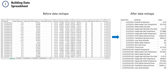
- Tableau provides an Excel plugin that allow one to reshape data into a format for easy processing especially if multiple attributes were present for selection. With the use of the tool, the following is then performed to each of the grouped datasheet:
- For the building data spreadsheet, a data reshape is performed to obtain the following result:
- For the floor data spreadsheet, a data reshape is performed. The output of the reshaped data is similar to the building data, with the exception of the difference in attributes between the overall building and each floor attributes.
- For the floor/zone data spreadsheet, a data reshape is also performed on its attributes. However, due to the volume of the data generated, additional processing needs to be done as follows:
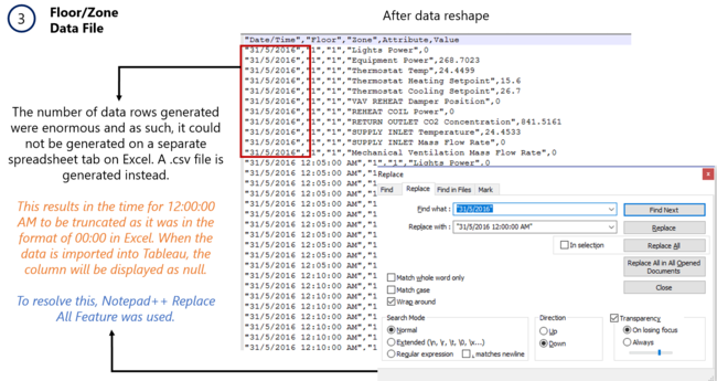
- For the building data spreadsheet, a data reshape is performed to obtain the following result:


With the reshaped data, it can then be imported into Tableau for analysis.
Hazium Readings
The sensor readings for hazium concentration level were saved as 4 different files in the given dataset. These readings are consolidated into one single file. The result is similar to the building dataset elements. As such, similar processing techniques were used to process the data - Excel Tableau’s plugin for data reshape. The following illustrates the steps taken to achieve the final transformed dataset.

Dataset Import Structure & Process
With the dataset analysis and transformation phase completed, the following files will have to be imported into Tableau for analysis:

Each of the data file is added as a data source in Tableau. The relationships defined between each data source is the timestamp, floor and zone. This will allow analysis to be conducted across all the data sources at any one point.
Additional processing is performed to the first data source - Proximity Data and Employee List.
- Import the proximity data as a data source.
- Add new data connections to the proximity data source. The new data connection file will be the Employee List.
- Perform a left join between the proximity data and the employee list to correlate the employee ID together. This will allow us to identify the employee with the captured proximity card ID. The following shows the configuration of the join:

To process and display the dates in a readable format for the analyst, each of the data sources will have a new calculated field to derive the date and day of the week. This will convert the date from the format “31/5/2016” to a format of “31 May (Tuesday)”.
The formula used is as follows:
STR(DATEPART('day', [Date/Time])) + " " + DATENAME('month',[Date/Time]) + " (" + DATENAME('weekday', [Date/Time]) + ")"
Interactive Visualization
The interactive visualization can be accessed here: https://public.tableau.com/views/Assignment3_145/Home?:embed=y&:display_count=yes
For the best experience, adjust your screen resolution to 1366x768 and enable full screen on the browser. Adjust the dashboard so that all elements can be clearly visible without the need to scroll up/down.
Throughout all the different dashboards, useful guides/tips are provided to help users navigate through the different filters and actions so that their analysis can be performed smoothly. The following interactivity elements are also used throughout all the dashboards to maintain consistency:
| Interactive Technique | Rationale | Brief Implementation Steps |
|---|---|---|
 |
The use of checkboxes or dropdown list requires the analyst to check/uncheck each date manually which is time-consuming. As such, a time range slider is preferred. |
|
 |
Use of a drop down list also allow analysts to easily choose the building level that they are interested to analyse. |
|
 |
When a user filters from one floor to another, the floor plan also changes to provide for quick and easy reference. Due to the space constraint, each floor plan has to be zoomed for users to identify and see the zone areas clearly. |
|
The following sections elaborates on other interactivity techniques are integrated into each of the individual dashboard.
Home Dashboard
There is a large amount of data attributes captured in the dataset provided. As such, it will not be possible to display all the attributes for a proper analysis in a single dashboard. At the same time, although many of these attributes are interrelated to each other, there is no clear and correct order in which data attributes should be analysed. Therefore, use of a story point does not seem plausible in this context. To resolve this issue, flexibility has to be provided for users to navigate between different dashboards. To do so, a homepage is created with 3 different data categories in mind – employee movement, HVAC Control System/Chemical Levels and power consumption. Each of these categories are further broken down into its respective sub-categories for users to conduct their analysis. This allow users to choose the analysis that they are interested to look in.
The following shows the home dashboard:

To allow for flexibility in navigation, the following interactive techniques have been employed:
| Interactive Technique | Rationale | Brief Implementation Steps |
|---|---|---|
| ||
|
Employee Movement Dashboard
The following shows the employee movement dashboard:

The following interactive techniques have been employed in this dashboard:
| Interactive Technique | Rationale | Brief Implementation Steps |
|---|---|---|
The following shows a screenshot of the configuration:  | ||
| ||
The following shows a screenshot of the configuration:  |
To help analysts get started with the analysis of the data, a typical pattern of GAStech employees have also been identified and included in the dashboard.
HVAC Control System & Chemical Levels (Heating)
The following shows the HVAC Control System (Heating) dashboard:

The following interactive techniques have been employed in this dashboard:
| Interactive Technique | Rationale | Brief Implementation Steps |
|---|---|---|
| The implementation steps are similar to the use of highlighting in the “Employee Movement” dashboard. | ||
|
HVAC Control System & Chemical Levels (Natural Ventilation)
The following shows the HVAC Control System (Natural Ventilation) dashboard:

The following interactive techniques have been employed in this dashboard:
| Interactive Technique | Rationale | Brief Implementation Steps |
|---|---|---|
| The implementation steps are similar to the use of highlighting in the “HVAC Control System & Chemical Levels (Heating)” dashboard. | ||
The rationale is that both ventilation elements are related to each other and analysts might be interested to analyse both elements one after the other. |
The following shows an example of the configuration:  |
HVAC Control System & Chemical Levels (Mechanical Ventilation)
The following shows the HVAC Control System (Mechanical Ventilation) dashboard:

The following interactive techniques have been employed in this dashboard:
| Interactive Technique | Rationale | Brief Implementation Steps |
|---|---|---|
| The implementation steps are similar to the use of highlighting in the “HVAC Control System & Chemical Levels (Heating)” dashboard. |
HVAC Control System & Chemical Levels (Air-Conditioning)
The following shows the HVAC Control System (Air-Conditioning) dashboard:

The following interactive techniques have been employed in this dashboard:
| Interactive Technique | Rationale | Brief Implementation Steps |
|---|---|---|
| The implementation steps are similar to the use of highlighting in the “Employee Movement” dashboard. |
HVAC Control System & Chemical Levels (Chemicals)
The following shows the HVAC Control System (Chemicals) dashboard:

The following interactive techniques have been employed in this dashboard:
| Interactive Technique | Rationale | Brief Implementation Steps |
|---|---|---|
For example, the line graph allows analysts to view the change in hazium concentration level overtime while the heatmap allow analysts to easily view the concentration levels of hazium based on colours representation. |
- | |
| The implementation steps are similar to the use of highlighting in the “HVAC Control System & Chemical Levels (Heating)” dashboard. | ||
|
| |
| To ensure that the filter applied in the dashboard is linked with the “HVAC Control System Ventilation Elements” dashboard, similar steps were taken as mentioned previously to link filters across different dashboards.
To allow clicking of the chart to another dashboard, actions were defined based on the following configuration:  |


Power Consumption in Kronos Office Building
The following shows the Power Consumption dashboard:

The following interactive techniques have been employed in this dashboard:
| Interactive Technique | Rationale | Brief Implementation Steps |
|---|---|---|
| The implementation steps are similar to the use of linking technique used in the “HVAC Control System & Chemical Levels (Chemicals)” dashboard. |
Interesting & Anomalous Observations
Using the dashboard as a platform for investigation and analysis, the following aims to provide answers to the questions posed.
Q1: Typical Patterns In Proximity Card Data & Typical Day Of GAStech Employees
Typical Patterns in Proximity Card Data
Based on the data captured by the proximity sensors, the following shows a typical pattern in the proximity card data.
- For the fixed proximity sensors, readings are collected for 24hours during the weekdays, except for 1am and 4am. From 12midnight to 6am, only level 1 fixed proximity sensor will collect data. This can possibly mean that there is no employee movement from 12midnight to 6am on level 2 and 3.
- For the mobile proximity sensor, Rosie (the mobile robot) travels the halls at 9am and 2pm daily. On 4, 5, 11 and 12 June, the robot does not collect any readings. One possible reason is that these are weekends (Sat/Sun) and therefore, Rosie will not be required to travel along the hallways.
Typical Day for GAStech Employees
The following lists a typical day for GAStech employees, in all departments:
- Employees start arriving in the office at 7am. By 9am, majority of the employees would have already arrived in the building and settle in their own office space.
- Lunch time is usually between 12nn to 2pm.
- At around 2pm, many employees will be back in their office and that’s when we can see lots of activities going on in the different levels.
- Employees typically end work at around 5pm, though some may leave slightly earlier.
- After 6pm, majority of the employees in the office are from the Engineering, Facilities and IT department.
- After 7pm, employees working in level 3 would have left the office.
- At 12midnight, most of the employees would have left the building and only people in the facilities team will be present in level 1.
- People in the facilities department will be available in the building 24 hours and its always the same people patrolling around the area.
- Other than the facilities personnel, IT and engineering employees often stay in the office and will only leave at around 12midnight.
The following lists some activities that is part of a typical day pattern for employees in a specific department:
| Department | Activities |
|---|---|
| |
| |
| |
| |
|
Q2: Interesting Patterns & Its Significance In Building Data
The following identifies some interesting patterns and the significance of the pattern to GAStech.
| S/N | Interesting Pattern | Significance |
|---|---|---|
| The water heater temperature set-point is set at around 60C. This is approximately similar to the water heater outlet temperature. From this, we can deduce that water entering the heater is always heated to the set-point temperature, regardless of the temperature of water entering the heater.
[Source: HVAC Control System & Chemical Levels (Heating) Dashboard] |
A consistent pattern of a change in inlet temperature is observed over the different days. However, the flow rate of water remains unchanged. This meant that there are other reasons as to why the inlet temperature always changes throughout the day.
| |
| The lower the supply inlet temperature, the higher the rate at which the water heater burns natural gas. From this, we can infer that the burning of natural gas is used as a way to heat up the water so as to maintain the outlet temperature.
[Source: HVAC Control System & Chemical Levels (Heating) Dashboard] |
Based on the data collected, we can deduce that the building provides for 2 different methods to heat up the water – burning of natural gas and using the hot water system pump.
| |
| The supply fan seems to consume higher levels of power from 7am to 10pm. The outlet mass flow rate also seems to be consistent across the days, when the supply fan is operating correctly.
[Source: HVAC Control System & Chemical Levels (Mechanical Ventilation) Dashboard] |
Through this pattern, we can infer that the building seems to be following energy efficiency standards by using more energy only when required, such as only during working hours. | |
| On level 1 and 2, the bathroom exhaust fan seems to be consistently turned on throughout the days. However, on level 3, the bathroom exhaust fan power is only consuming power between 7am to 10pm.
[Source: HVAC Control System & Chemical Levels (Mechanical Ventilation) Dashboard] |
Through this pattern, we can see that the use of the bathroom exhaust fan on level 1 and 2 does not seem to adhere to the energy efficiency standards. The practice of using energy only when required can be seen on level 3. However, as mentioned previously, employees in level 3 will be gone by 7pm. Despite so, the bathroom exhaust fan continues to generate power until late at night. This shows that the building is not following energy efficiency standards, as claimed. | |
| The level of carbon dioxide concentration typically falls within a safe range of 350 to 1000 ppm for both level 2 and 3. However, the level of carbon dioxide concentration in level 1, especially zone 5 (Conference room) and zone 7 (loading area/server room) often falls outside of the safe range.
[Source: HVAC Control System & Chemical Levels (Chemicals) Dashboard] |
The air ventilation system in the building is performing its expected functions in level 2 and 3, on a normal day. However, more needs to be done to improve the ventilation on level 1, to ensure that it remains a conducive working environment for all employees. This is especially important in the conference room, where employees conduct meetings. If the level of carbon dioxide falls in the unhealthy range, employees may experience discomfort and may not be able to perform up to standards. | |
| In the afternoon, the outdoor air mass flow rate is generally higher. However, during this period of time, the outside air temperature is generally warmer. When the outside air temperature is warmer, the percentage of outside air delivered by the HVAC system is generally lower. This pattern is generally observed across all the 3 levels.
[Source: HVAC Control System & Chemical Levels (Natural Ventilation) Dashboard] |
This is a good sign that the building is adhering to the energy efficiency standards. When the outside air is warmer, it takes more power to cool down the air so as to maintain a conducive temperature. As such, by restricting flow of warmer outdoor air, it helps the company to save on energy and power. | |
| Level 1 has the highest outdoor air mass flow fraction. However, it has the lowest flow rate of air returning back to the HVAC system.
With the difference in outdoor air mass flow rate, the temperature of the air returning back to the HVAC system is higher in level 1 as compared to level 3. However, more energy is used on level 3 as compared to level 1. [Source: HVAC Control System & Chemical Levels (Natural Ventilation) Dashboard] |
From this pattern, we can clearly see the exchange of air between the outside air and the internal building. When the amount of outdoor air flowing into the floor is high, the rate of air returning back to the system is lower. This shows that the building is adopting good air-conditioning/ventilation system.
| |
| The night cycle control status in level 3 is always off. In contrast to the night cycle control status in level 1, the status will be turned on after normal working hours of the company and during Sunday.
[Source: HVAC Control System & Chemical Levels (Air Conditioning) Dashboard] |
There is a need for the operations staff to check as to why the night cycle manager is not working on level 3. Although there is no direct evidence to show the consequences of the night cycle control manager being off, it may potentially cause wastage of energy especially when the set-point temperature is not set appropriately. | |
| Across all the three levels, the corridor spaces have constantly been using high levels of power.
[Source: Power Consumption in Kronos Office Building Dashboard] |
This is bad for the company as the corridor spaces do not contribute greatly to improving employees’ productivity or efficiency. Spending 80% of their energy in these areas are considered as energy wastage and potential measures have to be employed to reduce energy use in these areas. | |
| Level 3 Zone 9 (server room) has been constantly using large amounts of equipment power.
[Source: Power Consumption in Kronos Office Building Dashboard]
[Source: HVAC Control System & Chemical Levels (Air Conditioning) Dashboard] |
It is normal for the server to consume the largest amount of equipment power. At the same time, knowing that the server room have to be turned on 24 hours a day, measures have been taken to ensure a cooler temperature in the zone. This is notable for the company as it shows that they did deployed their resources properly. |
Q3: Notable Anomalies/Unusual Events In Data
The following lists some of the anomalies and unusual events identified in the data. Events that are possibly related to each other are grouped as one anomaly.
The priority level of issues will be ordered based on the following criteria:
- (Highest Priority) An issue leading to potential health risks or death to employees
- An issue leading to a decrease in employees’ morale
- An issue undermining the claim of Kronos Office as an energy efficiency building
- (Lowest Priority) An issue causing the financial losses to the company
| Priority | Anomaly/Unusual Events | Possible Danger/Serious Issue |
|---|---|---|
| There is a high hazium gas concentration level across all the levels in the building on 11 June. This takes place in the afternoon from 1pm till the wee hours, the next day.
[Source: HVAC Control System & Chemical Levels (Chemicals) Dashboard] |
Not much is known about Hazium gas, except for the fact that it is dangerous. With the high levels of Hazium gas concentration throughout the entire building, it may become unsafe for the employees to work in. In the worst case scenario, all employees may be subjected to health ailments or death in the building.
| |
| On 3 and 9 June, there is a rise in hazium gas concentration across all zones in the building. However, it was the highest in level 3, zone 1. This corresponds to the GAStech CEO’s office. The gas concentration level remains high throughout the entire day.
[Source: HVAC Control System & Chemical Levels (Chemicals) Dashboard] |
With a rise in hazium gas concentration in the CEO’s office, it may pose serious harm to the CEO. Furthermore, it was also mentioned that there are disgruntled employees in the company. It is possible that these employees may attempt to harm the CEO.
| |
| In level 3 zone 1 (CEO’s office), there is a constant high level of temperature (ranging between 32 to 40C) from 1pm to 4am the next day. This happens every day from 2 June onwards.
[Source: HVAC Control System & Chemical Levels (Air Conditioning) Dashboard] |
It is important to check the cause of the regular high level of temperatures in the CEO’s office. This might be due to acts of disgruntled employees in the company or for other unknown happenings in the CEO’s office.
| |
| Between 5 and 6 June, there is a sudden increase in carbon dioxide concentration in level 1 zone 3 (main entrance), zone 5 (conference room) and zone 7 (loading area and server room). However, this pattern was not observed in level 2 and 3.
[Source: HVAC Control System & Chemical Levels (Chemicals) Dashboard]
[Source: HVAC Control System & Chemical Levels (Natural & Mechanical Ventilation) Dashboard] |
It is important to identify the potential cause of the sudden spike in carbon dioxide concentration, especially during the weekends. Furthermore, the areas in which the spike is observed are working zones in the building.
| |
| On 7 and 8 June, the flow rate of outside air entering the HVAC system dropped. However, the percentage of outside air delivered by the HVAC system is actually higher than usual. This is abnormal because a lower flow rate of outside air should translate to a lower percentage of outside air delivered by the HVAC system. However, this was not the case observed on 7 and 8 June.
[Source: HVAC Control System & Chemical Levels (Natural Ventilation) Dashboard]
[Source: HVAC Control System & Chemical Levels (Mechanical Ventilation) Dashboard]
[Source: HVAC Control System & Chemical Levels (Air Conditioning) Dashboard]
[Source: HVAC Control System & Chemical Levels (Chemicals) Dashboard] |
It is important to identify possible factors that had led to the poor circulation of air and an extremely low levels of fan power generated to all floors in the building. Possible explanations could include a breakdown in the HVAC system. Of course, further investigation has to be performed to confirm the cause.
| |
| On level 3, the HVAC system fan consumes higher amounts of power every weekends as compared to the weekdays. This is unusual as employees are not typically working during the weekends. Therefore, the need for high usage of supply fan in the level is not required.
[Source: HVAC Control System & Chemical Levels (Mechanical Ventilation) Dashboard] |
There is a need to check the issue as to why the HVAC system fan is consuming so much fan power on level 3 during the weekends.
If the issue is not resolved, large amounts of energy will be wasted every weekend on level 3. This translates to large amounts of money wasted and this also means that the company is not adhering to energy efficiency standards. | |
| There is an abnormally high supply fan outlet mass flow rate on 11 and 12 June for all 3 levels. This is possibly supplied by the HVAC system fan, which has consumed abnormally high amounts of fan power on both days. This pattern continues until the early morning of 13 June.
[Source: HVAC Control System & Chemical Levels (Mechanical Ventilation) Dashboard]
[Source: Power Consumption in Kronos Office Building Dashboard] |
There is a need to check the issue as to why the HVAC system fan was triggered to generate abnormally high amounts of power.
| |
| On 11 and 12 June, the temperature of the air and the cooling/heating set-point is the same for all 3 levels. The reheat damper position is almost open throughout the entire day and this has brought about high levels of air flow rate into the different zones. The temperature of the air entering the zone is also higher than normal. A similar pattern is observed across all 3 levels in the building. The amount of energy used by the cooling coil power is also shown to be higher during these 2 days.
[Source: HVAC Control System & Chemical Levels (Air Conditioning) Dashboard] |
There is a need to check the cooling/heating set-point temperature in the different levels and the cause of the reheat damper position being fully opened throughout the days.
|
Q4: Observed Relationships Between Proximity Card Data & Building Data Elements
There is an attempt to identify possible relationships between the proximity card data and the building data elements. However, after much searching, only one relationship can be spotted, as elaborated below:
Orhan Strum is a suspicious employee who may have attempted to bring about an increase in hazium gas concentration in the CEO’s office.
The following evidence was observed:
- An abnormally high hazium gas concentration is observed in the CEO’s office on 11 June afternoon, till the next day. Using this as a potential lead, it was discovered that Orhan Strum had appeared in level 3 on 11 June between 8.30am to 1pm. After 1pm, the hazium gas concentration in the CEO’s office gradually increases. Orhan Strum was also not observed to be present in the office, as the hazium gas concentration rises.
- On days when the hazium gas concentration was high (3 and 9 June), Orhan Strum will be in the building before it happens. Once the hazium gas concentration gradually increases, he will not be in the office anymore. This pattern was observed both on 2 June and 8 June, before the hazium gas concentration increases. On 9 June, when the hazium gas concentration went higher than normal, he was not detected to be present in the office building.
With the above evidence, I attempted to analyse whether a similar cause and effect can be identified. However, it was found out that on days when the hazium gas concentration is slightly higher in level 3, Orhan Strum will still be present in the office building. This reduces the probability that Orhan Strum is a potential culprit, since one will not harm itself with the dangerous gas. At the same time, the activities occur on a weekday and this increases the difficulty of finding a suspect. On the other hand, this could be a deliberate activity that Orhan Strum took to reduce his chances of being identified.
Taking into account the evidence and evaluation of similar patterns, the level of confidence in the assessment of the relationship is still moderately high.
References
In the completion of the analysis, the following references have been extremely useful:
- Tableau Training Video - Polygon Maps (http://www.tableau.com/learn/tutorials/on-demand/polygon-maps-8.2)
- Tableau Training Video - Background Images (http://www.tableau.com/learn/tutorials/on-demand/background-images-8)
- Creating Custom Polygons On A Background Image (https://tableauandbehold.com/2015/04/13/creating-custom-polygons-on-a-background-image/)
- Dynamically Switch Images Using Filters (https://community.tableau.com/message/182926#182926)
- Tableau Tip Week - Dashboard Navigation Buttons (http://www.thedataschool.co.uk/niccolo-cirone/tableau-tip-week-wednesday-creating-dashboard-navigator-buttons/)
Comments
Congratulation! Thank for deliver such a high quality assignment submission. The visual report is very well prepared. All sections are very comprehensively discussed.
Please find below a few observations for your further improvements
- Employement Movement dashboard
- The design can be improved by adding a Time Clock in the form of text so that when the slider move from one hour to another, the viewer will know specifically the time interval.
- HVAC dashboard
- It will be clearer if there is an explanation on the the horizontal brown line measure.
- HVAC-Natural Ventilation
- Avoid changing the colour of the graph when switching from one floor to another.
- For cycle plot remove the AVG
- HVAC-Mechanical Ventilation
- Avoid changing the colour of the graph when switching from one floor to another.
- Chemical Level
- Remove the text: max. Safe Level: 1,000ppm. You can add one line below the subtitle.
--Tskam (talk) 08:05, 23 October 2016 (SGT)
Hi Prof. Kam, thanks for your comments! I have improved on the visualization. However, for the Employee Movement Dashboard, I can't seem to show the time interval period. I can only get the beginning time interval that is selected by the user (e.g. 9, 10, 11). To provide a clearer view of the selected time interval, i get the beginning time interval and allow the user to know that it will be to the next hour (e.g. 9 to next hour). Hopefully that will be a good enough solution, until I manage to find another possible way to do it. ><
-- Gwendoline