Difference between revisions of "ISSS608 2016-17 T3 Assign ZHANG YANRONG Visualization"
Yrzhang.2016 (talk | contribs) (→QGIS) |
Yrzhang.2016 (talk | contribs) |
||
| (18 intermediate revisions by the same user not shown) | |||
| Line 32: | Line 32: | ||
|} | |} | ||
<br/> | <br/> | ||
| − | Please view [https://public.tableau.com/views/ | + | Please view [https://public.tableau.com/views/MiniChallenge3_ZHANGYANRONG/MC3?:embed=y&:display_count=yes '''Visualization for MC3 of Vast Challenge 2017'''] on Tableau Public to get better visualization and interactive experience. |
| − | [[file:Home_YR.png|800px|link=https://public.tableau.com/views/ | + | [[file:Home_YR.png|800px|link=https://public.tableau.com/views/MiniChallenge3_ZHANGYANRONG/MC3?:embed=y&:display_count=yes]] |
=Background Knowledge= | =Background Knowledge= | ||
| Line 47: | Line 47: | ||
=Visualization Tool= | =Visualization Tool= | ||
| + | |||
==Tableau== | ==Tableau== | ||
[[file:Tableau_YR.png|200px]] | [[file:Tableau_YR.png|200px]] | ||
| − | |||
| − | === | + | ===Graphs=== |
| − | + | ====Choropleth Graph==== | |
| + | *A choropleth chart is a thematic chart in which areas are shaded or patterned in proportion to the measurement of the statistical variable being displayed on the graph. | ||
| − | + | *Since we have many measurements such as NDVI, NDWI, NDMI, BSI and AVI, we use Choropleth to represent these measurements on the graph. | |
| − | + | *In order to relate each measurement with its actual meaning, we select appropriate color to show on the Graph. | |
| − | + | *For example, NDVI represent the health of plants so we choose to use Divergence of Orange and Green. | |
| − | [[file:Areas_YR.png|800px]] | + | *Blue for Water, brown for soil, so on and so forth. |
| + | |||
| + | [[file:Choropleth_YR.png|800px|border]] | ||
| + | |||
| + | ====Line Graph==== | ||
| + | *Each of the lines in the line graph shown below represent the factor making up the relevant measurement and their average value by month. | ||
| + | *In this case, we choose NDVI as measurement and the formula of NDVI is (B4-B3)/(B4+B3). Therefore the two factors of NDVI are B4 and B3. | ||
| + | *From the graph, we can see that there is little difference between B4 and B3 on February, March, November and December. | ||
| + | *In order to get a clear and obvious outcome, we need to analyze data on other months which differentiate the factors. | ||
| + | |||
| + | [[file:Lines_YR.png|800px|border]] | ||
| + | |||
| + | ====Area Graph==== | ||
| + | *The X-axis of Area Graph is the bin of measurement such as NDVI and the Y-axis is the number of pixels in the image. | ||
| + | *By looking at the Area Graph, the area with high NDVI value can more or less reflect the health condition of the plant on particular date. | ||
| + | *By comparing two Area Graphs in the same coordinates, we can tell whether the overall health condition of the plant is getting better or not. | ||
| + | *We can use Plant Region as filter to focus our analysis on the Plant Region. | ||
| + | *In this graph, the main area with high NDVI value is shifting left from 2014-08-24 to 2015-09-12, which means that health condition of plant is getting worse from 2014 to 2015. | ||
| + | |||
| + | [[file:Areas_YR.png|800px|border]] | ||
====Histogram==== | ====Histogram==== | ||
| + | *We use the bin of measurement such as NDVI as X-axis and number of pixels in the image. | ||
| + | *It's the bar chart form of Area graph, but we can use it the do some interactions with histograms with other measurement. | ||
| + | *There are two obvious spikes in this Histogram which could be the possible features in the image. | ||
| − | [[file:Histogram_YR.png|800px]] | + | [[file:Histogram_YR.png|800px|border]] |
===Dashboard=== | ===Dashboard=== | ||
====Home Page==== | ====Home Page==== | ||
| + | *The "Home Page" Dashboard shows the background and three questions of this Mini Challenge 3. | ||
| − | [[file:Home_YR.png|1000px]] | + | [[file:Home_YR.png|1000px|border]] |
====Introduction==== | ====Introduction==== | ||
| + | *This "Introduction" Dashboard shows the 12 images processed by QGIS with their date and cloud coverage. | ||
| + | *The table is a description of the 6 bands information in the image. | ||
| − | [[file:Introduction_YR.png|1000px]] | + | [[file:Introduction_YR.png|1000px|border]] |
====Main Features==== | ====Main Features==== | ||
| + | *The "Main Features" Dashboard shows the clustering result of the features in the image, which solves the second question for MC3. | ||
| + | *The left one is processed by QGIS and the right one is processed by Tabelau. | ||
| + | *The legend shows that there are five main features in the Preserve, which are Plant Region, Water Region, Paths, Farmland and Construction area. | ||
| − | [[file:Features_YR.png|1000px]] | + | [[file:Features_YR.png|1000px|border]] |
====Determine Features==== | ====Determine Features==== | ||
| + | *This "Determine Features" Dashboard shows part of the process how we determine features in the Preserve. | ||
| + | *The interactive technique we are using here is Value Range Slider and we take NDVI range slider as example. | ||
| + | *By changing the NDVI value in the slider, the selected range will be filtered and shown in the Choropleth Graph. | ||
| + | *We assume the NDVI value of Plant Region will be above 0, so we select range from 0 to one and use it as the criteria for Plant Region. | ||
| + | *We do the same process for other measurement such NDWI, BSI and AVI. | ||
| − | [[file:Determine_YR.gif|1000px]] | + | [[file:Determine_YR.gif|1000px|border]] |
====Band Distribution==== | ====Band Distribution==== | ||
| + | *This "Band Distribution" Dashboard shows the relationship between Choropleth Graph, measurement value and bands value. | ||
| + | *The interactive techniques we are using here are Hover Highlight Action and Selection Filter Action. | ||
| + | *By hovering on any "bar" in NDVI histogram or others, it will highlight all related values in other histograms. | ||
| + | *When clicking particular "bar" or selecting a range or "bars" in NDVI histogram or others, it will filter both the related values in other histograms and the pixels in choropleth graph. | ||
| + | *The special "spikes" in the histogram could be the possible features in the image. | ||
| + | *If you click the spike labeled in the dashboard, you will see the Water Region being filtered in the choropleth graph. | ||
| − | [[file:Bands_YR.gif|1000px]] | + | [[file:Bands_YR.gif|1000px|border]] |
====Boonsong Lake==== | ====Boonsong Lake==== | ||
| + | This "Boonsong Lake" Dashboard shows the area of each pixel in the image by using the reference of Boonsong Lake image with real length. | ||
| + | By calculating the number of pixels we filter from Tableau by NDWI, we can get the length of each pixel in the real world, which solve the first question of MC3. | ||
| + | Then we can even count how many pixels there are and estimate the actual area of Boonsong Lake. | ||
| − | [[file:Boonsong_YR.png|1000px]] | + | [[file:Boonsong_YR.png|1000px|border]] |
====Analysis&Insights==== | ====Analysis&Insights==== | ||
| + | *This "Analysis&Insights" Dashboard shows the analysis result based on the combination of line graph, choropleth graph and area graph. | ||
| + | *We are using the same month as comparison to eliminate some uncontrollable seasonal factors. | ||
| + | *By using the analysis result of line chart, we can determine which month we should use to do the comparison. | ||
| + | *By seeing whether the area graph is shifting left or right from one year to another year, we can tell whether the overall health condition of Plant Region is getting better or worse. | ||
| + | *By choosing different feature such as filter, we can focus our result only on particular region such as Plant Region. | ||
| + | |||
| + | [[file:Analysis_YR.gif|1000px|border]] | ||
| − | |||
====NDVI Comparison==== | ====NDVI Comparison==== | ||
| + | *The "NDVI Comparison" Dashboard shows what is the area with the decrease of NDVI value, which represent the area plant getting less healthier. | ||
| + | *The interactive technique we are using here is NDVI difference range Slider. | ||
| + | *Users can adjust the range of value of NDVI difference to get relevant result based on their assumption. | ||
| + | |||
| + | [[file:Comparison_YR.gif|1000px|border]] | ||
| − | [[ | + | ===Interactive Techniques=== |
| + | |||
| + | {| class="wikitable" | ||
| + | |- | ||
| + | ! style="font-weight: bold;background: #2B3820;color:#fbfcfd;width: 10%;" | Name | ||
| + | ! style="font-weight: bold;background: #2B3820;color:#fbfcfd;width: 25%" | User Interface | ||
| + | ! style="font-weight: bold;background: #2B3820;color:#fbfcfd;" | Description | ||
| + | |- | ||
| + | | <center>'''Single Value List'''</center> | ||
| + | || <center>[[File:SVL1_YR.png|200px|center]]</center> | ||
| + | || | ||
| + | Single Value List allow user to choose only one of the choices among the list. It's convenient to select certain category from one to another instead of unchecking and checking again in Multiple list. In this case, user can focus on selecting only one particular region and switch it by the need. | ||
| + | |- | ||
| + | | <center>'''Single Value Dropdown List'''</center> | ||
| + | || <center>[[File:SVDL1_YR.png|200px|center]]<br/>[[File:SVDL2_YR.png|200px|center]]</center> | ||
| + | || | ||
| + | The only difference between Single Value Dropdown List and Single Value List is that dropdown list will save more space for other interactive control panels. In this case, there are 12 dates for use to choose. Once they make the choice, the dropdown list will fold up, which make interactive control panels much cleaner. | ||
| + | |- | ||
| + | | <center>'''Multiple Value Dropdown List'''</center> | ||
| + | || <center>[[File:MVDL1_YR.png|200px|center]]</center> | ||
| + | || | ||
| + | Multiple Value Dropdown List gives users the option to choose multiple filters. In this case, users can choose any two dates to compare by choosing two different dates from the dropdown list without occupying too much space for control panels. | ||
| + | |- | ||
| + | | <center>'''Value Range Slider'''</center> | ||
| + | || <center>[[File:VRS1_YR.png|200px|center]]<br>[[File:VRS3_YR.png|200px|center]]<br>[[File:VRS5_YR.png|200px|center]]</center> | ||
| + | || | ||
| + | Value Range Slider allows users to move the slider freely to the value they want. In the case, to choose a appropriate range for particular feature, users can move the slider to appropriate range that make the region in the graph reflecting the features they want. | ||
| + | |- | ||
| + | | <center>'''Hover Highlight Action'''</center> | ||
| + | || <center><br>[[File:HHA1_YR.png|200px|center]]</center> | ||
| + | || | ||
| + | Hover Highlight Action is an interactive action in the dashboard. Everytime users hover their mouse above any bar in the histogram for one band or measurement, the related bar with the same value of the band which users hover on will be highlighted. This allows users to see the relationship and the relevant distribution of the related value. | ||
| + | |- | ||
| + | | <center>'''Select Filter Action'''</center> | ||
| + | || <center><br>[[File:SFA1_YR.png|200px|center]]</center> | ||
| + | || | ||
| + | Select Filter Action is an interactive action in the dashboard. It's an additional action helping users to do further exploration of the data. When users select a particular bar or drag a cluster of bars in one band distribution. The graph will only show pixels with or within this range. In addition, all other distribution will be filtered to show only the value within the value range of that particular band. | ||
| + | |} | ||
===Story=== | ===Story=== | ||
| Line 110: | Line 201: | ||
===Image Processing=== | ===Image Processing=== | ||
| + | *These images shown below are processed by QGIS. | ||
| + | *From these images, we can see that some of them are heavily covered with cloud which should be exclude in the following analysis. | ||
| − | [[file:12QGIS_YR.png]] | + | [[file:12QGIS_YR.png|border]] |
| − | [[file:Image_qgis_YR.png]] | + | |
| + | *Here shows the large image on 2016-09-06, which is the clearest image among twelve images. | ||
| + | |||
| + | [[file:Image_qgis_YR.png|border]] | ||
===Creating feature layer=== | ===Creating feature layer=== | ||
| + | *By observation, we can discover those field with obvious features such as paths, cloud, farmland, lake and construction. | ||
| + | *We create new feature layer by using polygon and label them with feature names. | ||
<gallery mode="packed-hover" heights="350" widths="350"> | <gallery mode="packed-hover" heights="350" widths="350"> | ||
| Line 122: | Line 220: | ||
file:Feature_qgis_YR.gif | file:Feature_qgis_YR.gif | ||
</gallery> | </gallery> | ||
| + | |||
| + | ===False color=== | ||
| + | Use B5, B4 and B2 as RGB to highlight the features | ||
| + | |||
| + | [[file:542.png|800px]] | ||
| + | |||
| + | Use B4, B1, B2 as RGB to reflect the plant health. (The darker the red is, the healthier the plant is) | ||
| + | |||
| + | [[file:412.png|800px]] | ||
| + | |||
| + | Use B1, B5, B6 as RGB to reflect the snow coverage (Red). | ||
| + | |||
| + | [[file: 156.png|800px]] | ||
Latest revision as of 09:27, 21 July 2017
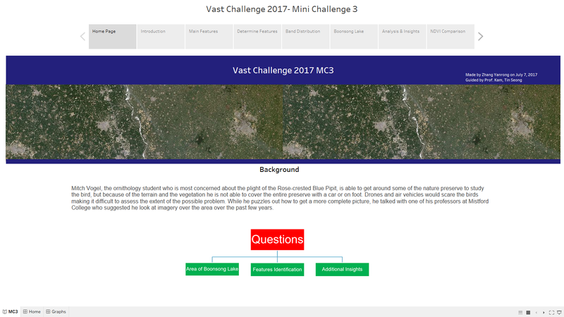
 VAST Challenge 2017 MC3
|
|
|
|
|
|
|
Please view Visualization for MC3 of Vast Challenge 2017 on Tableau Public to get better visualization and interactive experience.
Contents
Background Knowledge
Spectral Bands

Derived Measurement

Visualization Tool
Tableau
![]()
Graphs
Choropleth Graph
- A choropleth chart is a thematic chart in which areas are shaded or patterned in proportion to the measurement of the statistical variable being displayed on the graph.
- Since we have many measurements such as NDVI, NDWI, NDMI, BSI and AVI, we use Choropleth to represent these measurements on the graph.
- In order to relate each measurement with its actual meaning, we select appropriate color to show on the Graph.
- For example, NDVI represent the health of plants so we choose to use Divergence of Orange and Green.
- Blue for Water, brown for soil, so on and so forth.

Line Graph
- Each of the lines in the line graph shown below represent the factor making up the relevant measurement and their average value by month.
- In this case, we choose NDVI as measurement and the formula of NDVI is (B4-B3)/(B4+B3). Therefore the two factors of NDVI are B4 and B3.
- From the graph, we can see that there is little difference between B4 and B3 on February, March, November and December.
- In order to get a clear and obvious outcome, we need to analyze data on other months which differentiate the factors.

Area Graph
- The X-axis of Area Graph is the bin of measurement such as NDVI and the Y-axis is the number of pixels in the image.
- By looking at the Area Graph, the area with high NDVI value can more or less reflect the health condition of the plant on particular date.
- By comparing two Area Graphs in the same coordinates, we can tell whether the overall health condition of the plant is getting better or not.
- We can use Plant Region as filter to focus our analysis on the Plant Region.
- In this graph, the main area with high NDVI value is shifting left from 2014-08-24 to 2015-09-12, which means that health condition of plant is getting worse from 2014 to 2015.

Histogram
- We use the bin of measurement such as NDVI as X-axis and number of pixels in the image.
- It's the bar chart form of Area graph, but we can use it the do some interactions with histograms with other measurement.
- There are two obvious spikes in this Histogram which could be the possible features in the image.

Dashboard
Home Page
- The "Home Page" Dashboard shows the background and three questions of this Mini Challenge 3.

Introduction
- This "Introduction" Dashboard shows the 12 images processed by QGIS with their date and cloud coverage.
- The table is a description of the 6 bands information in the image.

Main Features
- The "Main Features" Dashboard shows the clustering result of the features in the image, which solves the second question for MC3.
- The left one is processed by QGIS and the right one is processed by Tabelau.
- The legend shows that there are five main features in the Preserve, which are Plant Region, Water Region, Paths, Farmland and Construction area.

Determine Features
- This "Determine Features" Dashboard shows part of the process how we determine features in the Preserve.
- The interactive technique we are using here is Value Range Slider and we take NDVI range slider as example.
- By changing the NDVI value in the slider, the selected range will be filtered and shown in the Choropleth Graph.
- We assume the NDVI value of Plant Region will be above 0, so we select range from 0 to one and use it as the criteria for Plant Region.
- We do the same process for other measurement such NDWI, BSI and AVI.

Band Distribution
- This "Band Distribution" Dashboard shows the relationship between Choropleth Graph, measurement value and bands value.
- The interactive techniques we are using here are Hover Highlight Action and Selection Filter Action.
- By hovering on any "bar" in NDVI histogram or others, it will highlight all related values in other histograms.
- When clicking particular "bar" or selecting a range or "bars" in NDVI histogram or others, it will filter both the related values in other histograms and the pixels in choropleth graph.
- The special "spikes" in the histogram could be the possible features in the image.
- If you click the spike labeled in the dashboard, you will see the Water Region being filtered in the choropleth graph.

Boonsong Lake
This "Boonsong Lake" Dashboard shows the area of each pixel in the image by using the reference of Boonsong Lake image with real length. By calculating the number of pixels we filter from Tableau by NDWI, we can get the length of each pixel in the real world, which solve the first question of MC3. Then we can even count how many pixels there are and estimate the actual area of Boonsong Lake.

Analysis&Insights
- This "Analysis&Insights" Dashboard shows the analysis result based on the combination of line graph, choropleth graph and area graph.
- We are using the same month as comparison to eliminate some uncontrollable seasonal factors.
- By using the analysis result of line chart, we can determine which month we should use to do the comparison.
- By seeing whether the area graph is shifting left or right from one year to another year, we can tell whether the overall health condition of Plant Region is getting better or worse.
- By choosing different feature such as filter, we can focus our result only on particular region such as Plant Region.

NDVI Comparison
- The "NDVI Comparison" Dashboard shows what is the area with the decrease of NDVI value, which represent the area plant getting less healthier.
- The interactive technique we are using here is NDVI difference range Slider.
- Users can adjust the range of value of NDVI difference to get relevant result based on their assumption.

Interactive Techniques
| Name | User Interface | Description |
|---|---|---|
 |
Single Value List allow user to choose only one of the choices among the list. It's convenient to select certain category from one to another instead of unchecking and checking again in Multiple list. In this case, user can focus on selecting only one particular region and switch it by the need. | |
  |
The only difference between Single Value Dropdown List and Single Value List is that dropdown list will save more space for other interactive control panels. In this case, there are 12 dates for use to choose. Once they make the choice, the dropdown list will fold up, which make interactive control panels much cleaner. | |
 |
Multiple Value Dropdown List gives users the option to choose multiple filters. In this case, users can choose any two dates to compare by choosing two different dates from the dropdown list without occupying too much space for control panels. | |
   |
Value Range Slider allows users to move the slider freely to the value they want. In the case, to choose a appropriate range for particular feature, users can move the slider to appropriate range that make the region in the graph reflecting the features they want. | |
 |
Hover Highlight Action is an interactive action in the dashboard. Everytime users hover their mouse above any bar in the histogram for one band or measurement, the related bar with the same value of the band which users hover on will be highlighted. This allows users to see the relationship and the relevant distribution of the related value. | |
 |
Select Filter Action is an interactive action in the dashboard. It's an additional action helping users to do further exploration of the data. When users select a particular bar or drag a cluster of bars in one band distribution. The graph will only show pixels with or within this range. In addition, all other distribution will be filtered to show only the value within the value range of that particular band. |
Story

QGIS

Image Processing
- These images shown below are processed by QGIS.
- From these images, we can see that some of them are heavily covered with cloud which should be exclude in the following analysis.

- Here shows the large image on 2016-09-06, which is the clearest image among twelve images.

Creating feature layer
- By observation, we can discover those field with obvious features such as paths, cloud, farmland, lake and construction.
- We create new feature layer by using polygon and label them with feature names.


False color
Use B5, B4 and B2 as RGB to highlight the features

Use B4, B1, B2 as RGB to reflect the plant health. (The darker the red is, the healthier the plant is)

Use B1, B5, B6 as RGB to reflect the snow coverage (Red).
