Mandi Assignment Final Answer

From Visual Analytics and Applications
Jump to navigation Jump to search
VAST Challenge 2017 MC 3

Introduction

Data Preparation

Data Exploration

Final Answer

Visualization Result

Comments


Questions & Answers

Q1. The scale and orientation of the supplied satellite images.

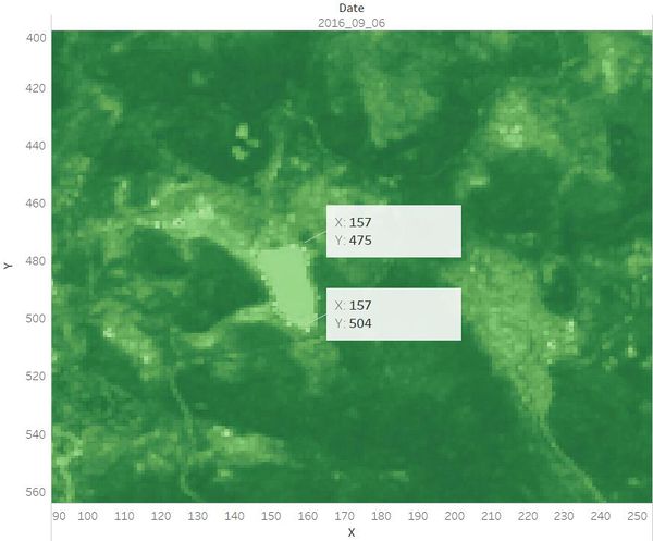
Identified the location and coordinates of the Boonsong Lake in the satellite image as below:
The orientation of the satellite image is the same with that of the Boonsong Lake.
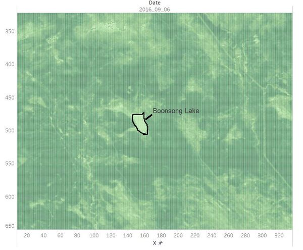
Lake.JPG Axis Image.jpg
Hence, the length of a pixel is 3000/(504 - 475+1) ft, equals to 100 ft. Then the area of one pixel is 100 * 100 = 10000 square ft.
As the satellite image has 651*651 pixels, the actual scale of the region is 651*651*10000 square ft = 4,238,010,000 square ft.
The orientation of the satellite image is oriented north-south.[1]

Q2. Features in the Preserve area as captured in the imagery.

Most of the images have sensor artifacts at the bottom right corner. To identify the features in the Preserve Area, I picked the image which is generated from the data [image11_2016_09_06.csv]. It has no sensor artifacts at all.

VisualizationsInterpretations
2016 09 06 Changes PlantHealth.jpeg
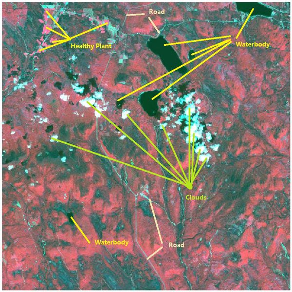
Band combinations(B4, B3, B2) are mapped to the RGB image channels to create the false-color image.
The color of the waterbody is from dark blue to black. Red region stands for vegetation.
Besides, we can recognize the clouds and roads by vision.
2016 09 06 Floods newLands.jpeg
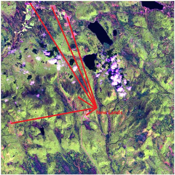
Band combinations(B5, B4, B2) are mapped to the RGB image channels to create the false-color image.
The red region represents new lands.
NDVI RVI.jpg

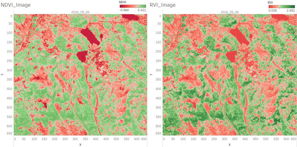
With the NDVI and RVI Value, we can identify the different vegetation.
The darker the green, the higher chlorophyll content the plant has.

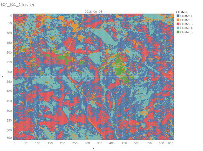
B2 B4 Cluster.jpg

As Band 2 shows different types of plants and general visible brightness and Band 4 is sensitive to vegetation structure and chlorophyll, we can perform clustering on the data by the value of Band 2 and Band 4.
Based on the previous analysis of the images, we summarized the clustering results as below.

  • Cluster 1: Common vegetation with lower chlorophyll content.
  • Cluster 2: Road/Newly Land/Soil.
  • Cluster 3: Healthy Plants with higher chlorophyll content which has absorbed the red light strongly.
  • Cluster 4: Waterbody.
  • Cluster 5: Clouds.


Q3. Features that change over time in these images.

In general, the waterbody became more pure from 2014 to 2016. The plants which are with higher chlorophyll content became less from 2014 to 2016.
The visualization analysis results are as below.

VisualizationsInterpretations
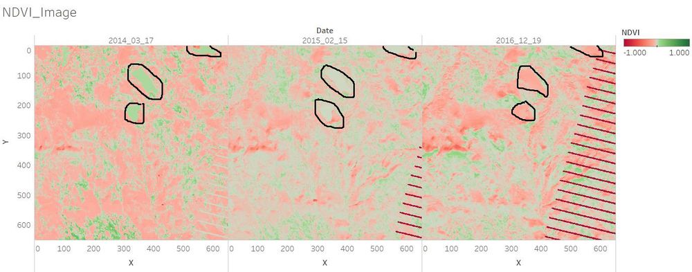
NDVI 3 compare.jpg
In March, Febraury, December, the season of the Preserve area is winter or early spring. During these periods, the NDVI value of the waterbody region should not have much difference. However, we can see from the left image that the color of the waterbody in 2014 was green and became light green in 2015, while it turned into red in 2016. We can infer that in 2014 there may be much algae in the waterbody region.
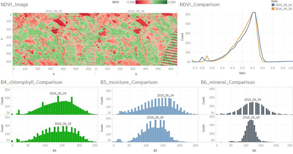
Jun.jpg
Compared to June 2015, the soil mineral content has changed in June 2016. And the plants which are with higher chlorophyll content became less in June 2016. The number of the plants which are with lower chlorophyll content stayed nearly the same in June 2016.
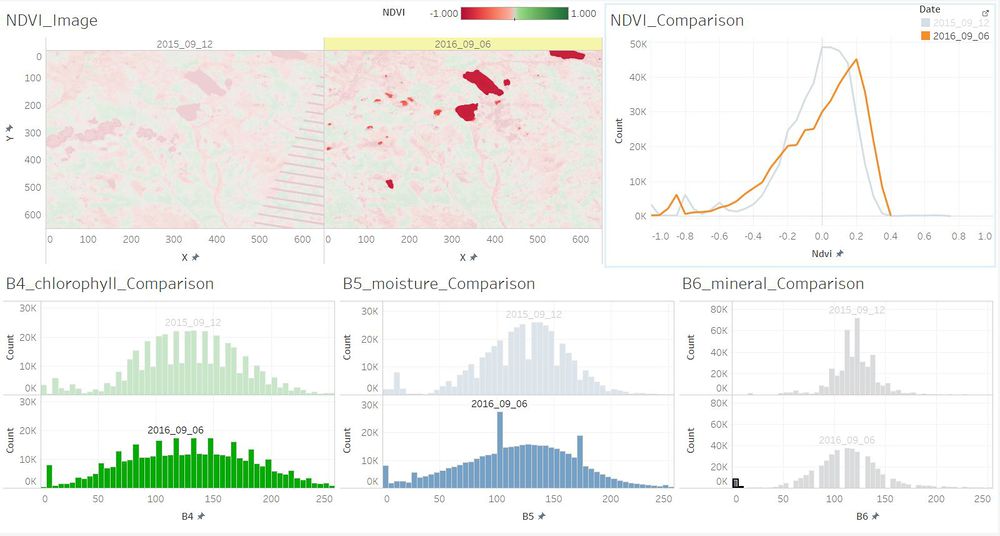
Sep WaterClear.JPG
The number of the plants which are with lower chlorophyll content became larger in September 2016. While the number of the plants which are with higher chlorophyll content became less in September 2016. And the waterbody became more pure in 2016 as the content of soil mineral content reduced.
Dec.jpg
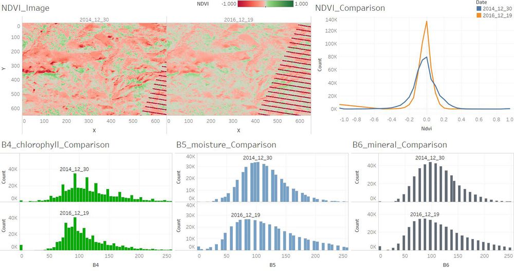
The plants which are with higher chlorophyll content were a little bit more in December 2014 than in December 2016. There were not too much changes between December 2014 and December 2016.


Reference