ISSS608 2016-17 T3 Assign TEN KAO YUAN MC3
|
|
|
|
|
|
|
Contents
Mini-Challenge 3 : Eye in the Sky
Introduction
Mitch Vogel, the ornithology student who is most concerned about the plight of the Rose-crested Blue Pipit, is able to get around some of the nature preserve to study the bird, but because of the terrain and the vegetation he is not able to cover the entire preserve with a car or on foot. Drones and air vehicles would scare the birds making it difficult to assess the extent of the possible problem. While he puzzles out how to get a more complete picture, he talked with one of his professors at Mistford College who suggested he look at imagery over the area over the past few years.
Perhaps, the professor mused, there have been changes in the flora that are related to issues with fauna. Mitch thought this kind of associated study may be informative, so the professor provided him with some images of the preserve collected by the National Space Service. However, they are multi-spectral image files, which Mitch had never dealt with before. The image analysis packages he found online were very complicated to work with, so he has asked you, a visual analytics expert, to help him view and understand this data. He understands that you are a visual analytics expert and an insightful analyst, even if you are not an expert image analyst.
Tableau is most certainly not the best tool to study images, but we will have to make do with what we have assigned.
Data Preparation
Since we are using Tableau we will use the data presented to us in the .csv file format (comma separated value). The data is given as a set of 12 .csv files, each representing an image taken on a particular day of the year. In the file names, the images are numbered according to the temporal order in which they were obtained. Also, the date of the image is included in the title. So “image09_2016_03_06.csv” is a comma-delimited text file, which is the 9th in the series and was taken on March 6, 2016. The files show the same piece of the Lekagul Preserve as imaged by a satellite over several years. The TIF files are 8-bit, 6-band files with 651 rows and columns. Bands 1-6 are ordered by wavelength (shortest to longest wavelengths) B1=blue, B2=green, B3=red, B4=near-infrared, B5= short-wave infrared (SWIR) 1 and B6= short-wave infrared (SWIR) 2. The ASCII files are in comma-delimited format where each record is the pixel value for each band at that X,Y location. Note that the X,Y origin is the upper left corner of the image. The X,Y locations are relative to the image itself and not a geo-coordinate on Earth. So, X=0, Y=0 refers to the pixel in the upper left corner of the image. Similarly, the bottom right pixel is X=650, Y=650.
The data is prepared using the following steps:
| Number | Description | Illustration |
|---|---|---|
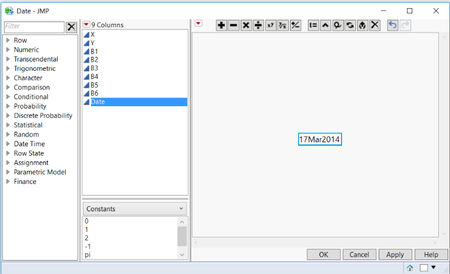
| 1 | The Data is opened using JMP and a column called 'Date' is created. A fixed formula is entered into the column, representing the date the image was taken. For example, “image09_2016_03_06.csv” is given the value "6MAR2016" in the Date column, and so forth. | |
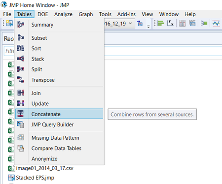
| 2 | The 12 JMP data tables are merger using the JMP concatenate function. This will produce a large file containing all the 12 images. In addition a source column is created as well when concatenating the files | |
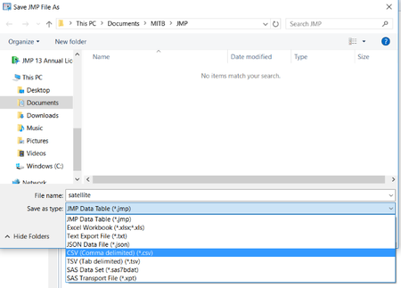
| 3 | The file is saved as a .csv file which is then opened in Tableau |
Tableau Visualization Available here https://public.tableau.com/profile/david.ten.kao.yuan#!/vizhome/MC3_0/TableauPublic?publish=yes
Q1 Boonsong Lake
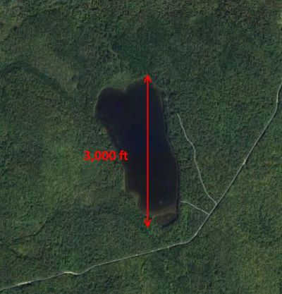
Boonsong Lake resides within the preserve and has a length of about 3000 feet (see the Boonsong Lake image file). The image of Boonsong Lake is oriented north-south and is an RGB image (not six channels as in the supplied satellite data). Using the Boonsong Lake image as your guide, analyze and report on the scale and orientation of the supplied satellite images. How much area is covered by a pixel in these images?
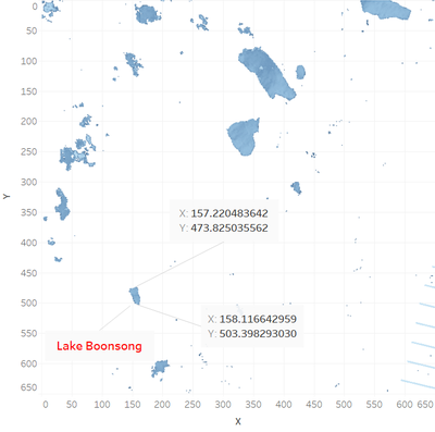
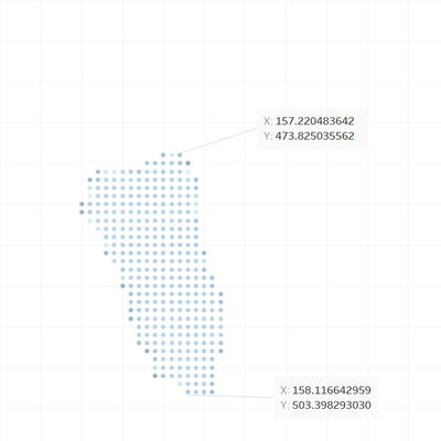
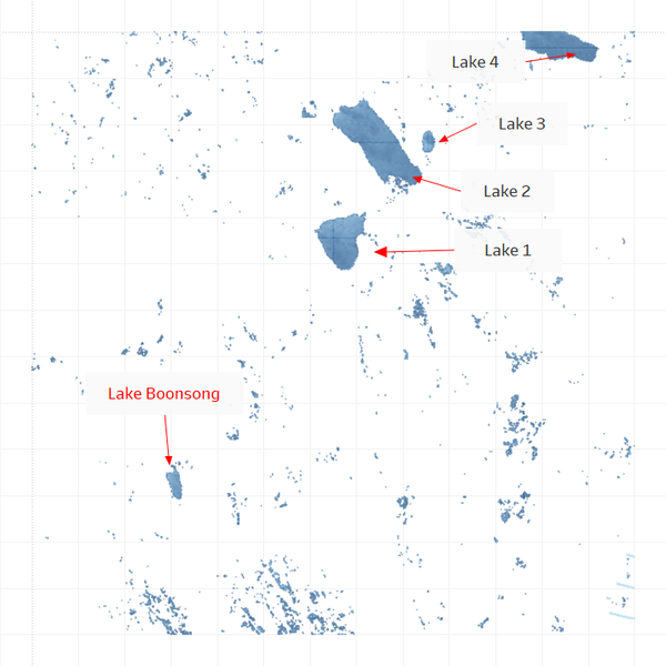
Using Band 5 and filtering for low values (absorbed by water, we are able to easily identify Lake Boonsong in the south east of the satellite image. The extreme points are annotated and the Y coordinates are 474 and 503. Hence the total length in the image is 503-474+1=30 pixels. Hence once pixel equals 100 feet since the lake is 3000 ft. We can conclude that one pixel is 100 x 100 or 10000 square feet. Since the lake is oriented north-south, satellite images are also oriented North-South.
The images cover and area of 65100 feet by 65100 feet or 12.33 x 12.33 miles. The area in the image is 152 square miles, or 55% the area of Singapore.
Q2 Feature Identification
Identify features you can discern in the Preserve area as captured in the imagery. Focus on image features that you are reasonably confident that you can identify (e.g., a town full of houses may be identified with a high confidence level).
Artificial border
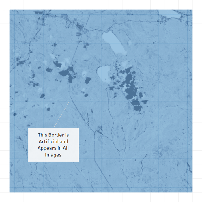
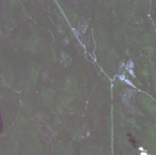
We observe a straight border running north-south through the image. This is certainly too straight and has too many sharp angles to be a road. This is highly likely to be an artificial line added to the satellite image to demarcate the border between states or regions. Since this is a natural preserve it does not make sense for this to be a walled area. It is too straight and cuts straight through hills and pathways
| Band B3 Image 11 | Border Cutting through Road |
Bodies of Water
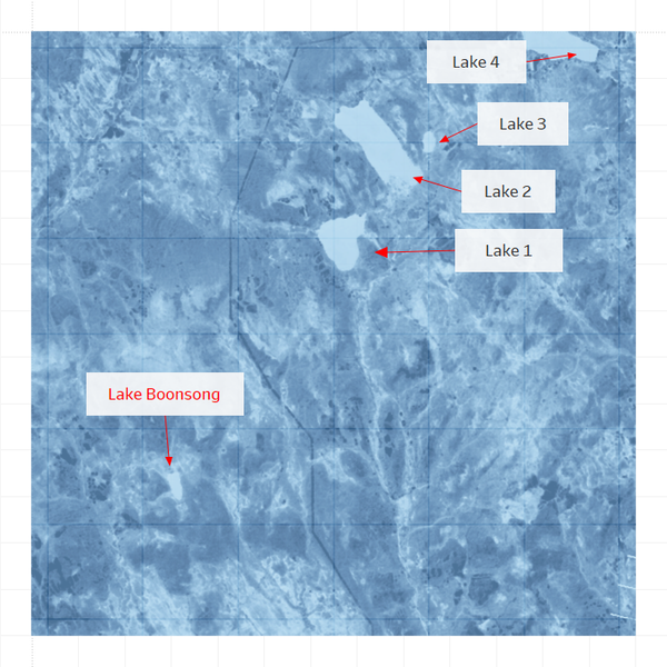
Bodies of water can be identified using Band 5 which is completely absorbed by water. There are a total of 5 lakes in the area.
Roads and Pathways
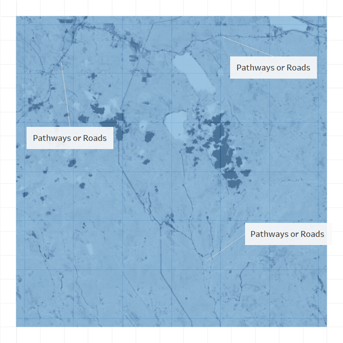
We also observe paths winding around the preserve.These are not streams or rivers as they show a different hue compared to Boon Song Lake.
High Land
From Band 6 of the satellite image, which ignores vegetation, we can clearly make out the contours of the hills and valleys that are around the park.
Clearings
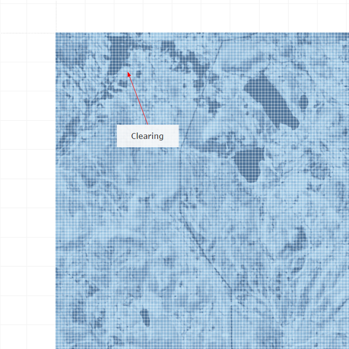
From Band 3 and Band 5, we are able to make out clearing at the north west corner of the satellite image. This clearing does not register on Band 5. This is definitely man made. It could be a plantation or human settlement.
Q3 Changes to the Park
There are most likely many features in the images that you cannot identify without additional information about the geography, human activity, and so on. Mitch is interested in changes that are occurring that may provide him with clues to the problems with the Pipit bird. Identify features that change over time in these images, using all channels of the images. Changes may be obvious or subtle, but try not to be distracted by easily explained phenomena like cloud cover.
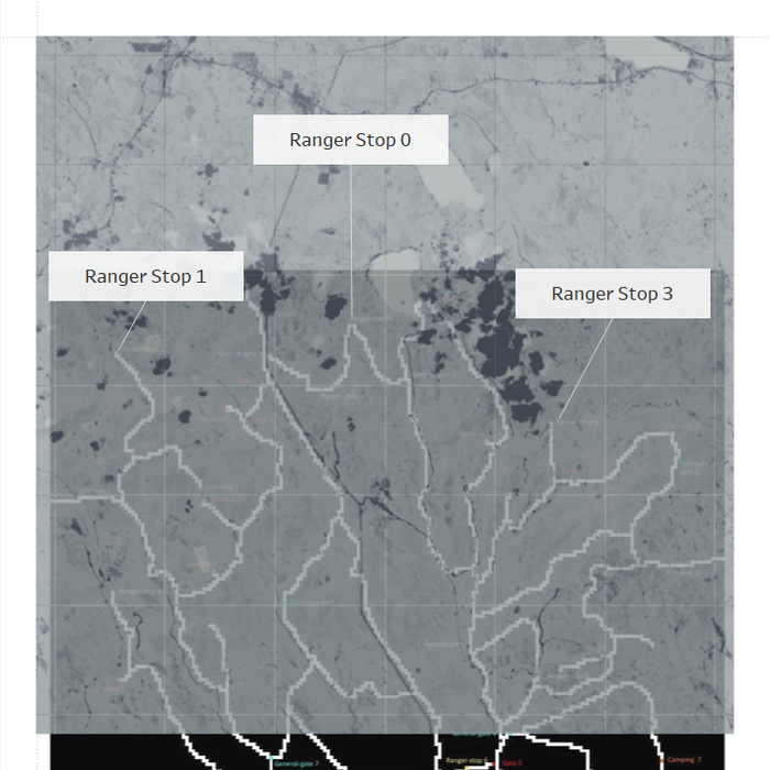
Due to cloud cover, different reflectance, and satellite artifacts, it is impossible or very difficult to compare the whole satellite image to each other. Instead our choice is to focus on specific areas of the park. This can be achieved by using the X and Y coordinates filter. We try to understand which are the sensitive areas of the park. These are areas that the rangers stop, get out of their vehicles and patrol. Linking it to the pathway map will help our understanding. Based on the road detection and our understanding of the park dimensions, we think the roads are located like this in the image below. This is obtained by scaling the park pathways map to match the satellite image dimensions translating the park pathways map in order to match the pattern of the pathways seen by satellite. The satellite image is taking a snap shot of the upper region of the park. We also observe that there is human activity to the North West of the park while we know that Mistford is to the south of the park. As such, this explains why there is commuter and transport traffic cutting through the park.
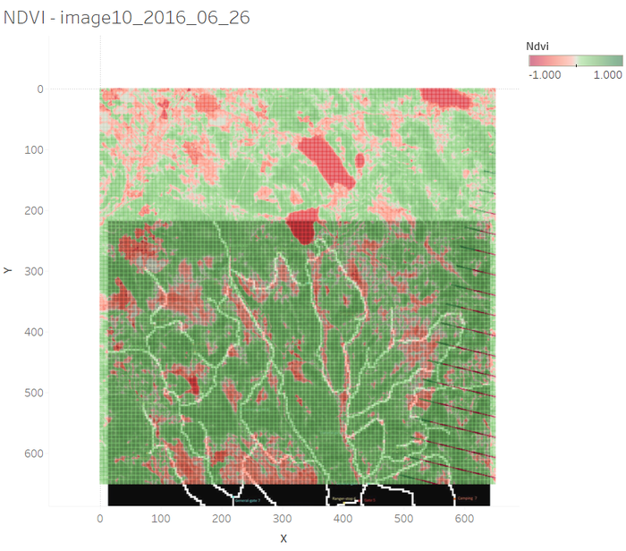
NVDI values are used to study the health of the vegetation. We observe that the NDVI value is low near the pathways. In addition there appears to be areas adjacent to the pathway that have poor vegetation; this seems to imply that visitors are heading off the pathways and affecting the health of the vegetation.
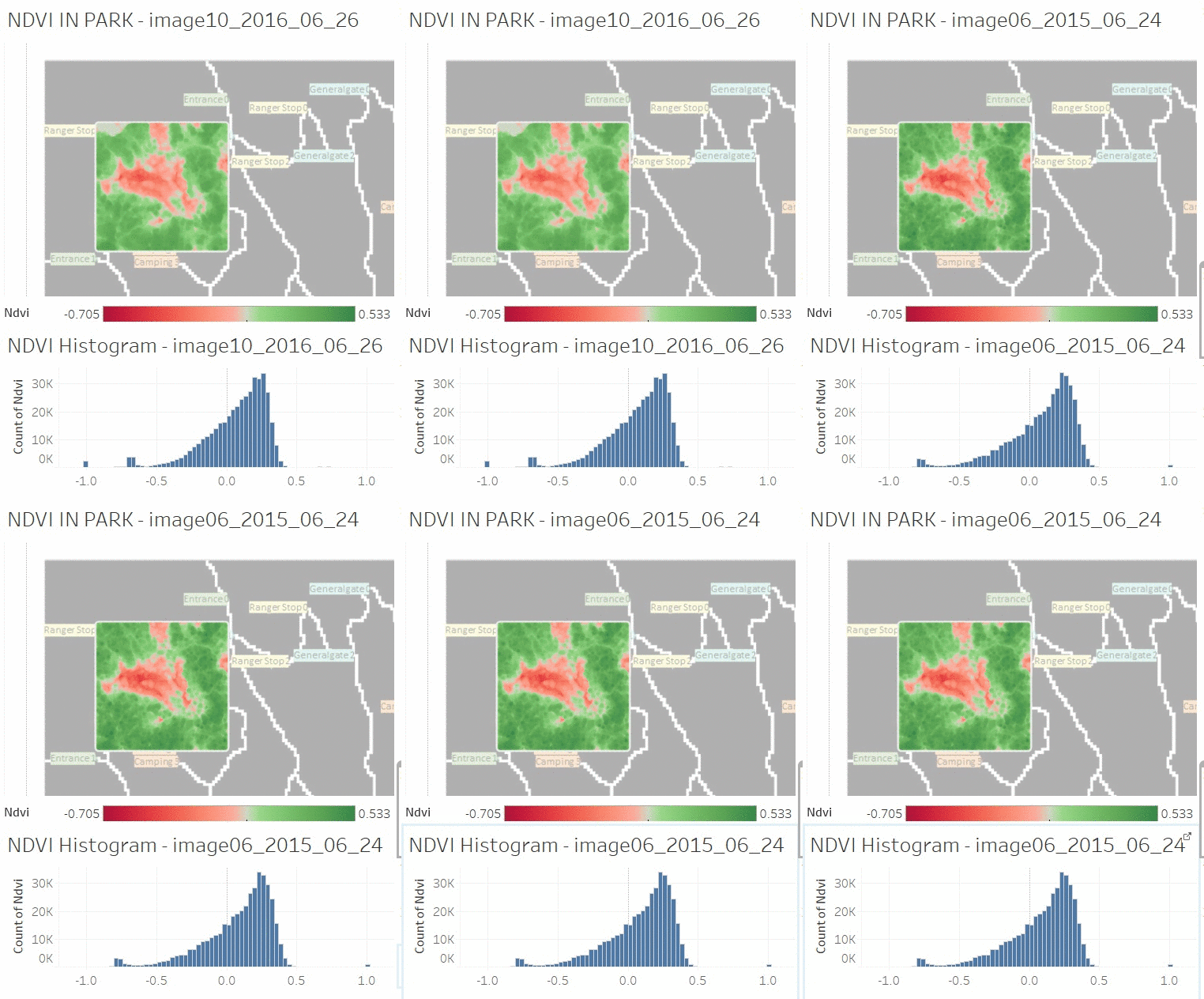
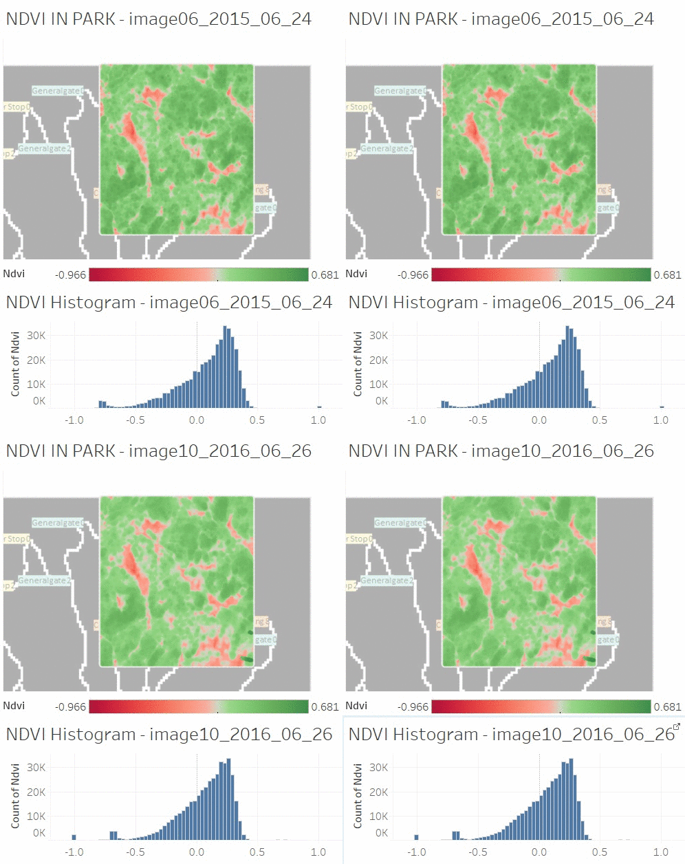
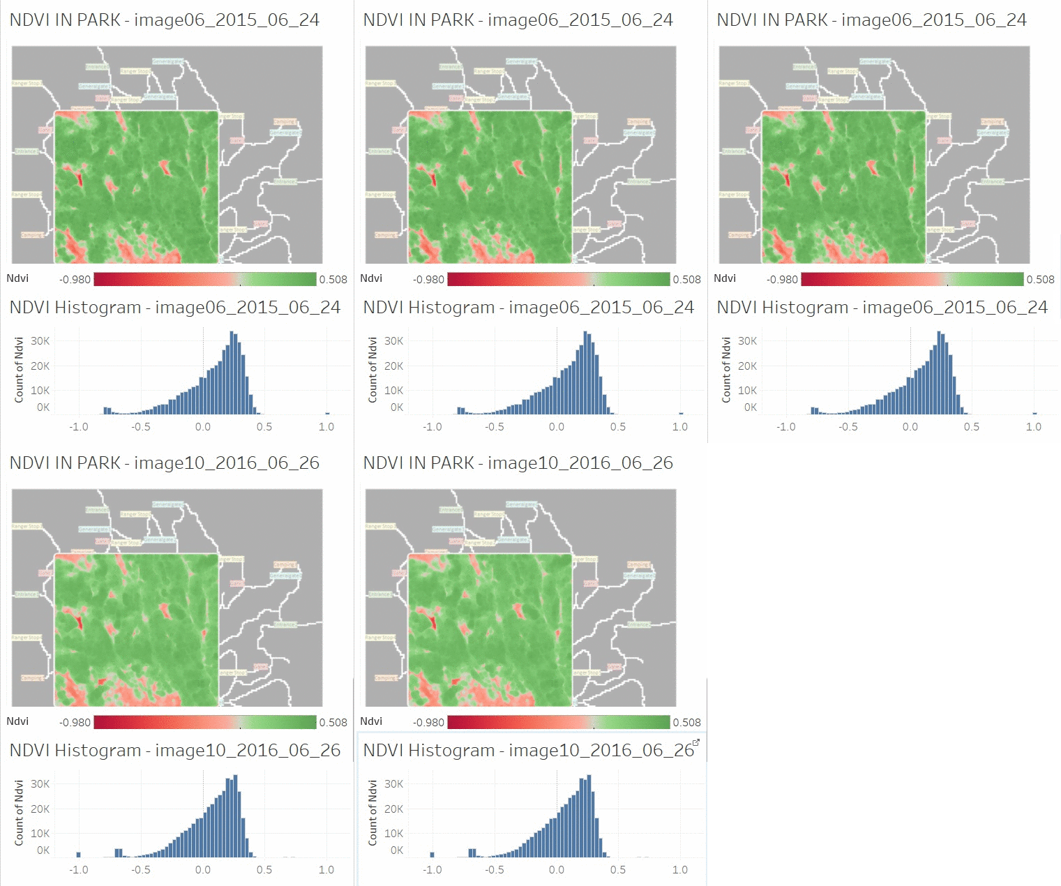
Based on this information, it might be a good idea to compare changes along the pathways and also at the ranger stops. We compare the months of June in 2015 and 2016 as it is summer and the vegetation should be at optimum health. Plotting the histogram values in the area of interest we are able to get an idea of the health of the vegetation in the area of interest.
It appears that at the North East of the park, where Ranger Stop 3 should be, the health of the vegetation is deteriorating, can show by the NDVI values which shift leftwards or into the negative zone. The same trend can be seen near the North West, near Ranger Stop 1 as well as the central region of the park.
| North West | North East
|
|---|---|
|
|
| Central
|
|---|
|
|
The vegetation in the park is deteriorating slightly from Summer 2015 to Summer 2016. We also notice that the vegetation is especially unhealthy near the vehicle pathways, which is a cause for concern. Other combinations of satellite bands should be studied in order to detect other anomalies such as evidence of burning or of declining soil health.
References and Feedback
References
Tableau Visualization https://public.tableau.com/profile/david.ten.kao.yuan#!/vizhome/MC3_0/TableauPublic?publish=yes
Feedback
Feedback (from Discussion Tab)
by Chua Gim Hong
Overall, very interesting analysis and easy to understand visuals. In your report: "Artificial border[edit] We observe a straight border running north-south through the image. This is certainly too straight and has too many sharp angles to be a road. This is highly likely to be an artificial line added to the satellite image to demarcate the border between states or regions. Since this is a natural preserve it does not make sense for this to be a walled area. It is too straight and cuts straight through hills and pathways " It would be clearer if you could mark out the hills and pathways being cut through by the line feature running in north-south direction with sharp bends.
by LUO Mandi
Amazing!!! You have done all the three challenges!!!
I have some feedback for the challenge 3 as below.
In your report you mentioned that "This is certainly too straight and has too many sharp angles to be a road. This is highly likely to be an artificial line added to the satellite image to demarcate the border between states or regions."
I agree that the road appears too straight. But if we compared all the statellites image, the image taken on 2016-09-06 is the only one without sensor artifacts in the right bottom corner. However, the straight line still exists in this image. I think this may imply that it is a road instead of sensor artifact.
by Zhang Yang Rong
- You are doing amazing job by consolidating all mini-challenges together. It's really impressive!
- Since I am only doing mini-challenge 3, my comments will focus on that part.
- Here are some suggestions for mini-challenge 3:
- Introducing interactive parts would make other people understand your work better.
- When comparing the two graphs about the changes to the park, putting two graph in the same coordinates would show the change more direct. Otherwise, it's hard to tell whether it's shifting left or shifting right.
- There are some problems with your gif, please check it.
- Last, welcome to comment on Mini-Challenge 3 from ZHANG YANRONG
