ISSS608 2016-17 T3 Assign JOSEF CARLO CUEVAS EXCONDE FINDINGS
ISSS608 Visual Analytics and Applications
|
|
|
|
|
DO WE SEE IT OR DO WE FEEL IT?
Contents
Comments and Feedback
1 Eric Prabowo
Feedback by Eric Prabowo:
Aesthetics for Dashboard
- Overall dashboard design, size, and placement is good
- Map Color is Dark, aesthetically not balance with other colors visible on the dashboard.
- Bar chart color has been explained through X-Axis text: repetitive information
Clarity for Dashboard
- Bar chart shows number for each reading shows clarity
- Pie chart comparing each sensor reading is hard to read on the map, knowing that it is measured based on area
- Wind speed is not clearly shown on the dashboard, only depends on dimension of polygon shape
Aesthetics for Factory Reading Charts
- Overall chart design is good and color choices are comparable
Clarity for Factory Reading Charts
- Chart clarity and calculation is good to show which sensor triggers the pollution
- Informative to show directly sensor readings
2 Akangsha Bandalkul
Hi Josef,
Great job on your analysis and approach. You explained all of your points well and backed it up with screenshots.
Here is some feedback in terms of clarity and aesthetics:
To where the wind blows and when.
Clarity
It is not immediately clear what the size of each pie corresponds to - I was unable to understand the supporting legend provided. I would like into how this could be made a bit more clear
Aesthetics
I like the use of the compass behind the wind direction plot - it was a lovely touch to reflect the information you are visualising The background image map provided by VAST is a bit hard to read I would recommend plotting your own version of the map and using that as the background for your wind plots - this would make it easier to read and easier to control the visualisation so that text and plots are in proportion For your third screenshot, the names for the readings column has been cut off - I would recommend either rotating the label or adjusting font size so this can be easier to read
Where does it come from?
Clarity
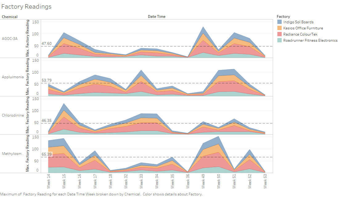
For the first Factory Readings graph, instead of week numbers I would recommend using dates as the X axis labels as these will provide better context
Aesthetics
I think it is great that for the second Factory Readings graph you added the reference line for average reading. Perhaps you can check if there is a way to label this or add a legend so that it is more clear that the line represents "Average reading"
Overall
I think you did a great job. I really liked the way you looked at visualising it and the arrangement of your dashboard used to map the readings back to sensors. Perhaps finding a way to more explicitly represent the wind speed (or distance travelled) in the wind plot over the map would provide a bit more clarity.
3
FINDINGS
Sensor Comparison
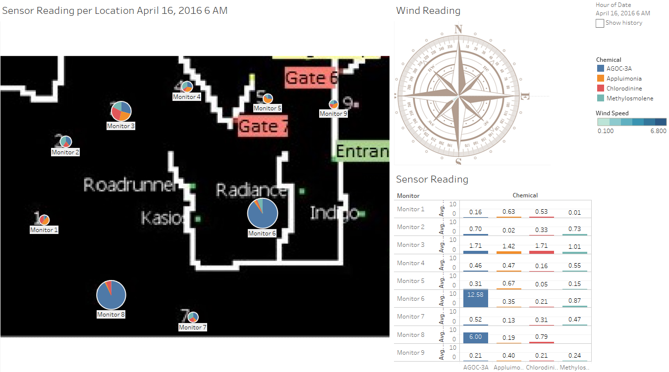
Looking at the values for the First Dashboard we can observe that in comparing the total reading of the different sensors it seems that Sensor 3 and Sensor 7 is more sensitive to the chemicals. This is due to the relative size of the reading of this sensor compare to its neighbors. As we run the viz through the whole data set we can observe that Sensor 1 and 2, and Sensor 5 and 9 stayed within relative sizes.
Looking at the April 18 Findings, even when there is close to no wind in the wildlife preserve you can see a slight difference in the sizes of the Pie for Sensor 3 and Sensor 7.
Even when the wind is coming from South West the reading on Sensor 3 is greater than that of Sendor 4 which is actually in the path of the wind that would have atleast passed through the factories, and the same could be said of Sensor 7 compared to Sensor 8.
And lastly for December 16 where the wind is blowing away of Sensors 3 and 4 we still see a slight difference in the readings between them.
Chemical Comparison
Again using the first dashboard we can observe size of the angles that represent the chemical reading in each sensor. Similar to the comparison made in the performance of the sensors we can compare the size of the angle as well as the numeric value in the lower right graph in the dashboard to see any glaring differences between the chemical reading in the dashboard.
For example, in the reading for April 17, we can see that much of Sensor 8 and 6 has capture AGOC-3A where there is little reading of the chemical in all the other Sensors, which can help us hypothesize that both sensors are sensitive to AGOC-3A
And again for our favorite Sensor 3, for august 16 we would see that there is a difference in the readings of Chlorodinine between Sensor 2, 3, 4, but more than that you can see that compared to the difference between the different chemical readings between 3 and 4 which differs from 0.20-0.40, there is almost 0.9 difference for Chlorodinine, which would support out hypothesis that Sensor 3 is sensitive to Chlorodinine.
Factory Reading
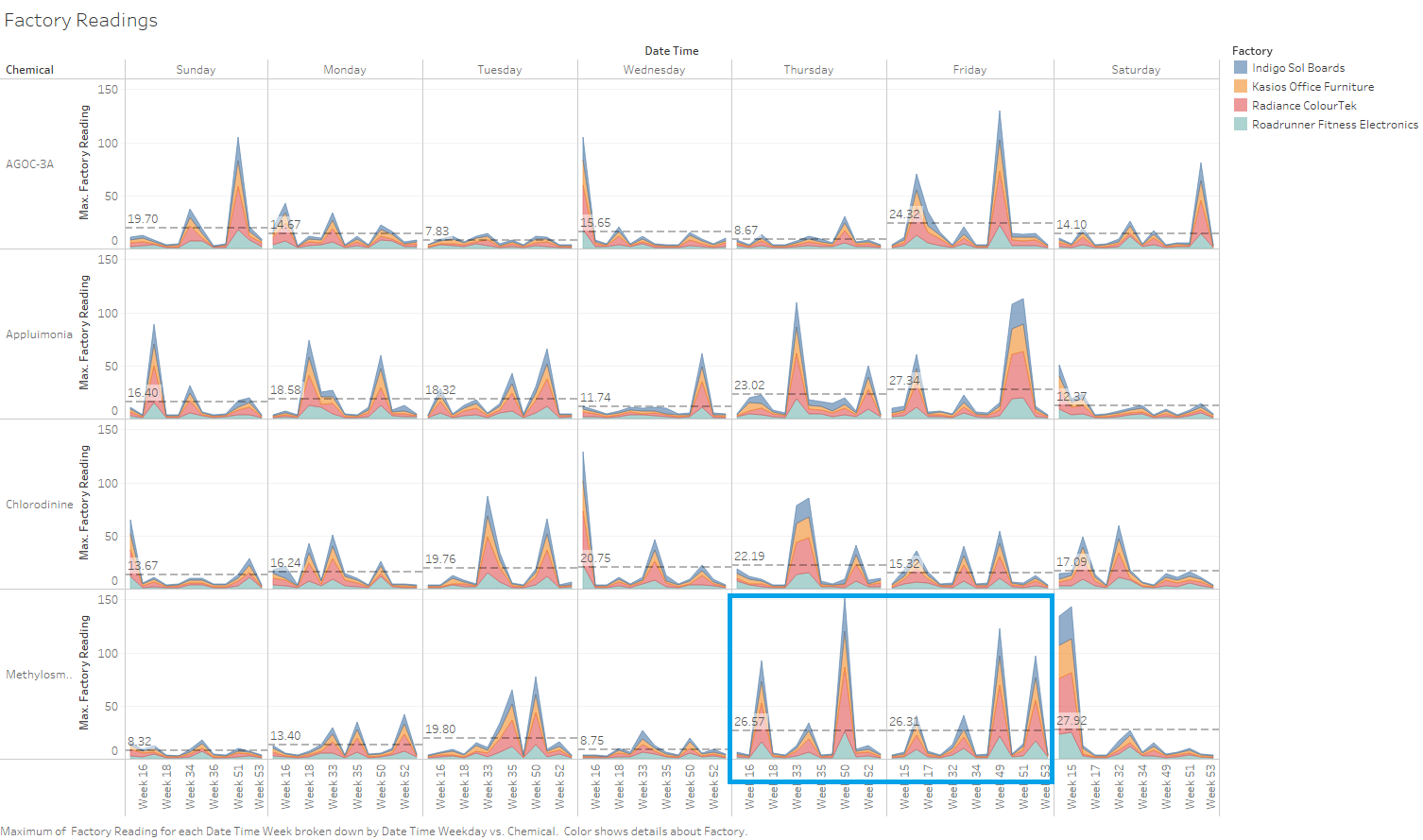
Using the Inverse Distance Weighting method we were able to compute the values of the reading per factory relative to their location at the wildlife preserve, and looking at the overall data every time we see a spike in the chemical it is usually because of the Radiance ColourTek.
But other than that there were spikes on some chemicals through out the 3 month cycle, such as:
Tuesday Production of Appluimonia, Cholorodinine, and Methylosmolene for weeks 33 - 35 and 50 - 51
Friday Production on all chemical for Week 49, probably in preparation for the Christmas Lights production :)
And the weekend use of Methylosmolene for almost the whole data set.


