ISSS608 2016-17 T3 Assign CHEN YINJUE Data Preparation
|
|
|
|
|
|
|
Dataset Description
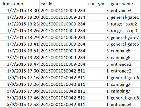
The data visualization and analysis will be done based on a raw dataset named ‘Lekagul Sensor Data’ providing information of timestamp, car-id, car-type and gate-name (gates that a vehicle entered/passed by/exited in order). Below is the screenshot of the dataset:
For car-type, when vehicles enter the Preserve, they must proceed through a gate and obtain a pass. The gate categorizes vehicles as follows:
• 2 axle car (or motorcycle)
• 2 axle truck
• 3 axle truck
• 4 axle (and above) truck
• 2 axle bus
• 3 axle bus
Vehicles receiving a pass with a “P” appended to their category are park service vehicles that have access to all parts of the Preserve. Currently, the Preserve vehicles are only 2 axle trucks, so they are designated as “2P” vehicle type.
There are five types of sensors recording data.
• Entrances. All vehicles pass through an Entrance when entering or leaving the Preserve.
• General-gates. All vehicles may pass through these gates. These sensors provide valuable information for the Preserve Rangers trying to understand the flow of traffic through the Preserve.
• Gates. These are gates that prevent general traffic from passing. Preserve Ranger vehicles have tags that allow them to pass through these gates to inspect or perform work on the roadway beyond.
• Ranger-stops. These sensors represent working areas for the Rangers, so you will often see a Ranger-stop sensor at the end of a road managed by a Gate. Some Ranger-stops are in other locations however, so these sensors record all traffic passing by.
• Camping. These sensors record visitors to the Preserve camping areas. Visitors pass by these entering and exiting a campground.
Data Preparation
1. Data Prepared for Sunburst in tableau
So, what can we do using this sensor data? Basically, the records of gate names should be combined to create one or multiple entire paths for each car-id so that a sunburst diagram can be drawn to check whether there are particular routes having relatively heavier traffic volumes compared to other paths.
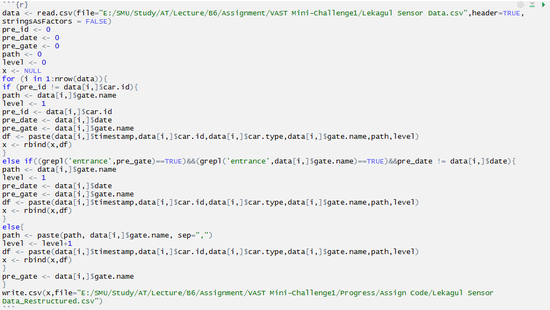
However, there is specific data structure requirements if we want to draw sunburst chart in tableau and hence we need to restructure data first. Therefore, R-studio is applied. Below are the R codes used to reshape our raw data:
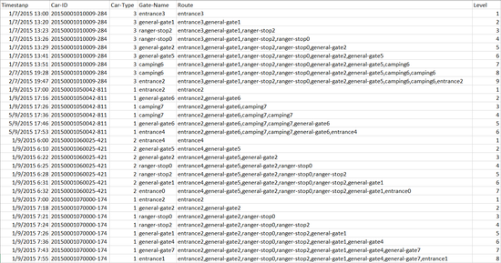
After running the code above, we can get the reshaped data as below shows:
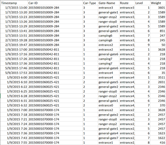
Next, the restructured dataset should be loaded into JMP so that the weight (number of records) of each row of ‘Route’ can be computed. To achieve that, after importing dataset into JMP, select: Table > Summary. In the pop-up window, drag ‘Route’ to ‘Group’ and then click ‘OK’ so that we can get the desired weights mentioned above. After that, the original table as well as this new table generated for weights can be joined together. So far, we are ready to do sunburst diagram using tableau. Below demos how the dataset looks like by now:
Lastly, save this file as an Excel worksheet.
2. Data Prepared for Mapping in tableau
Moreover, it will be good to lay out the paths on the map of the park so that audiences can have a better understanding of where do those cars go. The raw dataset only has ‘gate name’ and all the ‘gate name’ are labelled on the map. So, let’s use tableau to help. First, we need to create an Excel worksheet as below and name it as ‘coordinate table’. This is to help load the map as background image in tableau:
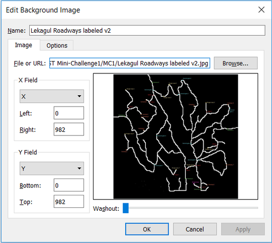
Next, open a new tableau workbook, import the ‘coordinate table’ as data source and go to ‘sheet1’. At the menu, select: Map > Background Images > coordinate table. In the pop-up window, click ‘Add image’ and in another pop-up window, load the map of park with gate name labelled in and set the parameters as below and click ‘OK’:
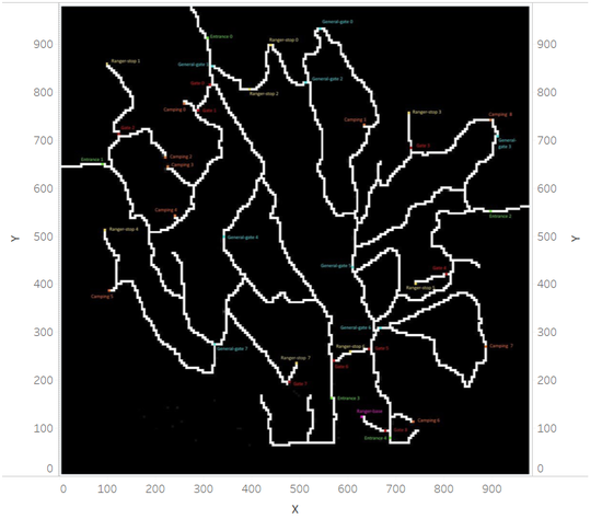
Drag ‘x’ to ‘Columns’, drag ‘y’ to ‘Rows’ and drag another ‘y’ to the right of the view (drop it at where you see a dashed line). Now we can have the map appearing as background image like this:
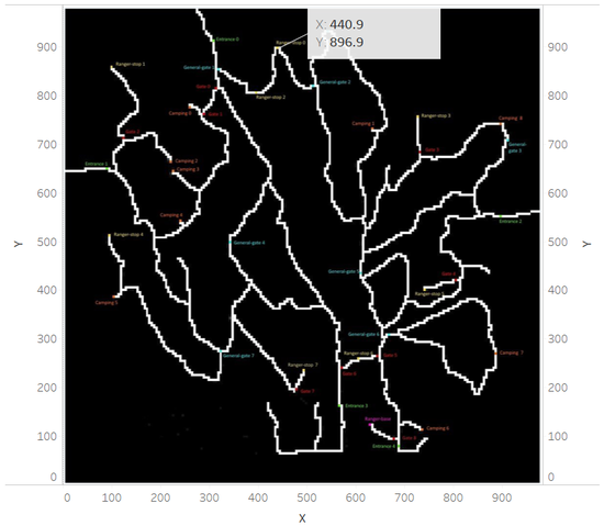
Now, to read the coordinate of each ‘gate’, we should hover the mouse over a ‘gate’ label and right click to choose: Annotate > Point. Select ‘OK’ in the pop-up window so that tableau will give us the corresponding coordinate of this gate:
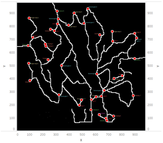
Use this method to get coordinates for each gate and then write down all the coordinates in ‘coordinate table’ and save. Then the data source should be refreshed and we can get a map with ‘gate name’ labelled with circle:

