ISSS608 2016-17 T3 Assign ANGAD SRIVASTAVA Vast Q2
|
|
|
|
|
|
|
|
Area of Investigation
Now turn your attention to the chemicals themselves. Which chemicals are being detected by the sensor group? What patterns of chemical releases do you see, as being reported in the data? Limit your response to no more than 6 images and 500 words.
The Investigative Journey
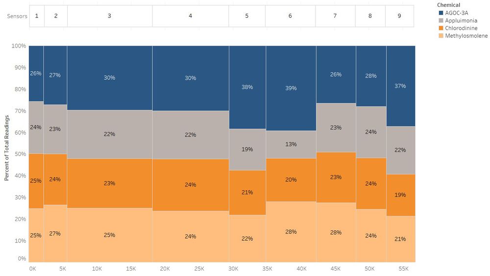
This subsection primarily focuses on the chemicals themselves. Regarding the analysis of detection of chemical readings by sensors, I briefly covered this topic in the previous subsection by using a Horizon chart. To better understand the relationship between the 4 chemicals and 9 sensors in terms of reading magnitude and relative distribution of number of records for each chemical, a Marimekko plot has been used to visually gain these insights.
The screenshot above shows that sensor 3, 4 and 6 detect the chemicals with highest reading magnitude based on the width size designated to each sensor. Moreover, the stacked colored bars representing the 4 chemicals detecting by each sensor show that the distribution of chemical readings is relatively equal except for Sensors 5, 6 and 9; that tend to detect more of AGOC-3A.
The screenshot below provides a trellis of Marimekko plots to highlight the differences between the 3 months.
Insights gained from the above visualizations for monthly chemical readings detected by sensors are as follows:
- Sensor 3 detects the highest overall chemical readings.
- Based on the monthly increase in width size, the magnitude of chemical readings detected by Sensor 4 continues to increase periodically.
- Sensor 6, 7 and 9 tend to capture higher readings of AGOC-3A and so the distribution of chemical readings detected is skewed. Sensor 6 also captures higher readings of Methylosmolene.
- The sum of chemical readings (emissions) has increased consistently with a total of 14,980 in April; 19,604 in August and 22,604 in December.
To visually detect time-based patterns of chemical releases, I have used a trellis of dot charts to highlight the daily and hourly patterns of chemical emissions.
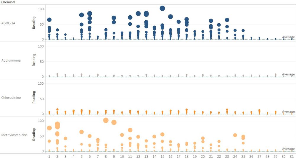
The image below shows the magnitude of chemical releases for each day of all 3 months. The size of the bubble is reflective of the magnitude of chemical reading.
As shown above chemicals – Appluimonia and Chlorodinine have consistent and relatively low readings through the months. In contrast, AGOC-3A and Methylosmolene have consistently high emissions.
It is interesting to note that there is a sharp decrease in the magnitude of chemical releases after the 25th of each month.
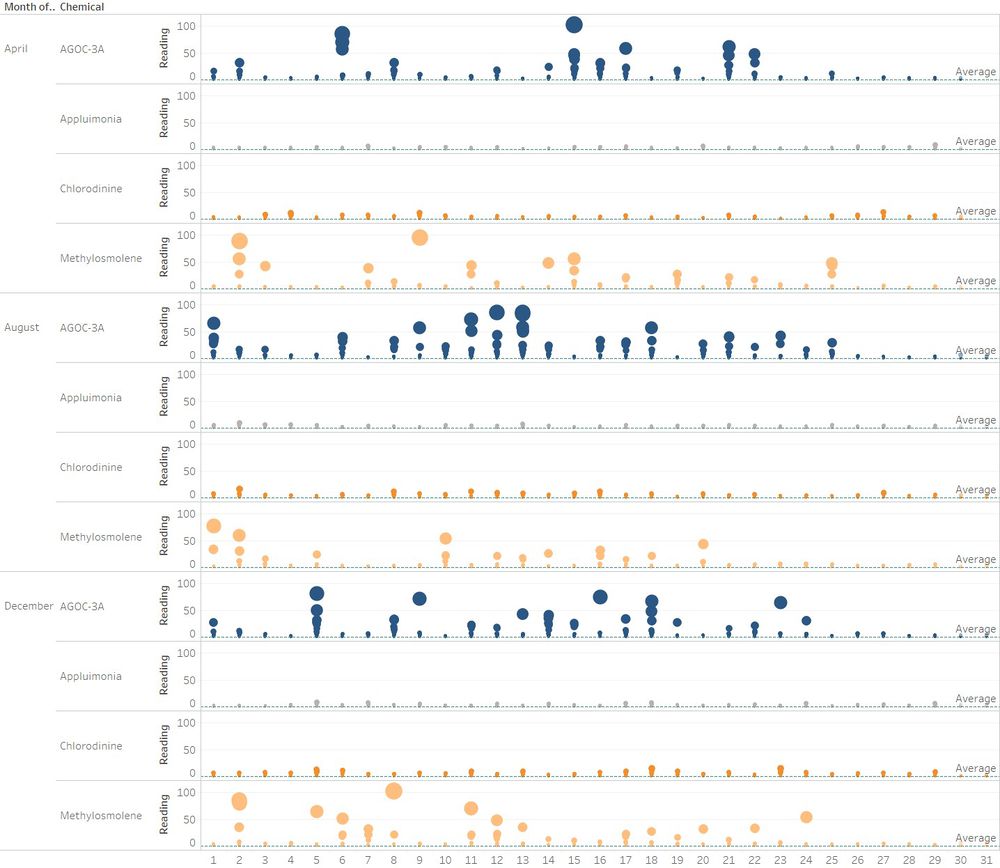
A monthly breakdown of the Dot chart is shown below:
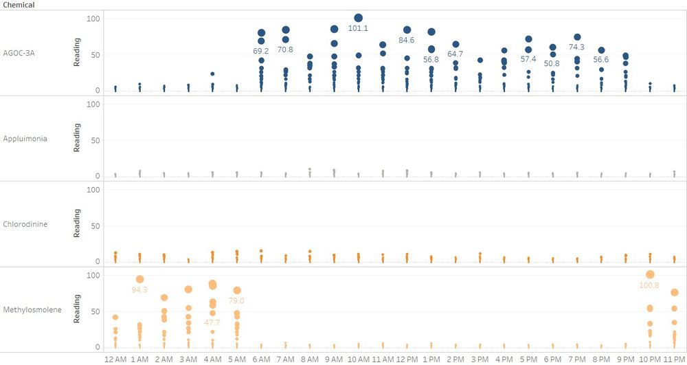
A similar visualization which tries to highlight the hourly release patterns is shown below:
As shown above, chemical releases for AGOC-3A and Methylosmolene are consistently high on an hourly basis whereas Appluimonia and Chlorodinine and relatively low for all hours of the day.
A distinct pattern that can be highlighted with this graph is that the high chemical releases for AGOC-3A always take place during the day from 6am to 9pm. In contrast, the high chemical emissions for Methylosmolene always takes place during the night from 10pm to 5am.


