ISSS608 2016 17T1 Group6 Project Report - Design Framework
Jump to navigation
Jump to search


| Proposal |
Core Principles
A detail description of the design principles used and data visualisation elements built:
- Interactive, especially the usage of cross filter.
- Be able to show country specific information of terrorist attacks.
- Clear representation of time dimension.
- Clear layout that is easy for all users to understand.
- Clear instruction on how to use the dashboard.
Early Concepts
- We considered tracing the rise and fall of different terrorist groups. However, firstly, there are thousands of terrorist groups in the dataset. It is difficult for us to find the representative terrorist groups to track and study. Secondly, the definition of terrorist groups in this database is rather unclear. Some groups with radical social advocacy are also listed as terrorist groups, but they are far from what we consider as terrorists.
- We realised that the number of terrorist attacks tends to increase drastically after wars. However, it is hard for us to develop further recommendations besides blaming certain countries for irresponsible policies after the wars.
- We also tried to link the number of terrorist attacks to coverage of terrorist attacks in mainstream media and social media. However, we found it very difficult to obtain related data. The amount of data would be huge across the years. The analytics to be done would be extremely challenging also.
- We reached the idea of visualising the relationship between terrorist attacks and Internet usages since the spread of Internet has changed the ways many things are done. We assume that with the Internet, terrorist groups can coordinate more easily online; radical terrorist materials can be spread much more easily online; recruitment of terrorist fighters can be conducted more easily online. We want to verify if there is really such an impact on terrorism by the Internet.
- We will use the Internet data from the World Bank for our Internet analysis.
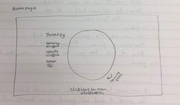
- To have a spinning globe that shows the locations of terrorist attacks.
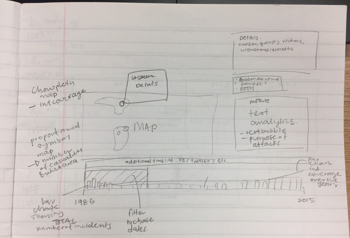
- To develop a dashboard that is all interlinked through the cross filter on the timeline, which includes:
- A map
- Details of the attack selected
- Legend for the map
- A timeline which shows the stacked bar charts for terrorism attacks by month
- A text cloud that shows the keywords for motivations of attacks
- A bar chart that shows the methods of terrorist attacks
- A bar chart that shows the targets of terrorist attacks
- A filter that allows us to choose to view international or domestic attacks
We sketched a rough idea of what we wanted to have in our dashboard. It can be seen in the picture below.
- The timeline would control the map, the Text Cloud, the filter and the bar charts.
- The timeline will have little flags for the appearance of Facebook, Twitter, Youtube etc.
Mid- Development
For the Spinning Globe:
- Use JMP to get the aggregated number of attacks in every city.
- Get the latitude and longitude of the coastal lines, assign value of 10 and merge with the city attack data.
- Change the format of the globe data into .json format by using csv to json converter online. CSV-to-GeoJson
For the dashboard:
- We encountered the problem of having a too small screen. We considered using two full screens of dashboards on the same page: one for the map and one for the row charts. However, later we managed to fit everything back into the same screen.
- We changed the stack bar chart to line chart because the international column has too many unknown entries. Since the column has so many unknowns, it should not be used as it can be misrepresentative.
- We drop the idea of linking attack patterns to Internet coverage because there is no single value to summarise the Internet coverage across the world. The Internet development across the world is very uneven also. Moreover, the data structure for the World Bank Internet data requires many transformations before it can be used. We will need to fit double axis on the timeline to accommodate two lines, which is very challenging and hard to achieve in short time.
- We changed the event markers to heatmap because there are too many markers, which makes the browser very slow and prone to crash.
- We changed the package for Text Cloud from textcloud.js to echart.js because we cannot figure out how to use the Require function and require.js package. Our friend helped us with coding that part. Later we encountered some difficulty in displaying the Text Cloud after uploading the project onto GitHub. We are still working on it.
- Due to data structure problem, we have to drop the time dimension for Text Cloud. Now it just shows the word and the number of appearance in the motive column.
- We changed the filter from button to drop-down list, because it is easier to implement.
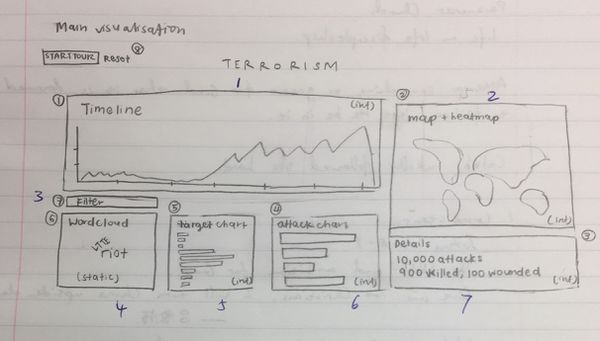
This is our final draft:
End Product
- A webpage of spinning globe with the terrorist attack locations on.
- The dashboard, which includes:
- A line chart as the timeline.
- A heatmap to show the distribution of the terrorism attacks
- A detail box that shows the number of terrorist attacks, number of deaths caused and the number of people injured.
- A country filter using drop-down list.
- A text cloud that shows the most frequent words of the attack motives.
- The horizontal bar chart of the attack targets.
- The horizontal bar chart of the attack methods.
