ISSS608 2016 17T1 Group6 Project Report - Demonstration

| Proposal |
Demonstration
We have two sets of sample test cases with regards to two sets of users - mainstream users and security researchers.
Sample test case 1: Mainstream Users
Users can generally explore the different functions of the dashboard.
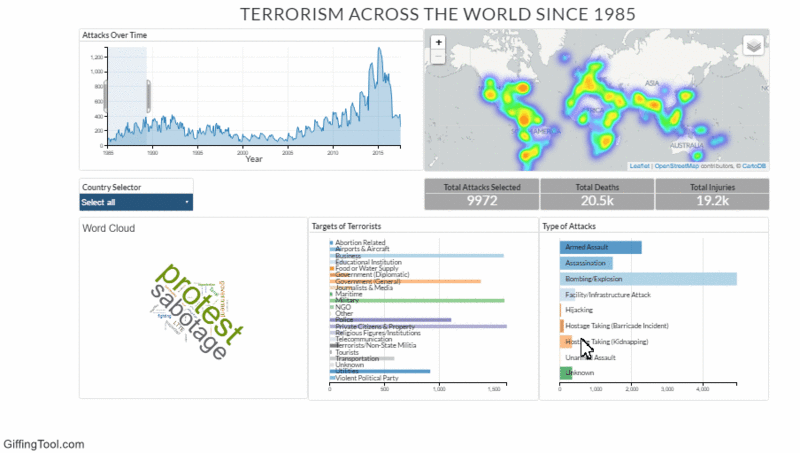
1) View the changes over the timeframe.
If the gif does not load, you can click on the picture to view the original gif.
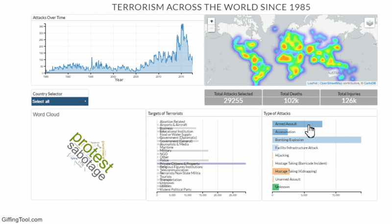
As seen above, when one selects an area on the timeline and drags it across the timeline, the row charts and the heatmap changes. For example, it can be seen that the most popular method that terrorists use to attack has still been bombing/ explosion.
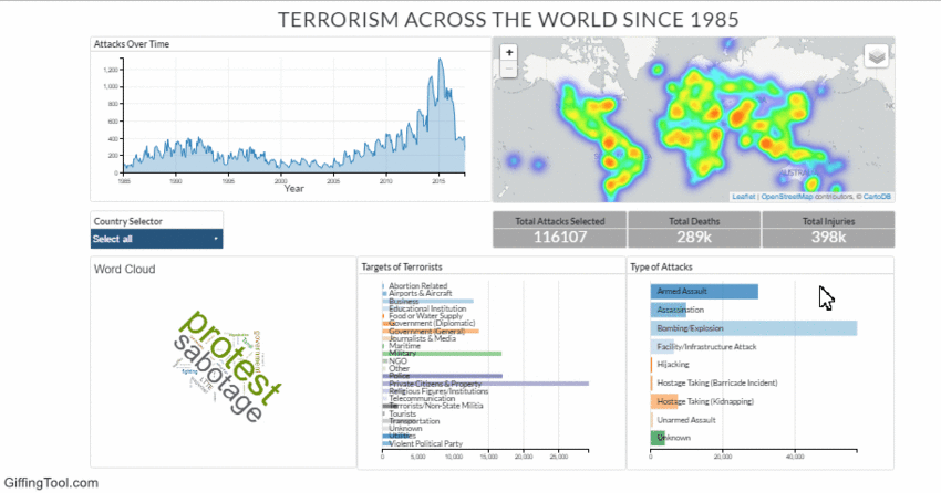
2) View the distribution of each category.
If the gif does not load, you can click on the picture to view the original gif.
Like in the example above, users can click on different categories on the row charts to filter the data, and to view how the distribution changes over the timeline and the map.
Sample test case 2: Security Researchers
The visualisation can help security researchers to zoom into the topics of interest. For example, if they're interested in how a specific type of attack (i.e. bombing attacks) has changed over time, he can zoom in to the specifics to understand the nature of the attack better.
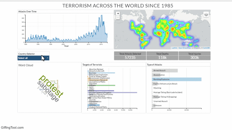
1) View how the nature of the attack has changed over time.
If the gif does not load, you can click on the picture to view the original gif.
For example, the researcher can select an attack category, in this case, bombing/ explosion, and also select a certain area over the timeline and drag it across the timeline, to understand how the geographical distribution, as well as the distribution of the targets changes.
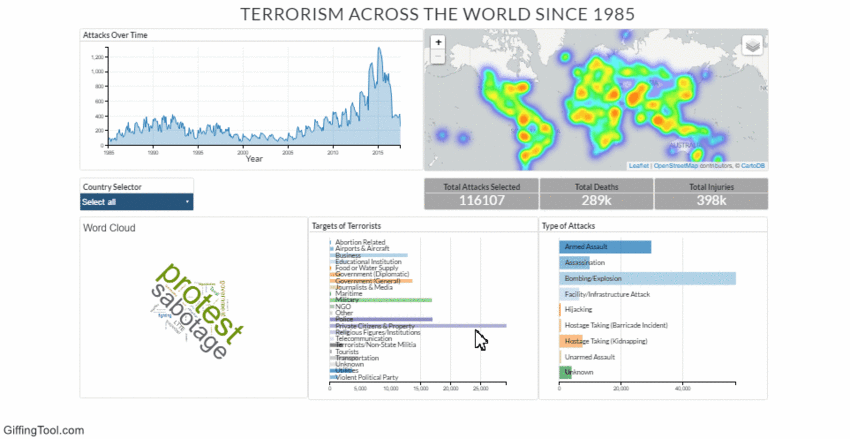
2) View how the nature of targets have changed over time.
If the gif does not load, you can click on the picture to view the original gif.
Researchers who want to protect a certain target group, for example, private citizens and property, can select a target group of their choice, and view the changes in distribution over time, and the kinds of attacks that these target groups receive over time.
3) View how the nature of specific attacks and targets changes over time.
If the gif does not load, you can click on the picture to view the original gif.
If researchers are interested in specific attacks and targets, he can select them from both charts, and view how the timeline and geographical distribution changes.
