ISSS608 2016 17T1 Group6 Proposal

| Proposal |
Contents
Background
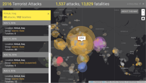
The increase in occurrences in terrorist attacks have been alarming. Just in 2016 so far (as of 12 Nov 2016) there has been 1,537 attacks and 13,829 fatalities. The rise in terrorist attacks could be attributed to the rise of the use of terrorists using social media on the internet, in order to recruit followers and spread their extremist ideologies. For example, ISIS has been known for its ability to maximise its reach by exploiting various social media platforms such as twitter. (Source)
Project Motivation
With this project, we hope to find out the changes in the characteristics of terrorist attacks over time. Also, we would want to verify the relationship between terrorism spread and Internet usage, to find if there is indeed a correlation between the two.
By doing so, we hope to provide strategies in media operations in order to combat the threat of terrorism.
Project Objectives
The main goal of this project would be to provide an interactive online visualisation for users. In this visualisation, users will be able to:
- View the changes in terrorist attacks over time.
- Understand the methods, motive, and the impact of each terrorist attacks and how these have changed over time.
- Observe the relationship between internet usage and the change in the types and targets of terrorist attacks.
Hence, this visualisation will help security agencies and government bodies better plan strategies and policies in combatting the threat of terrorism.
Data Sources
- Global Terrorism Database
- World Bank
Key Technical Challenges
|
Challenges |
Our Approach |
| Unfamiliarity with coding and using d3.js |
|
| Unfamiliarity with usage of visualisations |
|
Timeline
Related Work
|
Related Works |
Learning Points |
| Example 1 Source |
|
| Example 2 Source |
|
| Example 3 Source |
|
Proposed Storyboard
|
Storyboard |
Details |
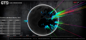
| Home Page | A spinning globe visualisation that allows the user to view the attacks that have occurred around the world since 1985. |
| Main Visualisation | A dashboard containing row charts, a map, timeline, and details. This dashboard will be an interactive one, allowing users to explore the given data set on their own and gain their own understanding. |
Approach
To use d3.js to make an interactive application, that allows users to visualise the changes in terrorist attacks over the years. The interactive application will consist of different visualisation techniques.
The main elements of the application consist of the following:
- Terrorist groups involved
- Types of attacks
- Types of victims
- Number of victims/ causualties
- Countries in which these attacks occurred
- Frequency of attacks
- International or Domestic component
The technique that we will be using are as follows:
- Timeline
- Line Chart: Showing internet penetration globally
- Stacked Bars: Showing number of casualties globally
- Geospatial Map
- Word Cloud
- Cross Filter
References
Using d3:
Integrating d3, dc, and crossfilter:
Integrating leaflet:
- dc.leaflet.js
- Interactive Geospatial using d3, dc
- Leaflet Marker Cluster
- dc leaflet add-ons
- Beer Brewery dc.js example
Others:


