Be Customer Wise or Otherwise - Findings
Interim
Data Collection and Preparation
Merging and Cleaning
GLC provided us with three datasets, namely Metadata, CRM, and Sales, collected over the 12 months of 2008. Metadata contains fields such as ‘Industry Description’ that help to interpret the industry codes used in the other files. The CRM dataset contains information about the accounts, including fields such as ‘New Ac Number’ and ‘Date Opened’. Finally, the Sales dataset contains 2.5 million rows of individual transactions that occurred within the 12 months of 2008. This file contains fields such as ‘Local Revenue’, ‘Destination’, ‘Origin’, ‘Billed Weight’ and ‘Sales Channel’.
Since we require variables from all three datasets, the first step we took was to merge them by joining the tables based on common fields such as ‘New Ac Number’ for the convenience of our subsequent analysis. Thereafter, we derived certain variables that, from our literature review, would be used in our later analysis, such as ‘Date of Last Transaction’ (i.e. Recency), ‘No. of Transactions’ per account (i.e. Frequency) and ‘Total 2008 Revenue’ per account (i.e. Monetary).
The team also removed unnecessary and duplicate fields such as those that, for confidentiality purposes, were given an ‘XXX’ value for all rows.
Missing Data
Finally, we did a missing data analysis to examine how significant the missing data were and decided how to deal with them. A summary can be seen in the table below:
| Variable | Count (Missing) |
|---|---|
| description of activities | 2424057 (95.42%) |
| inbound_contract_code | 2099942 (82.66%) |
| outbound_contract_code | 328756 (12.94%) |
| industry_code_CRM | 265198 (10.44%) |
| site_grouping | 214763 (8.45%) |
| local revenue | 24970 (0.98%) |
| zip_code | 3466 (0.136%) |
With the exception for local revenue, the rest of these fields were not used in our analysis, hence it did not affect our subsequent findings. As for the field 'local revenue', its missing values were actually coming from the accounts that were recorded in the CRM dataset but did not have any sales transaction in 2008 as seen from the Sales dataset. Hence, upon the merger of the data, there were no transaction data for these accounts, and as a result they were reflected in the missing data analysis. These accounts would be excluded from our subsequent analysis and separately reported to our sponsor for further action (e.g. review of the CRM dataset).
Feedback for Missing Data
In addition, based on this huge amount of missing data, we would like to feedback to the management also to find out why these fields are missing. We would like to understand if this indicates potential problems with the data collection process. Having too many missing data is not ideal as we will not be able to make use of the information to gather and analyse potential trends and insights. Moreover, refinement of the data collection system would allow for higher quality of analysis to be done in the future.
Exploratory Data Analysis
Univariate and Bivariate
To start off with our analysis, these are the general analysis gotten from GLC's dataset.
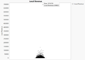
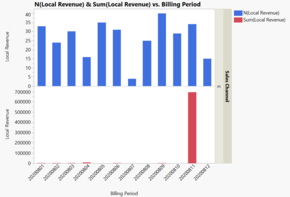
From the boxplot on the right, we noticed an outlier with a revenue of 694,851. Upon closer examination on the account related to this revenue, we plotted out the following bar charts as seen below.
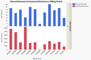
As seen from the bar chart that includes the outlier (left), the account does not display any abnormal activity besides the outlier point. The frequency of transaction for this account fluctuates quite randomly. As seen from the graph of local revenue by months (left bottom), the extremely high revenue in November 2008 is caused by the outlier. The bar chart that excludes the outlier (right) does not show any unusual patterns, and fluctuates rather randomly just as with the frequency of transactions. As such, the team concluded that the outlier may be an erroneous entry, and it would be excluded for our subsequent analysis.
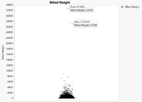
From the boxplot on the left, there are two outliers, billed weight of 27,200 and 32,476. The transaction with the billed weight of 27,200 is actually the previous outlier transaction with revenue of 694,851, which we have decided to exclude for subsequent analysis. For the outlier of billed weight 32,476, as the revenue of that transaction is 63,003, the team felt that this is still reasonable. Furthermore, as our focus was more on revenue, we left the data point as it is.
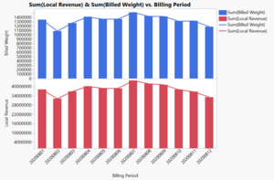
From the graph on the right, the sum of the billed weight and that of the local revenue follow the same trend over the 12 months in 2008. Thus, the team will be using 'local revenue' as an estimate of the billed weight for our subsequent analysis when needed.
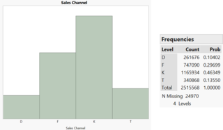
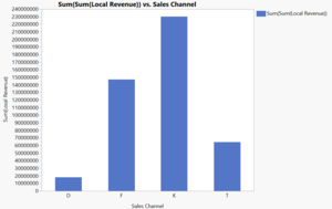
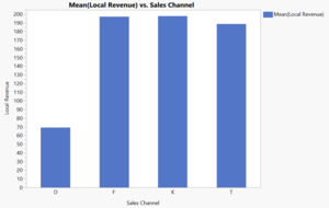
As seen from the histogram above (left), Channel K has the most number of transactions with almost 50% of the total number of transactions, followed by F, T, and D. The distribution of sum of revenue over the four different sales channels (center) follows closely the pattern given by the number of transactions of each sales channel. From the bar chart on the right, we can say that for each transaction, Channel F is almost as profitable as Channel K. Only Channel D is significantly less profitable comparatively.
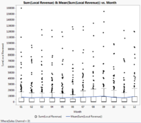
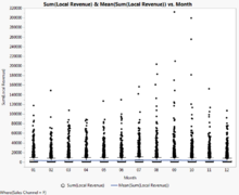
From the overview of the boxplot graphs of the monthly revenue per account for each sales channel, it is seen that the distribution of the accounts’ monthly revenue for Sales Channel D is the most dispersed out of the four sales channel, whereas the most concentrated one would be Sales Channel T with only a few outliers. Sales Channel F and K also generally have more concentrated distributions. As for the mean, Sales Channel D, F, K and T have the mean of 8400, 3900, 11,000 and 900 respectively. Sales Channel K seems to have accounts with the highest monetary values.
As seen from the bar chart on the left, majority of the accounts use only 1 sales channel and a minimal number of accounts use 2 sales channels. There are no accounts which use more than 2 channels.
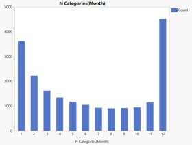
The bar chart on the right shows the frequency of accounts which made transactions throughout the year (number of months). The graph shows that the highest number of accounts making transactions are in 1 and 12, with 12 having 4,535 accounts. This means that there are 4,535 accounts which have transactions throughout the 12 months of the year in 2008 and the second highest result would mean that there are also a fair bit of customers who only made transactions within a month throughout the whole year.
The Pareto Chart of the sum of revenue for individual accounts is sorted in descending order (from the highest revenue on the left to the lowest on the right). This shows that the highest valued accounts are contributing a very significant portion of the total revenue of the company in 2008. This would be further elaborated in the next section.
Binning
After conducting the initial univariate and bivariate exploratory data analysis, the team then proceeded to bin the customers. The rationale for this was to make the customer rather than each transaction the base of the analysis as our ultimate goal is to develop customer profiles.
We decided to bin the customers according to quintiles based on their total revenue spent over the course of 2008. Choosing to segregate the accounts into 5 bins was to align our subsequent analysis with the literature review that revealed that RFM is traditionally applied to 5 segments.
The resulting bins are as follows:
- Less than $492.60
- $492.60 - $15820
- $1582 - $4505.80
- $4505.80 - $14,898.80
- More than $14,898.80
From the Pareto chart, the team observed that the top 20% of customers (that spent more than $14,898.80 in 2008) account for more than 80% of the total revenue earned. Evidently, this group comprises the highest value customers.
Zero Revenue Transactions
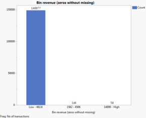
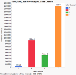
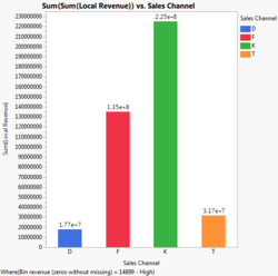
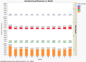
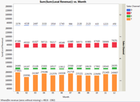
In doing the binning, we noticed that there were 581 rows that were recorded as having zero revenue transactions by month, for individual accounts. In order to decide whether or not to include these transactions when doing the binning, we ran the interactive binning twice: one with the zero revenue transactions, and one without.
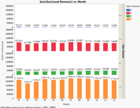
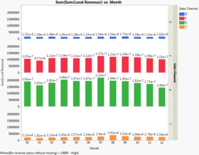
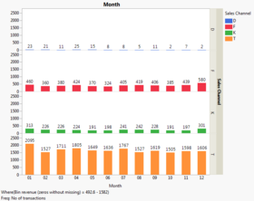
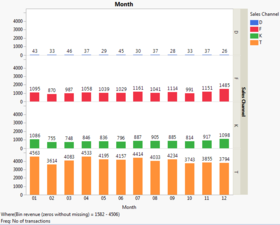
The results of these iterations are shown in figure above. We can see that including the transactions does not make much of a difference to the cut-offs of each bin, i.e. the ranges are not greatly affected. Furthermore, the team has decided that we would want to calculate certain metrics that relied on the total number of transactions, such as average revenue per transaction for each account. In such a case, to exclude transactions that occurred despite there being no revenue would skew these calculations. Hence, we decided to include zero revenue transactions in our analysis.
Despite this decision, the team recognises the importance of understanding the situations in which such transactions arise. Moreover, in each of these rows, the number of transactions accumulated for the month for each individual account ranges from 1 to as many as around 2000, all amounting to zero revenue. Therefore, the team has decided to further analyse the circumstances under which such transactions arise and which customers are involved.
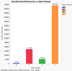
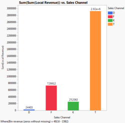
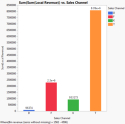
From the breakdown graph on the left, we can see that an overwhelming proportion of the zero revenue transactions are done through channel D. As we will elaborate later, channel D is not used very frequently overall, so this is a characteristic unique to zero revenue transactions.
One hypothesis we had to account for these zero revenue transactions was that they could have been extended to high-paying customers as a goodwill gesture. However, from the graph on the right, we can see that this is not the case. An overwhelming majority of accounts that were involved in these transactions belonged to accounts in the ‘Less than $492.60’ bin, with only 3 accounts falling within the middle $1582 - $4505.80 bin, and a single account in the highest ‘More than $14,898.80’ bin. With this knowledge, our hypothesis has been disproved and we need to rely on our client, GLC, to enlighten us onto the rationale for this proliferation of zero revenue transactions.
Bin Analysis
Revenue by Sales Channel for Each Bin
As can be seen from above, 4 out of the 5 bins follow a similar trend with Sales Channel T accounting for most of the revenue within each bin. The exception is the bin with the top 20% of accounts, that instead relies most heavily on Sales Channel K. As this group rakes in the most revenue across bins by far, Sales Channel K’s importance cannot be easily dismissed.
Monthly Revenue by Sales Channel for Each Bin
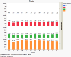
Looking at the distribution of the monthly revenue by sales channel throughout the year, we can observe the various fluctuations across the different bins and channels. There seems to be more revenue generated in the month of January for the lower three quintiles in general and more revenue generated in the month of July for the upper two quintiles. A comparison of the graphs will be done in the following section.
Total Monthly Transactions per Sales Channel by Bin
Comparing the above graphs with the ones from 'Monthly Revenue by Sales Channel for Each Bin', the team observed a high volume of transactions by Sales Channel D for accounts that fall in the lowest bin in the figures above, despite the figures from the 'Monthly Revenue by Sales Channel for Each Bin' showing that this channel is not a major revenue source.
To reconcile this discovery, we then looked at a derived variable, Average Revenue per Transaction, to examine the efficiency of different bins to generate more revenue from fewer transactions.
Average Revenue per Transaction of Each Bin
From the boxplot diagram above, we can see that the spread of mean revenue per transaction increases from the bottom 20% of accounts to the top 20%. This is reasonable due to the way the cut-off points for each bin is structured. More interestingly, from the bar graph, we can see that the mean revenue per transaction increases from the lowest bin to the highest. This means that customers that fall into the higher bins are not simply generating more revenue due to a larger volume of transactions. Instead, they are actually making transactions that are worth more in terms of revenue.
Number of Unique Accounts by Sales Channel per Bin
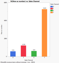
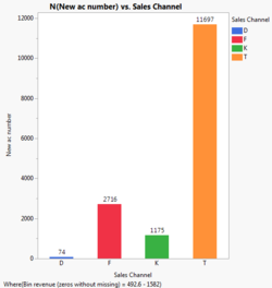
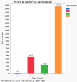
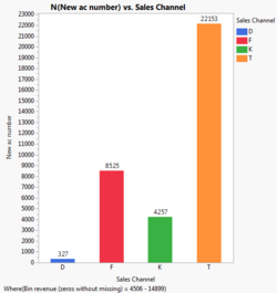
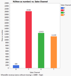
The final component of our EDA looks at the number of unique accounts by sales channel within each of the bins. One interesting observation is that for the highest value customers, most accounts used Sales Channel F. However, this had not shown up in prior analysis regarding transactions and revenues. This implies that there is a significant number of accounts within the ‘More than $14,898.80’ bin that do not make a high volume of transactions very frequently, particularly using Sales Channel F.
Finals
Data Preparation and Exploration
Merging and Cleaning
Missing Data
Derived Variables
