ANLY482 AY2017-18T2 Group03 Data Analysis
| HOME | ABOUT US | PROJECT OVERVIEW | DATA ANALYSIS | PROJECT MANAGEMENT | DOCUMENTATION | MAIN PAGE |
| Previous | Current |
|---|
Contents
Methodology
In this section, we will explain the methodology which our team plan to implement to perform analysis on the data provided by our sponsor.
We will be using Python for Exploratory Data Analysis (EDA) to better understand the dataset given and its characteristics. As part of data preprocessing, our team will be performing the following steps to obtain a clean dataset. These steps will eventually be converted into a script which will be used to clean the data file that is uploaded into the dashboard which we will develop for our sponsor.
Data Preprocessing
With every new dataset, we first must clean the data to remove irrelevant data that should not be included in our analysis. For data cleaning, the steps include:
- Handling missing values. If there are missing values in a row of record, the entire row will be excluded because it will be inaccurate to include it.
- Handling duplicate data. Duplicate data could occur when the employees double scan the barcode upon inbound of goods. Similarly, in the event of duplicate data, we will remove the entire row as well.
- Resolving redundancies caused by data integration.
With the clean dataset, we will proceed to further explore the data and find out potential visualizations and analysis that can be done with the dataset to provide a more in-depth analysis and dashboard that will be useful for our sponsor.
| S/N | Data Cleaning Steps | Justification & Rationale |
|---|---|---|
| 1 | ... | ... |
Exploratory Data Analysis
Inbound Report
The following few diagrams show the basic summary statistics for the Inbound Report for the years 2015 to 2017.
1. Year 2015 Summary Statistics

2. Year 2016 Summary Statistics

3. Year 2017 Summary Statistics

As we are also looking at the data from October 2016 to December 2017 only, since there was a change in the warehouse and the way LocName was stored, we also did the summary statistics for Before October 2016 and for October 2016 onwards. This is so that we can do a comparison, if need be, for the old warehouse compared to the new warehouse.
1. Before October 2016 Summary Statistics

2. October 2016 onwards Summary Statistics

We also conducted Exploratory Data Analysis on the Inbound dataset.
The chart below shows the GRN Date vs GRN Post Date. This represents the time difference between GRN Post Date and GRN Date and refers to the time taken to scan all the inbound goods. The average duration taken is 1.42 hours to complete the scanning. Also, we see that the peaks for each year is different. For 2015, the peak is in August. For 2016, the peak is in July and for 2017, the peak is in April.
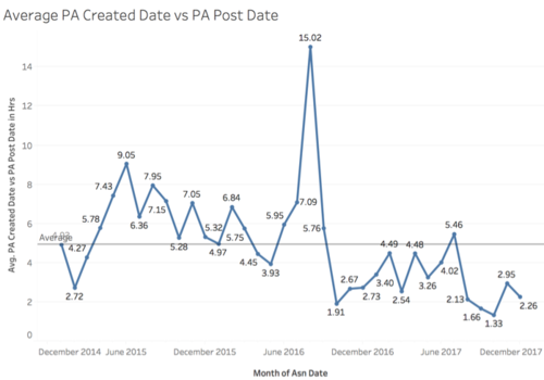
The chart below shows the average duration for the entire putaway process, which is calculated by taking the difference between PA Created Date and PA Post Date. Again, we see a spike on August 2016 with a duration of 15.02 hours while the average time taken was only 5 hours.
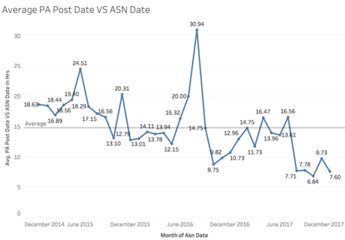
The time difference between the PA Post Date and ASN Date refers to the total time spent from the generation of customer order to the completion of inventory putaway process. This is also the measurement used by the company for their KPI, which is to complete this process within 1 working day. However, we see that on average, in June 2015 and August 2016, they did not seem to hit their KPI. This is especially so for August 2016, where we see that there is a spike of 30.94 hours taken to complete the entire process. It is an interesting insight that for most parts of the process, the peak is in August 2016.
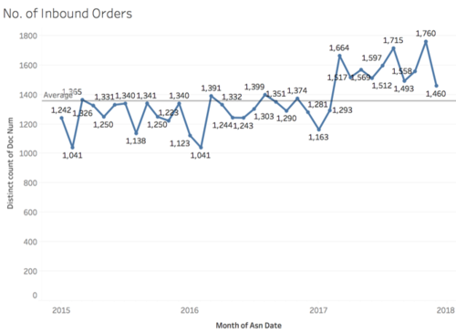
This chart shows the number of inbound orders over the years. We can see that in 2017, the average number of orders appear to be much higher than in 2015 and 2016 which shows that the business has been growing.
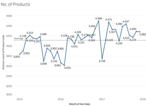
The chart below shows the number of distinct products ordered by the client over the years. It seems like that is no specific trend over the years. Further analysis can be done on the specific product codes after we find out whether they belong to category A, B or C.
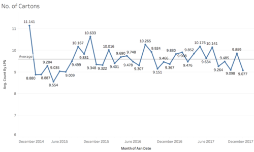
The chart below shows the average number of cartons inbound per month/year. The number of cartons for a product gives us an understanding on how important a product. We see that in January 2015, the inbound number of cartons is very high at 11,141. Also, the number of cartons inflow is below average for every March and December from 2015 to 2017.
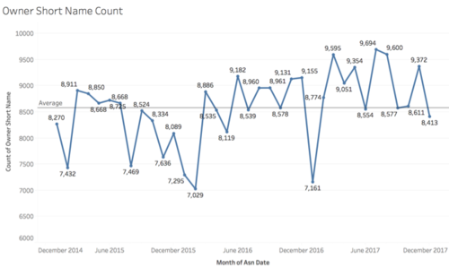
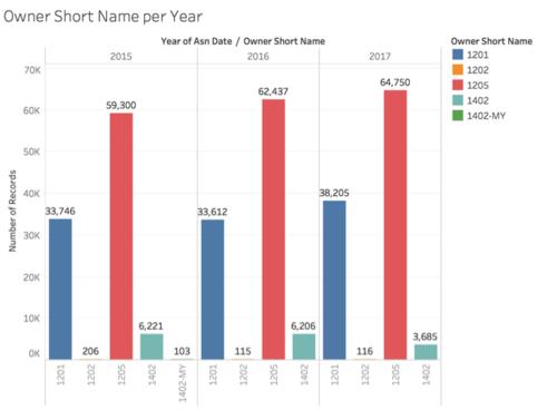
The chart below shows the owner short name count over the year.
There are only 4 to 5 unique owner short names in the Inbound dataset. For the top 2 owner short names, there is an increasing number of records from 2015 to 2017. More interestingly, we see that the owner short name ‘1402-MY’ only has 103 records in 2015 and after which, it does not have any more records.
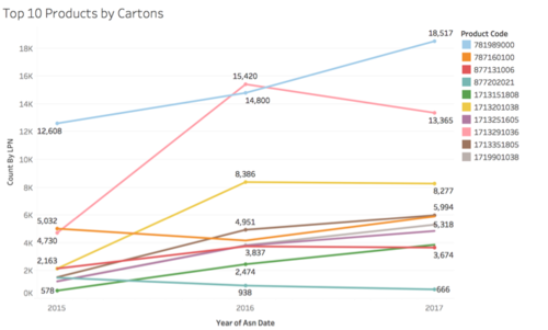
As there are over 15,000 different unique products, we have shortlisted the top 10 products based on their inbound volume by number of cartons. This is shown in the chart below. In general, we see that there is an increasing trend over the years. However, interestingly, there was a huge increase in the number of cartons for product code 1713291036 (represented by a pink line below) from 2015 to 2016.
Outbound Report
...


