ANLY482 AY2017-18 T2 Group 05 Project Findings
| Mid-Term | Finals |
|
|---|
Data Exploration
Due to the sensitivity of the data, please refer to the interim report for more details.
We have identified the top merchants in terms of total number of approved transactions, and approved transaction monetary value.
General Descriptive Statistics
Moving on, we also find out the top merchants contributing to the other types of transaction in each bin.
One Way Anova
As shown in Figure 6a, there are significant difference between the mean number of transactions per merchant for each bin
- e.g. Bin 1: average 3 transactions per merchant, Bin 2: average 25 transactions per merchant, Bin 3: average 135 transactions per merchant, Bin 4: average 714 transactions per merchant and as expected, Bin 5: average 30818 transactions per merchant.
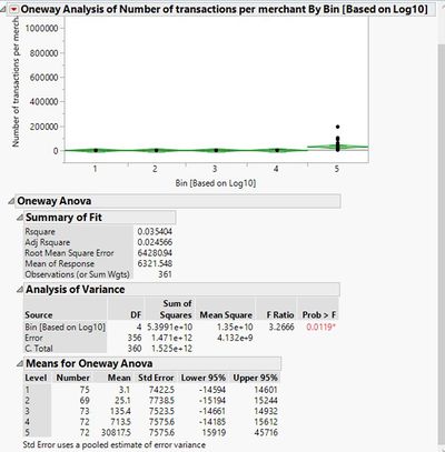
Figure 6a: Oneway Anova Analysis of Number of Transactions per merchant by bins
However, in Figure 6b, while there is a significant difference between the mean transaction monetary value among the 5 different bins, interestingly, we note that Bin 5 does not has the highest mean transaction monetary value (only $96.34). In fact, Bin 1 has the highest mean transaction monetary value of $3124.43.
This means that while Bin 5 consist of merchants with the highest volume of transactions, they are not necessarily the most valuable group of merchants. Moving forward, RDP will provide the total revenue it earns from each merchant, and we will create interactive binning and Line of Fit graphs again to identify the top merchants most valuable to RDP.
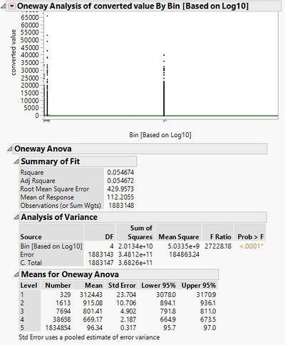
Figure 6b: Oneway Anova Analysis of ‘converted value’ by bins
Line of Fit
As mentioned under ‘Objectives’, we want to visualise and compare the performance among merchants in the same bin. Initially, we wanted to use funnel plot to perform this visualisation. Funnel plots are a form of scatter plot in which number of approved transactions per merchant are plotted against number of transactions per merchant. Control limits, similar to confidence limits are then overlaid on the scatter plot. The control limits represent the expected variation in number of approved transactions assuming that the only source of variation is stochastic. Thus, those who lie outside of the control limits would allow us to identify the star and laggard merchants in the same bin.
However, we were unable to obtain proper model fit for the funnel plots for each bin, as seen in the example under Figure 7, where we plot the funnel plot for Bin/Group 5.
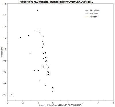
Figure 7: Funnel plot for Bin/Group 5s
Thus, we decided to use Line of Fit graphs instead. We plot the Line of Fit graphs for each bin, by comparing the number of approved transactions per merchant against total transaction per merchant in that bin. As shown in Line of Fit graphs in Figure 8a to 8e, we were able to get more proper model fit, and realised that merchants that lie outside the confidence interval can be grouped into over-performing (star) and under-performing (laggard) merchants. These merchants can be identified using the JMP’s brush tool. Merchants that fall above the confidence interval and regression line are identified as star merchants. Our client should focus on identifying factors that have led to the higher than average approved transaction rates of the star merchants. Merchants that fall below the confidence interval and regression line are identified as laggard merchants.
Merchants who lie within the confidence interval (blue shaded area) follow a stochastic trend and will not be analysed. In addition, we realised that the Line of Fit graph for Bin 1 does not provide a good model fit for analysis. Thus, the Line of Fit graph for Bin 1 will also not be analysed.
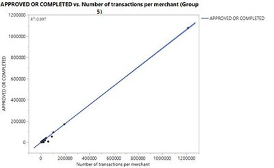
Figure 8a: Group 5 Line of Fit Graph
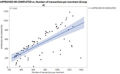
Figure 8b: Group 4 Line of Fit Graph
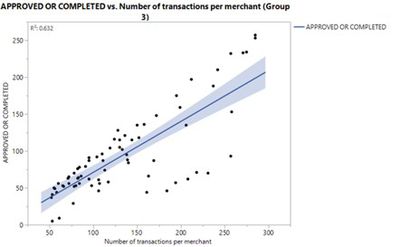
Figure 8c: Group 3 Line of Fit Graph
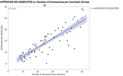
Figure 8d: Group 2 Line of Fit Graph
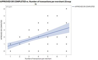
Figure 8e: Group 1 Line of Fit Graph
While we have identified laggard merchants from Line of Fit graphs, we should also set individual benchmarks for each merchant. Based on each merchant’s volume of transactions, we will identify the respective average number of approved transactions they should have in order to be within the confidence level. Thus, our client can highlight how each individual laggard merchant compares to other merchants within the same bin and set benchmarks based on the regression line. This will motivate merchants to improve their own performance.
Time Series Analysis
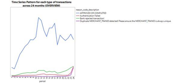
Figure 9a: Time Series Pattern for each type of transaction across 24 months
Based on the time-series graph in Figure 9a, we realised that the number of approved transactions increased drastically in the year of 2016, and generally decreased in the year of 2017. Nevertheless, we notice that the number of approved transactions are subjected to great fluctuation in 2017.
In addition, we notice that there is an increasing number of rejected transactions towards the end of 2017. This could demonstrate a potential problem for RDP, as it would mean a decrease in RDP commission/increase in opportunity cost with an increase in rejected transactions.
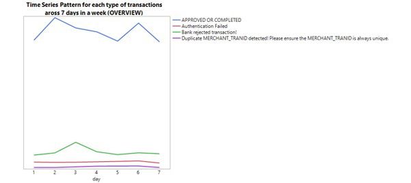
Figure 9b: Time Series Pattern for each type of transaction across 7 days in a week
Based on the time-series graph in Figure 9b, we also realised that approved transaction tend to peak on the Tuesday and Saturday of a week. On the other hand, rejected transaction tend to peak on Wednesday. There is no distinct relationship between authentication failed/duplicate merchant_train ID transactions and the day of the week.
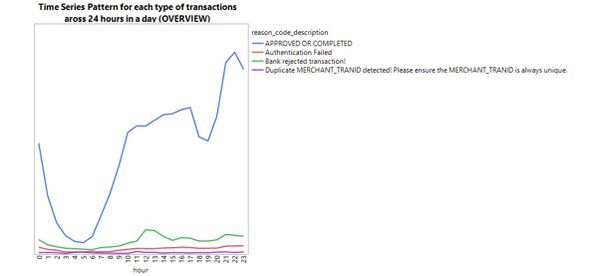
Figure 9c: Time Series Pattern for each type of transaction across 24 hours in a day
Based on the time-series graph in Figure 9c, we realised that approved transaction tend to rise from 6am onwards. Un contrast to our initial prediction that approved transaction will peak after working hours from 5-7pm, approved transaction actually drop during these hours. Insead, it rises from 7pm onwards. This could mean that merchants’ customers would usually transact at night/using home PC.
Moving Forward
After the interim presentation and this report submission, are looking to complete the following:
Merchant Categorisation Codes (MCC): To add a new column called “Merchant Categorisation Code (MCC)” into our data, that will categorise each merchant into a specific industry. This allows us to derive better analysis in terms of the common industries that star or laggard merchants belong to.
Remove Duplicated Merchants: There are certain merchants whose names are duplicated in various forms - e.g. City Harvest Church v.s. City Harvest Church (Virtual Terminal) actually belong to the same merchant. Our client hope to remove the duplicated names, so that each merchant name in our data is unique and belong to only one merchant.
Time Series Clustering: We can further cluster star or laggard merchants based on their time series patterns, through the use of time series clustering. This allows us to identify clusters with time series patterns that resemble the overall trends we have observed in our time series analysis so far. Through this method, we hope to better identify the characteristics of merchants who tend to lead the overall trends in approved/rejected transactions rates.
Visual Dashboard: Aid in understanding some of our client’s current business issues, as well as the benchmark metrics and attributes that the company may not be currently analysing.