ANLY482 AY2017-18 T2 Group 05 Project Findings
| Initial Data Exploration and Analysis | Deeper Data Exploration and Analysis | Setting Benchmarks for Merchant Performance | Limitations | Implications |
|---|
Using JMP Graph Builder, we plotted the total number of transactions against months of 2016-2017 (e.g. January 2016 coded as period ‘1’, January 2017 coded as period ‘13’)
From Figure 5, we discovered a sharp increase in number of approved transactions processed during the from January to October 2016. After that, there was an overall decrease in number of approved transactions, with sudden dips in November to December 2016, and April to May 2017. Additionally, the number of rejected transactions has been increasing towards the end of 2017. This signals potential issues, and exploratory analysis was conducted to assess performance of merchants contributing to the less optimistic trends towards end of 2017.
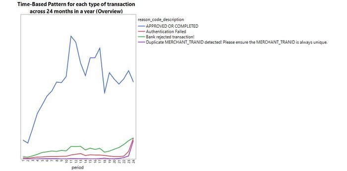
Figure 5: Time-based pattern for each type of transaction across 24 months
FUNNEL PLOT
We used funnel plots to assess the performance of merchants in terms of their number of approved transactions. Even though this is not a built-in feature on JMP Pro, Wolfe has created an add-in accessible via JMP’s user community, seen in Figure 6.
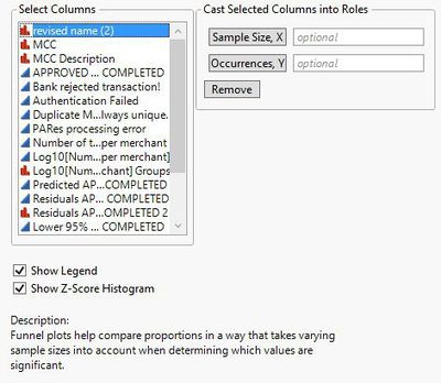
Figure 6: JMP Pro Funnel Plot Plug-in
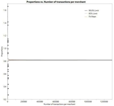
Figure 7: Proportion of approved transactions in bin 5
Figure 7 shows the proportion of approved transactions out of total number of transactions from 2016-2017 in bin 5. The fit mean line depicts the predicted number of approved transactions for each merchant, based on their number of transactions. Merchants that lie outside of the 95% and 99.8% control limits can be segregated into two groups - Star merchants (performing better than predicted in terms of number of approved transactions) and Laggard merchants (performing worse than predicted). However, as can be seen, we were unable to obtain a proper model fit to derive any meaningful insights. The result was the same even after using Johnson SI transformation to transform the data, to makes the distribution of variables less skewed (as seen in Figure 8 and Figure 9).
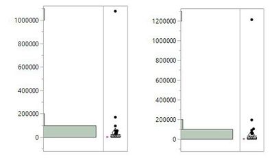
Figure 8: Distribution of approved transactions per merchant (left) and distribution of all total transactions per merchant before transformation (right)
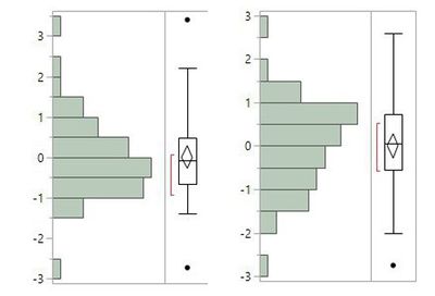
Figure 9: Distribution of approved transactions per merchant (left) and distribution of all total transactions per merchant after transformation (right)
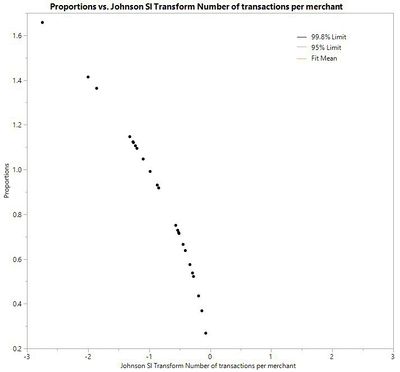
Figure 10: Proportion of approved transactions in bin 5
As seen in Figure 10, we were still unable to obtain a proper model fit. This issue applies to the rest of the bins, and as such, a hybrid approach was adopted.
HYBRID APPROACH
This section explains the hybrid approach; merging the characteristics of funnel plots with the line of best-fit graphs in identifying outliers.
By using JMP Graph Builder, the number of approved transactions was plotted against the total number of transactions, mapped by merchants. The line of best-fit graph provides the predicted number of approved transactions for each merchant, based on total number of transactions. Similar to a funnel plot, the line of best-fit graph has a confidence interval set at 95%. This allows us to be 95% confident that the two confidence bands (blue shaded regions) encloses the true best-fit linear regression line.
Merchants who lie within the confidence interval follow a stochastic trend and will not be analysed. Merchants outside of the confidence interval are categorised into star and laggard merchants.
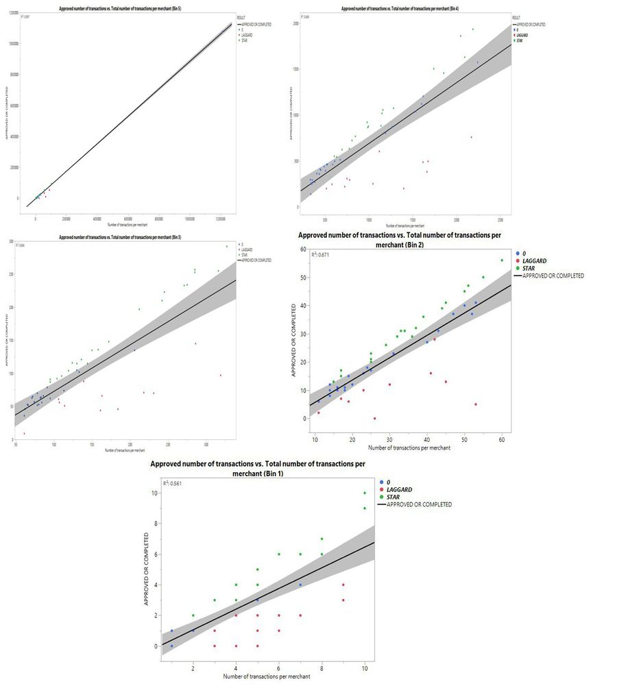
Figure 11: Visualization of hybrid approach for all bins
Figure 11 depicts the line of best fit graphs for Bin 1 to Bin 5, plotting the number of approved transactions per merchant against number of transactions per merchant through the two years. From the positive gradients of the line of best-fit graphs, we establish that as the number of transactions increases, the number of approved transactions also increases (positive correlation). Data points in green are identified as the star merchants, while data points in red are the laggards.
We used MCC to identify the most common industry sectors that these merchants belonged to. The table below depicts a summary of the star and laggard merchants in each bin.
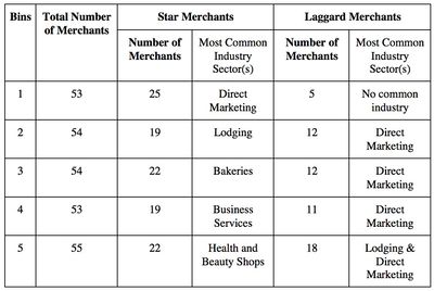
Figure 12: Summary table for star and laggard merchants