ANLY482 AY2017-18 T1 Group03/Final Progress
| Home | About Us | Project Overview | Midterm Progress | Final Progress | Project Management | Documentation |
1.1 Data Collection
There were 6 main files sent to us by client out of which 5 of them have been extensively used. For our research, we obtained a full year data of 2016 and 2017 data till August.
| File Name (Edited for confidentiality) | Description | Number of Rows |
|---|---|---|
| Customer Interaction | Information on interaction details | ~213,000(FTF) & ~421,000(PW) |
| Employee File | Information on employee teams | ~2000 |
| Customer (Organisations) | Information on healthcare organisations | ~117,000 |
| Customer (non-Organisation) | Information on healthcare professionals | ~205,000 |
| Invoice | Information on transactions | ~9,000,000 |
1.2 Tools Used
Our research has extensively used SAS JMP Pro 13 for data cleaning and transformation and for confirmatory analysis because of its intuitive system and simplistic approach. During the initial period, there has been considerable usage of Tableau Software for exploratory data analysis because of its easy visualisations for understanding the data.
1.3 Data Cleaning & Transformation
1.3.1 Files Required for Cleaning & Transformation
| File Name (Edited for confidentiality) | Description |
|---|---|
| Customer Interaction (Type A) | This file contains information about face-to-face interactions that the client has done with the customers. We have included information such as customer code and allocated duration (i.e to remove double counting of duration issue in the original file) in the file. |
| Customer Interaction (Type B) | This file contains information about phone web interactions that the client has done with the customers. We have included customer code in the file. |
| Clean Invoice (2015-2017) | This file contains information about sales invoices that occurred between 2015 to the latest month in 2017. We have previously cleaned and mapped in Therapy Area to the file. |
1.3.2 Customer Interaction
We have performed a summary function for both Customer 360 (F2F) and Customer 360 (Phone Web) based on each product code sold and total interaction duration to each customer on a monthly basis.
Essentially, the summarized files will show us that per month, how many interactions were made and how much time were spent to sell a product to each customer. The N counts that appear in each file represents interaction counts for face-to-face (F2F Interaction Count) and phone web (Call Count) interactions. We have saved both files as Summarized Customer 360 (F2F) and Summarized Customer 360 (PW).
1.3.3 Invoice File
We performed a summary function for the invoice file to extract out relevant information for us to analyse sales and to eventually link the summarized file to interaction files. Essentially, we summarized the invoice based on products sold to individual customer and how much revenue was earned per month. We also classified the products sold by their therapy areas, which distribution channel was used to sell the products, and the sales representative who was involved in making the sales. We have saved the summarized file as Summarized Invoice.
1.3.4 Linking both files
We used the update function to pull in interaction details from both summarized Customer 360 files into the summarized invoice file, using date of invoice and interaction as a linking point.
The purpose of doing this was that we could not find a direct linkage between customer interactions and sales invoice. To close a sales invoice, there could be multiple interactions done before the customer decides to buy a product. Therefore, we have chosen this method to account for the number of interactions done per month and tie that to sales invoices per month based on customer code and product code.
We will then have information about sales and interaction to each customer by a particular product the company made sales to. The file was saved as temporarily as Invoice Interaction.
1.3.5 Cleaning up Invoice Interaction
With the new file on hand, we have renamed both N rows for face-to-face interactions and phone web interactions to F2F Interaction Count and Call Count respectively. We then recoded missing value in F2F Interaction Count and Call Count columns with “0”. There were sales transactions done that did not contain both face-to-face and phone web interactions. As our objective was to analyze sales based on interactions, we have decided to remove those transactions that do not contain any interactions.
1.3.6 Standardizing Invoice Interaction file data
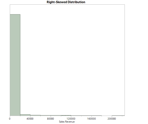
Before we came up with statistical model to analyze sales and interaction, we first checked if the data in the total sales amount (i.e Sum(Amount$)) contained a normal distribution. Initial analysis by running a distribution check indicated that the total sales amount was right-skewed as shown below.
| Mean | 2172.2607 | Std Dev | 8785.3315 | Std Err Mean | 78.534427 | Upper 95% Mean | 2326.2002 |
| N | 12514 | Median | 515 | Mode | 173.55 | Lower 95% Mean | 2018.3211 |
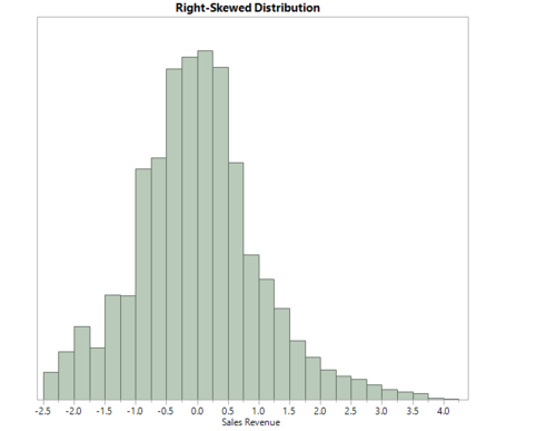
We had transform such data into normal distribution so that robust parametric tests can be applied for our analysis. By performing data transformation, it will be easier for us to do comparisons and interpretations of results. With the help of JMP Pro software, we were able to identify the best transformation test for the sales amount by using the Johnson Su test as shown below:
| Mean | -6.53e-17 | Std Dev | 1.00004 | Std Err Mean | 0.0089396 | Upper 95% Mean | 0.017523 |
| N | 12514 | Median | -0.029004 | Mode | -0.99218 | Lower 95% Mean | -0.017523 |
The results above showed us that the transformed sales amount is now more normally distributed. Therefore, we created a new column for the transformed sales amount as Johnson Su Transform Sum(Amount$).
1.3.7 Binning of interaction counts
According to client’s requirement, the binning of interaction counts for both face-to-face and phone web interactions should be as follows:
- 1) Low: 0 – 1 interactions
- 2) Medium: 2 – 3 interactions
- 3) High: 4 interactions and above
Thus, we used the interactive binning function to bin up the interaction counts into their respective bins and created new columns for them as Call Count Groups and F2F Interaction Groups. With the new updated Invoice Interaction file, we have extracted out 2016 and 2017 data using the “Filter” function and saved them separately as Invoice Interaction (2016) and Invoice Interaction (2017).
1.4 Data Analysis
1.4.1 Exploratory Data Analysis
As we had substantial amount of dataset, our initial period was mainly based on data cleaning and analysing each file. Tableau was mainly used for visualisation purposes where we simulated different graphs by choosing different parameters to better understand the data. Tree-maps, Bar charts, Histograms were mainly used for visualisation purposes as we had a mixture of categorical and continuous variables in our dataset.
1.4.2 Confirmatory Data Analysis
The 2 main independent variables for our analysis are the two-different interaction counts: Call Count and F2F Interaction Count. Both variables are of ordinal type and after binning our interaction counts, the variable type changed to nominal. Our dependent variable is the sales revenue: Johnson Su Transform Sum(Amount$) which is of continuous nature.
Given the nature of the variables, we decided to run One-way Analysis or ANOVA (Analysis of Variance) test to check for sensitivity in each stage of our analysis. The null hypothesis for ANOVA is that the difference in group means equals to 0 while rejecting the null hypothesis means that the difference in group means is not equal to 0. As ANOVA test only tells us if the results are significant or not, we later run a post-hoc test called Tukey HSD (Tukey’s Honest Significant Difference) test to find out which specific group’s means (compared to each other) is different or also a between group comparison for the different levels of interactions. The null hypothesis of Tukey HSD states that the two or more group means should be equal while rejecting the null hypothesis means that the two or more group means are not equal. Tukey HSD test should only be used after rejecting the null hypothesis of ANOVA.
This step is further verified by a non-parametric test called Wilcoxon’s test which statistically compares the means of the different levels of interactions and assesses for significant differences. As it doesn’t require a normal distribution of the dependent variable, it helps us to cross verify our results against the Tukey HSD’s test. We also use another non-parametric test called Moods Median test when there are significant outliers in our sample. The Median test compares the medians of the different levels of interactions and this is essentially helpful when the sample size as heavy outliers which might alter our results from our previous tests.
After running each of the tests, we further streamline our sample data through channels to get even more accurate analysis on the sensitivity of each product. We follow similar procedures mentioned above to get the results.
2.1 Distribution of Revenue
Since the objective of our analysis is to determine the drivers behind GSK’s sales revenue, it is essential to understand how sales revenue is currently distributed within the entity. Thus, before conducting statistical analysis on the data, we performed exploratory data analysis to derive insights about the distribution of GSK’s sales revenue. We used Tableau, an intelligent software that allows data to be transformed into actionable insights via data visualization. In addition, Tableau will allow us to create dashboards and enable us to share our findings with the client.
We used “Invoice Interaction” as our Data Source in Tableau and started analysing the data by channels and therapy areas for a general overview of the distribution. For this, we used a tree-map, which is ideal for displaying large amounts hierarchically structured data.
The size of the rectangles in the tree-map represents the amount of sales revenue each channel generates GSK. We have also used colour to represent the sales quantity of each rectangle. The darker the shade, the higher the quantity of sales. Each channel is broken down to the therapy areas contributing to the channel’s revenue.
We observed that Restructured Hospital, General Practitioner, and Specialist are the top 3 channels that generate the most sales amount for the company. Further analysis also shows that most of Restructured Hospital’s purchases are CNS and HIV products, most of the General Practitioner’s purchases are Anti Infective products and most of the Specialist’s purchases are Paediatric Vaccine products.
2.2 Pareto Analysis of Revenue
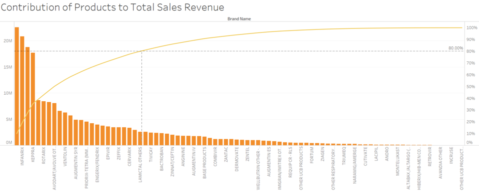
Next, to decide which products to focus on for further analysis, we studied the contribution of each product total sales revenue. For this visualisation, we used a Pareto chart, a chart that contains both bars and a line graph.
The left vertical axis represents the sales revenue generated by each product, while the right vertical axis is the cumulative percentage of the total sales revenue. The individual sales revenue of each product is represented in descending order by bars with the cumulative total represented by the line. The purpose of the Pareto chart is to highlight products that are the highest contributors to GSK’s sales revenue. We filtered out the top products that make up 80% of total sales revenue. This is marked out by the dotted reference line on the graph shown above:


