Qui Vivra Verra - Data Exploration
The team has performed exploratory data analysis and highlighted some anomalies as listed:
- Anomaly 1
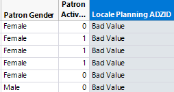
In the 2013 Patron Dataset, 2.534% of all records have Locale Planning ADZID set to “Bad Value” and “Missing Value”. In the 2013 Patron Dataset, 2.876% of all records have Locale Planning ADZID set to “Bad Value” and “Missing Value”. A snapshot of the anomaly is as shown below.
- Anomaly 2
In the 2013 Transaction Dataset, 19,828 records have Patron_UID set to ‘0’. In the 2014 Transaction Dataset, 641 records have Patron_UID set to ‘0’. A snapshot of the anomaly is as shown below. A snapshot of the anomaly is as shown below.
- Anomaly 3
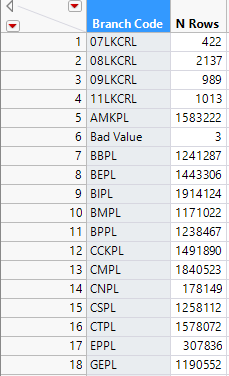
In the 2013 Transaction Dataset, 3 records have Branch Code set to “Bad Value” and 3,065 records set to “Missing Value”. In the 2014 Transaction Dataset, 9,467 records have Branch Code set to “Bad Value” and 1,600 records set to “Missing Value”. A snapshot of the anomaly is as shown below.
- Anomaly 4
In the 2013 Transaction Dataset, there are 893 patrons with Avg. No. of Books Borrowed (aggregated value) exceeding 32. In the 2014 Transaction Dataset, there are 779 patrons with Avg. No. of Books Borrowed exceeding 32. Furthermore, from the records with Avg. No. of Books Borrowed exceeding 32, we find that most of the records have attribute Patron Borrower Category Code set to “DEAR”. These records also have unrealistic values in attribute Patron Birthyear i.e. “1900”, “2015, and “2016”. These records have Patron Citizenship, Patron Race, Patron Gender set to “Others”. A snapshot of the anomaly is as shown below.
- Anomaly 5
In the 2013 and 2014 Transaction Datasets, there are records with Branch Codes that do not exist in Collection_Dataset_FY13 and FY14, e.g. ‘07LKCRL’, 08LKCRL’. A snapshot of the anomaly is as shown below.
During Sponsor Meeting 01 with the NLB held on 06 October 2016, the team has consulted the NLB Analytics Team regarding the above-mentioned anomalies and noted the following:
- Patron Borrower Category Code “DEAR”, is not a unique patron per se, but refers to institutional partnership programmes. NLB suggested to remove all records with Patron Borrower Category Code set to “DEAR” from further analysis.
- Patrons with Birthyears ‘1900’, ‘2015’ and ‘2016’ are due to values being set to the year that the institutional programme was set up.
- NLB suggested to exclude the Branch Codes that are not listed in the Collection Dataset.
- NLB is agreeable with removing all records that contain the anomalies as described above.
Planning Area Reconciliation
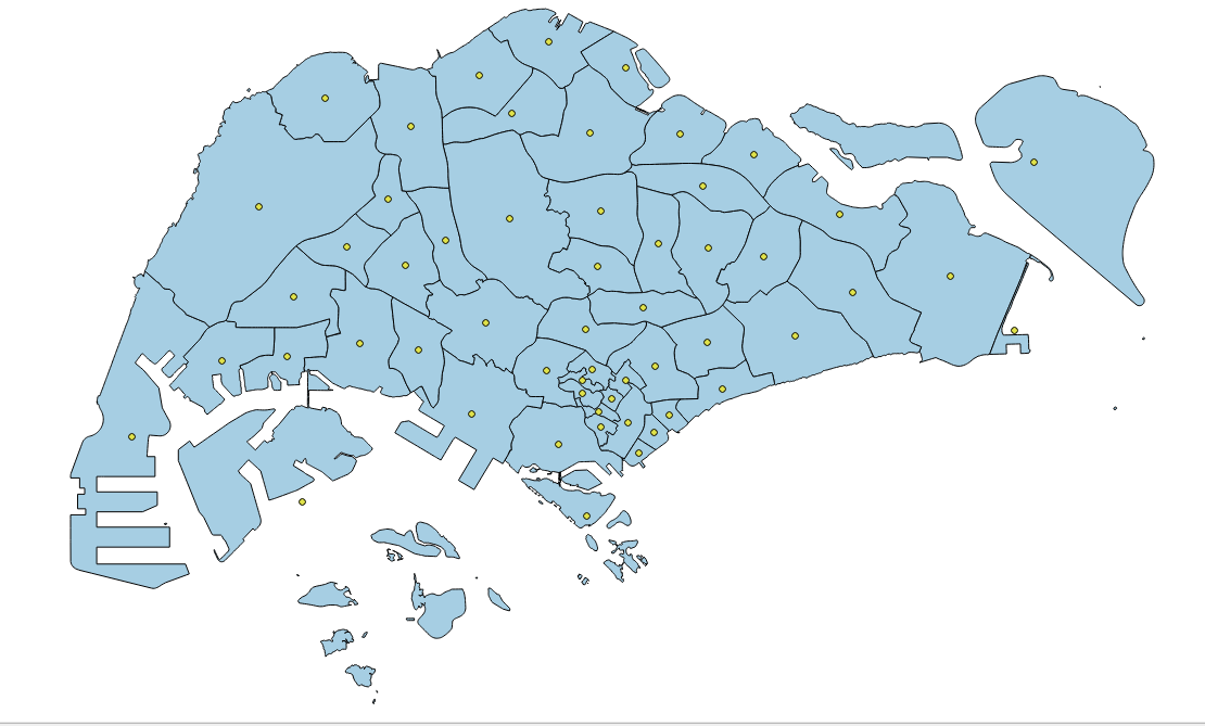
In the Patron Datasets, the residential areas of the patrons are given as Local Planning ADZID, which is equivalent to the subzones where they live in. However, the team find that it may be hard to identify the residential areas with subzones as there are simply too many subzones. Hence the team has decided to match the subzones to URA Planning Areas instead.
The matching of Subzones to Planning Area was performed in QGIS and the procedure is as follows:
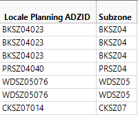
1. Extracted the first 6 characters (column ‘Subzone’) of Locale Planning ADZID from the Patron Dataset using JMP Pro.
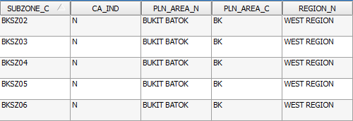
2. The Patron Dataset is then joined with the MP14_SUBZONE shapefile which the team has obtained from data.gov.sg, matching the extracted characters from Patron Dataset with the variable ‘SUBZONE_C’ found in the MP14_SUBZONE shape file to get the Planning Area for each Subzone. The team has also obtained the region (column REGION_N) in which the Subzones fall in, which can be used to display the data in a higher level of detail.
3. The team also needed the centroid of each Planning Area to be used for initial visualisation in Tableau, thus the team has made use of the ‘Polygon Centroid’ function available in QGIS to obtain the centroid and coordinates (Latitude and Longitude) of each Planning Area.
Library Branch Code Reconciliation
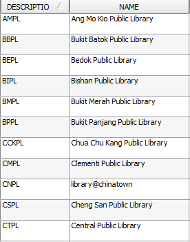
From the Collection Dataset, the only identifier for the libraries is the attribute Branch Code. However, it is hard to identify a library based on the Branch Code. Hence, the Branch Code is then matched to the ‘DESCRIPTIO’ variable found in the attribute table of the LIBRARIES shapefile which the team has obtained from data.gov.sg to get the library names. Furthermore, as the team wanted to perform a geospatial visualisation, we needed to get the coordinates of the libraries which was also obtained from performing the join.
The team has sourced for external data, which will be used in conjunction with the provided data to build up the geospatial model. Listed in the following sections are the details of the type of external data derived.
MRT Stations
The team felt that the libraries’ proximity to MRT stations is possibly a factor explains the difference in patronage flow to a library. For example, an individual may prefer to patronise a particular library due to the presence of a MRT station near the library. Hence, libraries with a greater number of MRT stations located nearby would draw more patrons.
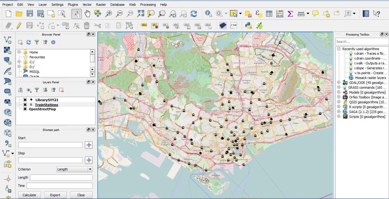
Therefore, we decided to compile information on the locations of the various MRT stations along Singapore. Fortunately, this information is readily available at data.gov.sg, in SHP format. After downloading this dataset, we visualized the distribution of MRT stations along with the library branches in QGIS.
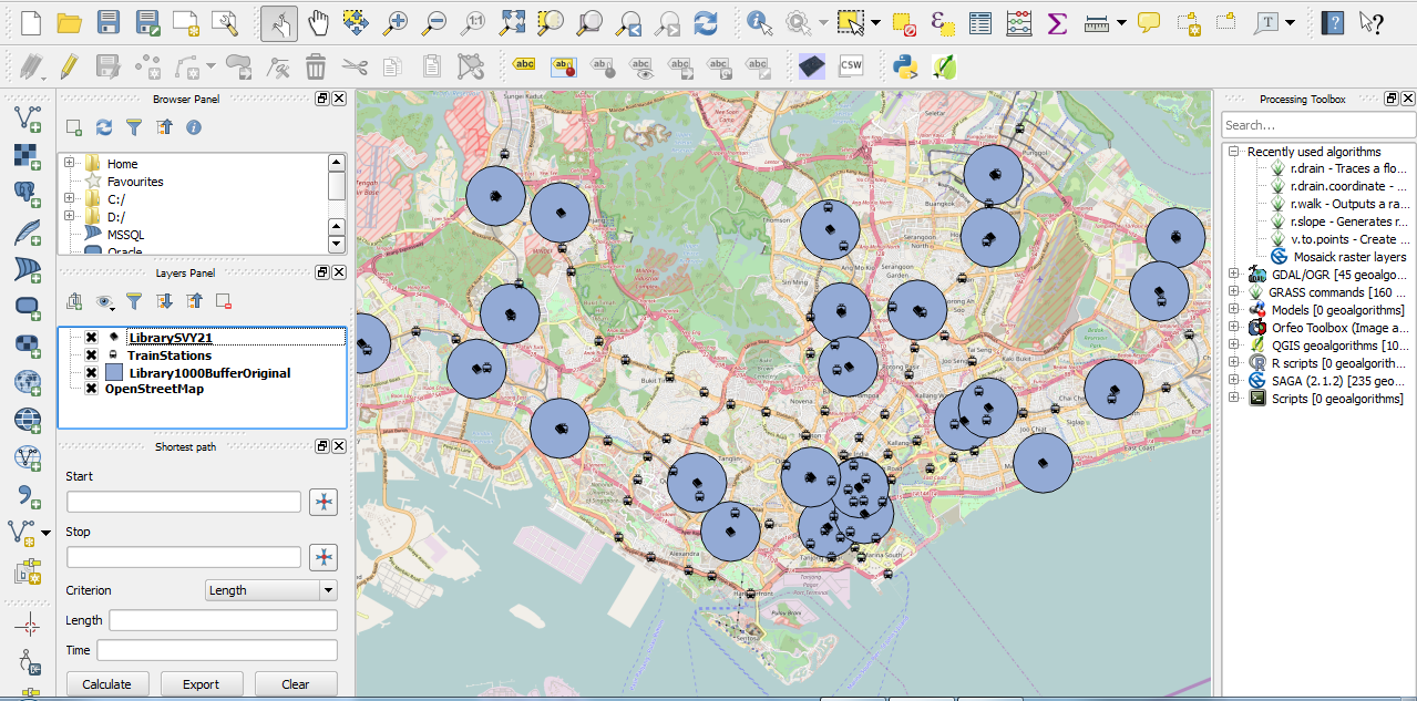
Using QGIS, we then created buffer region with a radius of 1 kilometre around the library branches, to simulate the area within walking distance to the branches.
We then counted the number of MRT stations within this specified area, and exported the derived data in the form of a .csv file to be used in Tableau.
To add another dimension in the data, the team have researched on using centrality measures of the MRT stations within the MRT transport network, instead of simply using the absolute number of MRT stations within 1 kilometre of the libraries.
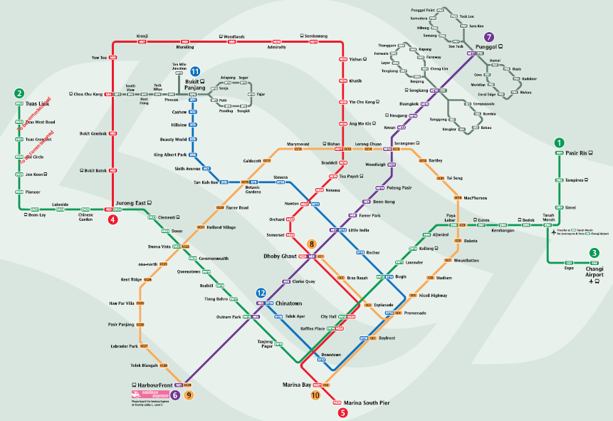
First, we derived the MRT network map from the SMRT official webpage:
Next, we manually created a matrix, in which each row shows a unique MRT stations (ego) and the other MRT stations it is adjacent to (alters). A snapshot of the matrix is as shown below:
Using UCINET, an open-source software package for social network analysis, we calculated the centralities of each MRT station in the overall network (excluding LRT stations), using different formulations of centralities, such as degree centrality, eigenvector centrality, betweenness centrality and closeness centrality. A screenshot is provided below:
A high centrality measure for a MRT station suggests that it holds a greater importance within the network, and hence a library located to a MRT station with a high centrality score may attract more patrons than one located to a MRT station with a low centrality score. We will be testing the statistical significance of the different centralities and to prevent multicollinearity in the regression model that will be built, we may be only using one type of centrality that best fits the data.
Shopping Malls
The team felt that proximity to shopping malls would be another factor that explains difference in libraries’ patronage flow. Visitors to malls might patronise the libraries near the malls due to convenience. To collect geographical data on shopping malls in Singapore, we downloaded the shopping mall data set from data.gov.sg, similar to the process we used to obtain the MRT stations data. The process used to derive the .csv file for visualizing Tableau is similar to the process rendered for the MRT stations’ data set.
Tuition Centres
The presence of tuition centres near the libraries may also explain the differences in patronage levels for different libraries (due to differences in number of nearby tuition centres). Parents dropping off their children at children centres may arrive early and decide to let their children spend some time at a nearby library. However, it is difficult to obtain geographical data set for tuition centres in Singapore as the information is not readily available on data.gov.sg. Instead, we have decided to use inSing, a website that functions like a phone book for businesses. Information available on the site includes addresses of businesses.
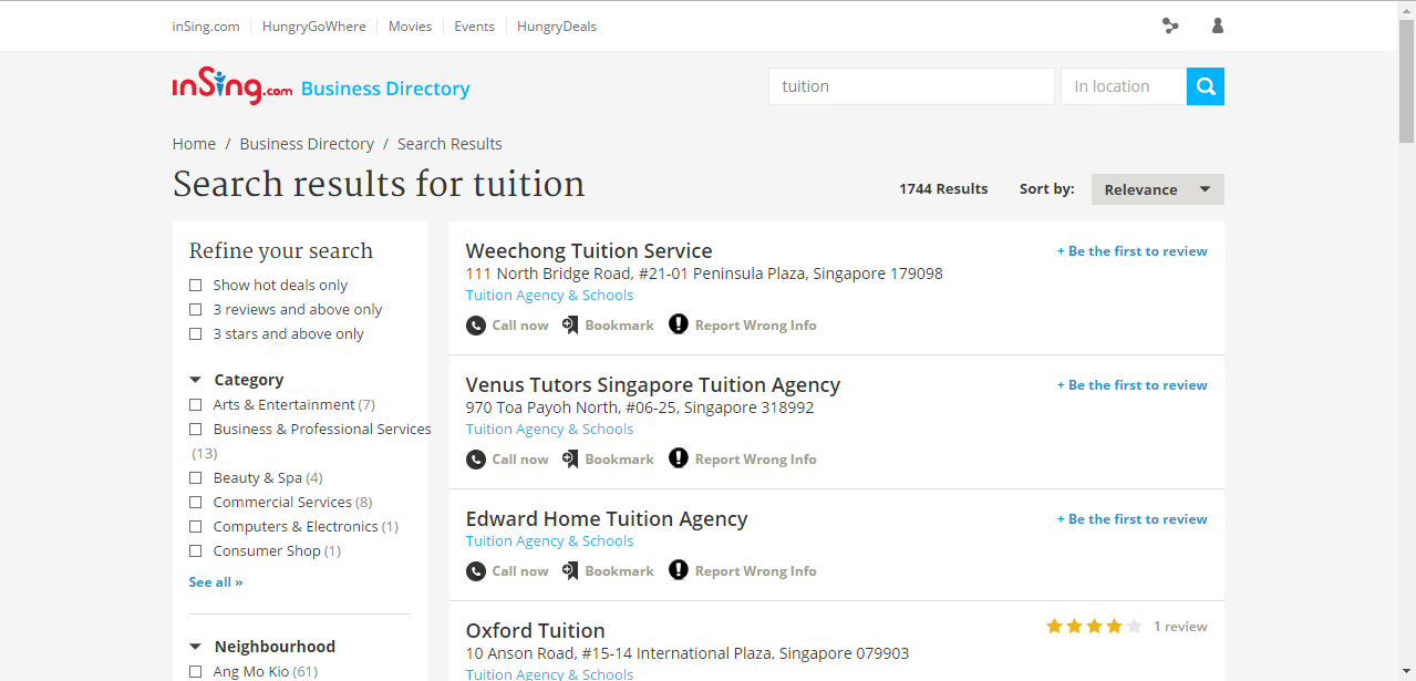
To get a list of tuition centres, we used the keyword ‘tuition’ and performed a search on the inSing website, as shown in the screenshot below.
However, due to the large number of results (1,744), copying and pasting the information manually will take too long, as inSing shows information for 10 tuitions centres at a time. Instead, we created a list of links to inSing, with each link giving us the information about 10 tuition centres, by changing the page number in the link. For example, the link http://search.insing.com/s/tuition?page=1 lists first 10 tuition centres in the results, while the link http://search.insing.com/s/tuition?page=10 lists the 100th to 110th tuition centres.
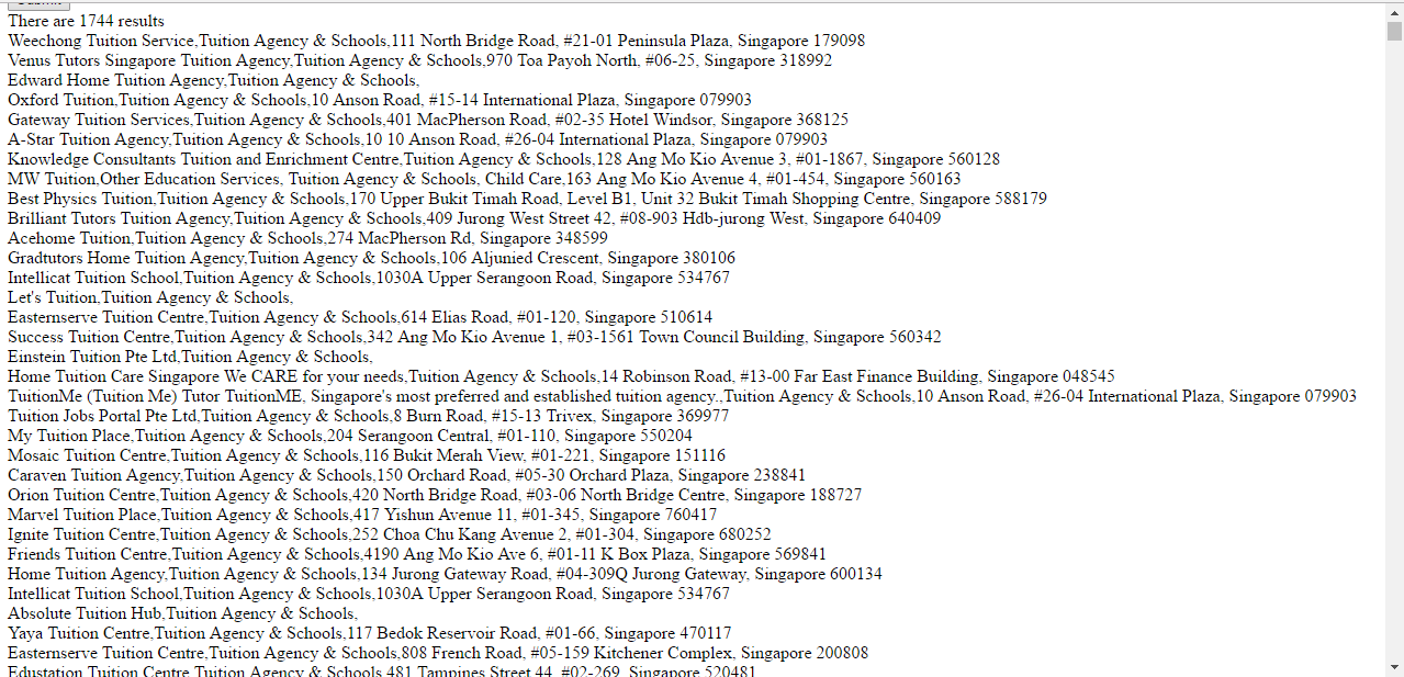
The full list of 175 links were inserted to a self-coded html parser, to extract the information needed. The of the process is shown below, and specifically the last column contains the postal code of the tuition centre.
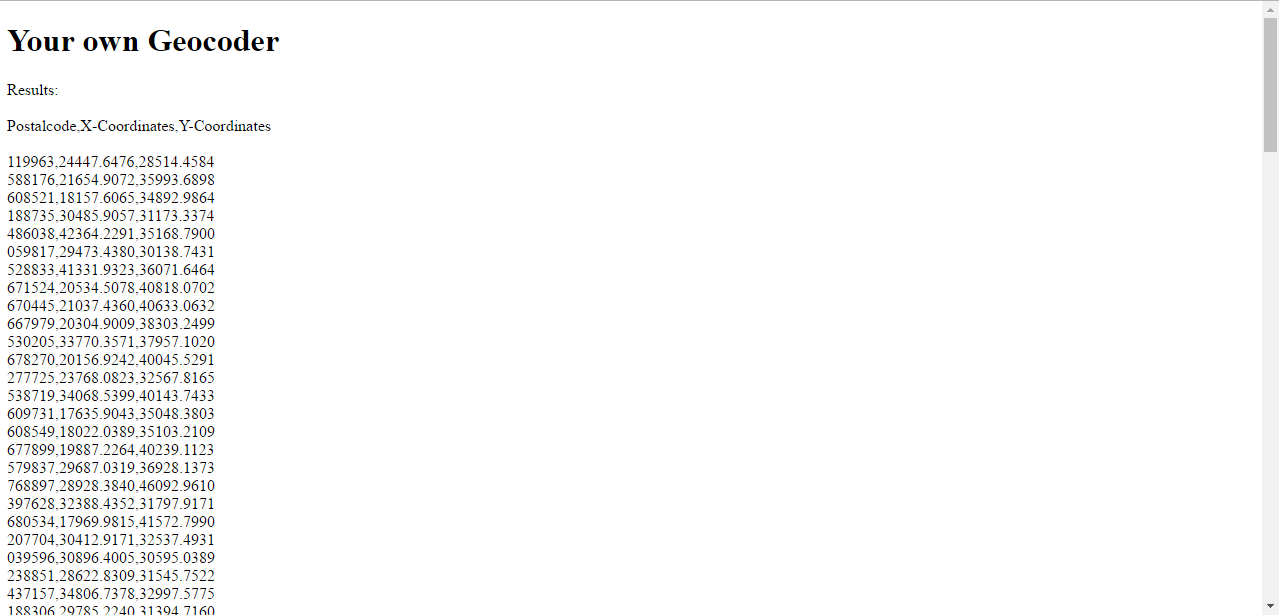
Next, the list of postal codes generated by the html parser were used as inputs in a geocoder app (as recommended for use by Prof Kam) to derive the corresponding coordinates.
These coordinates are finally read into QGIS to give a layer showing the geographical location of tuition centres in Singapore. The process used to derive the .csv file for visualizing Tableau is the same as the one used for the two data sets mentioned above.
Bus Stops
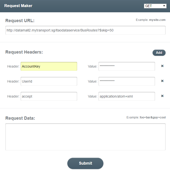
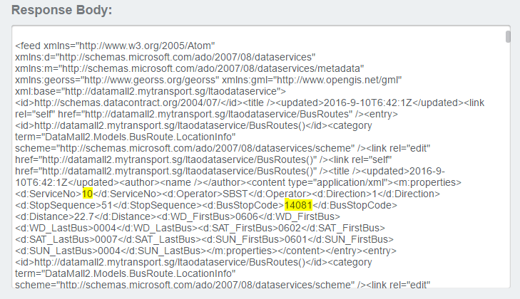
Instead of counting the number of bus stops within a buffer, the team would like to get the number of bus services instead as it better show how convenient people could get to the libraries. The bus stop data was retrieved from LTA’s DataMall@MyTransport API.
The API calls returned information of every bus service and the bus stops that it will stop by, which could be aggregated to get the number of bus service at a bus stop. The data also provided the coordinates of the bus stops which would be useful to visualise the location of bus stops.
After removing the anomalies mentioned in section 2.1, the team decided to apply the method of cluster analysis to identify possible segmentations in the library patrons, based on differences in their borrowing patterns.
The variables that are used for the cluster analysis are:
- End Date – Last TXN Date (Recency)
- Total No. of TXN in the FY (Frequency)
- Avg. No. of Books Borrowed Per TXN (Monetary)
These variables are adapted from the concept of RFM Analysis, which is popular in marketing analysis. By looking at the how recent was the patron’s last transaction (recency), how many times did they visit the library in a year (frequency), and the average number of books borrowed per transaction (monetary), we can potentially divide patrons into distinct groups based on differences in their borrowing patterns.
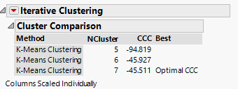
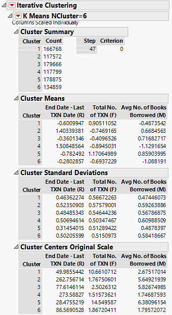
Using JMP Pro, we used the cluster analysis module and applied the Johnson Transformation and standardization functions, then performed k-means clustering on the data. Results of the cluster analysis is as displayed below:
From the results, even though k=7 gives us the optimal Cubic Clustering Criterion (CCC), our team decided to go with k=6, as the difference in CCC is not much (-45.511 vs -45.927), and a smaller no. of clusters may allow us to make more intuitive interpretation of the clustering results. A further discussion of the clustering results can be found in the RFM Analysis section under Initial Visualizations & Findings.
