ANLY482 AY2017-18T2 Group03 Data Analysis
| HOME | ABOUT US | PROJECT OVERVIEW | DATA ANALYSIS | PROJECT MANAGEMENT | DOCUMENTATION | MAIN PAGE |
| Previous | Current |
|---|
Contents
Methodology
In this section, we will explain the methodology which our team plan to implement to perform analysis on the data provided by our sponsor.
Firstly, refer to the above figure which shows the methodology process we took for our project. We did the initial data preparation and transformation on the files provided to us based on specific requirements. The processed data is then used in our model which provides the input used for our application development.
We will be using Python for Exploratory Data Analysis (EDA) to better understand the dataset given and its characteristics. As part of data preprocessing, our team will be performing the following steps to obtain a clean dataset. These steps will eventually be converted into a script which will be used to clean the data file that is uploaded into the dashboard which we will develop for our sponsor.
ABC Analysis
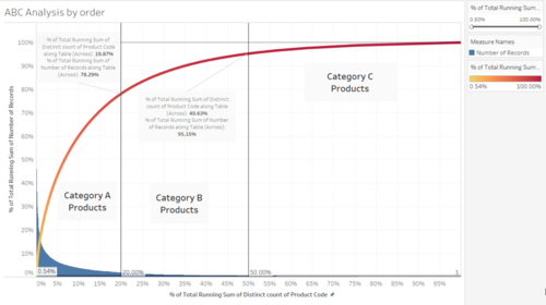
To conduct the ABC Analysis, we will be using a Pareto Chart. Pareto charts are used to focus on the most significant portions of your data. This is especially useful in our case as we want to be able to pick out which products are the most important to the business so that we can give these products better priority so that they can be picked more easily since these are the products that contribute the most to the bottom line of the company.
We will be using the standard 80-20 rule, the top 20% of the products which make up 80% of the sales or in this case overall outbound volume. After which, the next category of goods will be the next 30% of the goods which make up the next 15% of the overall outbound volume and finally the last 50% of the goods which make up the last 5% of the overall outbound volume.
The output from this analysis will be a model which will give us the list of products which are now categorized by their ABC classification. Using this classification, we will be able to come up with a model which will allow our client to input the incoming orders and our model will provide them with the best zones to allocate the products based on the ABC analysis.
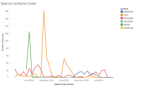
Over the years, trends can be seen that lesser goods are now being placed on the floor, probably due to the shifting of warehouse and the change in its structure. We see a rise in damaged goods however from year 2016 to 2017. This could be because the categorisation of goods is introduced only in 2016 during the shift of the warehouse and there might have been goods that are damaged during the shifting process, or at the beginning of the usage of the new warehouse.
Other noticeable trends include the sudden spike in goods being placed on the floor during December 2015 and June-August 2016.
Data Preprocessing
With every new dataset, we first must clean the data to remove irrelevant data that should not be included in our analysis. For data cleaning, the steps include:
- Handling missing values. If there are missing values in a row of record, the entire row will be excluded because it will be inaccurate to include it.
- Handling duplicate data. Duplicate data could occur when the employees double scan the barcode upon inbound of goods. Similarly, in the event of duplicate data, we will remove the entire row as well.
- Resolving redundancies caused by data integration.
With the clean dataset, we will proceed to further explore the data and find out potential visualizations and analysis that can be done with the dataset to provide a more in-depth analysis and dashboard that will be useful for our sponsor. Prior to conducting Exploratory Data Analysis, our team first cleaned the dataset provided. The data cleaning steps and rationale will be explained below.
Data Merging
All dataset is combined into respective inbound and outbound data to facilitate better EDA and analysis. Files are mainly from year 2015 to 2017.
| Dataset | Inbound | Outbound |
|---|---|---|
| Files |
INBOUND JAN 2015 - DEC 2015.xls |
OUTBOUND FROM 01 JAN 2015 TO 30 JUN 2015.xls |
During the data merging step, the columns are retained, as seen in the table below for the respective inbound and outbound files. Other details including the number of rows, missing and duplicate values are mentioned in the table below.
Data Quality Issues
1. The inability to connect inbound to outbound with the current dataset. As of now we were unable to link the inbound to outbound data through the columns, hence we will not be able to identify the exact item that is being retrieved during outbound. Thus, we are assuming a first in first out approach.
2. Unable to calculate base stock level due to the lack of quantity level data in inbound report. As we have received the base level data from our sponsor, we were unable to correctly calculate the base level from 2015 to 2017 as the inbound data lack the required quantity data. We are currently trying to request from our sponsor inbound data with quantity level data.
3. There is a shifting of warehouse in October 2016, which means we can only make use of warehouse location data from October 2016 onwards. This will limit us from using the entire 3 years of dataset. We will still be using the full dataset to study the trends in inbound and outbound of the brand.
| Dataset | Inbound | Outbound |
|---|---|---|
| Column Headers |
All columns retained. |
All columns retained. |
| Missing Values |
Loose Carton = 379,470 Remarks = 379,474 |
TP_FULL_NAME = 481 Expected delivery date = 6,543 PlannedPGIDate = 6,543 |
| Duplicated Rows* |
56 |
0 |
| Non-uniform Data |
0 |
LocName Old warehouse format: 380,220 New warehouse format: 270,815 Special Codes: 411 (As seen in the figure below) |
*Duplicated rows are recorded in the file: Inbound duplicates.csv
Non-uniform Data
Other than having data that belongs to the old warehouse, there are also other LocNames used to represent certain status of the goods.
| LocName | Description | Number of Records |
|---|---|---|
| Damaged |
Signifies that the good is damaged. |
106 |
| FLOOR-related |
Signifies that the good is being placed on the floor. |
440 |
| MOLEXQA |
Signifies that the good is being used for quality assurance. |
311 |
| MPART |
Signifies that the good is being used for quality assurance. |
154 |
| MPARTQA |
Signifies that the good is being used for quality assurance. |
4 |
| MOLEXSLT |
Signifies that the good is being used for quality assurance. |
14 |
Data Cleaning
| Issues | Solution |
|---|---|
| Missing Values |
For inbound data, 1) Missing values in ‘Loose Carton’ is due to the fact that most products have records for only ‘Full Carton’, thus having 0 loose cartons which lead to the column being empty for most of the dataset. In order to combine both ‘Full Carton’ and ‘Loose Carton’ into a single value, we created a new variable called ‘NO_OF_CARTONS’, which rounds up loose cartons into 1 carton to help eliminated missing values in the ‘Loose Carton’ column. 2) For ‘Remarks’ column, we realised that there is only 1 row of data that has ‘Remarks’ filled. We have decided to remove the column as we deem that remarks by customers is not relevant to our models. For outbound data, 1) 6,543 missing values in Expected Delivery Date and PlannedPGIDate were removed upon discussion with our sponsor. Missing values in TP_FULL_NAME was also removed as they are within the 6,543 rows with missing values in Expected Delivery Date and PlannedPGIDate. |
| Duplicates |
Duplicated values were removed. We understood that the duplicated data may be errors in entry as warehouse staff keyed in the same record twice. |
| Non-uniform Data |
We will not be considering LocName with old warehouse format as it will not contribute to our optimization of the new warehouse with implementation of ABC. |
Feature Creation
We have created a few new features to help us carry out our Exploratory Data Analysis and better understand the data provided.
Inbound Report
| Feature | Description | Formula |
|---|---|---|
| GRN Date vs GRN Post Date |
This attribute signifies the time taken by the warehouse staff to complete the process of scanning the inbound goods. |
GRN Post Date - GRN Date |
| GRN Post Date vs PA Created Date |
This attribute represents the time between completion of scanning the inbound goods and the time which they start to putaway the goods into their locations. |
PA Created Date - GRN Post Date |
| PA Created Date vs PA Post Date |
This attribute refers to the time taken by the warehouse staff to putaway the inbound goods. |
PA Post Date - PA Created Date |
| PA Post Date vs ASN Date |
This attribute refers to the total time spent from the generation of customer order to the completion of inventory putaway process. The KPI is within 1 working day. |
PA Post Date - ASN Date |
Outbound Report
| Feature | Description | Formula |
|---|---|---|
| DO Commit vs Expected Delivery Date |
The deviation between actual and expected delivery date. |
Expected Delivery Date - DO Commit |
| Lane No. |
Used to represent the lane number. |
Refer to the example below. |
| Shelf Level |
Represents the shelf level in alphabet format. |
Refer to the example below. |
| Depth No. |
Represents the depth level of the warehouse. |
Refer to the example below. |
| isMiddle |
Represents if the location is in the middle of 2 location. |
Refer to the example below. |
An example of a LocName is 12D32M.
- First 2 number to denote the lane number i.e. 12
- First letter used to denote the shelf level i.e. D
- Next 2 numbers to denote the depth level of the warehouse i.e. 32
- Represents if the location used is in the middle of 2 other location i.e. M. But this character may or may not be present in a location name
Other columns which we created to further help us build our models are:
| Data | Columns | Purpose |
|---|---|---|
| ABC Classification of products |
ABC Classification Type |
The purpose is to group products into categories A, B and C based on their volume. More will be discussed in the later section. |
| Base inventory levels of products in their warehouse locations |
Quantity, location, product code and ABC type |
Data are cross-referenced from all 4 files to get the current level of stock of products in the warehouse: |
Post-Processing Dataset
| Files | |
|---|---|
| Interim Data |
Combined Inbound.csv Combined Outbound.csv |
| Cleaned Data |
Inbound
Outbound
|
Exploratory Data Analysis
Inbound Report
The following few diagrams show the basic summary statistics for the Inbound Report for the years 2015 to 2017.
1. Year 2015 Summary Statistics

2. Year 2016 Summary Statistics

3. Year 2017 Summary Statistics

As we are also looking at the data from October 2016 to December 2017 only, since there was a change in the warehouse and the way LocName was stored, we also did the summary statistics for Before October 2016 and for October 2016 onwards. This is so that we can do a comparison, if need be, for the old warehouse compared to the new warehouse.
1. Before October 2016 Summary Statistics

2. October 2016 onwards Summary Statistics

We also conducted Exploratory Data Analysis on the Inbound dataset.
The chart below shows the GRN Date vs GRN Post Date. This represents the time difference between GRN Post Date and GRN Date and refers to the time taken to scan all the inbound goods. The average duration taken is 1.42 hours to complete the scanning. Also, we see that the peaks for each year is different. For 2015, the peak is in August. For 2016, the peak is in July and for 2017, the peak is in April.
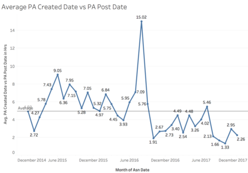
The chart below shows the average duration for the entire putaway process, which is calculated by taking the difference between PA Created Date and PA Post Date. Again, we see a spike on August 2016 with a duration of 15.02 hours while the average time taken was only 5 hours.
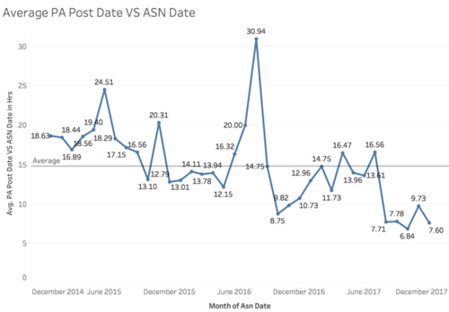
The time difference between the PA Post Date and ASN Date refers to the total time spent from the generation of customer order to the completion of inventory putaway process. This is also the measurement used by the company for their KPI, which is to complete the inbound process within 1 working day. However, we see that on average, in June 2015 and August 2016, they did not seem to hit their KPI. This is especially so for August 2016, where we see that there is a spike of 30.94 hours taken to complete the entire process. It is an interesting insight that for most sections of the inbound process, the peak is in August 2016. This could potentially be related to their shifting of warehouse in September 2016.
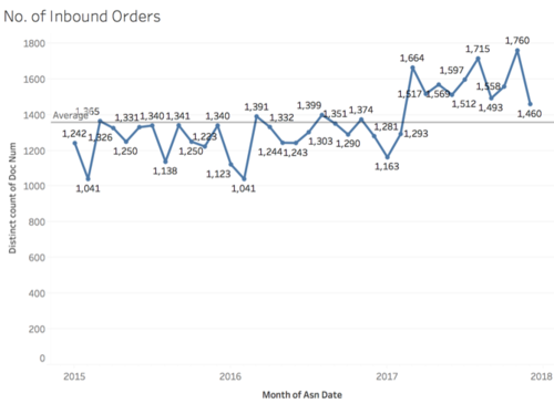
This chart shows the number of inbound orders over the years. We can see that in 2017, the average number of orders appear to be much higher than in 2015 and 2016 which shows that the business has been growing.
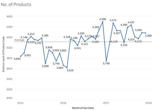
The chart below shows the number of distinct products ordered by the client over the years. It seems like that is no specific trend over the years. Further analysis can be done on the specific product codes after we find out whether they belong to category A, B or C.
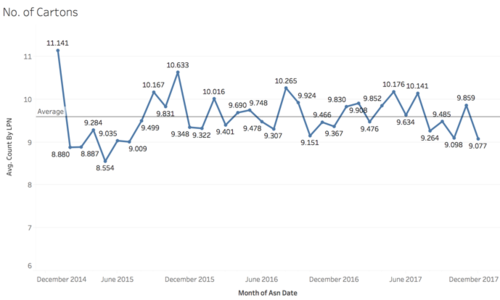
The chart below shows the average number of cartons inbound per month/year. The number of cartons for a product gives us an understanding on how important a product. We see that in January 2015, the inbound number of cartons is very high at 11,141. Also, the number of cartons inflow is below average for every March and December from 2015 to 2017.
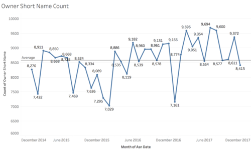
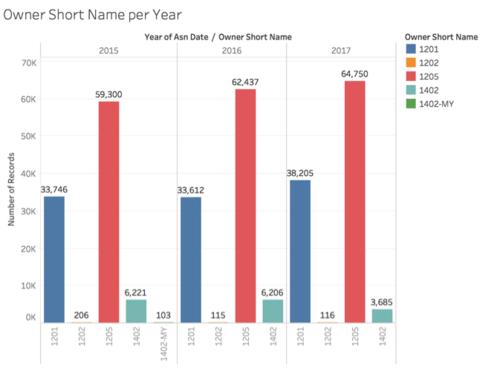
The chart below shows the owner short name count over the years. The count of owner short name refers to the number of owner short names which appeared in the orders every month/year. It appears that there are no specific trends over the years.
There are only 5 unique owner short names in the Inbound dataset. For the top 2 owner short names, there is an increasing number of records from 2015 to 2017. More interestingly, we see that the owner short name ‘1402-MY’ only has 103 records in 2015 and after which, it does not have any more records.
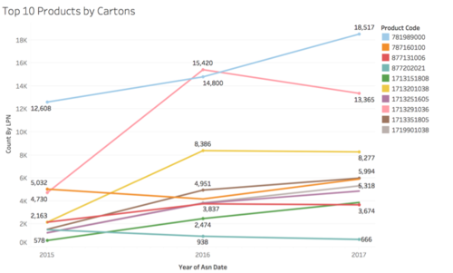
As there are over 15,000 different unique products, we have shortlisted the top 10 products based on their inbound volume by number of cartons. This is shown in the chart below. In general, we see that there is an increasing trend over the years. However, interestingly, there was a huge increase in the number of cartons for product code 1713291036 (represented by a pink line below) from 2015 to 2016.
Outbound Report
The following few diagrams show the basic summary statistics for the Outbound Report for the years 2015 to 2017.
1. Year 2015 Summary Statistics
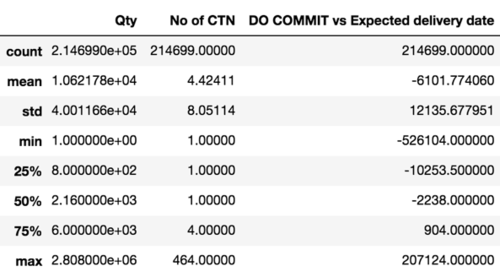
2. Year 2016 Summary Statistics
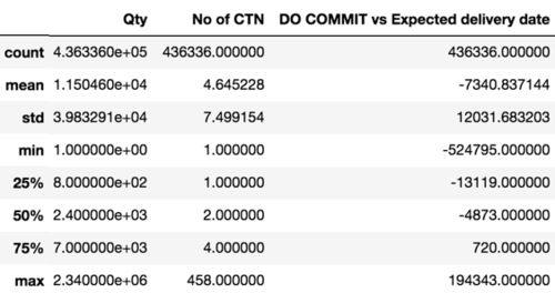
3. Year 2017 Summary Statistics
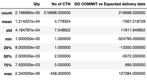
Similarly, we also did the summary statistics for Before October 2016 and for October 2016 onwards for the Outbound dataset.
1. Before October 2016 Summary Statistics
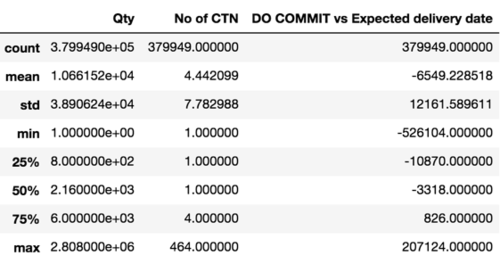
2. October 2016 onwards Summary Statistics
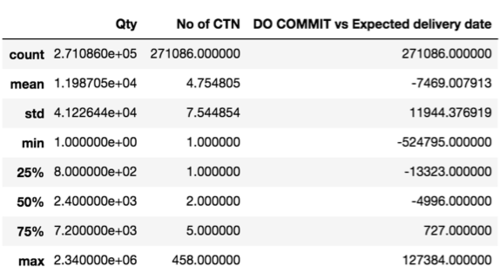
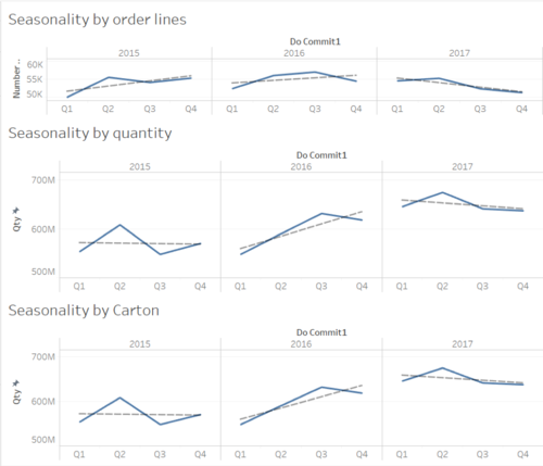
To explore the trends and seasonality in the demand, we decided to analyze it based on different units of measurement.
1. The first one being by order lines, or in an easier term, by location. Therefore, 10 lines would mean goods were being picked for shipment from 10 locations. 2. The second one based on the actual quantity itself, how many units are being picked for shipment out of the warehouse. 3. Finally, by the cartons being picked.
If we were to look at the overall trend across all 3 graphs, in 2015 and 2016, the trend is generally going upwards. However, in terms of orders, the overall number of order lines being made was not increasing much and it was pretty flat from 2015 to 2016, but looking in terms of unit level and carton level, we can see that the overall volume shows great improvement from 2015 to 2016. This could be a result of the fact that the company moved into a new facility which was bigger and better equipped, thus leading to a greater increase in volume per order in Q3 because this was the period which the company moved into the new facility.
Throughout all 3 years, it showed a downward sloping trend, especially so for the number of orders with the number of orders dropping below the lowest performing quarter of 2016. However, in terms of units and carton level, the overall volume despite showing a downward trend is still much higher as compared to the volumes of 2015 and 2016. This could be a sign that the client is making less orders but the volume involved in each order is much greater as compared to before which is a good sign since the costing is done on a carton level and not order level.
From the chart above, we can see a vague seasonality pattern, Q1, Q3 and Q4 seem to have similar low performance, while Q2 has the biggest spike. We do not take 2016 into our view because there was a change in facility in the 3rd quarter so that could possibly have some effects on the demand patterns for that year, so we excluded 2016 when attempted to look for a seasonality pattern in the demand.
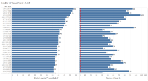
The goal of the order breakdown exploration was to attempt to explore how many products are being picked within each order. This would help play a part in our market basket analysis where we would try to find affinities between each product so that we can place these products nearer to each other since these products are usually picked together in an order.
From the chart above, the one on the left shows the number of distinct products that made up each order and the on the right shows the total number of locations that had to be picked to fulfil the order.
Looking at the chart on the left, we can see that the most number of distinct products that made up an order is 53 and this order was serviced by picking it from 94 different locations but not many of these transactions occur. Most of the orders are made up of just 1 product from 1 location only.
Looking at the chart on the right, the most number of locations ever required to satisfy an order was 108 different locations for 50 different products.
After this initial exploration, we wanted to see if these cases of huge complex orders had any correlation with the period, so we decided to colour the bars by year and by quarter and explore further. From the above, we can see that there is no clear pattern and that it is randomly distributed, so there is no proof that there are certain periods which result in more complex orders requiring many touch points.
The image below shows the Shelf Level Layout of the warehouse.
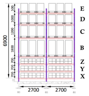
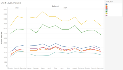
From the chart above, we wanted to see which shelf levels had the most activity in the warehouse. X, Y and Z are shelves which can be serviced by people while the other levels must be serviced by a forklift. Please refer to Figure 27 to familiarize yourself with which level each alphabet corresponds to.
We can see that Shelf Level Y was the most active, followed by X, then B. What was interesting in this analysis was the fact that shelf level Z did not follow the intuition of being one of the most active shelves even though it should be, since it can be serviced by a person instead of requiring a forklift. One possibility could be that since Z is the most inconvenient level for people since it is on the top, most products are not placed there for picking and possibly for replenishment downwards, but this is something for us to verify.
To verify our findings, we carried hypothesis testing on the means from each shelf number to see if our findings were significant. As seen from Table below, Shelf Level. X and Y indeed proves to be significantly different from the means in frequency of goods being placed at each shelf level.
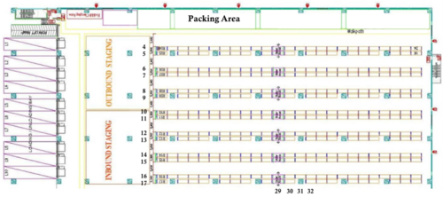
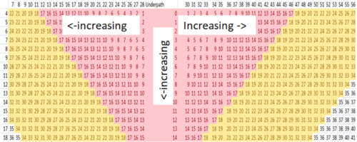
The image shows the layout of the warehouse, the numbers on the left show the lane numbers starting from 4 and ending at 18.
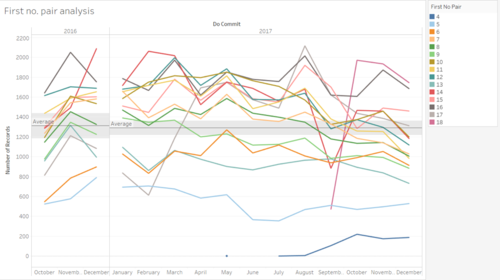
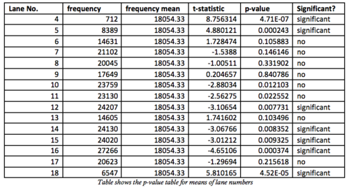
From the chart above, we can see that despite lane 4 and 5 being of the closest proximity to the packing area, it is the most under-utilized for outbound transactions. To check if these findings were significant, we conducted hypothesis on these data and it gave us the following results as shown in table below. Lane 4 and 5 were significant lower than the sample mean while lanes 12, 14, 15, 16 and 18 were significant greater than the sample mean.
However, after finding out more from our sponsor, we found out that it was precisely because of this reason that these lanes were not being utilized. These lanes were being used for last minute orders, handling returns or even as a temporary staging area when the volume is too big. Since these actions are not tracked by the system, it seemed like these locations were not being utilized at all but in fact, these locations were being utilized but not for proper storage purposes but instead to act as a buffer.
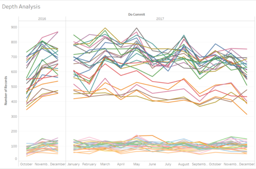
From the chart above, the number of transactions were plotted over a monthly period from Q3 2016 which was when the operations shifted into a new warehouse to the end of 2017 and we coloured each depth number to see which areas of the warehouse were showing greater signs of outbound activity. There are 2 very clear clusters being shown above. Cluster 1 being the one on top (high volume cluster) and Cluster 2 being the one below (low volume cluster).
As we delved deeper into the data, we found a very interesting pattern. All the depth numbers in the high-volume cluster were the odd numbered ones from 55 all the way to 7 except for row 29. While the low volume cluster was made up of all the even numbered depth numbers and row 29 as well. From our initial discussion with our sponsor, row 29 is the middle of the whole warehouse and thus it should be a place which is easy to access but for some reason it is not the case.
We did a hypothesis testing on the data using the whole data set and we realized it made everything significant which is not accurate. So we split the data into 2 different clusters based on whether it is high volume or low volume. Then we conducted hypothesis testing again to find its significance. The table below shows us which lanes were significant.
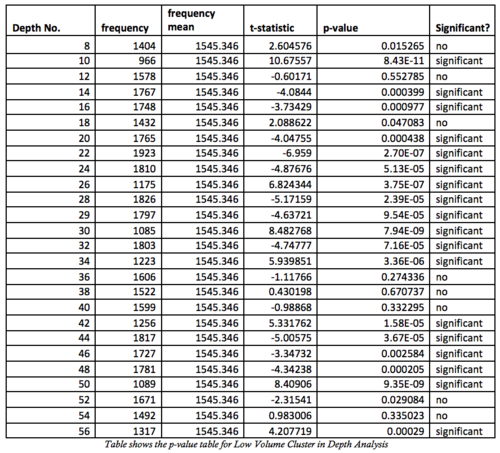
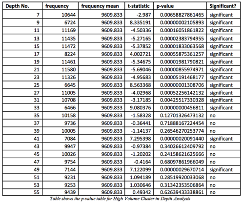
Our client has currently not found a reason on why there is such a pattern so this is something interesting for them to look into to find out why there is such a jarring pattern occurring.
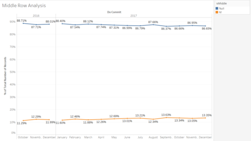
For this chart, we were trying to see how much of transactions for each month made use of the middle row. We can see that on average middle rows only make up around 12 % of the overall outbound transactions each month.
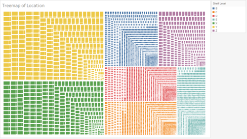
The treemap above aims to see which are the most active locations in the dataset coloured by the shelf level. From this treemap, we can clearly see that shelf Y (Yellow), shelf X (Green) and Shelf B (blue) make up the bulk of the activity in the warehouse. We can see that the most active locations are those in shelf Y and X. Everything else is much smaller as compared to these 2 locations.
Special LocName Codes Analysis
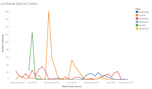
Over the years, trends can be seen that lesser goods are now being placed on the floor, probably due to the shifting of warehouse and the change in its structure. However, we do see a rise in damaged goods between around October 2016 to June 2017, while the amount of goods left on the floor peaked at around December 2015 and June to July 2016. Other noticeable trends include the sudden spike in goods being placed on the floor during December 2015 and June-August 2016.
Proposed Implementation
ABC Classification Service
The main goal of this project is to give our client a web tool which will help them to find out the ABC classifications of the products they are handling so that they will be able to better handle these goods during the inbound process so that the outbound process can be more efficient. A web service which takes in the input of the products incoming and gives an output which tells the user the best place each product should be stored at. This web service would be developed using python and the database used would be a PostgreSQL Database. It will be hosted locally as the company does not use cloud services so they would prefer to host the service themselves. The client should be able to adjust the perimeters and limits of the analysis so that they can play around with different configurations.
For the dashboard, there are 2 approaches that we want to explore. 1) To create a dashboard from scratch using JavaScript and Highcharts libraries; 2) Use Tableau to create the dashboards.
Dashboard
Create a dashboard from scratch
The benefit of doing this approach is that the application will be totally under the control of our client, so if they intend to do future changes, they will be able to do so with minimal fear of them losing the capabilities. Also, the costs will be lower because there will be no licensing fees that need to be paid.
However, the problem is that they would need to have people who will be willing to maintain the system and keep it up-to-date and this is something we are fearful of as the previous teams implementations were "killed" off precisely because of the fact that there were no people who were willing to take over the system once the handover was complete.
Create a dashboard using Tableau
Using Tableau is good because it already comes built in with a lot of functions to allow our client to carry out further data exploration and visualization should they want to do so in the future. Also, because our client does have Tableau already in the office, they can easily use it with little fuss. As Tableau is a company that is focused on building their product, the updates and features will always be updated and our sponsor will have a better dashboard overall.
The weakness of doing so would be the lack of licenses as they only have a set amount at this point of time so scalability may be an issue in the future if cost is a concern. Tableau is also an external product so should it eventually go bankrupt, then our sponsor may lose access to their dashboard.
Model Development
ABC Classification Model
The main purpose of ABC analysis is to classify the products in a company into 3 main classifications.
1. 'A' for products which are extremely important
2. 'B' for products of average importance
3. 'C' for products which are relatively unimportant
This assignment is determined by following the 80-20 rule, which is also widely known as the Pareto principle which says that for most events, 80% of the effects come from 20% of the causes (Bunkley, 2008). Applying the same principle in inventory management, 'A' products shall be products which account for 80% of the overall volume, 'B' products are products which account for the next 15% and 'C' products make up the rest. The main idea behind this classification is that products in different classifications should be handled differently as they bring about different profitability for the company. In our case, what we want to do is to allocate 'A' products during the put-away process to the most optimal locations since these are the products with the most volume and activity. Next, we will go through the process on how we implemented the ABC Classification model.
Assigning ABC Category to Products

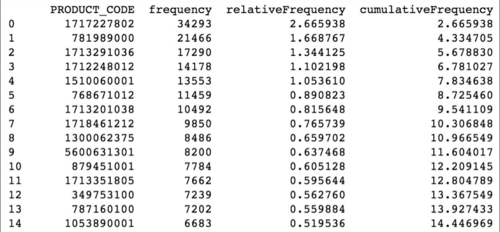
After going through the process above, we will get the following table as shown below.
Using this output, we proceed to categorize the products in the following manner. All products with a cumulative frequency below 80% will be classified as a 'A' product, all products with a cumulative frequency greater than 80% and below 95% will be classified as 'B' and the final 5% of the products will be classified as 'C'.
Assigning ABC Category to Locations
For our ABC assignment, we decided to use the distance from the packing area, which is the first location an outbound shipment must go to, as our distance measure. Based on the distance measure, we then iteratively assign the distance in an increasing manner from the centre, which is depth number 29 and 30 which are also the bypass rows. This allocation is done dynamically using a script written in Python and is also different for each shelf level (B, C, D, E, X, Y and Z).
After assigning the distances for each location, we need to decide on the range of distances for a location to be categorized as A, B or C respectively. To do this, we used the data provided to find out the number of unique locations used for each category. Firstly, we grouped the data according to its shelf levels (B, C, D, E, X, Y and Z) as the shelf level has the greatest impact on whether the position is being used to store a product of category A, B or C.
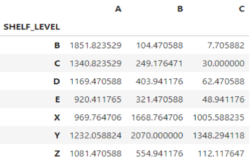
Next, we split up the locations into 3 different segments for locations which are to be assigned with category 'A' products, category 'B' products and category 'C' products and averaged the sum across all the months. This gave us the following result as shown in Figure 5. The problem with this was that the numbers were too inflated as one location could possibly store many products of the same type, thus overinflating the actual number of locations required to satisfy the demand, leading to an inaccurate reflection of the proportion.
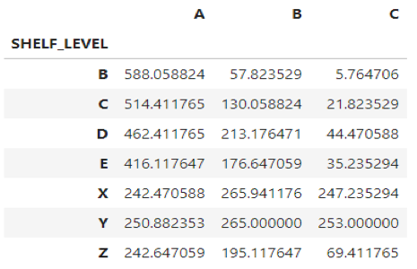
Therefore, we decided to remove the duplicate entries as this would give us the actual number of unique locations required to fulfil the warehouse operations every month. Doing so led to the following results as shown by the figure below.
After finding the correct proportion, we then assigned each location an ABC category based on the number of unique locations required each month. To do the assignment, we first create a cumulative table of the number of locations and its respective distances sorted in ascending order. This gives us the results as shown in the figure below.
To illustrate, let us take shelf level X as an example. The number of unique locations needed to satisfy the 'A' category products on this shelf level is 242.4 or 243 when rounded off as shown in Figure 7. Thus, using this number as the benchmark, we will then look at the table above and look for the first row which is greater than 243, which in this case is index 15, with a distance of 16 and a cumulative sum of 270. Thus, our algorithm will assign all location at shelf level 'X' which has a distance value which is less than or equal to 16 an ABC category of 'A' respectively.
Market Basket Analysis
In Market Basket Analysis, transactions representing a group of items that are bought together is also known as an item set. An example of an item set might be: {apple, beer, diapers}. From many of these item sets, association rules are identified in the following format: {apple} -> {beer}. This rule would mean that when a customer buys apples, they are likely to buy beer as well. Association rules often come with a support, confidence and lift value as well which will be explained in detail later.
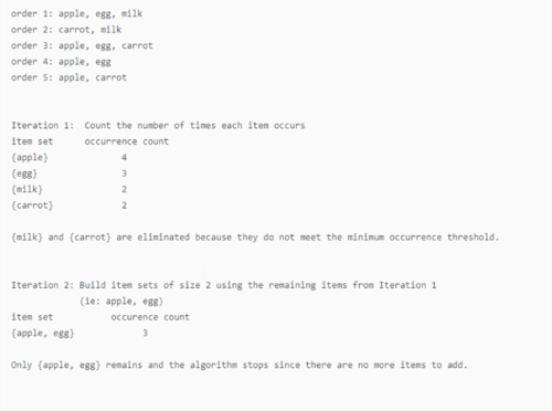
To do this, the Apriori algorithm is used. The algorithm eliminates transactions which do not satisfy the minimum occurrence threshold. For example, if the threshold is 3, any item that exists in less than 3 transactions will be removed from the analysis. From there, the remaining items will be used to build association rules. The screenshot below shows a pseudo code of the algorithm in action.
Typically, there can be many association rules generated. However, if we were to use every single rule that generated from the transactions, there would still be too many rules with little or no significance. Therefore, 3 metrics are used to decide which rules should be kept in consideration.
SUPPORT: The proportion of orders in the whole dataset that contains the item set. The higher the support, the higher the chances that this item set will repeat itself.
This means that out of the total number of item sets used in the analysis which is 5, {apple} and {egg} occur 3 times, meaning that this item set will occur 60% of the time.
Dashboard Development
After coming up with the analytical models, we had to find a way to display this information in a way that would be beneficial to our sponsor. The visuals had to be interactive and easy to understand so that our sponsor would be able to come up with new insights on their own. The 2 main visualizations are:
1. Interactive Heat Map with ABC Categorization
- Visualization showing the current positions being filled in the warehouse coloured by the respective ABC classifications
2. Graph Network Visualization with Interactive Filtering
- Visualization showing the association rules of their products, allowing users to filter the association rules according to the support, confidence or lift values.


