Difference between revisions of "Visualization of Consumer Satisfaction"
Jump to navigation
Jump to search

| Line 25: | Line 25: | ||
Objective : The objective of the quick glance portion of the application was to give users a 30 second outlook on the situation. The charts are suppose to give very basic information but creates enough value to make some sense. | Objective : The objective of the quick glance portion of the application was to give users a 30 second outlook on the situation. The charts are suppose to give very basic information but creates enough value to make some sense. | ||
| − | + | ==== Bar Chart ==== | |
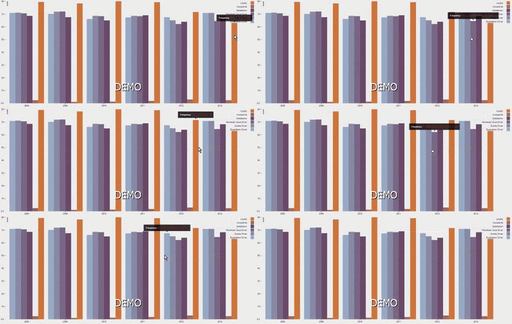
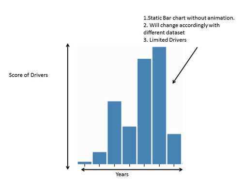
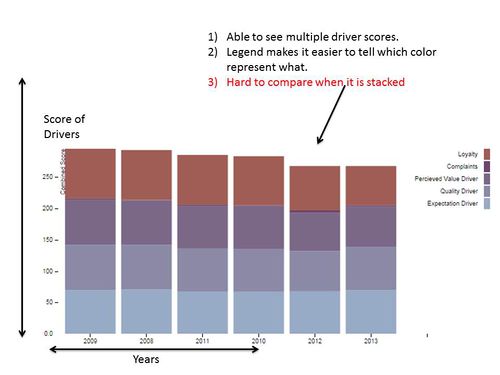
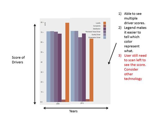
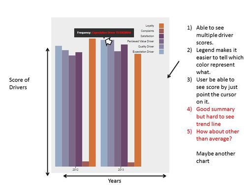
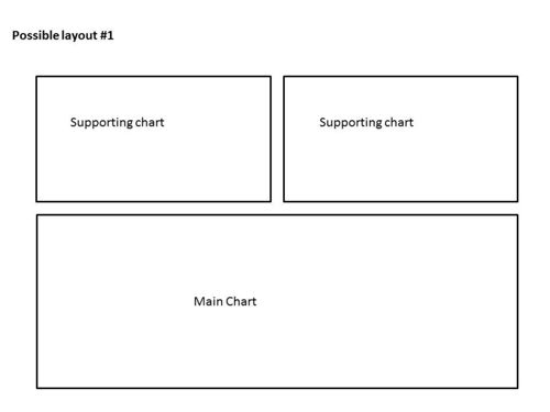
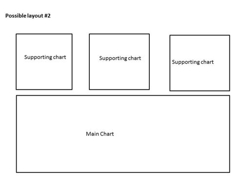
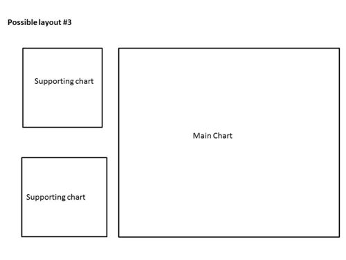
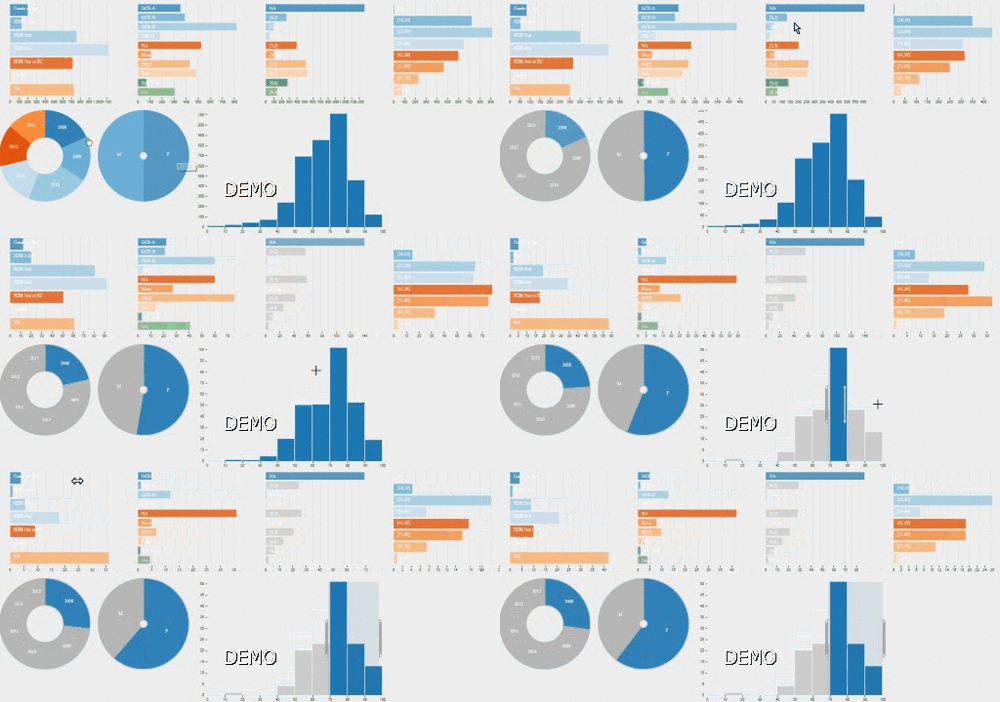
This portion shows the development of our bar charts. The bar charts shows the average scores of all the main score-drivers through out the years. With just a glance, users are able to compare the drivers of different years. Our bar chart has gone through several iterations as show. | This portion shows the development of our bar charts. The bar charts shows the average scores of all the main score-drivers through out the years. With just a glance, users are able to compare the drivers of different years. Our bar chart has gone through several iterations as show. | ||
Revision as of 21:59, 8 October 2014
| Home | Project Overview | Documentation |
Contents
Stakeholders
Supervisor : Seema Chokshi
Instructor : Daniel Koh
Sponsor : Marcus Lee
Development of Chart and Dashboards
Our dashboard has gone through many iterations of user testing and interactive design prototyping. The outcome of those are documented in this section
Quick Glance
Objective : The objective of the quick glance portion of the application was to give users a 30 second outlook on the situation. The charts are suppose to give very basic information but creates enough value to make some sense.
Bar Chart
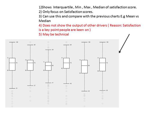
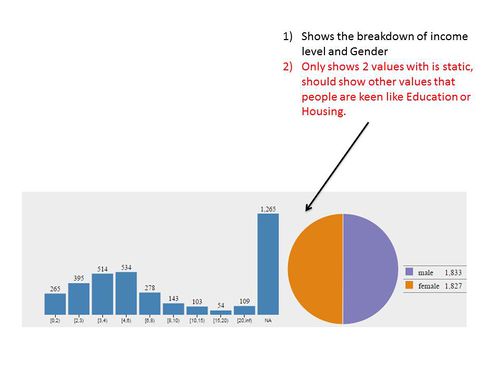
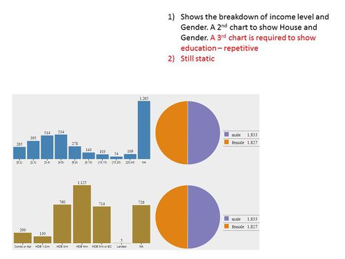
This portion shows the development of our bar charts. The bar charts shows the average scores of all the main score-drivers through out the years. With just a glance, users are able to compare the drivers of different years. Our bar chart has gone through several iterations as show.
