Difference between revisions of "Visualization of Consumer Satisfaction Project Overview"
| Line 12: | Line 12: | ||
| − | == <div style="background: # | + | == <div style="background: #0B0B61; padding: 15px; font-weight: bold; line-height: 0.3em"><font color= #FFFFFF>Background </font></div>== |
Consumer research has been a hot topic. Businesses and government agencies are interested to know the satisfaction levels of Singaporean consumers and effectively take actions that can create valuable and meaningful impact in the society. | Consumer research has been a hot topic. Businesses and government agencies are interested to know the satisfaction levels of Singaporean consumers and effectively take actions that can create valuable and meaningful impact in the society. | ||
This project explores these satisfaction levels. It uses the respondent level data from the Customer Satisfaction Index of Singapore (2008-2013) for the following sub-sectors: | This project explores these satisfaction levels. It uses the respondent level data from the Customer Satisfaction Index of Singapore (2008-2013) for the following sub-sectors: | ||
| Line 22: | Line 22: | ||
<br> | <br> | ||
| − | == <div style="background: # | + | == <div style="background: #0B0B61; padding: 15px; font-weight: bold; line-height: 0.3em"><font color= #FFFFFF>Motivation </font></div>== |
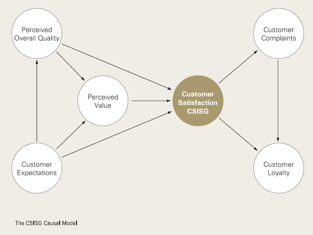
The motivation for doing this project was based on our interest in presenting the data in an interesting way that will help users and business leaders derive fresh insights from the data. Through the visualizations, we hope to illustrate customer satisfaction in various measures as shown in the CSISG Causal Model above to provide the users with a better understanding of the data. | The motivation for doing this project was based on our interest in presenting the data in an interesting way that will help users and business leaders derive fresh insights from the data. Through the visualizations, we hope to illustrate customer satisfaction in various measures as shown in the CSISG Causal Model above to provide the users with a better understanding of the data. | ||
<br> | <br> | ||
| − | == <div style="background: # | + | == <div style="background: #0B0B61; padding: 15px; font-weight: bold; line-height: 0.3em"><font color= #FFFFFF>Objective </font></div>== |
The primary scope of this project is to produce an Interactive Dashboard that shows market trends and customer satisfaction visually. We will try to incorporate a ‘fun’ element into the dashboard so that users and business leaders will be interested to play with it during events and roadshows organized by the Institute of Service Excellence. | The primary scope of this project is to produce an Interactive Dashboard that shows market trends and customer satisfaction visually. We will try to incorporate a ‘fun’ element into the dashboard so that users and business leaders will be interested to play with it during events and roadshows organized by the Institute of Service Excellence. | ||
| Line 32: | Line 32: | ||
<br> | <br> | ||
| − | == <div style="background: # | + | == <div style="background: #0B0B61; padding: 15px; font-weight: bold; line-height: 0.3em"><font color= #FFFFFF> Approach </font></div>== |
Our primary focus is building the Interactive Dashboard, relying mainly on d3.js as it provides us with the option of customizing our visualizations and charts. We will be taking up the SDLC Software Prototype Model to help us achieve our main objective. | Our primary focus is building the Interactive Dashboard, relying mainly on d3.js as it provides us with the option of customizing our visualizations and charts. We will be taking up the SDLC Software Prototype Model to help us achieve our main objective. | ||
We have conducted the Exploratory Data Analysis on the dataset given to us to explore the characteristics and discover any trends that are present in the data. We then tried to visualize the data using different charts to determine which chart is the best to show meaningful information. | We have conducted the Exploratory Data Analysis on the dataset given to us to explore the characteristics and discover any trends that are present in the data. We then tried to visualize the data using different charts to determine which chart is the best to show meaningful information. | ||
| Line 41: | Line 41: | ||
[[File:ApproachKes.png|800px]] | [[File:ApproachKes.png|800px]] | ||
| − | ===<div style="background: # | + | ===<div style="background: #0B0B61; padding: 15px; font-weight: bold; line-height: 0.3em"><font color= #FFFFFF>Project Timeline</font></div>=== |
[[File:TimelineKes.png|800px]] | [[File:TimelineKes.png|800px]] | ||
| − | ===<div style="background: # | + | ===<div style="background: #0B0B61; padding: 15px; font-weight: bold; line-height: 0.3em"><font color= #FFFFFF>Technology and Tools</font></div>=== |
[[Image:Techtools.png |500px]] | [[Image:Techtools.png |500px]] | ||
| − | ===<div style="background: # | + | ===<div style="background: #0B0B61; padding: 15px; font-weight: bold; line-height: 0.3em"><font color= #FFFFFF>Risk & Mitigation Plan</font></div>=== |
====Risk & Mitigation Plan Part 1 ==== | ====Risk & Mitigation Plan Part 1 ==== | ||
| Line 236: | Line 236: | ||
| − | ===<div style="background: # | + | ===<div style="background: #0B0B61; padding: 15px; font-weight: bold; line-height: 0.3em"><font color= #FFFFFF>Schedule Metrics</font></div>=== |
* Insert Schedule Metric | * Insert Schedule Metric | ||
| Line 289: | Line 289: | ||
. | . | ||
| − | ===<div style="background: # | + | ===<div style="background: #0B0B61; padding: 15px; font-weight: bold;"><font color= #FFFFFF>Bug Metrics</font></div>=== |
Revision as of 14:24, 8 October 2014
| Home | Project Overview | Documentation |
Contents
Background
Consumer research has been a hot topic. Businesses and government agencies are interested to know the satisfaction levels of Singaporean consumers and effectively take actions that can create valuable and meaningful impact in the society. This project explores these satisfaction levels. It uses the respondent level data from the Customer Satisfaction Index of Singapore (2008-2013) for the following sub-sectors:
The metrics that measure satisfaction includes:

Note: Referenced from the CSISG Brochure
Motivation
The motivation for doing this project was based on our interest in presenting the data in an interesting way that will help users and business leaders derive fresh insights from the data. Through the visualizations, we hope to illustrate customer satisfaction in various measures as shown in the CSISG Causal Model above to provide the users with a better understanding of the data.
Objective
The primary scope of this project is to produce an Interactive Dashboard that shows market trends and customer satisfaction visually. We will try to incorporate a ‘fun’ element into the dashboard so that users and business leaders will be interested to play with it during events and roadshows organized by the Institute of Service Excellence.
The secondary scope of this project will be to deploy the interactive dashboard onto the client’s preferred server and also create the documentation for the processing of the dataset for the interactive dashboard.
The tertiary scope of this project will be to automate the data formatting and processing of the datasets through backend codes for the dashboard. Finally, we will try and develop any predictive analysis models based on the datasets if possible.
Approach
Our primary focus is building the Interactive Dashboard, relying mainly on d3.js as it provides us with the option of customizing our visualizations and charts. We will be taking up the SDLC Software Prototype Model to help us achieve our main objective. We have conducted the Exploratory Data Analysis on the dataset given to us to explore the characteristics and discover any trends that are present in the data. We then tried to visualize the data using different charts to determine which chart is the best to show meaningful information.
After our initial analysis, we proceeded with the Prototyping of our Interactive Dashboard. The process of Prototyping will be explained more in detail in the report. This is an iterative process as we will continue to gather feedback from our supervisor and sponsor on the proposed dashboard and them come back to the drawing board to enhance our dashboard to suit our sponsor’s needs. Once the Prototyping process is completed, we will then proceed to finalize our Interactive Dashboard.
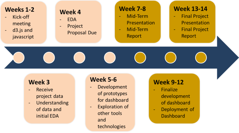
Project Timeline
Technology and Tools
Risk & Mitigation Plan
Risk & Mitigation Plan Part 1
| Types of Risk | Risk Description | Likelihood | Impact | Level | Mitigation |
|---|---|---|---|---|---|
| Project Management Risk |
Delay in completion of task. These task can cause possible bottlenecks due to dependency requirements. This may affect the delivery of the product. |
High |
Medium |
A |
Includes buffer in every iterations in order to deal with such situation. Do a clearly defined critical path to ensure a clear understanding on the critical path. More time and effort should be given core components that affects the success rate of other components. Understand which task can be brought forward in the event other task cannot be completed without prior pre-requisite component. |
|
Client may potentially have different ideas and suggestion along the way. This may translate into a scope creep , especially if the client were to venture into areas not discussed previously. |
Medium |
High |
A |
Change management Plan. Review each change request case by case.Discuss and interact with the client on the feasibility and priority of change. If a change is necessary, re-confirm priority of function with client again. A Change request may be rejected if the team is lacking resources such as time or man-power. | |
| Technical Risk |
Team is unfamiliar with the current technologies used such D3. All of the core components requires the use of D3 to interact with external sources like CSV files . There may be a need to involve other technologies and this could lead to integrating issues. |
High |
High |
A |
Study these technologies off-hand to be more prepare when development portion began. Technologies must be well understood for implementation, hence the Visual Analysts should explore the client's existing codes in order to utilize and re-usable codes. This also allows the Visual Analyst to understand the current logic that was implemented.
|
|
High volumes of data is stored by the client. Potentially these data may not be sufficiently clean and suitable for analysis. Most data derived from database management systems is geared towards speedy performance and transaction and not for Business Analytics. |
Medium |
Medium |
B |
Create new database structure specifically for business analytic. This is to ensure that the current database can still be used for fast performance while the new database structure free for study. Additional time will be given to extract, load and transform data to the most appropriate forms. | |
|
The project is implement a newly proposed dashboard. This is a problem as there is no previous reference for both the client and visual analyst. |
Medium |
Medium |
B |
During the exploration phase, the team can write comments base on what he/she has discover about a particular design. This helps those who have yet learn that part of the design to better follow the reasoning . Interaction with client frequently gives us a better understanding on the requirement. Also, consulting VA Prof may help. | |
|
Difficulty in integrating multiple systems together like Web service, database server and Visual analytics since the team does not have anything to work with. Team needs to pass the codes to the client so that he can test and check that it integrates seamlessly. |
Low |
High |
B |
Time will be taken to understand the limitation of the technologies used |
Risk & Mitigation Plan (Add on to original list)
| Types of Risk | Risk Description | Likelihood | Impact | Level | Mitigation |
|---|---|---|---|---|---|
| Project Management Risk |
Team members might underestimate school commitments and conflicting priorities. This might affect the completion of deliverables and even the quality. |
Medium |
Medium |
B |
Team members will meet up and discuss to clarify if there are other commitments they need to adhere to. PM will revise the schedule by including sufficient buffer days during such "busy" periods.
|
|
Team might not be able to complete all the agreed upon features by final presentation. |
Low |
High |
B |
Team will liaise with client and make client understand clearly why there might be a potential drop in functions i.e. due to lack of time according to schedule | |
| Technical Risk |
During the usage, a critical problem could occur if the client inserts a different/problematic kind of data that is not supported by the dashboard. |
Medium |
High |
A |
The team can educate the stakeholder on the type of data governance that needed to be adhere to for the dashboard to work seamlessly. |
Schedule Metrics
- Insert Schedule Metric
- The Schedule Metrics(SM) is used to keep track on the progress of the team.
- The result will be compiled and evaluated by the PM at the end of each iteration.
- The table below states the action plan when the metric is within the range of scores
Schedule Metrics (SM) = Actual time/Estimated time
| Score | Description | Action |
|---|---|---|
| SM < 0.7 |
Team is way behind schedule |
Very behind schedule. PM to conduct review to determine the cause of delay and to reschedule project. Consider dropping functionalities. |
| 0.7<=SM<=0.9 |
Team is behind schedule |
Behind schedule. PM to conduct review to determine the cause of delay. Bring delayed tasks into the next iteration and to reschedule project. Can choose to overload more tasks in the next iteration or push into buffer time |
| 0.9<=SM<=1.1 |
Team is on track |
Currently on track. Keep up with the progress. |
| 1.3=<SM<=1.1 |
Team is ahead of schedule |
Ahead of schedule. Review schedule and decide whether it is possible to bring forward tasks from next iteration to current iteration |
| SM > 1.3 |
Team is way ahead of schedule |
Very ahead of schedule. Bring forward tasks from next iteration to current iteration. Reschedule remaining iterations. |
.
Bug Metrics
- Insert Bug Metric
The following formula is used by the team to calculate Bug Metrics:
1 x num (low) + 5 x num (high) + 10 x num (critical)
| Severity | Description |
|---|---|
| Low Impact (1 points) |
Typo error or small user interface alignment issues |
| High Impact (5 points) |
The application runs. However, some non-critical functionalities are not working |
| Critical Impact(10 points) |
The application is down or is un-usable after a short period of time. The team must stop development and fix the bugs immediately |
Mitigation Plan
| Points in Iteration | Action |
|---|---|
| Points < 10 |
Use the planned debugging time in the iteration |
| Points >= 10 |
Stop current development and resolve the bug immediately |


