Difference between revisions of "Qui Vivra Verra - Geospatial Dashboard"
Cxpong.2013 (talk | contribs) |
Cxpong.2013 (talk | contribs) |
||
| Line 122: | Line 122: | ||
<div style="background: #dce6f9; line-height: 0.3em; font-family:Century Gothic; border-left: #003464 solid 15px;"><div style="border-left: #FFFFFF solid 5px; padding:15px;font-size:15px;"><font color= "#000000"><strong>Implementing the Huff's Model</strong></font></div></div> | <div style="background: #dce6f9; line-height: 0.3em; font-family:Century Gothic; border-left: #003464 solid 15px;"><div style="border-left: #FFFFFF solid 5px; padding:15px;font-size:15px;"><font color= "#000000"><strong>Implementing the Huff's Model</strong></font></div></div> | ||
| + | The dashboard uses another choropleth map, this time at the subzone level, to visualize the patron flow for each library predicted using the Huff’s Model built earlier. This dashboard is built using findings obtained from results from the Huff’s Model in the previous segment of the paper. | ||
| + | [[File:Geospatial10.png|frame|center|600x400px]] | ||
| + | |||
| + | From our earlier analysis, we have found that the number of MRT Stations, Tuition Centres and Collection Size significantly affects the attractiveness of a particular library, and has derived the corresponding alpha values for each of these variables. We have likewise determined the beta value for the distance decay variable. With these values known, we have built a function to calculate the Huff’s Probability of a particular library given the number of amenities around it, its collection size, and the distance from the library to a subzone. This function is made up of many smaller methods, each with the purpose of calculating a component of the Huff’s Model. | ||
| + | |||
| + | [[File:Geospatial11.png|frame|center|600x400px]] | ||
| + | |||
| + | This method takes in a list of libraries and their positions, and the buffer radius, and calculates the number of each type of amenities that lie within the designated buffer radius. The method then stores the information in a new dataframe. | ||
| + | |||
| + | [[File:Geospatial12.png|frame|center|600x400px]] | ||
| + | |||
| + | This method takes in a list of library and a list of subzone coordinates, and calculates the haversine distance between each library and each subzone. The calculated distance is then stored in a new dataframe. | ||
| + | |||
| + | [[File:Geospatial13.png|frame|center|600x400px]] | ||
| + | |||
| + | This method calculates the numerator of the Huff’s Model equation. This is possible as we have calculated all required variables in the numerator. The number of amenities, collection size and distance is obtained from the two methods mentioned above. The alpha and beta values are determined through an analysis done earlier in the report. With these variables known, we can obtain the Huff’s Model numerator using this code: | ||
| + | |||
| + | [[File:Geospatial14.png|frame|center|600x400px]] | ||
| + | [[File:Geospatial15.png|frame|center|600x400px]] | ||
| + | |||
| + | This method is used to get the Huff’s Model denominator by summing the Huff’s Model numerators for each planning area. | ||
| + | |||
| + | [[File:Geospatial16.png|frame|center|600x400px]] | ||
| + | |||
| + | Finally, we can obtain the Huff Model Probability, or probability of a patron from subzone I visiting library J, by dividing the Huff Model numerator by the Huff Model denominator. | ||
| + | |||
| + | [[File:Geospatial17.png|frame|center|600x400px]] | ||
| + | |||
| + | The dashboard visualization is created using the same method as the choropleth map for patron flow. | ||
| + | |||
| + | [[File:Geospatial18.png|frame|center|600x400px]] | ||
| + | |||
| + | Users can view the estimated number of patrons visiting a selected library from each subzone by selecting a library from the dropdown list located at the upper right area of the dashboard. | ||
| + | |||
| + | [[File:Geospatial19.png|frame|center|600x400px]] | ||
| + | |||
| + | The choropleth map is shaded according to the estimated number of patrons in each subzone for a library, calculated by multiplying the population of a subzone with the Huff Model probability. | ||
| + | |||
| + | [[File:Geospatial20.png|frame|center|600x400px]] | ||
| + | |||
| + | Additional data available to the user include the actual population of a subzone, the Huff Model probability for that subzone, and the difference between the estimated proportion and the actual proportion of patrons from the subzone visiting a selected library. | ||
| + | |||
| + | '''Adding and Removing Libraries''' | ||
| + | |||
| + | [[File:Geospatial21.png|frame|center|600x400px]] | ||
| + | |||
| + | A user is able to add a new location by clicking on a location on the map. To save this location for a new library, user will need to specify a name and the collection size of the proposed new library. | ||
| + | |||
| + | [[File:Geospatial22.png|frame|center|600x400px]] | ||
| + | |||
| + | Even after a location is added, the user can choose to remove a location by choosing from the list of added locations. | ||
| + | |||
| + | [[File:Geospatial23.png|frame|center|600x400px]] | ||
| + | |||
| + | A user is able to change the location of an existing library by selecting a library from the list of libraries. To change the location of the existing library, user can click on the desired location on the map and save the changes. | ||
| + | |||
| + | [[File:Geospatial24.png|frame|center|600x400px]] | ||
| + | |||
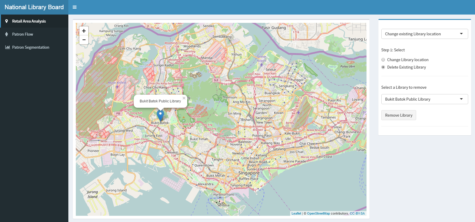
| + | To remove an existing library, user will need to select the library from the list of existing libraries. | ||
<div style="background: #dce6f9; line-height: 0.3em; font-family:Century Gothic; border-left: #003464 solid 15px;"><div style="border-left: #FFFFFF solid 5px; padding:15px;font-size:15px;"><font color= "#000000"><strong>The Adapted RFM Analysis</strong></font></div></div> | <div style="background: #dce6f9; line-height: 0.3em; font-family:Century Gothic; border-left: #003464 solid 15px;"><div style="border-left: #FFFFFF solid 5px; padding:15px;font-size:15px;"><font color= "#000000"><strong>The Adapted RFM Analysis</strong></font></div></div> | ||
Revision as of 22:32, 2 December 2016
Interactive Visualization of Geospatial Data
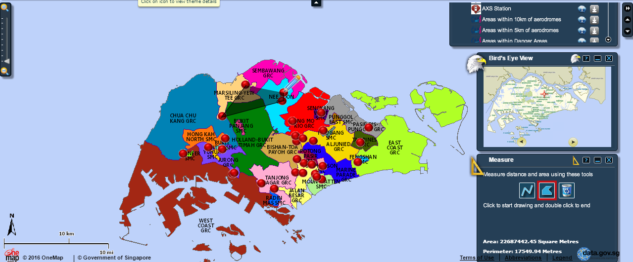
Building a dashboard for interactive visualization of geospatial data is not a novel idea, and has been used by many organizations around the world, including the Singapore Government. OneMap.sg is the Singapore government’s attempt to provide a service to visualize the geospatial information provided by the various government agencies, and has a variety of useful functions to aid users in visualizing data, which we will look at.
Firstly, OneMap.sg provides a large choice of base layers and data layers, allowing users to visualize geospatial data about a large variety of subjects. Users are also able to upload their own datasets onto to visualization service. The ability for users to upload additional data for visualization could be applied to the project, in which we will prepare various data layers that are most likely to have an impact on library patronage.
Next, OneMap.sg allows users to filter out unwanted data through a myriad of query functions like landQuery, SchoolQuery and BizQuery, allowing users to only see the data they want. This is another useful function that has relevant applications for the project, as it avoids cluttering the map. This will be implemented as selectable layers in the dashboard, allowing users to choose the layers they wish to visualize.
In addition to the large amount of data available for visualization on OneMap.sg and the utility functions, the dashboard also provides some basic analysis functions, like allowing users to measure distances and areas on the map.
While OneMap.Sg is useful for an introductory exploration into geospatial data, its lack of advanced analysis functions unfortunately limits the amount of insights that can be drawn from the data provided. However, it is sufficient for serving as a basic design for the project.
To leverage the statistical methods in R and wide range of libraries to create the dashboard functions and interface. Furthermore, as R is open-sourced, our sponsor can access the dashboard without purchasing commercial software.
List of R packages used:
- maptools: To manipulate spatial data
- rgdal: To read in the kml of subzone and planning area using readOGR
- leaflet: To create interactive web maps
- geosphere: To get the distance between a library and subzone centroid
- classInt: To group data points into 5 Jenks classification
- plyr: To rename rows and columns of dataframe
- shinydashboard: To quickly create a look and feel of a dashboard
Markers and Layers
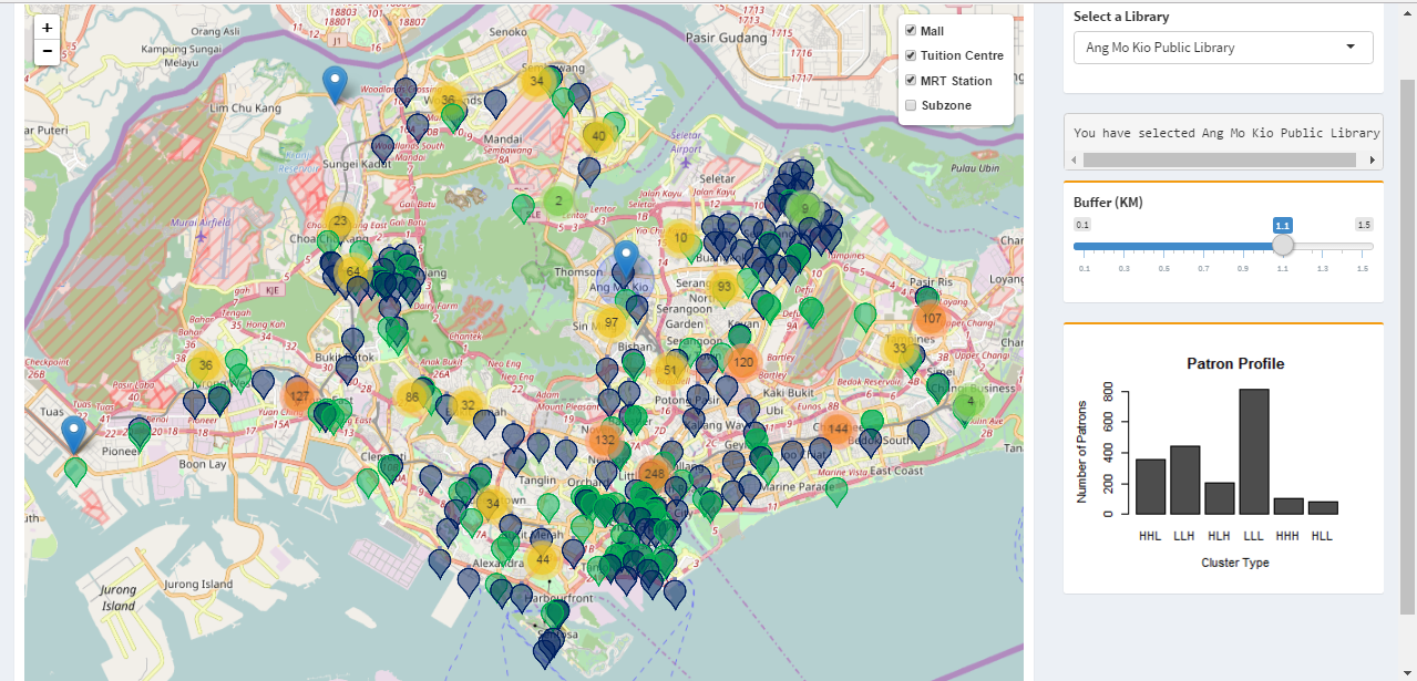
The dashboard for our project is built using a combination of Shiny R for its analytics functions like clustering and huff’s model and Leaflet.js for its geospatial visualization methods. To build the layers, we first read the various csv files containing information about the layers into R as data frames using R’s read.csv and readOGR methods.
The data frames are then converted to layers of markers, and placed on a base map using leaflet’s addTiles and addMarkers methods.
This basic visualization allows users to explore the data provided, and view the distribution of the locations of the facilities and libraries around the country.
Adjustable Buffer
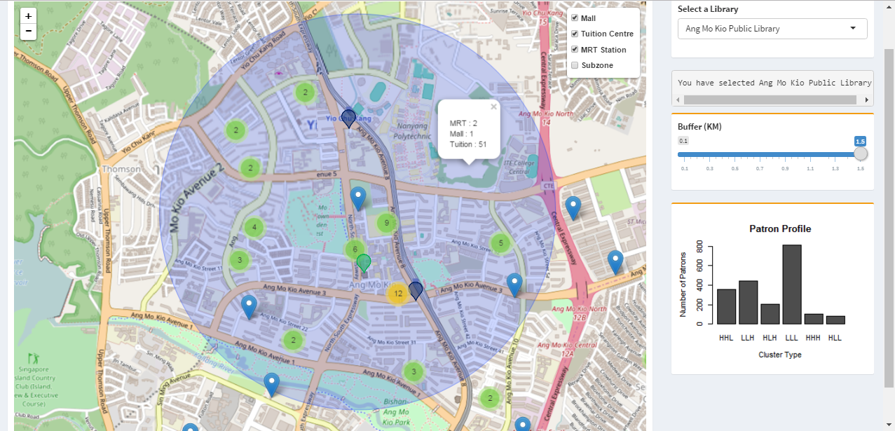
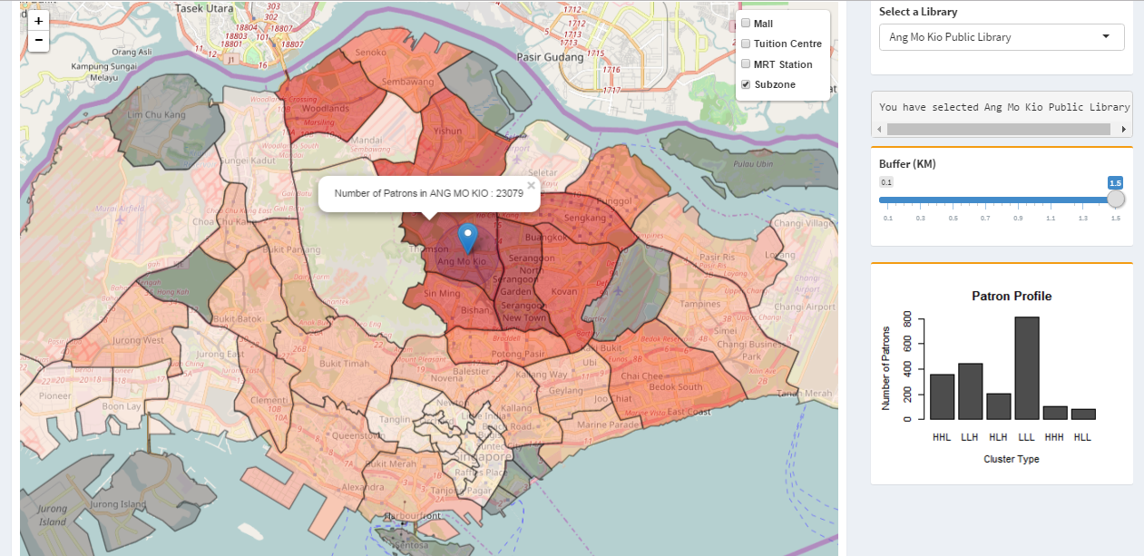
The dashboard provides some descriptive statistics for the users through the adjustable buffer function. Users can select the library they wish to visualize using a drop down list on the right hand side of the dashboard. Then using a slider on the right hand side of the dashboard, users can select the radius of the buffer area around the selected library.
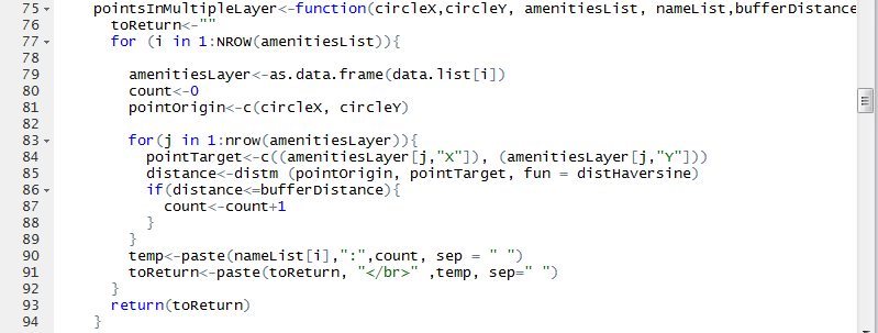
The popup around the library displays the number of each type of facility that falls within the buffer. This function allows the user to tell at a glance the number of facilities within a set distance of a library, allowing them to do a number of evaluations, like the centrality of the library using the number of train stations in the vicinity, or evaluate the amount of traffic around the library by looking at the number of shopping and tuition centres around it. Furthermore, the statistics provided by the buffer will be used to calculate the attractiveness index of a library for the huff’s model discussed later in the project. The adjustable buffer is accomplished by the method below.
The method takes in the coordinates of a library, a list of data frames containing the data of the facilities, and the radius of the buffer. It then computes the haversine distance from the library to each point in the data frames, and counts the number of points that lies within the buffer radius.
Choropleth Map
The dashboard uses a choropleth map to visualize the patron distribution for a selected library, with the colour intensity of the choropleth map representing the number of patrons in a planning area. A higher intensity represents a larger number of patrons. This visualization allows users to look for anomalies in the distribution of a library’s patron across the country, like excessively low or high number of patrons in a planning area going to the library.
To accomplish this visualization, a subset (the selected library) of the patron flow data for all libraries is extracted. Using this information, the data is further classified into 5 groups using the Jenks classification method, and a colour palette is created using this classification.
Next, polygons are created for each planning area, and coloured according to the number of patrons in each planning area.
When a user adds or removes a library to/from the existing list of libraries in the dashboard, a recalculation of the choice probabilities is performed and the visualizations will be updated accordingly. This will allow the user to compare the differences in patron-flow when changes are made to the location of a library vis-à-vis the locations of all the libraries.
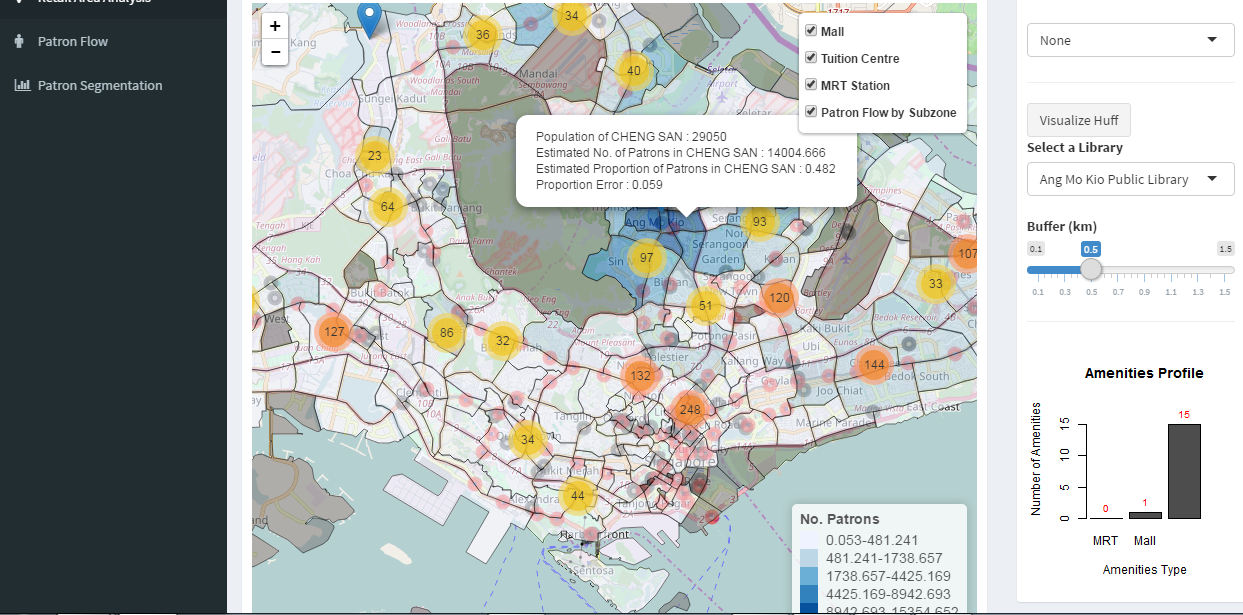
The dashboard uses another choropleth map, this time at the subzone level, to visualize the patron flow for each library predicted using the Huff’s Model built earlier. This dashboard is built using findings obtained from results from the Huff’s Model in the previous segment of the paper.
From our earlier analysis, we have found that the number of MRT Stations, Tuition Centres and Collection Size significantly affects the attractiveness of a particular library, and has derived the corresponding alpha values for each of these variables. We have likewise determined the beta value for the distance decay variable. With these values known, we have built a function to calculate the Huff’s Probability of a particular library given the number of amenities around it, its collection size, and the distance from the library to a subzone. This function is made up of many smaller methods, each with the purpose of calculating a component of the Huff’s Model.
This method takes in a list of libraries and their positions, and the buffer radius, and calculates the number of each type of amenities that lie within the designated buffer radius. The method then stores the information in a new dataframe.
This method takes in a list of library and a list of subzone coordinates, and calculates the haversine distance between each library and each subzone. The calculated distance is then stored in a new dataframe.
This method calculates the numerator of the Huff’s Model equation. This is possible as we have calculated all required variables in the numerator. The number of amenities, collection size and distance is obtained from the two methods mentioned above. The alpha and beta values are determined through an analysis done earlier in the report. With these variables known, we can obtain the Huff’s Model numerator using this code:
This method is used to get the Huff’s Model denominator by summing the Huff’s Model numerators for each planning area.
Finally, we can obtain the Huff Model Probability, or probability of a patron from subzone I visiting library J, by dividing the Huff Model numerator by the Huff Model denominator.
The dashboard visualization is created using the same method as the choropleth map for patron flow.
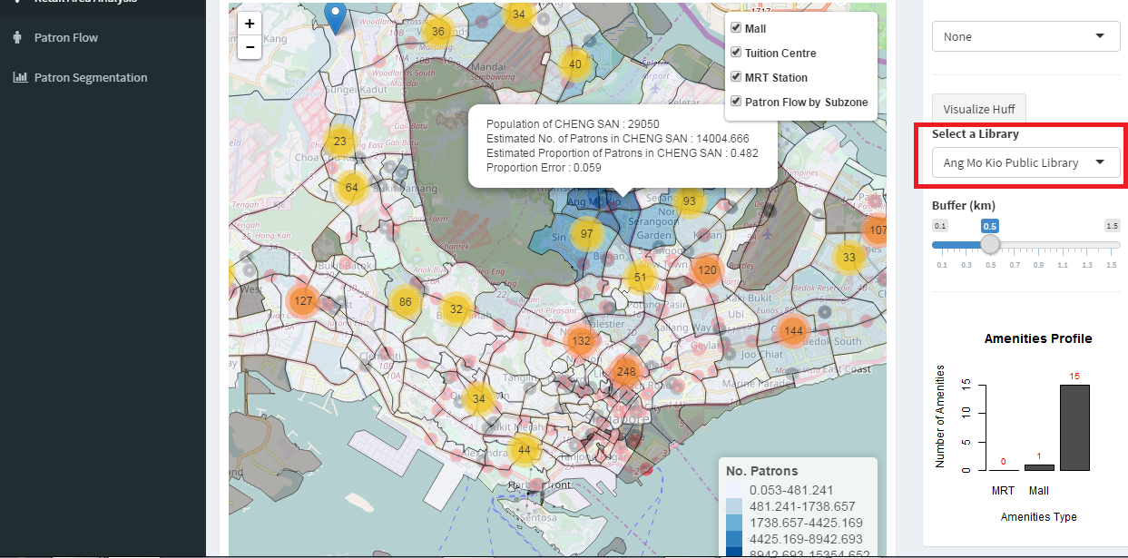
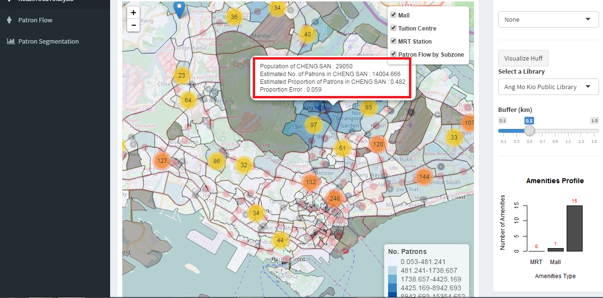
Users can view the estimated number of patrons visiting a selected library from each subzone by selecting a library from the dropdown list located at the upper right area of the dashboard.
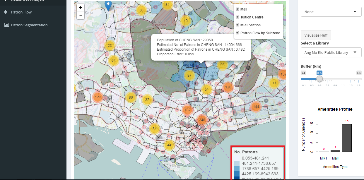
The choropleth map is shaded according to the estimated number of patrons in each subzone for a library, calculated by multiplying the population of a subzone with the Huff Model probability.
Additional data available to the user include the actual population of a subzone, the Huff Model probability for that subzone, and the difference between the estimated proportion and the actual proportion of patrons from the subzone visiting a selected library.
Adding and Removing Libraries
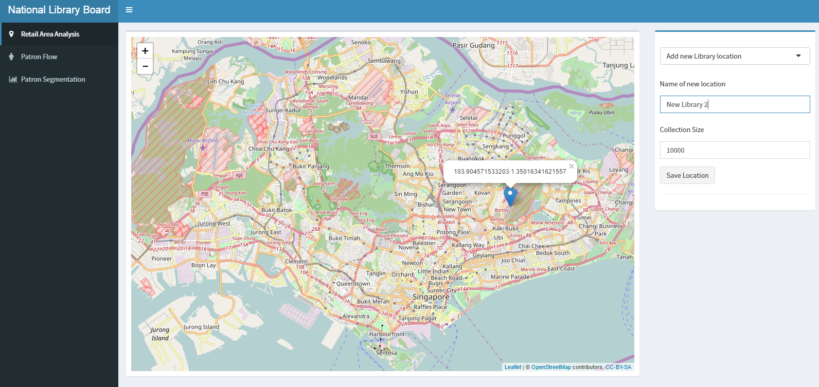
A user is able to add a new location by clicking on a location on the map. To save this location for a new library, user will need to specify a name and the collection size of the proposed new library.
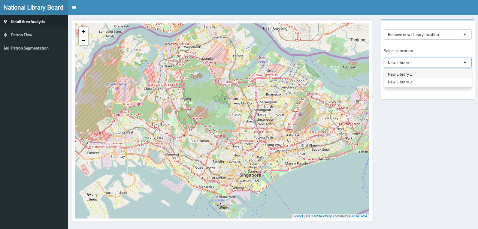
Even after a location is added, the user can choose to remove a location by choosing from the list of added locations.
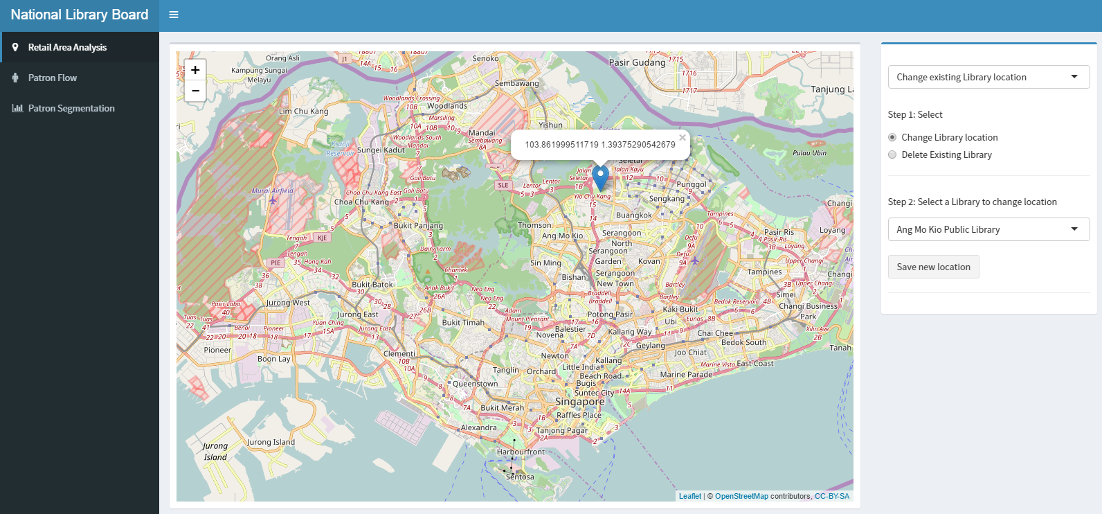
A user is able to change the location of an existing library by selecting a library from the list of libraries. To change the location of the existing library, user can click on the desired location on the map and save the changes.
To remove an existing library, user will need to select the library from the list of existing libraries.
As the library provides service that is not valued in monetary terms, there is a need to tweak the RFM criterion to better fit the patron-library context. Recency is defined as the number of days from the last transacted date to the end of the FY. Frequency is the number of transactions performed by a patron during the FY. Lastly, Monetary is the average number of books borrowed per transaction by the patron during the FY.
By looking at the how recent was the patron’s last transaction (recency), how many times did they visit the library in a year (frequency), and the average number of books borrowed per transaction (monetary), we can potentially divide patrons into distinct groups based on differences in their borrowing patterns.
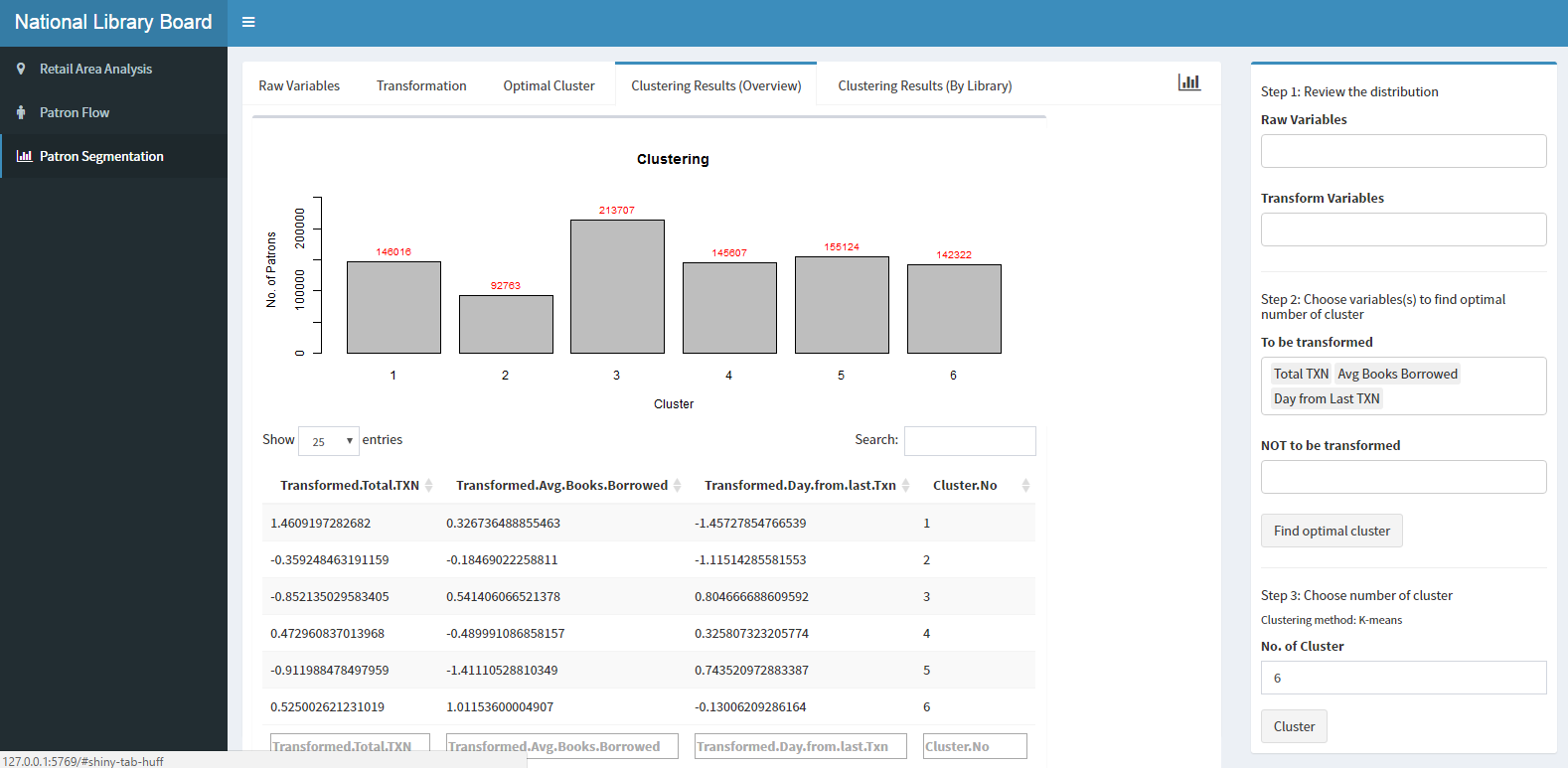
We first compute the R, F and M criterion from the raw transaction data provided by the NLB. Next, we observe the distribution of each criterion, and perform transformations if required. Using k-means cluster algorithm, we assign each patron to a cluster, with each cluster homogenous within and heterogeneous across the criterion. Instead of the metric-scoring method described by the typical RFM method, we utilised the cluster analysis method to split the patrons into different clusters based on their borrowing patterns. Arguably, this is a method which warrants greater scientific rigour, as the groups are not subjectively divided; the division into groups follow the optimization required of cluster analysis i.e. minimize the total within-cluster sum of squared error.
From here, we can determine the dominant cluster of patrons that each library caters to – which provides user with some operational insights by understanding the demographics of the bulk of each library’s patrons.
We have added various dashboard functions which mimics the steps described above.
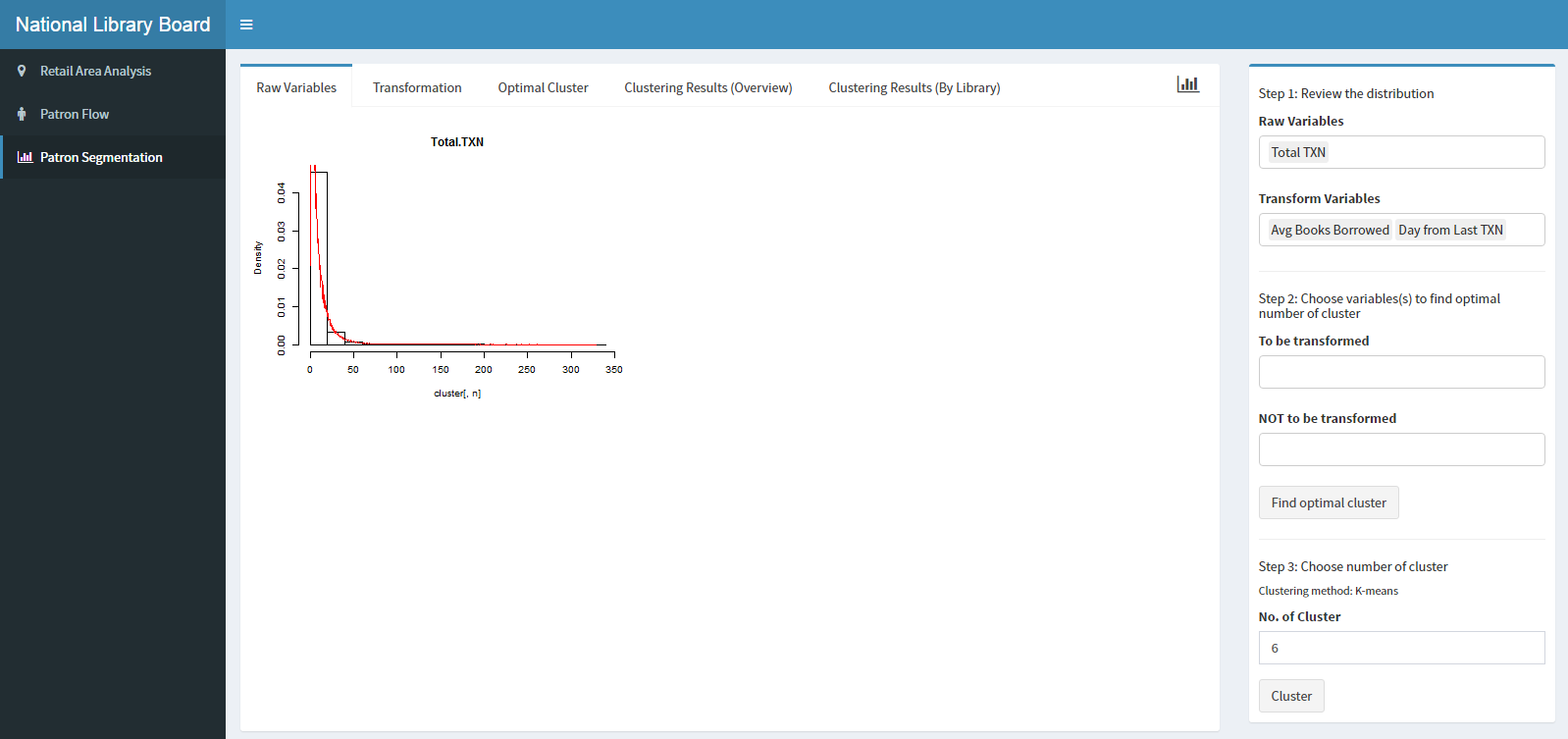
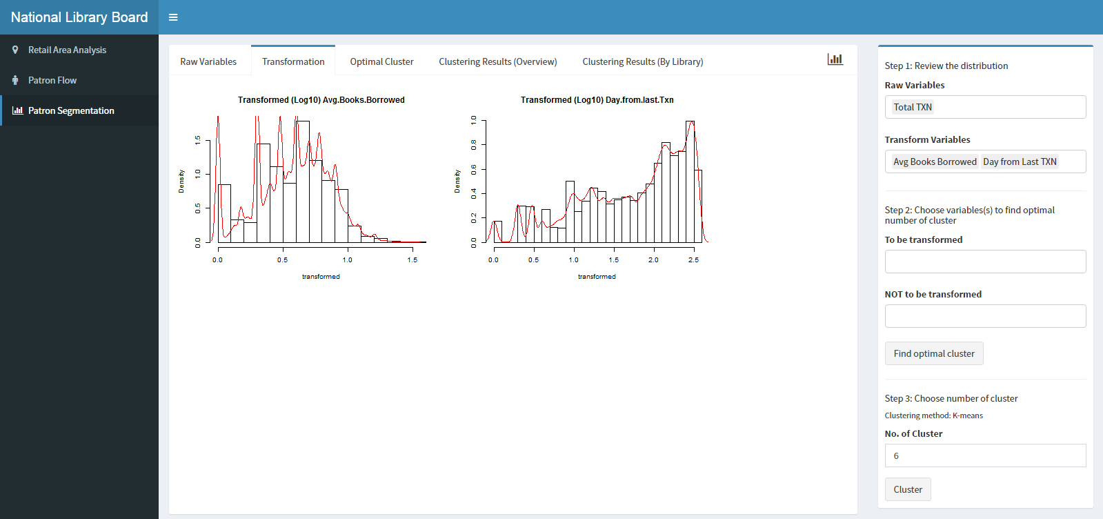
A list of numeric variables is populated into the dropdown Raw Variables and Transform Variables for the purpose of allowing users to explore the data before performing cluster analysis. The exploration includes evaluating distribution of the variables. If the variables are skewed, users can then perform a transformation on the variables, which is more appropriate for clustering.
Prior to cluster analysis, users can review the transformed distribution to see if they would want to use the transformed or the actual variable for clustering. Users have the freedom to select up to the number of raw variables (a mix of transformed and non-transformed variable) that are populated in the list.
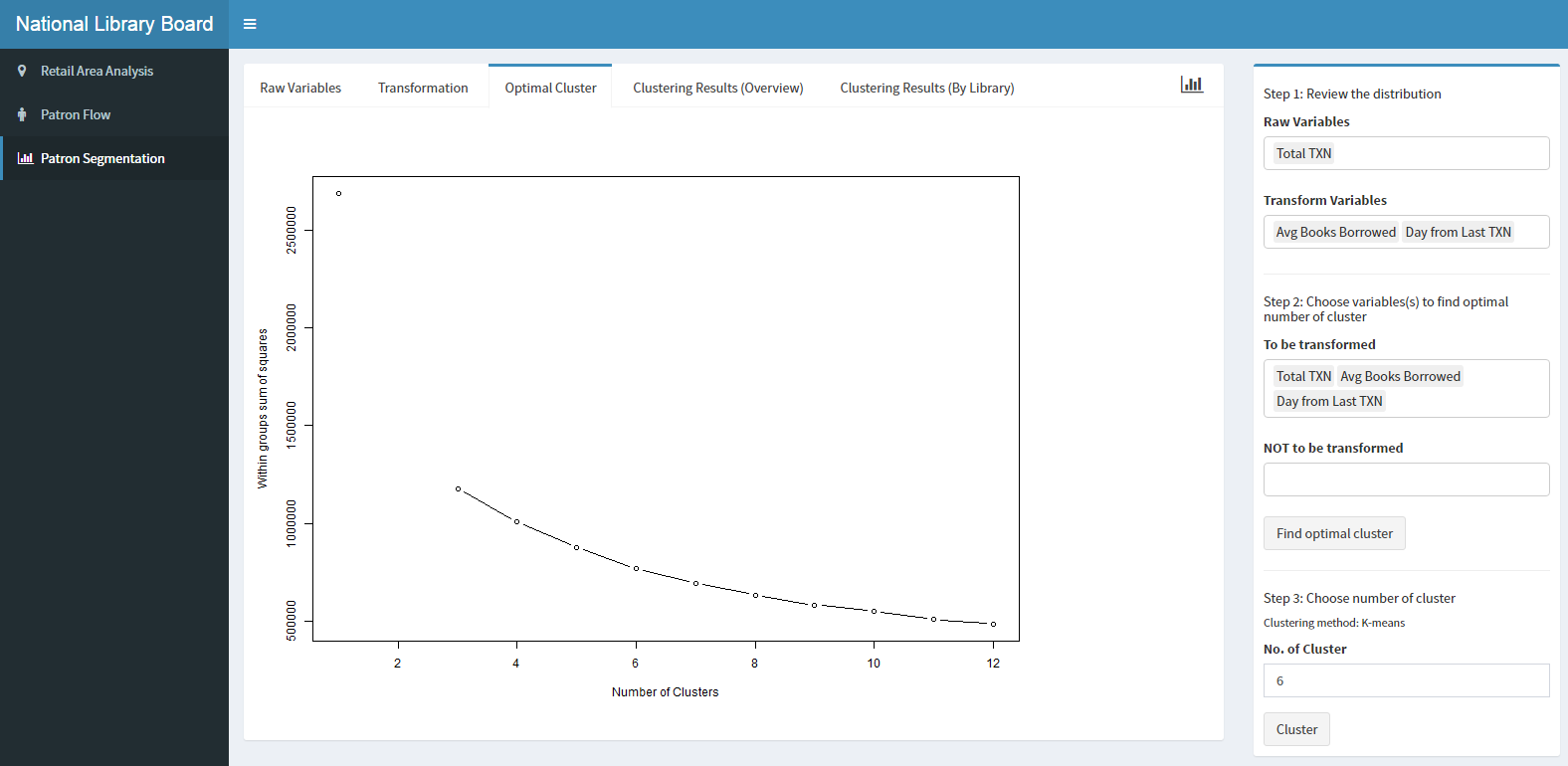
Clustering variables to be transformed are mutually exclusive from variables that are not to be transformed. The clustering criterion is the within-cluster sum of squares (WSS) that is generated from the optimal number of clusters. Users are able to view the WSS for different values of k (no. of clusters), and from there, input their desired k to generate the clustering results. The clustering method that will be used is fixed to k-means clustering.
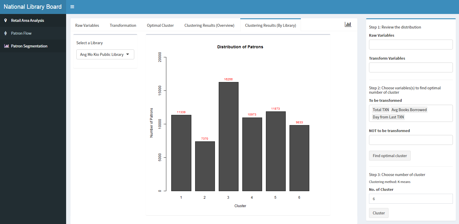
After clustering, a bar chart of the cluster, along with the number of patrons in each cluster will be visualised. The cluster mean of each cluster will also be shown to the user in order to profile the clusters.
Users can also understand the distribution of patrons by clusters for a selected library. It shows the clusters of patrons visiting the selected library.
With these functions, users have the flexibility to select which variables to be considered in the cluster analysis, and the number of clusters which they believe to be optimal.
