Difference between revisions of "Qui Vivra Verra - Initial Visualizations & Findings"
Cxpong.2013 (talk | contribs) |
Cxpong.2013 (talk | contribs) |
||
| Line 49: | Line 49: | ||
'''Features''' | '''Features''' | ||
| + | |||
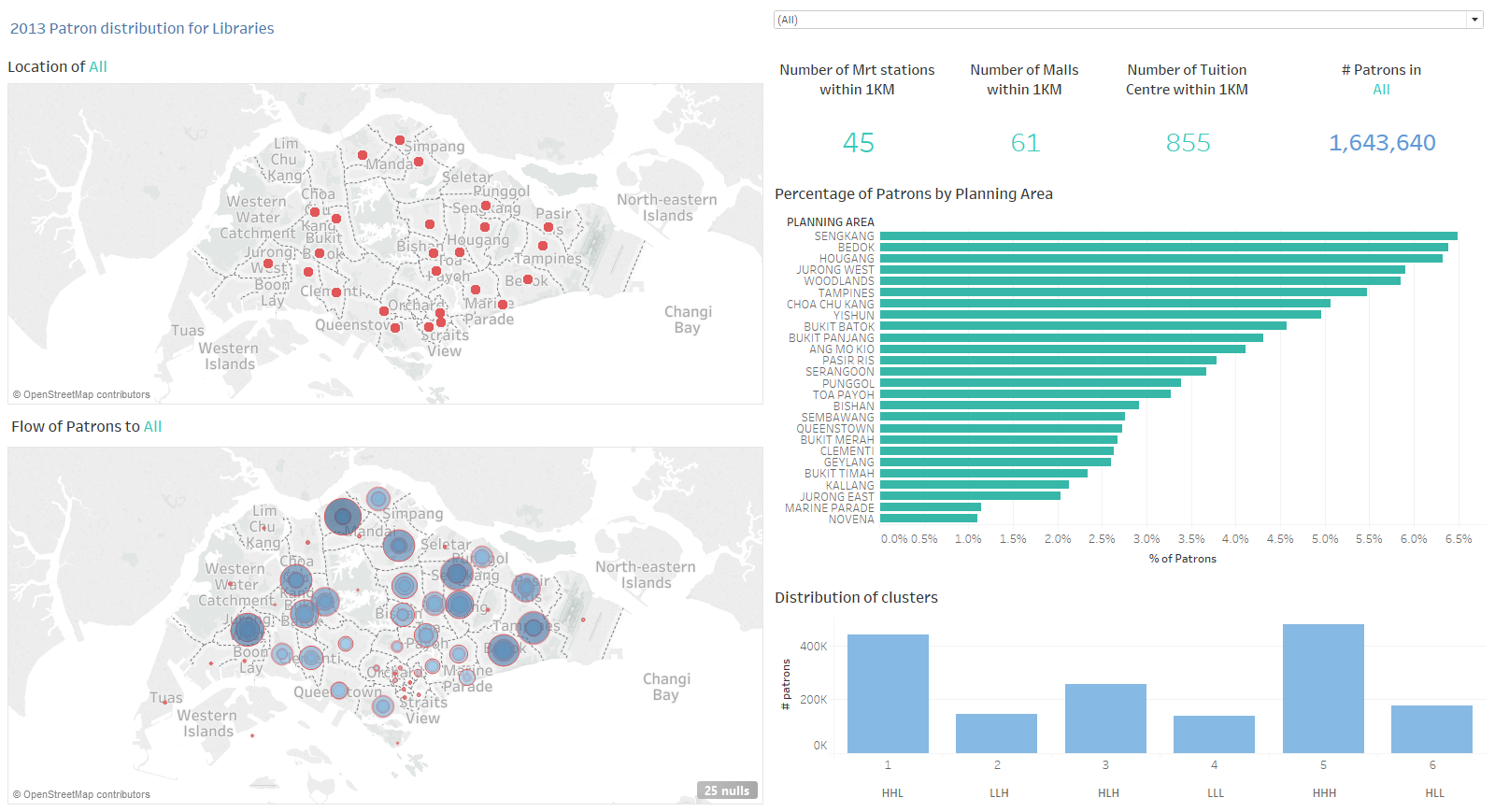
| + | The dashboard visualisation below allows users to understand the flow of patrons to each of the libraries using the FY2013 datasets. The following section will explain the different features in the dashboard. | ||
| + | |||
| + | [[File:Patron Flow1.png|frame|none|600x400px]] | ||
| + | |||
| + | |||
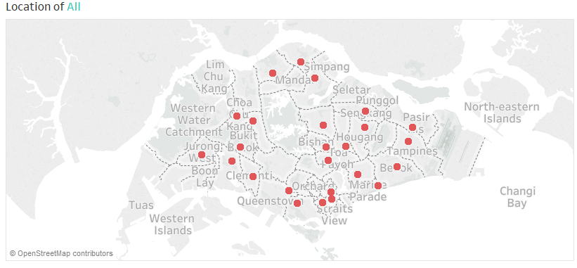
| + | * Location of Library | ||
| + | |||
| + | The map visualises the location of the selected library. | ||
| + | |||
| + | [[File:Patron Flow2.png|frame|none|600x400px]] | ||
| + | |||
| + | |||
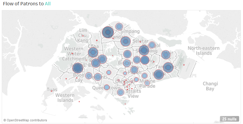
| + | * Geographical Distribution of Patrons | ||
| + | |||
| + | The map visualises the flow of patrons (by Planning Area) to the selected library. | ||
| + | |||
| + | [[File:Patron Flow3.png|frame|none|600x400px]] | ||
| + | |||
| + | |||
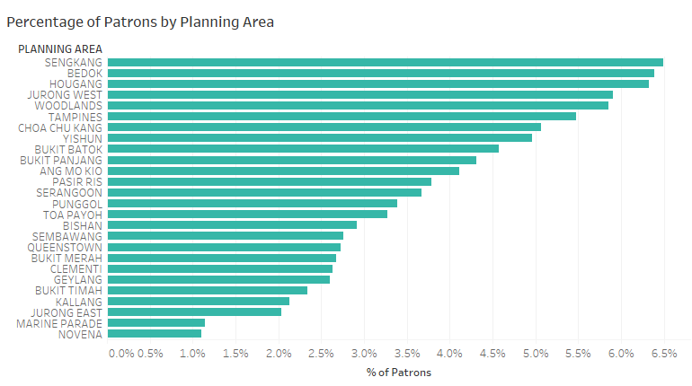
| + | * Distribution of Patrons | ||
| + | |||
| + | The bar chart is sorted in descending order to identify the top Planning Areas with higher number of patrons for the selected library. | ||
| + | |||
| + | [[File:Patron Flow4.png|frame|none|600x400px]] | ||
| + | |||
| + | |||
| + | * Distribution of Patrons by Clusters | ||
| + | |||
| + | The distribution of patrons by clusters (from RFM Analysis below) for selected library is as shown. | ||
| + | |||
| + | [[File:Patron Flow5.png|frame|none|600x400px]] | ||
| + | |||
| + | |||
| + | * Number of Nearby Amenities From Library | ||
| + | |||
| + | The number of nearby amenities (MRT stations, Malls and Tuition Centres) within 1 km from the selected library. | ||
| + | |||
| + | [[File:Patron Flow6.png|frame|none|600x400px]] | ||
| + | |||
| + | |||
| + | * Number of Patrons in Library | ||
| + | |||
| + | The number of unique patrons visiting the selected library. | ||
| + | |||
| + | [[File:Patron Flow7.png|frame|none|600x400px]] | ||
Revision as of 00:30, 11 October 2016
Features
The dashboard visualisation below allows users to understand the flow of patrons to each of the libraries using the FY2013 datasets. The following section will explain the different features in the dashboard.
- Location of Library
The map visualises the location of the selected library.
- Geographical Distribution of Patrons
The map visualises the flow of patrons (by Planning Area) to the selected library.
- Distribution of Patrons
The bar chart is sorted in descending order to identify the top Planning Areas with higher number of patrons for the selected library.
- Distribution of Patrons by Clusters
The distribution of patrons by clusters (from RFM Analysis below) for selected library is as shown.
- Number of Nearby Amenities From Library
The number of nearby amenities (MRT stations, Malls and Tuition Centres) within 1 km from the selected library.
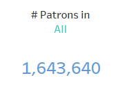
- Number of Patrons in Library
The number of unique patrons visiting the selected library.
Findings
Features
Findings
Features
Findings
