Difference between revisions of "Visualization of Consumer Satisfaction"
| Line 14: | Line 14: | ||
== <div style="background: #0B0B61; padding: 15px; font-weight: bold; line-height: 0.3em"><font color= #FFFFFF>Development of Chart and Dashboards</font></div> == | == <div style="background: #0B0B61; padding: 15px; font-weight: bold; line-height: 0.3em"><font color= #FFFFFF>Development of Chart and Dashboards</font></div> == | ||
| − | Our dashboard has gone through many iterations of user testing and interactive design prototyping. The outcome of those are documented in this section | + | Our dashboard has gone through many iterations of user testing and interactive design prototyping. The outcome of those are documented in this section. |
| − | === <div style="background: # | + | === <div style="background: #B18904; padding: 10px; font-weight: bold; line-height: 0.3em"><font color= #FFFFFF> Main Dashboard </font></div>=== |
| + | |||
| + | ==== Mid-Term Prototype ==== | ||
| + | |||
| + | After iterating through our development process, we finally came up with a working interactive dashboard prototype using different libraries and technologies. Initially, we split our visualizations into 3 different categories: Quick Glance, Parallel Coordinates and the final interactive Demographic Dashboard. However, as mentioned in the development process in previous sections, we will be removing the Quick Glance and Parallel Coordinates section as it was not very useful to our sponsor. We will focus our effort mainly in perfecting the interactive demographic dashboard as it is the closest to our final product. | ||
| + | |||
| + | <center> | ||
| + | {| | ||
| + | |[[File:2014 gif 7.gif|600px|Mid-Term version of dashboard]] | ||
| + | |} | ||
| + | </center> | ||
| + | |||
| + | Our sponsor mentioned the following changes to be made to the dashboard to make it more useful: | ||
| + | *Remove the Donut and Pie Charts and make them horizontal bar charts like other attributes | ||
| + | *Change the values of all the variables to percentages instead of aggregated values | ||
| + | |||
| + | Besides suggesting the following changes, our sponsor also requested for an entire new dashboard with the following features in mind: | ||
| + | *Develop line charts for the each of the 6 value drivers and place them in a 2 by 3 format | ||
| + | *Add all the demographic variables as filters on top of the line charts | ||
| + | |||
| + | === <div style="background: #B18904; padding: 10px; font-weight: bold; line-height: 0.3em"><font color= #FFFFFF> Exploring Interactivity of charts </font></div>=== | ||
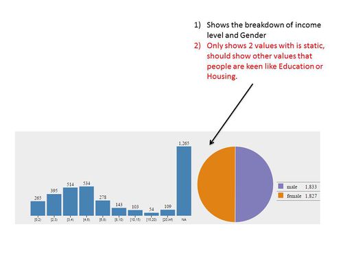
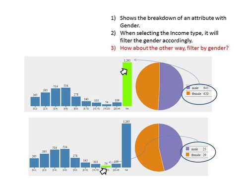
| + | After several attempts at developing simple charts with d3.js. we proceed to develop interactive charts for the demographic variables, as a stepping stone for our final dashboard. The initial idea of this simple interactive chart consists of a Histogram and a Pie Chart. Both charts can be interchangeable with the demographic variables in the dataset. | ||
| + | {| | ||
| + | |[[File:2014 1 Slide14.JPG|500px|thumb]] | ||
| + | |[[File:2014 1 Slide15.JPG|500px|thumb]] | ||
| + | |} | ||
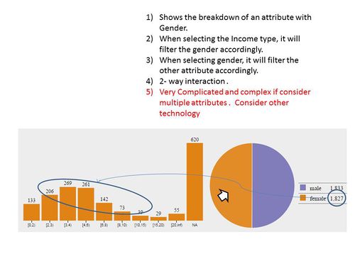
| + | By moving the mouse over to a bar or the pie chart, the chart figures and size will change accordingly. The highlighted bar or pie acts as a filter for the entire chart, and the chart reacts to the filter interactively. | ||
| + | Through this initial development of an interactive chart, we got a better understanding of developing the final interactive dashboard consisting of different variables, as our main focus of the dashboard is in the various value drivers. | ||
| + | {| | ||
| + | |[[File:2014 1 Slide16.JPG|500px|thumb]] | ||
| + | |[[File:2014 1 Slide17.JPG|500px|thumb]] | ||
| + | |} | ||
| + | <center> | ||
| + | {| | ||
| + | |[[File:2014 gif 2.gif|500px|thumb|Brief demonstration of interactivity]] | ||
| + | |} | ||
| + | </center> | ||
| + | |||
| + | === <div style="background: #B18904; padding: 10px; font-weight: bold; line-height: 0.3em"><font color= #FFFFFF> Quick Glance </font></div>=== | ||
Objective : The objective of the quick glance portion of the application was to give users a 30 second outlook on the situation. The charts are suppose to give very basic information but creates enough value to make some sense. | Objective : The objective of the quick glance portion of the application was to give users a 30 second outlook on the situation. The charts are suppose to give very basic information but creates enough value to make some sense. | ||
| Line 46: | Line 84: | ||
| − | === <div style="background: # | + | === <div style="background: #B18904; padding: 10px; font-weight: bold; line-height: 0.3em"><font color= #FFFFFF> Individual Levels </font></div>=== |
This portion goes to a very granular level where each row of data will be visualized. This part contrast the quick glance as this shows the specific response where else quick glance shows an aggregated output. | This portion goes to a very granular level where each row of data will be visualized. This part contrast the quick glance as this shows the specific response where else quick glance shows an aggregated output. | ||
| Line 72: | Line 110: | ||
[[File:2014 gif 6.gif|600px]] | [[File:2014 gif 6.gif|600px]] | ||
</center> | </center> | ||
| − | |||
| − | |||
| − | |||
| − | |||
| − | |||
| − | |||
| − | |||
| − | |||
| − | |||
| − | |||
| − | |||
| − | |||
| − | |||
| − | |||
| − | |||
| − | |||
| − | |||
| − | |||
| − | |||
{| class="wikitable" | {| class="wikitable" | ||
| Line 96: | Line 115: | ||
! Chart Type !! Demo Version !!Version 1 !! Version 2 !! Version 3 !! Version 4 !! Version 5 !! Version 6 | ! Chart Type !! Demo Version !!Version 1 !! Version 2 !! Version 3 !! Version 4 !! Version 5 !! Version 6 | ||
|- | |- | ||
| − | | Layout acts as a blueprint for dashboard design || '''Not Available Yet''' ||[[File:2014 1 Slide3.JPG| | + | | Layout acts as a blueprint for dashboard design || '''Not Available Yet''' ||[[File:2014 1 Slide3.JPG|300px]] || [[File:2014 1 Slide4.JPG|300px]] || [[File:2014 1 Slide5.JPG|300px]]|| [[File:2014 1 Slide6.JPG|300px]]|| Example || Example |
|- | |- | ||
| − | | Dash Board - working towards a end product|| [[File:2014 gif 2.gif| | + | | Dash Board - working towards a end product|| [[File:2014 gif 2.gif|300px]] || [[File:2014 1 Slide14.JPG|300px]]|| [[File:2014 1 Slide15.JPG|300px]]|| [[File:2014 1 Slide16.JPG|300px]]|| [[File:2014 1 Slide17.JPG|300px]]|| Example || Example |
|- | |- | ||
| − | | Multi-linear chart to show the scores for everyone. Granular level to show specifics ( removed eventually due to confusion ) || [[File:2014 gif 3.gif| | + | | Multi-linear chart to show the scores for everyone. Granular level to show specifics ( removed eventually due to confusion ) || [[File:2014 gif 3.gif|300px]] || [[File:2014 1 Slide18.JPG|300px]]|| [[File:2014 1 Slide19.JPG|300px]]|| [[File:2014 1 Slide20.JPG|300px]]|| [[File:2014 1 Slide21.JPG|300px]]|| Example || Example |
|- | |- | ||
| − | |Parallel Chart to show the scores given to each person. || [[File:2014 gif 4.gif| | + | |Parallel Chart to show the scores given to each person. || [[File:2014 gif 4.gif|300px]]|| [[File:2014 1 Slide23.JPG|300px]]|| [[File:2014 1 Slide24.JPG|300px]]|| [[File:2014 1 Slide25.JPG|300px]]|| [[File:2014 1 Slide26.JPG|300px]] || Example || Example |
|- | |- | ||
| − | | Sensitivity Analysis || [[File:2014 gif 6.gif| | + | | Sensitivity Analysis || [[File:2014 gif 6.gif|300px]]|| Example || Example || Example || Example || Example || Example |
|- | |- | ||
| − | | Dashboard Mid-term || [[File:2014 gif 7.gif| | + | | Dashboard Mid-term || [[File:2014 gif 7.gif|300px]]|| Example || Example || Example || Example || Example || Example |
Revision as of 15:29, 14 October 2014
| Home | Project Overview | Documentation |
Contents
Development of Chart and Dashboards
Our dashboard has gone through many iterations of user testing and interactive design prototyping. The outcome of those are documented in this section.
Main Dashboard
Mid-Term Prototype
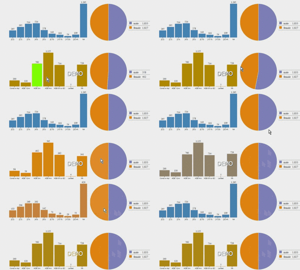
After iterating through our development process, we finally came up with a working interactive dashboard prototype using different libraries and technologies. Initially, we split our visualizations into 3 different categories: Quick Glance, Parallel Coordinates and the final interactive Demographic Dashboard. However, as mentioned in the development process in previous sections, we will be removing the Quick Glance and Parallel Coordinates section as it was not very useful to our sponsor. We will focus our effort mainly in perfecting the interactive demographic dashboard as it is the closest to our final product.

|
Our sponsor mentioned the following changes to be made to the dashboard to make it more useful:
- Remove the Donut and Pie Charts and make them horizontal bar charts like other attributes
- Change the values of all the variables to percentages instead of aggregated values
Besides suggesting the following changes, our sponsor also requested for an entire new dashboard with the following features in mind:
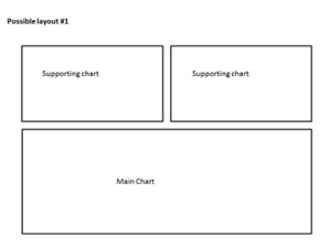
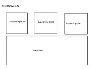
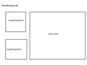
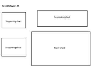
- Develop line charts for the each of the 6 value drivers and place them in a 2 by 3 format
- Add all the demographic variables as filters on top of the line charts
Exploring Interactivity of charts
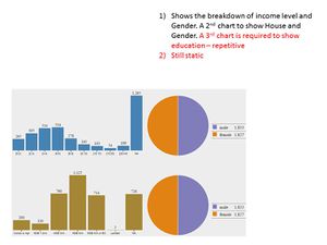
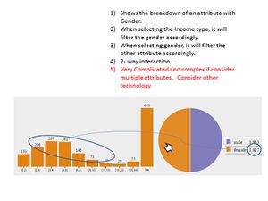
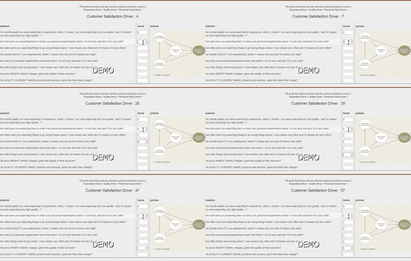
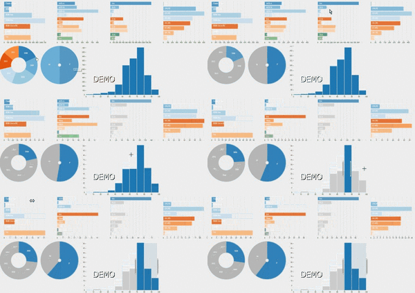
After several attempts at developing simple charts with d3.js. we proceed to develop interactive charts for the demographic variables, as a stepping stone for our final dashboard. The initial idea of this simple interactive chart consists of a Histogram and a Pie Chart. Both charts can be interchangeable with the demographic variables in the dataset.
By moving the mouse over to a bar or the pie chart, the chart figures and size will change accordingly. The highlighted bar or pie acts as a filter for the entire chart, and the chart reacts to the filter interactively. Through this initial development of an interactive chart, we got a better understanding of developing the final interactive dashboard consisting of different variables, as our main focus of the dashboard is in the various value drivers.
Quick Glance
Objective : The objective of the quick glance portion of the application was to give users a 30 second outlook on the situation. The charts are suppose to give very basic information but creates enough value to make some sense.
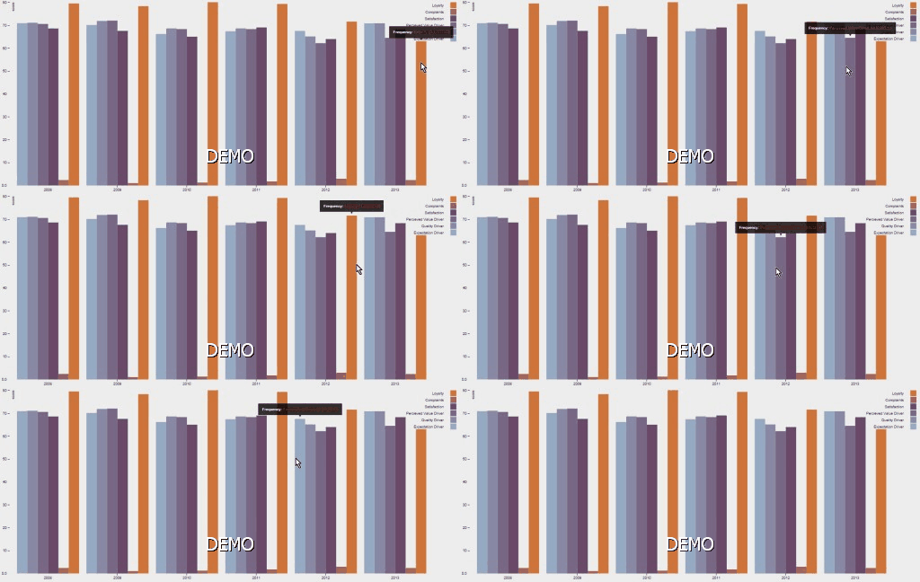
Bar Chart
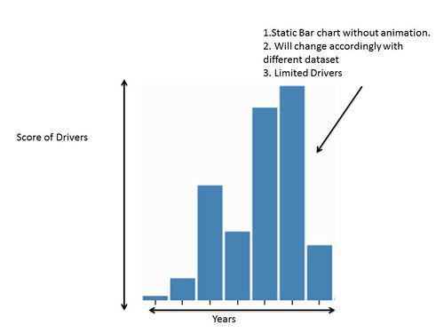
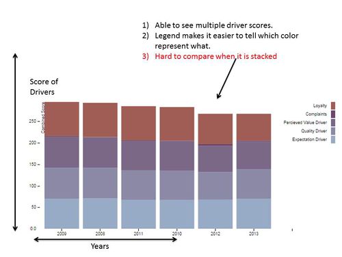
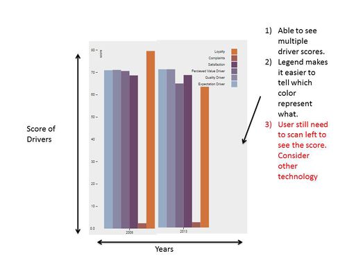
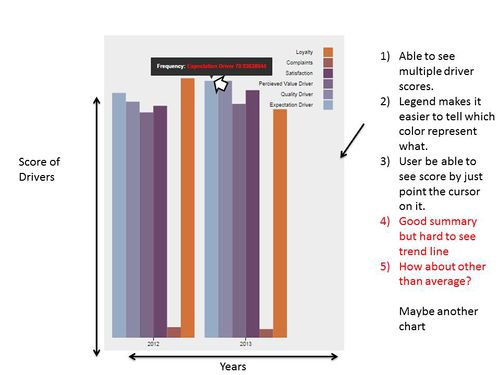
This portion shows the development of our bar charts. The bar charts shows the average scores of all the main score-drivers through out the years. With just a glance, users are able to compare the drivers of different years. Our bar chart has gone through several iterations as show.
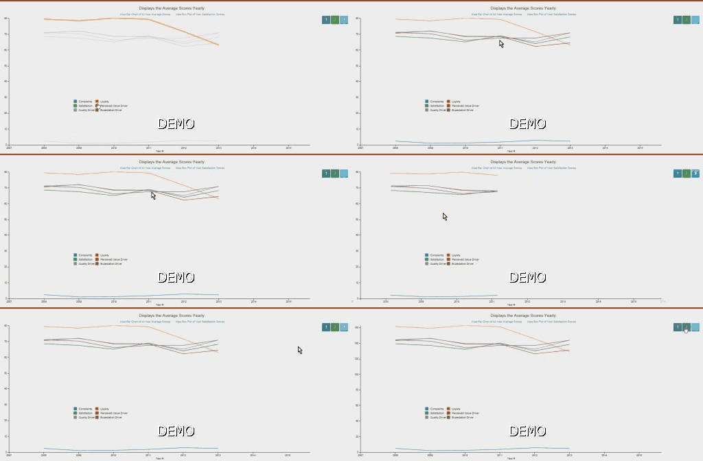
Line Chart
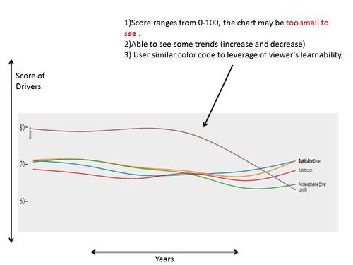
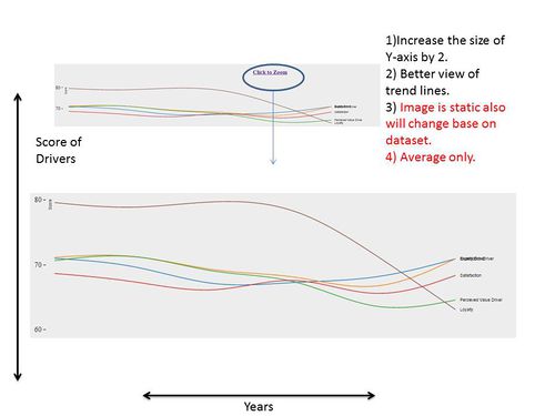
This portion shows the development of our line charts. The line charts shows the average scores of all the main score-drivers through out the years in a linear manner. The objective was to see trends easier than looking at the bar charts. With just a glance, users are able to see increase or decrease in certain drivers throughout the years. The can only see how each drivers react with each other. Our line chart has gone through several iterations as show.
Box Plot
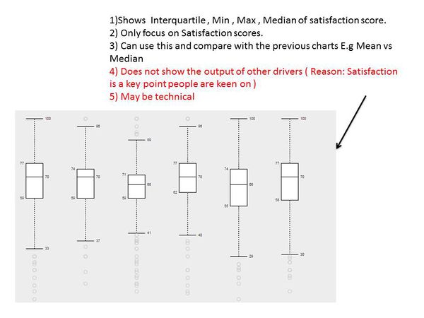
The box plot was created in response to wanting additional information apart from just the averages. The box plot below was created base on the Satisfaction driver (Main driver people are interested ). With this chart, people are able to see the Median and the quarter ranges. This chart did not go any deeper as Heuristic evaluation suggests that such charts are complex and requires training to interpret.
Individual Levels
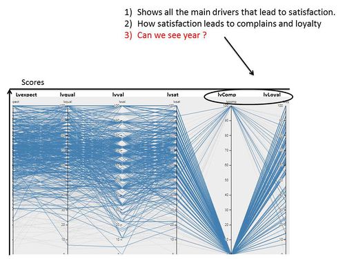
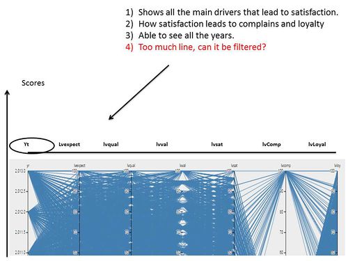
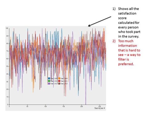
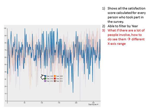
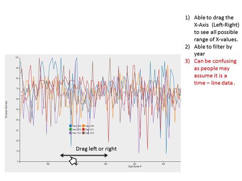
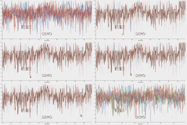
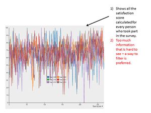
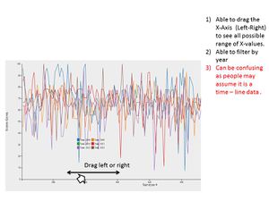
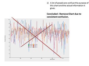
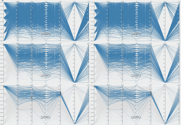
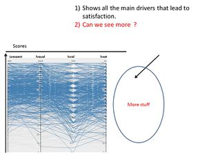
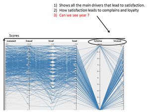
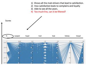
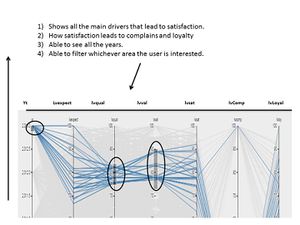
This portion goes to a very granular level where each row of data will be visualized. This part contrast the quick glance as this shows the specific response where else quick glance shows an aggregated output.
Parallel Chart
Individual Satisfaction Line Chart
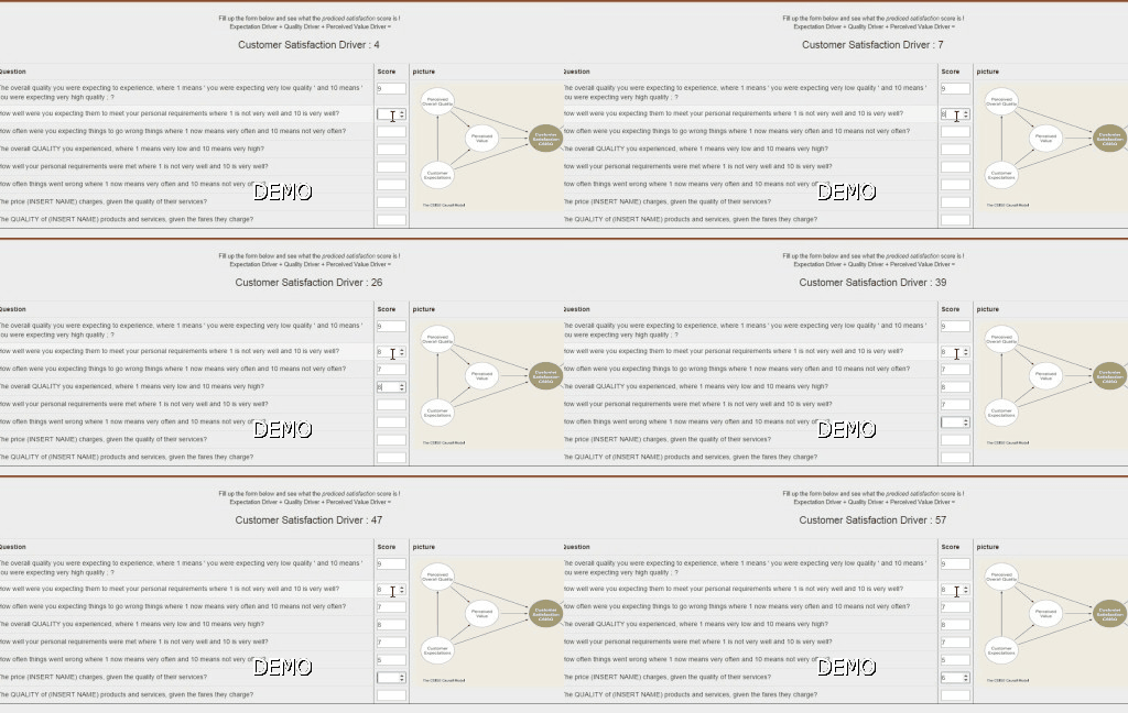
Sensitivity Analysis
xxxxxxxxxxxxxxxxxxxxxxxx
