Difference between revisions of "Visualization of Consumer Satisfaction"
| Line 43: | Line 43: | ||
[[File:2014 1 Slide13.JPG|600px]] | [[File:2014 1 Slide13.JPG|600px]] | ||
| − | |||
| + | === <div style="background: #FF00FF; padding: 10px; font-weight: bold; line-height: 0.3em"><font color= #FFFFFF> Individual Levels </font></div>=== | ||
| + | |||
| + | This portion goes to a very granular level where each row of data will be visualized. This part contrast the quick glance as this shows the specific response where else quick glance shows an aggregated output. | ||
| + | |||
| + | ==== Parallel Chart ==== | ||
| + | |||
| + | ==== Individual Satisfaction Line Chart ==== | ||
| + | |||
| + | ==== Sensitivity Analysis ==== | ||
{| class="wikitable" | {| class="wikitable" | ||
|- | |- | ||
Revision as of 22:23, 8 October 2014
| Home | Project Overview | Documentation |
Contents
Development of Chart and Dashboards
Our dashboard has gone through many iterations of user testing and interactive design prototyping. The outcome of those are documented in this section
Quick Glance
Objective : The objective of the quick glance portion of the application was to give users a 30 second outlook on the situation. The charts are suppose to give very basic information but creates enough value to make some sense.
Bar Chart
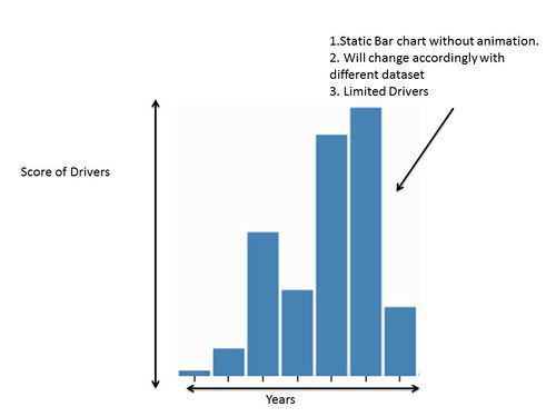
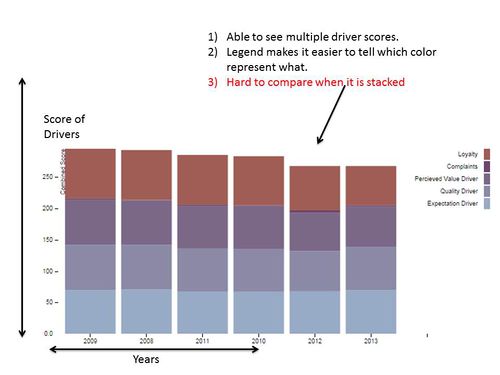
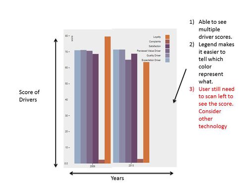
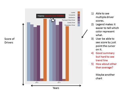
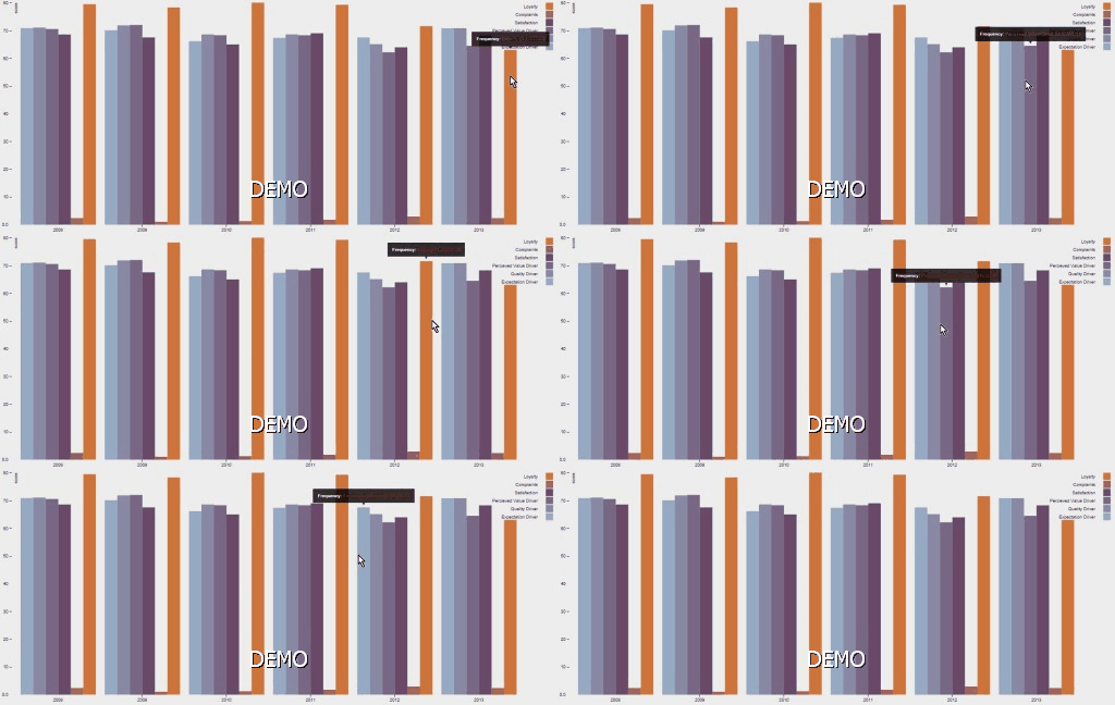
This portion shows the development of our bar charts. The bar charts shows the average scores of all the main score-drivers through out the years. With just a glance, users are able to compare the drivers of different years. Our bar chart has gone through several iterations as show.
Line Chart
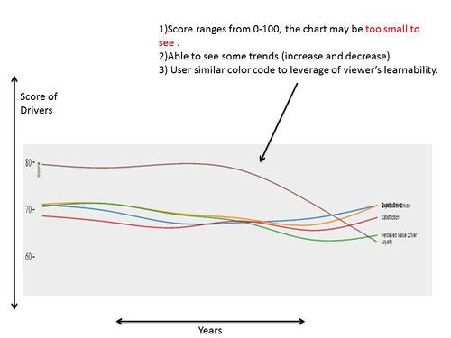
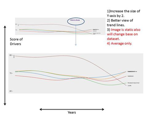
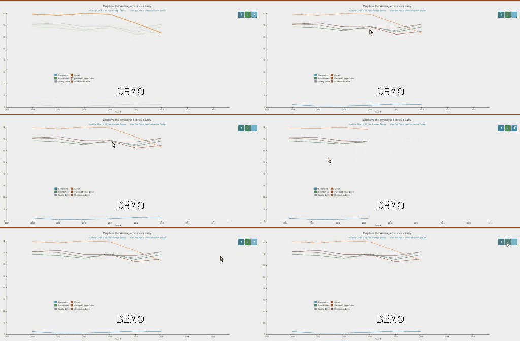
This portion shows the development of our line charts. The line charts shows the average scores of all the main score-drivers through out the years in a linear manner. The objective was to see trends easier than looking at the bar charts. With just a glance, users are able to see increase or decrease in certain drivers throughout the years. The can only see how each drivers react with each other. Our line chart has gone through several iterations as show.
Box Plot
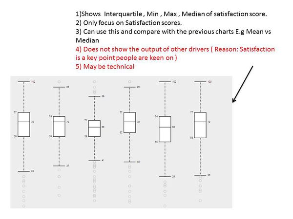
The box plot was created in response to wanting additional information apart from just the averages. The box plot below was created base on the Satisfaction driver (Main driver people are interested ). With this chart, people are able to see the Median and the quarter ranges. This chart did not go any deeper as Heuristic evaluation suggests that such charts are complex and requires training to interpret.
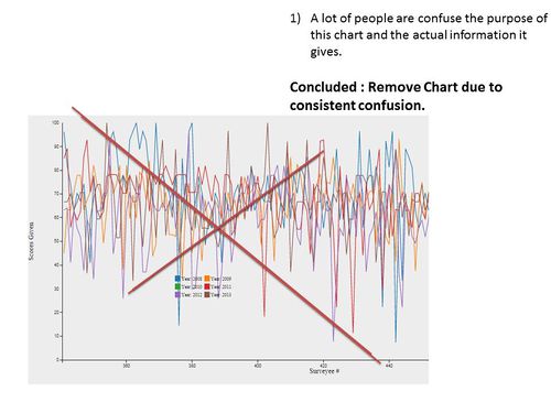
Individual Levels
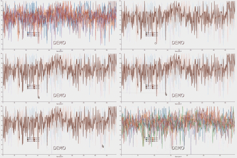
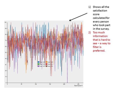
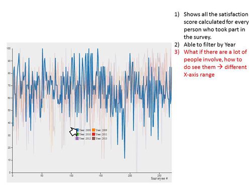
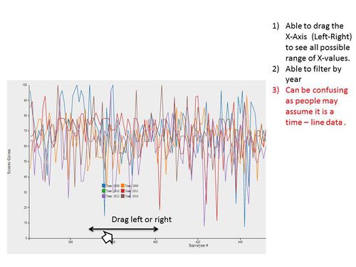
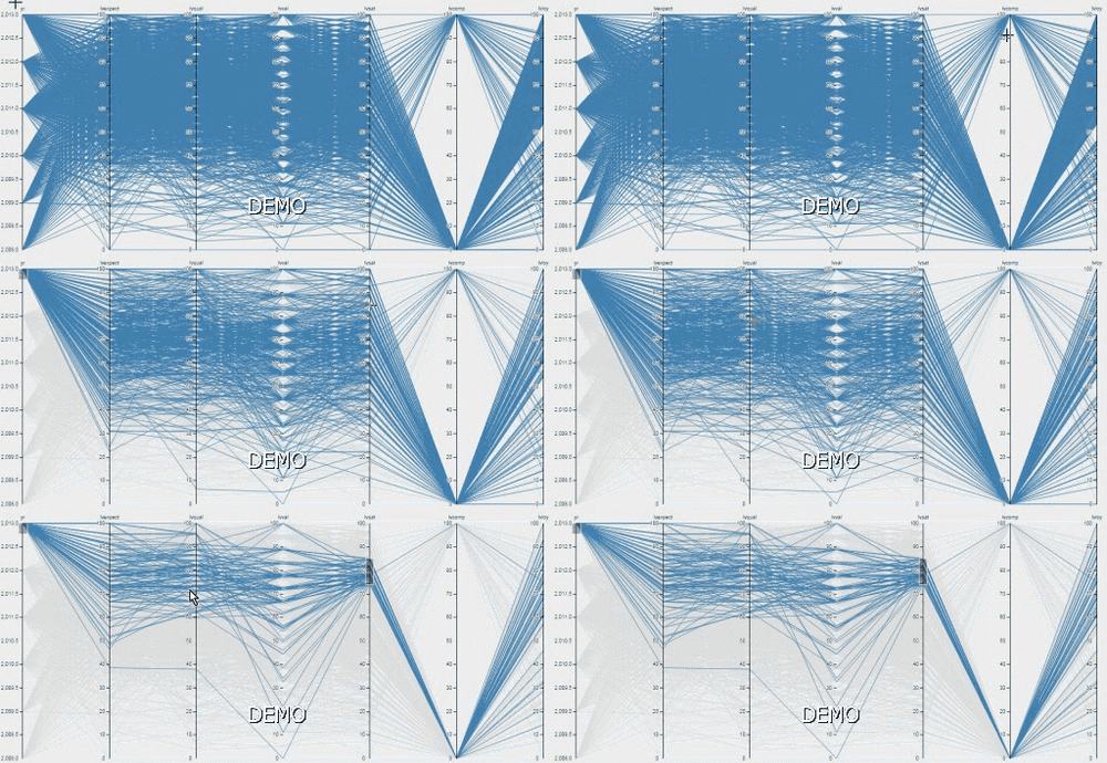
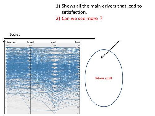
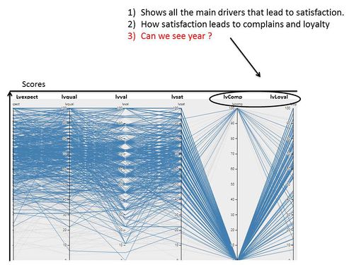
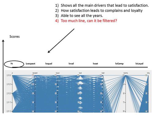
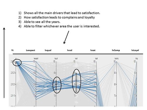
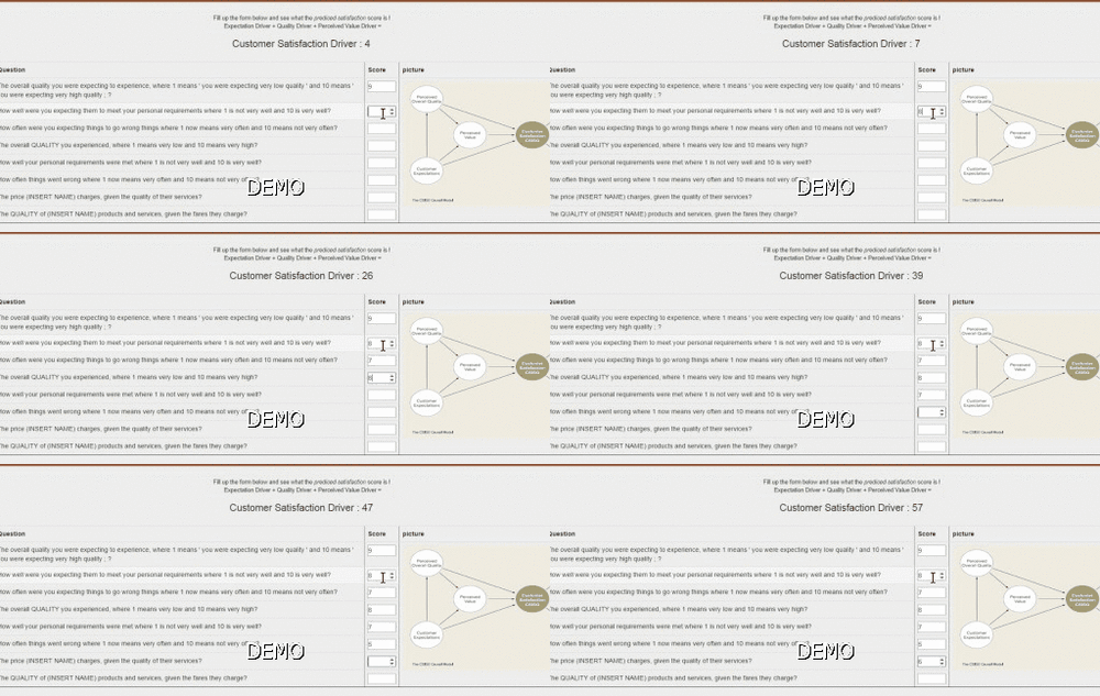
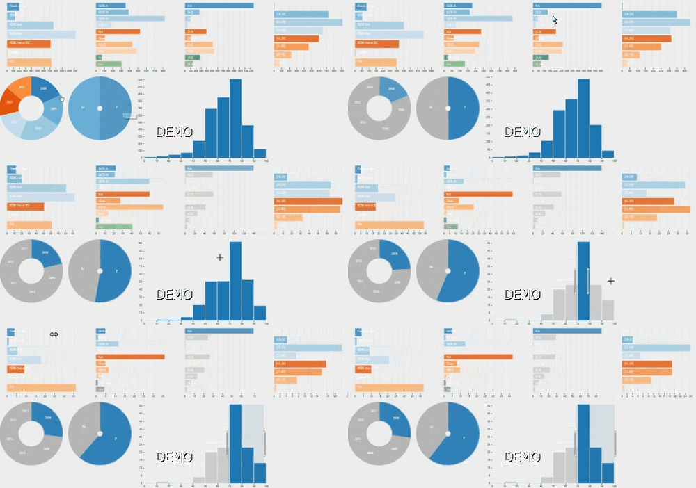
This portion goes to a very granular level where each row of data will be visualized. This part contrast the quick glance as this shows the specific response where else quick glance shows an aggregated output.
