Difference between revisions of "Analysis of User and Merchant Dropoff for Sugar App - Findings"
| Line 218: | Line 218: | ||
==<div style="background: #95A5A6; line-height: 0.3em; font-family:helvetica; border-left: #6C7A89 solid 15px;"><div style="border-left: #FFFFFF solid 5px; padding:15px;font-size:15px;"><font color= "#F2F1EF"><strong>Funnel Plot Analysis</strong></font></div></div>== | ==<div style="background: #95A5A6; line-height: 0.3em; font-family:helvetica; border-left: #6C7A89 solid 15px;"><div style="border-left: #FFFFFF solid 5px; padding:15px;font-size:15px;"><font color= "#F2F1EF"><strong>Funnel Plot Analysis</strong></font></div></div>== | ||
| + | |||
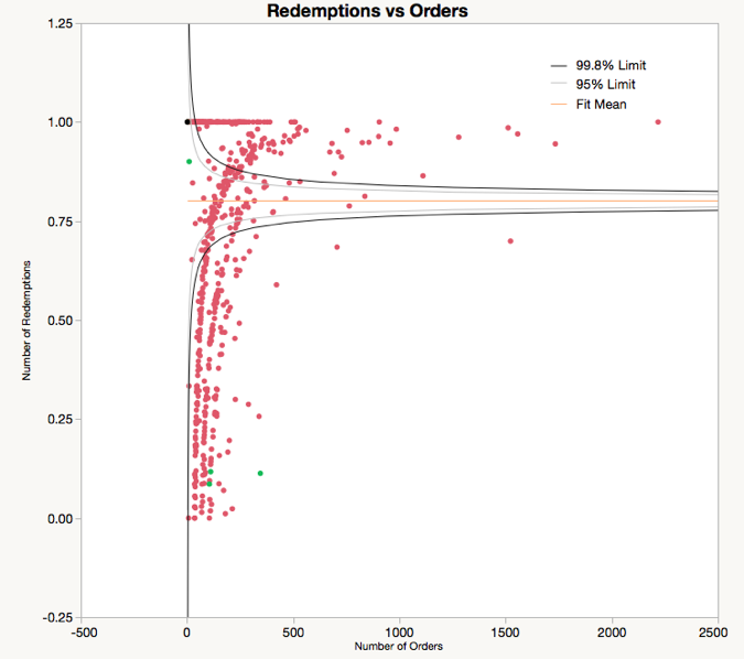
| + | As mentioned earlier in our objectives, we want to identify star merchants (performing better than expected) and laggard merchants (performing worse than expected). We have decided to use a funnel plot as opposed to tree maps or scatterplot graphs because they are difficult to interpret. For a tree map, the dataset is too big to have a comprehensible result. For a scatterplot graph, it is insufficient because it does not tell us which points are outliers unlike the funnel plot which provides control limits. These control limits informs us that whichever points that fall within the funnel is categorised as stochastic. | ||
| + | |||
| + | We categorise star merchants as having a high redemption rate and also generating high total revenue. Thus, we will be generating 3 funnel plots and inner-joining the merchants within these 3 datasets to identify these star merchants and laggard merchants. | ||
| + | |||
| + | [[File:FP.png|400x]] | ||
| + | |||
| + | From the funnel plot analysis, we have identified a total of 248 merchants (31.5%) who are star merchants. We also identified a total of 244 merchants (31.0%) who are laggard merchants. | ||
==<div style="background: #95A5A6; line-height: 0.3em; font-family:helvetica; border-left: #6C7A89 solid 15px;"><div style="border-left: #FFFFFF solid 5px; padding:15px;font-size:15px;"><font color= "#F2F1EF"><strong>Time-Series Analysis</strong></font></div></div>== | ==<div style="background: #95A5A6; line-height: 0.3em; font-family:helvetica; border-left: #6C7A89 solid 15px;"><div style="border-left: #FFFFFF solid 5px; padding:15px;font-size:15px;"><font color= "#F2F1EF"><strong>Time-Series Analysis</strong></font></div></div>== | ||
==<div style="background: #95A5A6; line-height: 0.3em; font-family:helvetica; border-left: #6C7A89 solid 15px;"><div style="border-left: #FFFFFF solid 5px; padding:15px;font-size:15px;"><font color= "#F2F1EF"><strong>Geospatial Analysis</strong></font></div></div>== | ==<div style="background: #95A5A6; line-height: 0.3em; font-family:helvetica; border-left: #6C7A89 solid 15px;"><div style="border-left: #FFFFFF solid 5px; padding:15px;font-size:15px;"><font color= "#F2F1EF"><strong>Geospatial Analysis</strong></font></div></div>== | ||
Revision as of 18:52, 28 February 2016
| Mid-Term | Finals |
|---|
Exploratory Analysis
| Merchants |
Merchant Growth
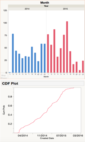
As we look towards Sugar’s merchant acquisition process over the past 2 years, there are several notable spikes.
For example, during the beta phase in February 2014, Sugar is trying to bring merchants on board before its official launch in July. There is also a noticeable spike in July 2015 which is probably due to Sugar’s campaign.
Looking at the CDF plot, we can see that the cumulative growth in number of merchants have slowly been tapering off. Currently, Sugar has 835 merchants compared to a total of 6,860 establishments in the food & beverage (F&B) services industry (Singstat, 2016). Sugar’s merchant pool only constitutes only 12.2% of the industry and this means great room for potential in acquiring more merchants.
Number of Orders per Merchant
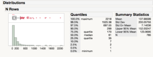
Looking at the number of orders, the distribution is mainly right-skewed. Around 80% of merchants generate only 200 or less orders over the course of 2 years whereas the top 20% are able to generate up to 2,200 orders in total. However, we should take into account how many total revenue is also generated by these top 20% merchants. Thus, we will be looking more into the funnel plot analysis to identify these star merchants.
| User Growth |
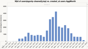
Number of User Sign ups per Month
As shown by the graph, Sugar experienced its highest user growth in Apr 2015. It has not been consistent. Number of new users per month has been decreasing.
User sign-ups grouped by Day of Month
Interestingly, the 5th and 6th day of each month has more orders than the rest of the month.
Number of User Sign Ups grouped by Day of Week
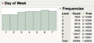
The Day of Week does not seem to affect the number of user sign ups. There seems to be no patterns within a week even though there is a slight bump on a Saturday.
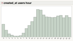
User Sign Ups grouped by Hour of Day
Similar to orders, more users sign up at around lunch time than any other time.
User Profiles
We also separated Users into 3 groups based on their total order value:
- Top 25% - We recoded it into 3
- Middle 50% - We recoded it into 2
- Lower 25% - We recoded into 1
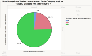
As shown the top 25% of the users contributes 75.4% of revenue. The middle 50% contributes only 22.1% of the total revenue and the bottom 25% only contributes to 2.5% of the total revenue.
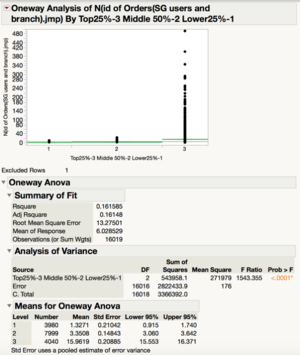
To explain this phenomenon, we can look at the number of orders for each user.
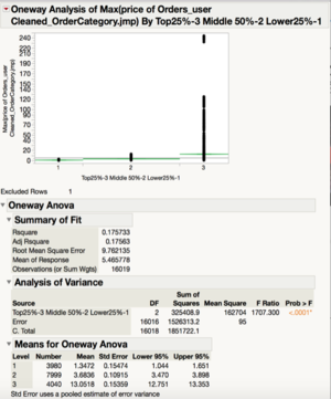
As shown, there are significant difference between the number of orders of each group. The top 25% group has a mean of 15.96 orders each whereas the middle 50% only has a mean of 3.35 orders each. The graph below shows the Maximum order price a user has spent on vs the three groups. As shown above, the mean of the Max order price for the top 25% users is significantly different from compared to the other groups.
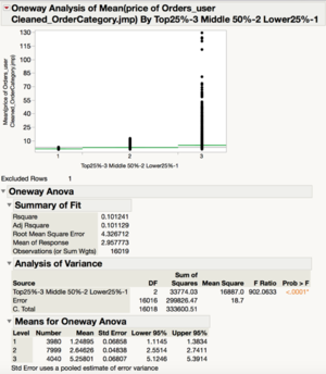
Lastly, the graph below shows the differences in the mean order price for each user.
As shown, there is a significant difference between the mean order price of the top25% and the middle 50%. The top25% has a mean average order of $5.25 per user whereas the middle 50% has roughly about half that amount.
Therefore, there is a multiplier effect. The top 25% spend more per order and have higher number of orders. This results in the extremely right skewed graph for revenue.
Implication: Sugar should focus on the high value customers if it wants to increase revenue.
| Orders |
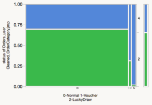
For orders, only orders status = 1,2,4 are analysed. This is because these orders represent Sugar’s revenue. To recap, Order status: 1 - Active orders 2 - Redeemed orders 4 - Unredeemed orders
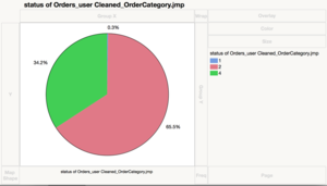
Proportion of Order Status
As shown, 65.5% of the orders are redeemed, and only 34.2% of the orders are unredeemed.
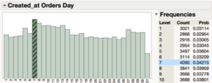
Orders grouped by Day of Month
Every month, there seems to be a small spike on the 7th and a dip on the 31st. Other than there, there seems to be no significant difference.
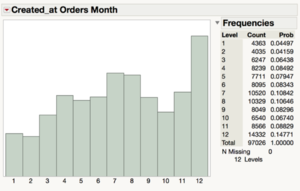
Orders grouped by Month
As shown, orders seem to peak at July and December. However this graph is subject to changes as most of the gifting orders are in Dec, awaiting verification.
Orders grouped by Hour of Day
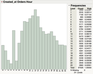
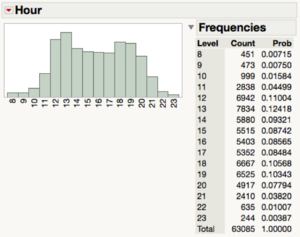
As mentioned above, the 4691 orders at 4am needs to be verified with Sugar. Nonetheless, a clear pattern is shown here: orders peak at 12noon, which is right before lunch time. This may be because users may be deciding where to head for lunch.
Orders grouped by DayofWeek
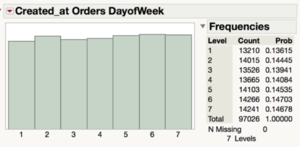
There are no major differences between the days of the week and the number of orders.
Distribution of Prices of Orders
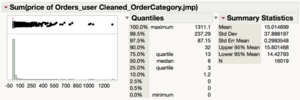
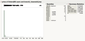
It is a very right skewed graph with extreme values. The maximum price of an order is $244 while the median is only $2. As such, we have to zoom in.
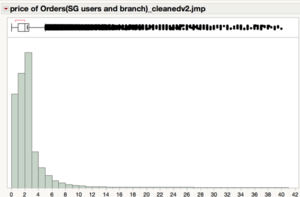
After temporarily removing the extreme values, this is the zoomed in graph:
This graph shows that most people order not more than $2, as orders sharply decrease from $3. This may be because of the free $2 that was given to the users when they install the app.
| Redemptions |
Firstly, when we take a look at paid orders versus unpaid orders, we can see that only 65% of orders are actually checked out. 35% of orders drop off along the customer journey funnel (e.g. some users added the order to cart but didn’t managed to check out).
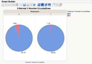
When we examine these paid orders, we can see that approximately only 69% of all orders are redeemed.
For these redeemed vouchers, there is a higher ratio of normal items to voucher items as compared to non-redeemed vouchers. This insinuates that voucher items are more unlikely to be redeemed as compared to normal items. A possible explanation could be that these vouchers are often contingent on paying for expensive full-priced items.
By decomposition of redemption date into Hour, Day of Week and Month, we have gained a better understanding and identified key insights.
Redemptions grouped by Day of Month
In terms of redemptions, there is a relatively consistent trend throughout the month, with a drop on the 31st. This can be attributed to the nature of the Gregorian calendar where several months have only 30 days.
Redemptions grouped by Day of Week
In terms of day of week, there is low traffic on Mondays and Tuesdays and an increasing trend throughout the week, peaking on Saturday.
Redemptions grouped by Hour
As we can see, there is an influx of redemptions mainly during lunch-time (i.e. 12PM to 2PM) and dinner-time (i.e. 6PM to 8PM).
Redemptions grouped by Month
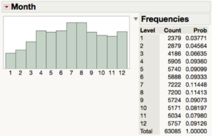
July and August seem to be the most popular months, which could be due to campaigns and events held during this period (e.g. National Day campaign). On the flipside, January and February have significantly much lower traffic in comparison to the other months. This could be explained by the fact that there is much little to no intake in 2014’s first quarter as the app was still in beta-testing.
Time Frame between Creation of Order and Redemption
We were also interested to find out whether users usually paid for an order in advance to redeem it on another day, or to purchase it on the same day itself.
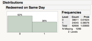
It seems that only 38% of redemptions usually take place on the current day itself, with 62% opting to purchase for orders in advance. We decided to investigate further to understand the redemption behaviour for items that are bought in advance.
Taking a closer look at normal items, users usually redeem the day after they bought their items or on the last day of their usual seven-day redemption period. For the other items, many of them are registered as redeemed at a later timing due to (i) a need for an appointment or (ii) a voucher with a longer redemption period. As what was observed earlier, approximately 34.2% of the orders are expired.
Funnel Plot Analysis
As mentioned earlier in our objectives, we want to identify star merchants (performing better than expected) and laggard merchants (performing worse than expected). We have decided to use a funnel plot as opposed to tree maps or scatterplot graphs because they are difficult to interpret. For a tree map, the dataset is too big to have a comprehensible result. For a scatterplot graph, it is insufficient because it does not tell us which points are outliers unlike the funnel plot which provides control limits. These control limits informs us that whichever points that fall within the funnel is categorised as stochastic.
We categorise star merchants as having a high redemption rate and also generating high total revenue. Thus, we will be generating 3 funnel plots and inner-joining the merchants within these 3 datasets to identify these star merchants and laggard merchants.
From the funnel plot analysis, we have identified a total of 248 merchants (31.5%) who are star merchants. We also identified a total of 244 merchants (31.0%) who are laggard merchants.
