Difference between revisions of "Analysis of User and Merchant Dropoff for Sugar App - Findings"
| Line 60: | Line 60: | ||
'''Number of User Sign ups per Month''' | '''Number of User Sign ups per Month''' | ||
| − | [[File: | + | [[File:U2.png|300px]] |
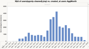
As shown by the graph, Sugar experienced its highest user growth in Apr 2015. It has not been consistent. Number of new users per month has been decreasing. | As shown by the graph, Sugar experienced its highest user growth in Apr 2015. It has not been consistent. Number of new users per month has been decreasing. | ||
| Line 69: | Line 69: | ||
Interestingly, the 5th and 6th day of each month has more orders than the rest of the month. | Interestingly, the 5th and 6th day of each month has more orders than the rest of the month. | ||
| + | |||
| + | '''Number of User Sign Ups grouped by Day of Week''' | ||
| + | |||
| + | [[File:U3.png|300px]] | ||
| + | |||
| + | The Day of Week does not seem to affect the number of user sign ups. There seems to be no patterns within a week even though there is a slight bump on a Saturday. | ||
| + | |||
| + | '''User Sign Ups grouped by Hour of Day''' | ||
| + | |||
| + | [[File:SugarU4.png|300px]] | ||
| + | |||
| + | Similar to orders, more users sign up at around lunch time than any other time. | ||
| + | |||
| + | '''User Profiles''' | ||
| + | |||
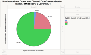
| + | We also separated Users into 3 groups based on their total order value: | ||
| + | #Top 25% - We recoded it into 3 | ||
| + | #Middle 50% - We recoded it into 2 | ||
| + | #Lower 25% - We recoded into 1 | ||
| + | |||
| + | [[File:SugarU5.png|300px]] | ||
| + | |||
| + | As shown the top 25% of the users contributes 75.4% of revenue. The middle 50% contributes only 22.1% of the total revenue and the bottom 25% only contributes to 2.5% of the total revenue. | ||
| + | |||
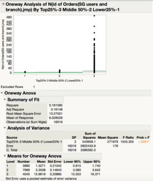
| + | To explain this phenomenon, we can look at the number of orders for each user. | ||
| + | |||
| + | [[File:U6.png|300px]] | ||
| + | |||
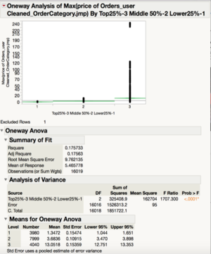
| + | As shown, there are significant difference between the number of orders of each group. The top 25% group has a mean of 15.96 orders each whereas the middle 50% only has a mean of 3.35 orders each. The graph below shows the Maximum order price a user has spent on vs the three groups. As shown above, the mean of the Max order price for the top 25% users is significantly different from compared to the other groups. | ||
| + | |||
| + | [[File:SugarU7.png|300px]] | ||
| + | [[File:SugarU8.png|300px]] | ||
| + | |||
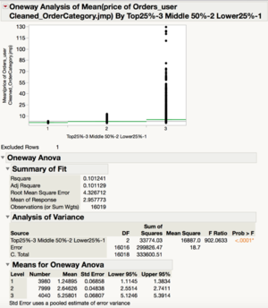
| + | Lastly, the graph below shows the differences in the mean order price for each user. | ||
| + | |||
| + | [[File:SugarU9.png|300px]] | ||
| + | |||
| + | As shown, there is a significant difference between the mean order price of the top25% and the middle 50%. The top25% has a mean average order of $5.25 per user whereas the middle 50% has roughly about half that amount. | ||
| + | |||
| + | Therefore, there is a multiplier effect. The top 25% spend more per order and have higher number of orders. This results in the extremely right skewed graph for revenue. | ||
| + | |||
| + | Implication: Sugar should focus on the high value customers if it wants to increase revenue. | ||
| + | |||
{| style="background-color:#E6CCFF; color:#E6CCFF padding: 1px 0 0 0;" width="100%" cellspacing="0" cellpadding="0" valign="top" border="0" | | {| style="background-color:#E6CCFF; color:#E6CCFF padding: 1px 0 0 0;" width="100%" cellspacing="0" cellpadding="0" valign="top" border="0" | | ||
Revision as of 18:16, 28 February 2016
| Mid-Term | Finals |
|---|
Exploratory Analysis
| Merchants |
Merchant Growth
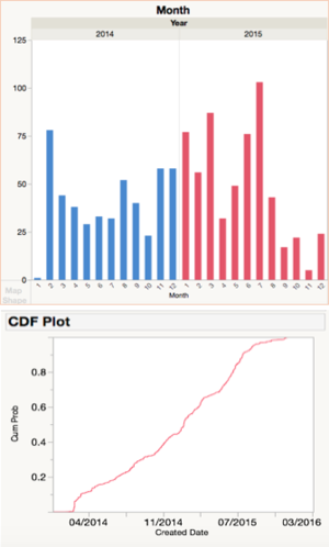
As we look towards Sugar’s merchant acquisition process over the past 2 years, there are several notable spikes.
For example, during the beta phase in February 2014, Sugar is trying to bring merchants on board before its official launch in July. There is also a noticeable spike in July 2015 which is probably due to Sugar’s campaign.
Looking at the CDF plot, we can see that the cumulative growth in number of merchants have slowly been tapering off. Currently, Sugar has 835 merchants compared to a total of 6,860 establishments in the food & beverage (F&B) services industry (Singstat, 2016). Sugar’s merchant pool only constitutes only 12.2% of the industry and this means great room for potential in acquiring more merchants.
Number of Orders per Merchant
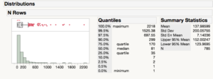
Looking at the number of orders, the distribution is mainly right-skewed. Around 80% of merchants generate only 200 or less orders over the course of 2 years whereas the top 20% are able to generate up to 2,200 orders in total. However, we should take into account how many total revenue is also generated by these top 20% merchants. Thus, we will be looking more into the funnel plot analysis to identify these star merchants.
| User Growth |
Number of User Sign ups per Month
As shown by the graph, Sugar experienced its highest user growth in Apr 2015. It has not been consistent. Number of new users per month has been decreasing.
User sign-ups grouped by Day of Month
Interestingly, the 5th and 6th day of each month has more orders than the rest of the month.
Number of User Sign Ups grouped by Day of Week
The Day of Week does not seem to affect the number of user sign ups. There seems to be no patterns within a week even though there is a slight bump on a Saturday.
User Sign Ups grouped by Hour of Day
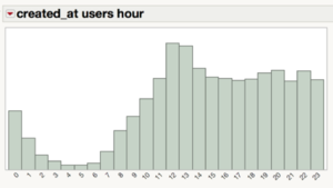
Similar to orders, more users sign up at around lunch time than any other time.
User Profiles
We also separated Users into 3 groups based on their total order value:
- Top 25% - We recoded it into 3
- Middle 50% - We recoded it into 2
- Lower 25% - We recoded into 1
As shown the top 25% of the users contributes 75.4% of revenue. The middle 50% contributes only 22.1% of the total revenue and the bottom 25% only contributes to 2.5% of the total revenue.
To explain this phenomenon, we can look at the number of orders for each user.
As shown, there are significant difference between the number of orders of each group. The top 25% group has a mean of 15.96 orders each whereas the middle 50% only has a mean of 3.35 orders each. The graph below shows the Maximum order price a user has spent on vs the three groups. As shown above, the mean of the Max order price for the top 25% users is significantly different from compared to the other groups.
Lastly, the graph below shows the differences in the mean order price for each user.
As shown, there is a significant difference between the mean order price of the top25% and the middle 50%. The top25% has a mean average order of $5.25 per user whereas the middle 50% has roughly about half that amount.
Therefore, there is a multiplier effect. The top 25% spend more per order and have higher number of orders. This results in the extremely right skewed graph for revenue.
Implication: Sugar should focus on the high value customers if it wants to increase revenue.
| Orders |
