Difference between revisions of "ANLY482 AY2017-18T2 Group30 Facebook Video"
| Line 77: | Line 77: | ||
</div> | </div> | ||
<div align="center"> | <div align="center"> | ||
| − | [[File:Dailyviews.png | + | [[File:Dailyviews.png|Video Views for first 30 days|1000px]] |
</div> | </div> | ||
<div align="center"> | <div align="center"> | ||
| Line 90: | Line 90: | ||
</div> | </div> | ||
| + | <div align="center"> | ||
| + | [[File:Weekday views2.png|Weekday views|1000px]] | ||
| + | </div> | ||
<div align="left"> | <div align="left"> | ||
<div style=" width: 85%; padding:75px; font-family: Arimo; font-size: 14px; font-weight: bold; line-height: 1em;"> | <div style=" width: 85%; padding:75px; font-family: Arimo; font-size: 14px; font-weight: bold; line-height: 1em;"> | ||
<font> | <font> | ||
| − | + | Graph on the left shows the number of videos that were posted across the week. We can observe that more videos were posted across the weekday from Monday to Thursday, followed by a decrease in videos posted from Friday to Sunday. | |
| + | (Hypothesis 1)Hence we would assume that viewership would have the same trend across the same period of time. However, this doesn't seem to be the case. | ||
| + | A graph on the right shows the average number of views per weekday. Views are generally higher on Monday and viewership would decline across the week, with an exception on Friday, where viewership has a slight spike followed by a decrease towards Sunday. This is a striking contrast against graph on the left and proved our hypothesis false. Our team believes that viewership count is perpetuated by other circumstances other than the amount of videos posted. | ||
</font> | </font> | ||
</div> | </div> | ||
Revision as of 17:25, 19 February 2018
| HOME | ABOUT US | PROJECT OVERVIEW | PROJECT FINDINGS | PROJECT MANAGEMENT | DOCUMENTATION | MAIN PAGE |
| Facebook Post | Facebook Video | Youtube | Blog Post |
|---|
For data files from Facebook Insights Data Export (Video Post), the sponsor provided exported data from different periods of the year, with different metric tabs in Excel format. The tabs included are:
- Lifetime Post Total Impression/Reach/Views
- Geographic Views
- Demographic Views
- Lifetime Post Toal Views by (page_owned / Shared)
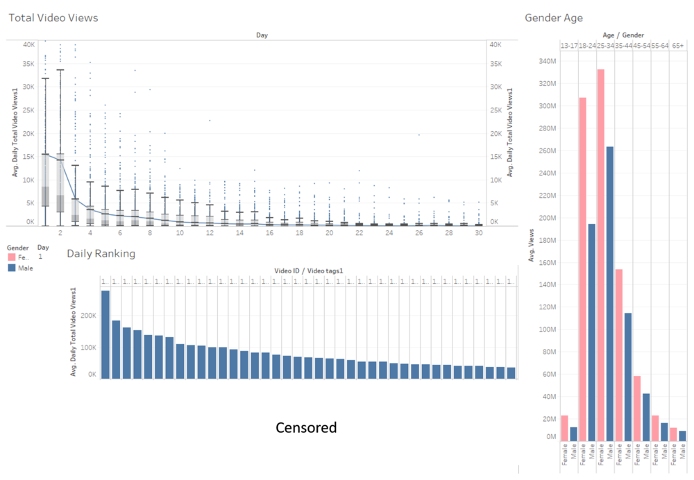
The diagram abve demonstrates the number of views for a video from Day 1 to Day 30. It would be interesting to note which are the videos that have more views than the upper whisker for each day. These videos would be termed as high-performance videos. Most of the views are generated within the first two days and view count would decrease significantly from day 3 onwards.
In subsequent analysis, we aim to categorize videos into different topics so that we will have an understanding of which topics that are popular amongst the Singapore population. The current bar chart just displays the ranking of videos in a descending order with its respective video tags. The video viewership demographics shows the type of audience that has viewed the video.
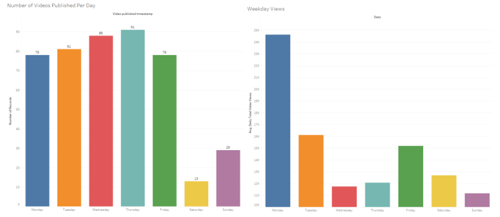
Graph on the left shows the number of videos that were posted across the week. We can observe that more videos were posted across the weekday from Monday to Thursday, followed by a decrease in videos posted from Friday to Sunday. (Hypothesis 1)Hence we would assume that viewership would have the same trend across the same period of time. However, this doesn't seem to be the case. A graph on the right shows the average number of views per weekday. Views are generally higher on Monday and viewership would decline across the week, with an exception on Friday, where viewership has a slight spike followed by a decrease towards Sunday. This is a striking contrast against graph on the left and proved our hypothesis false. Our team believes that viewership count is perpetuated by other circumstances other than the amount of videos posted.


