ANLY482 AY2017-18T2 Group27 : Project Findings / Final
| Interim | Final |
Contents
- 1 0.0 Abstract
- 2 1.0 Research Contribution & Objectives
- 3 2.0 Literature Review
- 4 3.0 The Datasets
- 5 4.0 Exploration of Analytical Tools
- 5.1 4.1 Appropriate amount of data displayed
- 5.2 4.2 Appropriate Choice of Display Media
- 5.3 4.3 Comparing Funnel Chart to Box Plot
- 5.4 4.4 Comparing Scrolled Display of Clustered Bar Chart to Chord Diagram
- 5.5 Chord Diagram
- 5.6 4.5 Comparing Bar Chart and Line Graph to Quadrant Matrix
- 5.7 Quadrant Matrix
- 5.8 Misusing or Overusing Colours
- 6 5.0 Technologies Used
- 7 6.0 Case Study
- 8 7.0 Further Recommendations to Sponsor
- 9 8.0 Recommendations to Business
- 10 References
0.0 Abstract
Visualisations serve as an important tool in effectively analysing data and gathering meaningful insights. The ease of connecting multiple diagrams together in a dashboard sequence, allows users to see multiple connections between different variables to identify plausible trends quickly. Often, managements utilise visualisations to identify valuable insights on their business functions. Thus, dashboards offer a striking solution to an organization's need for information at a glance. Organisations commonly believe that traditional charts such as bar graphs and pie charts are able to effectively convey information. However, this is not sufficient in providing insights and a seamless user experience. To further explore this, a research study is conducted to demonstrate the use of a common organisational visualisation tool, Power BI in developing effective and sustainable dashboard for the air freight industry, and to overcome Power BI’s current technical limitations.
The case study is an in-depth analysis on a leading logistics company and its air freight shipping division. It will utilise transactional data relating to a client of the logistics company over 3 years. Also, the case specifically looks into elements such as rates, density and shipping patterns and tries to develop links that can be further analysed and transformed into actionable business insights. The study introduces the business and primary research motivations. Following this, it looks into suitable literature on PowerBI tools as well as air freight shipping. Next, analysis will be applied to the case and relevant discussions will be presented. Subsequently, designs and final applications will be exhibited. A comprehensive summary on the results will be provided along with recommendations to other organisations as well as Power BI technical limitations.
1.0 Research Contribution & Objectives
Due to better pricing, rapid and continuous improvements, PowerBI has gained popularity among many companies. Our research efforts will focus on PowerBI as a common visualisation software and better visualisation. The objective is to provide logistics company account managers with effective business visualisation tools on PowerBI that will allow them to assess commercial aspects across time. A three-pronged approach will be utilized to fulfill the following analytics requirements:
- To investigate PowerBI’s effectiveness and limitations as a visualisation software; and methods to overcome limitations
- To explore the use of visualisation tools – Quadrant Matrix and Chord Diagram, in analyzing the varying patterns across data.
- To build interactive visualization dashboards that can depict 3 key commercial aspects – Rate per Kg (RpK), Density and Ship to Profile (STP), and how they are used
2.0 Literature Review
2.1 Dashboard Design
Common issues in designing dashboards include exceeding the boundary of display screen, inadequate context for the data, poor data arrangement, misusing or overusing colour, displaying too much details and choosing inappropriate display media. [1]
Exceeding the Boundary of Display Screen
Dashboards that exceed the display screen boundary sometimes require scrolling. According to Few, an experienced and influential dashboard designer, many users do not scroll to view the other data. They assume data viewed at first glance to be utmost importance. [1]
Inadequate Context for the Data
Measures in businesses usually require a comparison to produce meaningful insights. For example, knowing the density of one customer’s shipment is not enough. It must be compared with others. Also, in using median to describe the average of a skewed transaction data, such as weight of shipment by customers, a distribution of the data should be displayed. Viewers can then expect and investigate possible outliers. [1]
Poor Data Arrangement
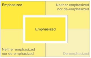
As dashboard space is limited, data should be arranged according to their emphasis. Few suggested that dashboards should be arranged in the following manner:
Figure 1: Convention
Primarily due to western reading conventions, the top left-hand corner is the most important, followed by the top right, bottom left and bottom right. [1] However, the center of the screen is also a region of strong emphasis, due to a more fundamental inclination of visual perception. Few discovered that information in the center is only emphasized when there is a white space surrounding it, allowing it to stand out. [1]
Misusing or Overusing Colour
To effectively highlight data, colours should be used only when necessary. Otherwise, grey or muted hues should be used. As visual perception is highly sensitive to differences, a contrast from the norm can attract viewers’ attention to it. Methods to attract viewers’ attention includes intensity. Also, as visual perception is sensitive to associated meanings, colours have different meanings. Red may mean urgency in certain cultures but not in Chinese. In Chinese culture, red represents prosperity and joy. [1]
Data-ink Ratio
According to Tufte, data-ink ratio should be maximised. Ink on dashboards should be purposeful. Data-ink ratio is defined as 1 ‐ proportion of a graphic that can be erased without loss of data‐information. [1]
Displaying excessive details
Too much details can slow down viewers’ analysis. Also, these excessive details do not value add analysis. [1]
Inappropriate Display Media
An inappropriate display media can confuse viewers and obscure data. [1] To effectively visualize the key measures in our case study, we propose the following:
2.11 100% Stacked Bar Graphs
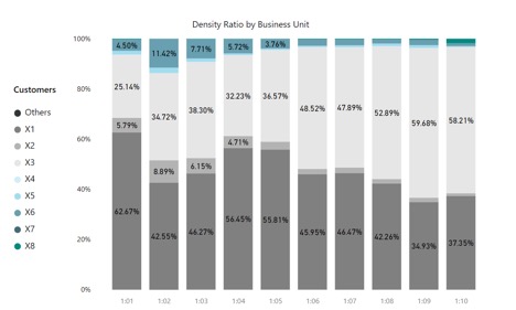
In the business world, dashboards are commonly used as a tool to effectively convey huge amounts of information to a simplified audience. However, it is found that often dashboards are unable to convey information and brings about confusion due to ineffective design. Hence, with the guidance of Stephen Few’s Information Dashboard Design, our group intends to incorporate best practices for effective visual communication into our prescribed dashboard. In this paper, adoption of stacked bar charts to effectively convey information are used.
Figure 2: 100% Stacked Bar Chart
2.12 Chord Diagram
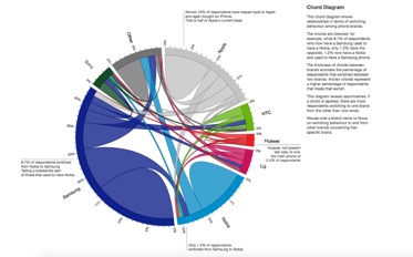
A chord diagram visualizes inter-relationships between entities. It is an elegant visualisation to show networks of relations between items such as products, individuals or groups. The circular layout illustrates relation, one-to-many, many-to-one and many-to-many, among data elements. [3] It consists of nodes which represents entities that are assigned a colour to be distinguishable. Between nodes, arcs are used to indicate the relationship between the segment and each arc is assigned a value [4].They are currently used in text analytics to visualize the differences in geo-tagged tweets across locations [4], visualize global geo-ontology research [5], in environment and planning to visualize China’s internal migration flows [6], and in the financial industry to visualize transactions across borders [7].Nevertheless, it should be noted that this is a relatively new and niche visualisation tool that could potentially confuse the audience. As such, the chord diagram must be used in an intuitive manner for audiences to grasp easily. [2]
2.13 Quadrant Analysis
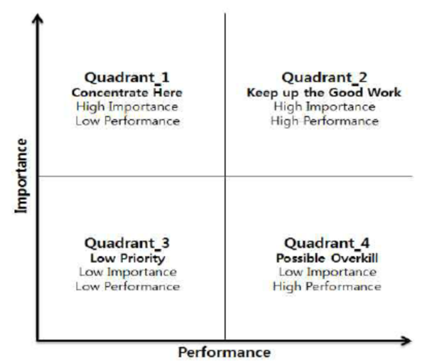
Quadrant Matrix or importance-performance visualisation is used in market research widely for intuitive visualisation. It is often used to evaluate a firm’s competitive position in the market, identifying improvement opportunities, and guiding strategic planning efforts. [8] Typically, attribute importance is placed at the vertical axis while attribute performance is on the horizontal axis. [9] Based on the quadrants, we can prioritise our focus, and to derive strategic decisions.
It is used in service industry, which includes logistics. [10]. Also, customer segmentation is used in identifying customers who can drive profit the fastest. [11] Depending on the number of segmentations, Quadrant Matrix is used when comparing 2 attributes in pricing for profitability. [12]
3.0 The Datasets
3.1 Data Origin
Logistics company X, provided us with air freight data for a customer. Company X would like to shed some insight in customer profile, maximising the capacity for its airfreight shipments per customer, and the difference between actual and projected shipment for each shipping lane. The data provided from Company X will be used as a sample data to gain meaningful analysis on data relating to rates per kg (RpK), Density and Ship to profile.
3.2 Data Collection and Preparation
Based on the three variables of RpK, Density and Ship to profile, related data was formulated and transformed to obtain relevant analysis in visualisation graphs. Using JMP Pro, we performed exploratory data analysis.
4.0 Exploration of Analytical Tools
4.1 Appropriate amount of data displayed
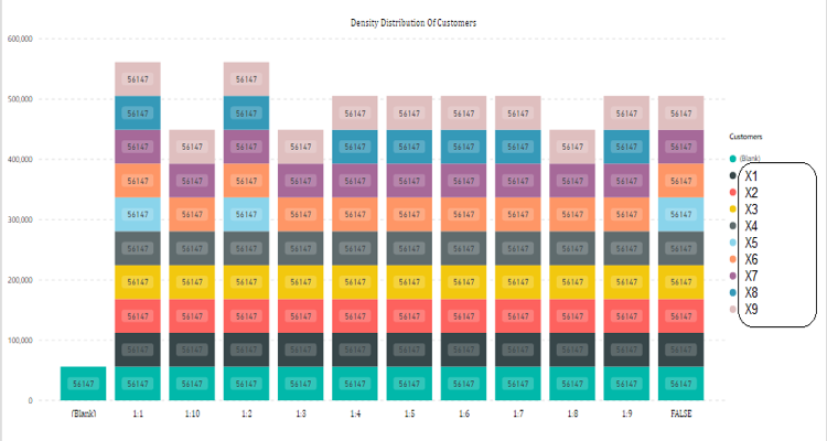
Poorly designed dashboards squeeze large amounts of information in a single graph. In Figure 5, we see the initial graph representation for density distribution of 10 customers being stacked on each other. This makes it hard to compare customers with one another. Also, the sequence of the x-axis is not properly arranged with the 1:10 bar appearing as the third row rather than towards the end. An orderly arrangement as well as filtered customers perhaps the top five will allow for better comparison and clarity to the chart, seen in Figure 6.
4.2 Appropriate Choice of Display Media
There are many forms in the display of data. Some examples of commonly heard displays are bar charts, pie charts and histograms. Depending on the data required, some charts may pose as appealing displays however, may not be able to effectively communicate data results.
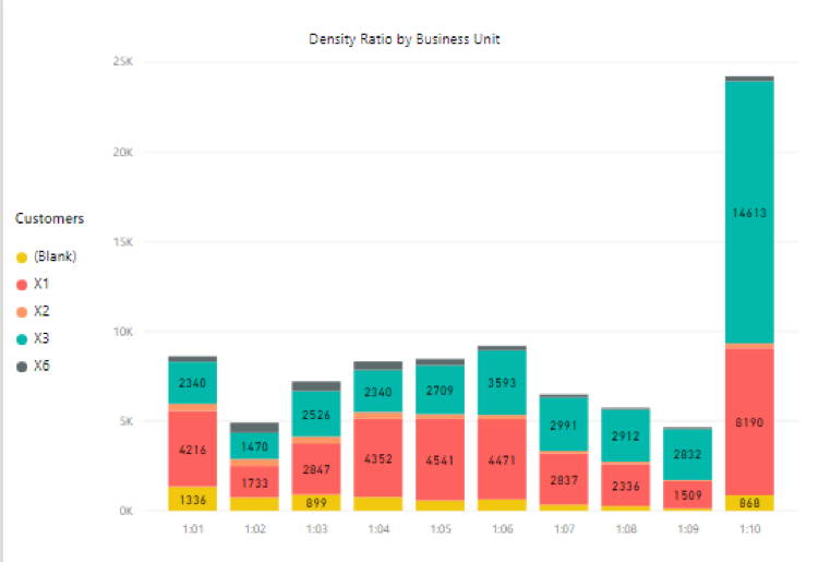
From Figure 7, the bar chart represents the top 5 customers according to its density ratio scale with 1:1 representing dense shipment volumes and 1:10 representing volumetric shipments respectively. However, the bar chart lacks clear comparison between the various customers.
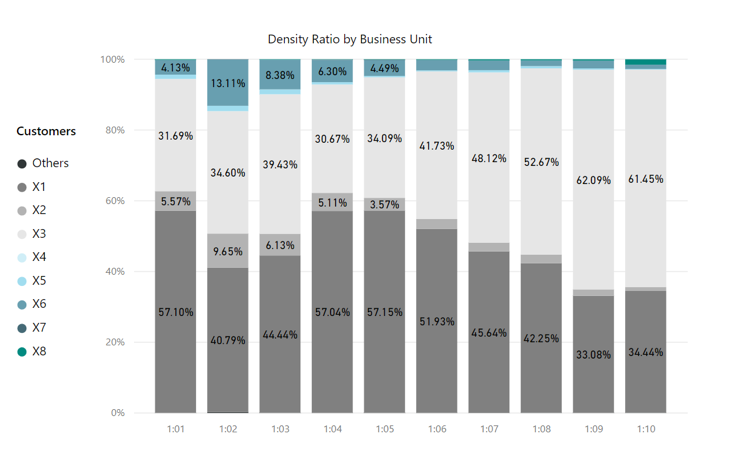
Hence, an improvisation would be to utilize a stacked column chart with totals so that 100% totals can be determined and used to base a one-on one comparison with each respective customer. The chart would continue implementing the stack method limited to top five customers. (Figure 6).
4.3 Comparing Funnel Chart to Box Plot
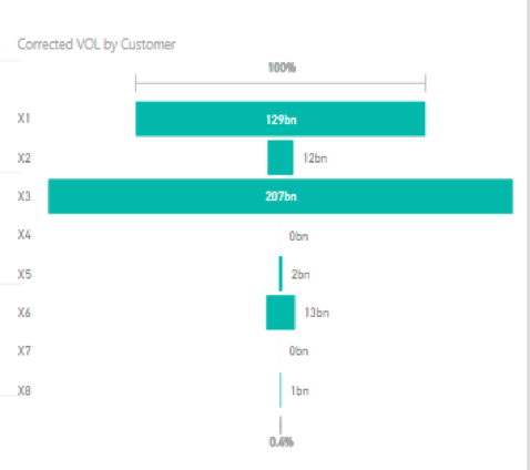
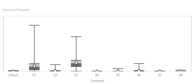
In Figure 8, a funnel chart is initially used to display the volume distribution of each customer from the dataset. This is not an ideal way of showcasing such information as the smaller quantities such Customer X6 and X7 are not well represented and its values cannot be compared effectively. Instead, a box plot as illustrated in Fig 3 better represents the volume distribution. Box plots shows the range of rate per kg for the different customers. They offer a condensed view of 5 summary statistics: minimum and maximum (extremes), median (average), first (25% of data) and third quartile (75% of data). This is useful for comparing the distributions across customers and to visually summarise the data. [13] Due to wide range of data, some box plots in Figure 9 are short, hampering viewers’ ability to perceive the data spread by customers. Figure 10 was proposed to display box plots individually, allowing viewers to reference each customer’s distribution while viewing RpK or Density. Additionally, the presented graph is also more visually appealing.
4.4 Comparing Scrolled Display of Clustered Bar Chart to Chord Diagram
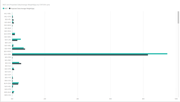
Usually a bar chart is used to display amount of shipment along each lane. This meets the purpose of analysis however, it may present a cluttered analysis as a customer may have too many lanes. As such, it is difficult to display all lanes at once. Figure 11 requires user to scroll to view all lanes. This defeats the purpose of a dashboard, which is to condense and display details in an intuitive manner. [1]
Chord Diagram
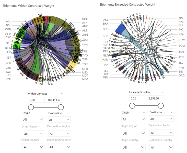
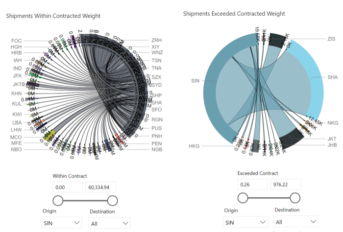
The chord diagram is used to show the difference between actual and projected shipment. However, the chord diagram in Power Bi does not show chords for negative values. Also, when viewing all lanes that are shipped within and exceeding projected shipment, it poses a cluttered display. (Figure 12) As such, there are 2 methods to tackle this obstacle- 1. Separate the Chord Diagram into lanes that (a) exceeded actual shipment and (b) within projected shipment. 2. Use filter functions for difference between projected and actual, and lanes, resulting in a clearer view of the arcs Like bar chart’s length, chord diagram’s arc thickness represents the shipment amount.
4.5 Comparing Bar Chart and Line Graph to Quadrant Matrix
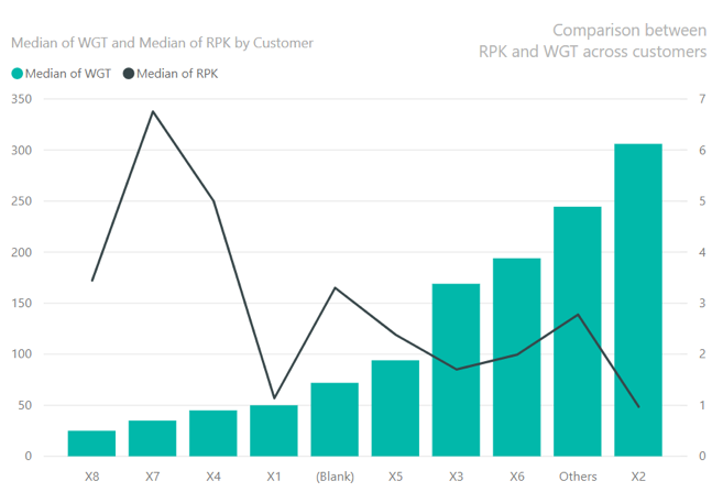
Visualisation tools such as bar and line graph were initially used to compare between RPK and WGT across customers. As seen in Figure 13, it provides rich details of RPK and WGT for all customers. However, these details do not help users to draw a clear conclusion as to which customers ship the most goods and obtain the most revenue. Users could rank customers by either attribute. From Figure 13, viewers can rank by shipment weight. Sorting customers by RpK via a function allows viewers to rank by RpK. However, WGT will not be sorted. As such, there is a disconnect between the 2 attributes in profiling customers.
Quadrant Matrix
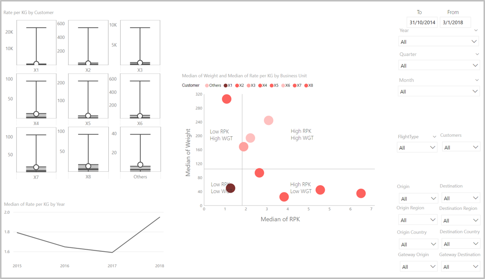
Figure 14 Quadrant Matrix As rate per kg measures the performance of customers, it will be on the X-axis. On the other hand, weight represents importance; the heavier the weight of shipment the larger impact on Company X’s revenue. As rate per kg and weight is skewed across all customers, we will use median to describe its central tendency. Values plotted are median of Rate per KG and Weight, represented by the red dots. To categorise the scatter plot into 4 categories, 2 lines can be dotted at the 50th percentile of X-axis and Y-axis. Quadrants are characterised accordingly. (Figure 14) Quadrants are labelled with their respective attributes. This allows easier identification of points’ attributes.
Misusing or Overusing Colours
From Figure 14, the dots’ colour intensity represents the number of preferred attributes lacking; as the darker the shade is, the more attention it captures. By representing the different types of customer profile by intensity of the same colour, the visualisation is colour-blind friendly. [1] Red is used in the quadrant matrix as the audience is based in Singapore and are exposed to Singapore’s red-light conventions.
5.0 Technologies Used
As mentioned earlier, PowerBI will be used as the embedded analytics tool. PowerBI is built upon Microsoft Excel built-ins: Power Pivot, Power Query and Power View. With time, PowerBI has introduced more features such as DAX, high density line sampling, custom visualisations and Query Editor, which is based on Power Query. While creating our dashboard, we faced several challenges and we overcame them with the following tech solutions.
Based on Power Query, PowerBI’s Query Editor is an Extract Transform Load (ETL) tool. The data transformation features can be grouped into 4 categories: [14]
1. Transforming datasets: adding and removing columns and rows,renaming columns and filtering data.
2. Data modification: Changing the actual data in the rows and columns of a dataset.
3. Extending datasets: adding further larger columns from another table to expand existing columns into more columns or rows and adding calculations.
4. Joining datasets: combining multiple separate datasets—possibly from different data sources—into a single dataset, using one-to-many or many-to-many join, or left outer join or full outer join.
Our dataset is joined by one-to-many join as one table has distinct values while the other has repeated distinct values, and the purpose is to bin the repeated distinct values.
DAX is a Data Analysis Expressions formula language found in PowerBI and Power Pivot. It uses operational overloading and works with transformed and loaded data in Query Editor. This allows calculation of different data types – numeric and others, in the formula. Data type of the calculated field will be assigned automatically. [15]
PowerBI’s high density line sampling is an in-built sampling algorithm that ensures the min, max and outliers are reflected to give a better representation of the trend. This function can be called when there are more than 3500 data points or more than 60 underlying data points. The algorithm works by iteratively binning data points to obtain its minimum and maximum. [16]
Also, open source custom visualisation allows users to create and share visualisation created, to complement the limited visualisations in PowerBI. PowerBI certified visuals, like Chord diagram and Quadrant Matrix, have passed rigorous tests. [17]
6.0 Case Study
Logistics Company X is a leading logistics firm in the industry today. The focus of this project is to generate visualisations for the management team to obtain useful insights to manage its current customer accounts. Their key objectives are to improve operational efficiency for these accounts and drive growth. To drive growth and have meaningful conversations with an account, the Group Account Managers (GAM) analyse the past data to gather relevant insights on airfreight for an account. However, within this process, there are 2 prominent business issues. (1) There is lack an integrated visualisation tool as they currently base their primary analysis on excel (2) there is a lack of analysis in the areas of rates per kg(RpK), density and shipping profile (STP).
6.1 Analysis and Evaluation
STP
To reduce freight cost, Company X would purchase cargo space from airlines to ship goods. This amount is based on the projected amounts. When actual shipment exceeds projected amounts, Company X must spend more to purchase space last minute. As such, all lanes should ideally be within projected weight.
Chord Diagram
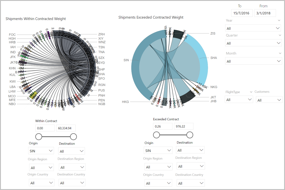
As seen in Figure 12, the chord diagram is extremely messy and complicated because there are more than 100 permutations of trade lanes. With the help of the filter, the chord diagrams above depicted the filtered version. This is an effective way to showcase data as users can see the trade lanes that have the highest STP. For instance, Singapore to Shanghai, the actual shipped amount drastically exceeds the projected amount as the chord is extremely thick as compared to other shipping lanes, on the right chord diagram. Insights from Figure 15 can alert GAMs to anticipate and purchase appropriate cargo space.
RpK
Customer profiling aids in Company X’s future contract negotiation with customers.
Quadrant matrix
A Quadrant matrix can identify customers’ profile based on their rates per kg and weight shipped. It segments customers based on RPK and WGT. To increase revenues, Company X must identify and negotiate new rates for customers with low contractual rates and low quantity shipped. Since rates per kg are charged based on weight shipped, weight will be used to measure size of shipments. The preferred customer profile is one with high rate per kg and high weight of shipment. From Figure 14, we can easily identify customers who lack one or both preferred attributes.
Density
Identifying density spread by top 5 customers aids Company X in purchasing the appropriate shipment from airlines – space or weight, which lowers cost.
Stacked Bar Chart for Density
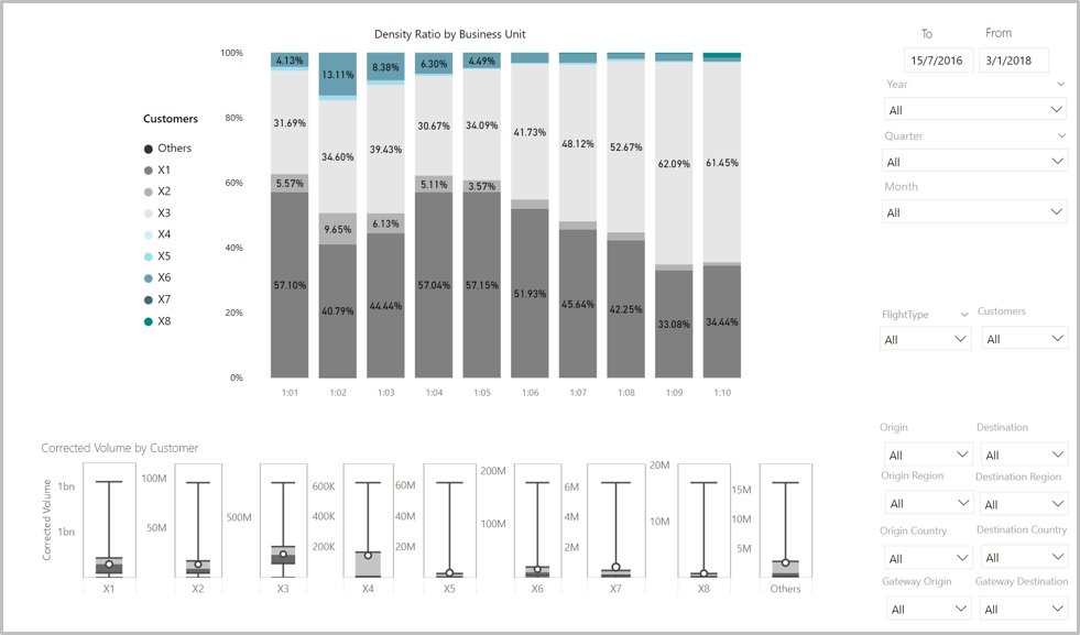
From Figure 2, Company X can compare density distribution of each customer easily. For instance, Customer X1 has 51.48% of its shipments in 1:01 as opposed to X3 which only had 20.73% representing extremely dense shipments This would indicate that the nature of Customer X1's shipped goods are relatively highly dense. Based on this, Company X will be able to determine if it should purchase more weight for X1.
Dashboard Design
3 key measures to increase profits were separated in 3 dashboards as they serve different purpose.
RpK relates to revenue analysis; customer segmentation based on weight and rate per kg.
Density and STP relates to cost analysis; top 5 customers in each density bin, and comparison between actual and projected amount. They serve different purpose. Density aids in purchasing the appropriate amount of weight or space from airlines while STP aids in purchasing shipment from airlines.
In all dashboards, space, instead of lines, is used to demarcate visualisations. This is to abide by Tufte’s data-ink ratio best practices. Also, important visualisations were placed on the left, while sliders on the right to be congruent with western reading orientation. Overly colourful dashboards are avoided, seen in Figure 16-18. In general, grey ink is used for reporting data that do not need to grab viewers’ attention. Colour of grey hues with different intensity are used to distinguish between different customers and lanes in Figure 17 and Figure 18 respectively, to avoid drawing any association by colours and to be “colour-blind friendly”. Grey hues are chosen to allow visualisations that intend to do so to grab attention clearly, as seen in the red data points in Figure 16’s Quadrant Matrix.
7.0 Further Recommendations to Sponsor
Usability Study
It is imperative to conduct a usability study to gather feedback from the future end user of the dashboard. There may be various end users and they may have different needs for the dashboard. Furthermore, niche visualisations like Quadrant Matrix and Chord Diagram are currently used in the dashboard. Users may not understand these visualisations as they are not conventional visualisation tools like pie and bar charts, and this asymmetry could limit users experience. Thus, conducting a usability study to determine effective use of the dashboard will be helpful in improving design.
Extension Graphs
Figure 2 is only effective in showing a general view of the customers and their density distribution shipped. This only helps in understanding which customer ships the most dense and volumetric shipments respectively. To obtain greater analysis, Company X can add an extension to the current stacked column chart such as a bar chart that would analyse each customer individually and incorporate the average and median volume ranges of the selected data. This would gauge whether each customer is reaching its target or is above the average volume being shipped. From here, Company X can approach these customers specifically to increase their volume shipped thereby finding effective solutions to maximise its revenue.
8.0 Recommendations to Business
Applying the suggested dashboard, logistics companies can derive meaningful insights that can help to increase profit by increasing revenue and reducing costs. To potentially increase revenue, companies could adopt Quadrant matrix visualisation to target potential customer groups for renegotiation of contracts in future. Businesses can use the 100% stacked column chart (Figure 2) to understand the density distribution shipped by each customer. Through this they will be able to determine if the shipments are dense or volumetric and forecast demand accordingly. Cross analysis with the chord diagram will shed insights on shipping lanes that are particularly popular. This allows logistics firms to forecast total shipped volumes and prepare shipping lanes in advance thereby reducing spare capacity and cost simultaneously.
References
[1] S. Few, Information dashboard design. Beijing: O'Reilly, 2006.
[2] "Using “Data Storytelling” with a chord diagram". [Online]. Available: https://www.visualcinnamon.com/2014/12/using-data-storytelling-with-chord.html.
[3] R. Koochaksaraei, I. Meneghini, V. Coelho and F. Guimarães, "A new visualization method in many-objective optimization with chord diagram and angular mapping", Knowledge-Based Systems, vol. 138, pp. 134-154, 2017.
[4] P. Prasetoyo, A. Palakorn and E. Lim, "On Analyzing Geotagged Tweets for Location-based Patterns.", 2016.
[5] L. Li, Y. Liu, H. Zhu, S. Ying, Q. Luo, H. Luo, X. Kuai, H. Xia and H. Shen, "A bibliometric and visual analysis of global geo-ontology research", Computers & Geosciences, vol. 99, pp. 1-8, 2017.
[6] W. Qi, G. Abel, R. Muttarak and S. Liu, "Circular visualization of China’s internal migration flows 2010–2015", Environment and Planning A, vol. 49, no. 11, pp. 2432-2436, 2017.
[7] M. Flood, V. Lemieux, M. Varga and B. William Wong, "The application of visual analytics to financial stability monitoring", Journal of Financial Stability, vol. 27, pp. 180-197, 2016.
[8] W. Deng, "Using a revised importance–performance analysis approach: The case of Taiwanese hot springs tourism", Tourism Management, vol. 28, no. 5, pp. 1275-1276, 2007.
[9] D. Bacon, "Multiple Regression and Quadrant Analysis", American Marketing Association, 2004.
[10] M. Feng, J. Mangan, C. Wong, M. Xu and C. Lalwani, "Investigating the different approaches to importance–performance analysis", The Service Industries Journal, vol. 34, no. 12, pp. 1021-1041, 2014.
[11] B. Grover, More to the Bottom Line: Customer Profitability Tools for Wholesaler-Distributors. 2003.
[12] J. Meehan, C. Goodin, L. Montan and M. Simonetto, Pricing and Profitability
[13] N. Salkind, Encyclopedia of measurement and statistics. Thousand Oaks, Calif: SAGE, 2007, pp. 112-114.
[14] A. Aspin, Power BI Desktop. .
[15] "Introduction to DAX - Power BI". [Online]. Available: https://docs.microsoft.com/en-us/power-bi/guided-learning/introductiontodax#step-1.
[16] "High Density Line Sampling in Power BI - Power BI". [Online]. Available: https://docs.microsoft.com/en-us/power-bi/desktop-high-density-sampling.
[17] "Custom visualizations in Power BI - Power BI". [Online]. Available: https://docs.microsoft.com/en-us/power-bi/power-bi-custom-visuals.
