ANLY482 AY2016-17 T2 Group21 : Finals
| Exploratory | Mid-Term | Finals |
|---|
Contents
Survival Analysis
Our sponsor faces the challenge of understanding the actual demand of their products. This is because the sales amount reported are often limited by the stock quantity ordered. This leads to a related phenomenon known as censored demand where the actual demand of a product is not realized due to a product going out-of-stock. Due to the censored demand identified during our exploratory analysis, using survival analysis provides a way for us to handle such hidden values.
Survival analysis is performed using the JMP built-in survival functions, using two features:
1. Basic Survival Function
- Applies Kaplan-Meier Estimator to account for censored values
2. (Cox) Proportional Hazards Fit
- Fits a linear model between predictors (explanatory variables) and the hazard function.
- Parameters estimates show how predictors affect the hazard function.
First, we perform SA on product stock-out time to set a benchmark of their current inventory stockout time. Next, we perform SA on the time-to-sale to gauge the demand of their product offerings.
Product Stock Out Time
Survival Curve
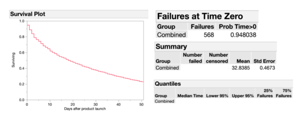
To account for non-stockout products, we perform our survival analysis of product stock-out-time with the following definition:
- Subject: A product identified by name and size
- Time to event: Time in days for a product to stockout
- Censor: 0 if product stockout, 1 otherwise
The above analysis shows a more accurate median time of stockout of 18 days, which is longer than our sponsor’s target of achieving a stockout period of 7 days. From the survival plot, we can also see that 68% of all products still remains on the shelf after 7 days after launch. It is, therefore, useful to understand which product groups have longer stockout periods. We further add groupings by category to our analysis.
Breaking down the survival function by category, we see that Accessories have a longer period of stockout time of 46 days while Outerwear has the lowest of 15. The large interquartile range of failures for Accessories also shows that product order quantities within Accessories categories largely differs.
(Cox) Proportional Hazard Model
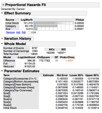
We perform a regression analysis to explain stockout rates. We would like to see if sizes, category and initial order quantities affect stockout times.
A positive parameter estimate means that the covariate results in a shorter stockout time, while a negative parameter estimate results in a longer stockout time. The parameter estimates above highlights that Accessories takes a longer time to stock out, whereas Outerwear stocks out the fastest. An increase in initial stock also increases stockout time.
Cox proportional hazard fit also allows us to compare the effect of each predictor with another, risk (or hazard) ratios shows the relative effect of one variable against the other.
The relative risk ratio for sizes S and M shows that size S is 8% more likely to stockout compared to M. Similarly, size F is 6% more likely to stockout as compared to size M.
Product Time To Sale
Time to sale refers to the number of days after the launch date of each item being sold. A product refers to a group of individual pieces of items with the same product id and attribute. Each product comes in multiple sizes with varying quantity of product items available. For example, a product A comes in sizes S, M, L, each size has a quantity of 5 items available for sale, totaling to 15 items available for sale under product A. Hence, time to sales is useful as it allows us to understand the distribution of the days for a product item to be sold.
Survival Curve
As some products are not sold or pulled off from store, these products will be used as the censor for our survival analysis. As such, our definition are as follow:
- Subject: A product item identified by name, size and item number
- Time to event: Time-to-sale, days it takes for a product item to sell after launch
- Censor: 0 if product item is sold, 1 if unsold or removed from store
- Grouping: By collection, category and size (depending on what we are trying to analyze)
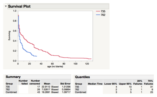
The above survival analysis graph indicates a large difference between the survival curve between the two collections. Collection 762 has a much lower survivor curve, and hence each product item in the collection has a much lower chance of surviving (i.e. being left on the shelf). The summary table shows that a product in collection 762 takes less than a third of the time a product will take to sell in collection 735 (in terms of the mean). 50% of the products in 762 are sold in 2 days compared to 8 days for collection 735. However, the distribution of time-to-sales has shown a right skew. As such, mean is not an accurate measure of performance. In survival analysis, the median time is defined as the time it takes for half the population to die. As such, the median is a much better indication of the performance.
Both the Log-Rank and Wilcoxon statistical test show that the difference between the groups, collections in the case, is statistically significant. As such, it is fair to say that collection 762 has, on average, products that are more popular as compared to collection 735.
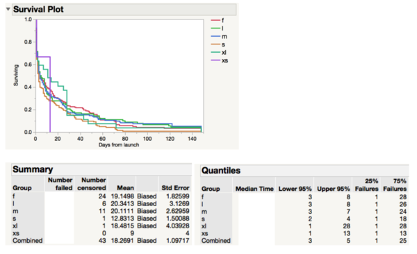
The survival graph shows a similar pattern for all sizes except for XS and XL. Upon closer inspection, we can put this down to the small sample size for both these sizes.
Inventory Performance Grid
A goal of our project is to make it accessible for our sponsor to utilize SA in their decision making process. To achieve this, a clear data representation is needed to help our sponsor understand their product demand. Our group came up with a visual decision tool called the Inventory Performance Grid which relies on both Sell-Through Rate and Average Rate of Sales on a product to produce actionable insights for our sponsor.
We created an example based on 4 different products which we sold in a 2 days, 7 days, and 30 days time window.
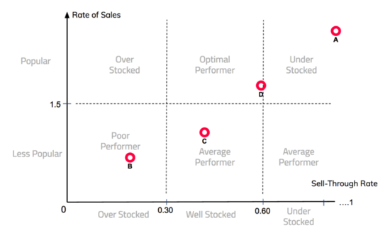
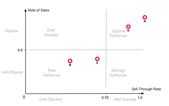
With the above metrics for each product, we can now visualize each product’s inventory performance on an inventory performance grid. Sell-through rate and the average rate of sales combine to produce an inventory performance grid that helps us understand different aspects of merchandising. Sell-through rate depicts stock sufficiency while the average rate of sales is a measure of the popularity of the product. With that, each product can be classified into different quadrants, with each quadrant representing different business meaning. The figures below depicts an inventory performance grid of the products A, B, C, and D in a 2 days and 7 days time window respectively.
The inventory performance grids of 2 days and 7 days have different business meaning and interpretation. For 2 days, products should have an optimal sell-through rate of between 0.3 to 0.6 and a rate of sales of above 1.50 pieces per day. This means that the product is popular and that the stock quantity is optimal. If the sell-through rate of the product is above 0.6 with a high rate of sales, it signals that the product is under stocked and the actual demand is higher than predicted.
The ideal stock-out time of each product is aimed to be 7 days. As such, products with less than 0.7 sell-through rate after 7 days can be deemed to be not ideal. Of course, these numbers can be tweaked as deem fit. The main idea behind the inventory performance grid is to give businesses a simple assessment of the performance of their inventory decisions. For example, it is apparent that product B is a poor performer. Products similar to product B can be avoided in the future.
The different grids provide businesses with a snapshot of product performance over different time windows. For example, by simply looking at the 7 day grid, it can be said that product A is a optimal performer. However, when you combine the 7 day grid with the 2 day grid, it can be concluded that product A is extremely popular and achieved a sell-through of 0.8 within 2 days. As such, product A can be classified as “under stocked”.
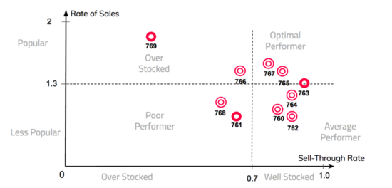
In the above figure, we plot the 7 day average figures of collections 760 - 769. In the figure, collection 761 and 768 falls into the bottom left quadrant. With a relatively low rate of sales and low sell-through rate. It can be said that the popularity of the products in the collection was misjudged and brought in a disproportionate amount of stock. On the flip slide, collection 763, 765 and 767 falls into the top right quadrant, indicating optimal stock amounts and high popularity amongst users.
