ANLY482 AY2016-17 T1 Group4: Project Findings
Mid-Term Findings
Exploratory Data Analysis
For our exploratory data analysis, we went with analyzing the three different aspects of the data, namely, the clients and the policies.
Distribution By Age
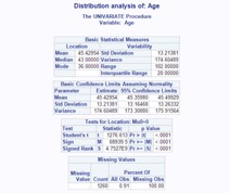
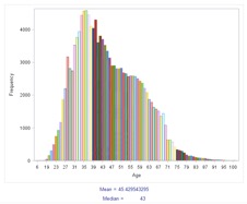
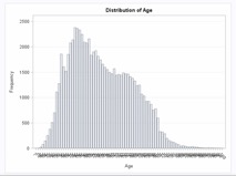
In the dataset, age was not a present field, so it had to be derived using the customers' date of birth. The current year was subtracted by the customer's birth year in order to generate a derived field, which was then the customer's age. Using SAS EG's 'one way frequency' feature, we were able to generate the age distribution for the clients.
From the data, we are able to see that the median age is around 45, with the standard deviation being around 13 years. However, there are missing age values, and those entries consist of 9% of the data, and have been excluded from this analysis.
We can also see that most of the customers are around the ages of 31 to 45, from the graph. It can also be observed that the graph is right skewed, because of this particular distribution
Distribution By Gender
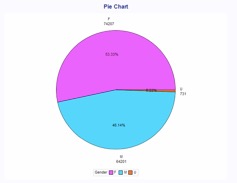
Clients were also grouped into their respective genders, and the distribution was then plotted into a pie chart. The males are denoted by the blue segment, while the females are denoted by the pink segment. Those clients that failed to disclose their gender, which appeared the dataset as "U", are denoted by the orange segment.
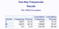
From the data, we are able to observe that around 53% of the valid clients are male, while around 46% are female. There is a very small percentage of individuals, however that did not disclose their gender (0.53%).
Distribution By Age & Gender
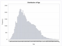
Below are two separate age distribution graphs that are grouped by gender. The graph on the top is for females while the graph on the bottom is for males. The bars are the frequency of clients who fall under that particular age.
For Females:
For Males:
What we can observe is slightly more women than men for clients aged 50 years old to their late 60s. However, we are also able to see that there are slightly more men than women clients for clients in their late 30s, by comparing both peaks, which both happen to fall within the similar age range of 30 to 45 years old.
Distribution of Customers By Occupation
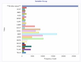
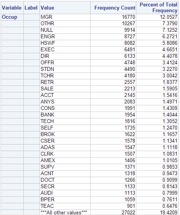
From the above analysis, we are able to observe that the highest group of customers are managers, followed by “OTHR”. This could possibly consist of other businessmen such as Entrepreneurs. Following that are a group that did not disclose their occupation. Engineers, Housewives and Executives follow after that.
Understand Policy Based Data
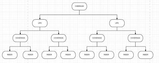
For policy based data, we would be looking at a few fields, namely, CHDRNUM, which indicates the unique policy number, RIDER, which indicates the rider index number, INSTPREM, which is the premium that has been paid up for that particular. Also, we would be looking at the columns LIFE and COVERAGE, which are the columns that define the index of each contract’s coverage. Essentially, this is the visual representation of how each contract is modelled:
Each CHDRNUM has many LIFE, which has many COVERAGE, which has many RIDERs. To illustrate, the table below shows a small sample of the data:
As seen from the small sample above, we can see that for a contract with CHDRNUM of 00240907, it contains two LIFE coverages, 01 and 02. Within each LIFE, COVERAGE then denotes each coverage plan within each Life Coverage. For each coverage plan, there exists various riders. However, one thing to take note of is that the all life coverages that come after 01 will be nested under the original coverage defined in the row where LIFE =01, COVERAGE = 01 and RIDER = 00. Therefore, if the product defined for the row of LIFE =01, COVERAGE = 01, RIDER = 00 is “Legacy Plan”, then the basic plan for the entire contract of 00240907 would be “Legacy Plan”. Also, another thing to take note is that as long as LIFE is not 01, then that particular record is a rider for the basic plan defined by LIFE =01, COVERAGE = 01, RIDER = 00 in that particular contract.
Policy's Uptake Vs Time
We plotted graphs for each of the basic plans and also for the riders, to allow the client company to understand the uptake of each basic plan over the years. The variable used in this analysis was the start date of the client's policy, and this was grouped by each unique policy, to generate one chart per policy.
For Basic Plans Only:
From this, they will be able to understand which plans have an increasing uptake rate, and which plans have a decreasing uptake rate. These graphs have been put into a separate PDF, for their perusal.
For Riders Only:
Finals Findings
Clustering Analysis
Rationale
Initially, K-means clustering in SAS Enterprise Guide was considered, but this procedure can only analyse numerical variables. The exploratory data analysis revealed that there were some important categorical variables such as marital status or nationality which is extremely essential in understanding the customer. On a side not, converting categorical variables to numerical variables is not a logical solution as it’s meaningless to calculate the Euclidean distance between the values of a categorical variable.
Hierarchical Clustering was avoided as it has higher complexity than the other clustering methods, thus it would take an extremely long time to experiment and execute an optimal clustering solutions for such a large dataset (consisting of nearly 140,000 customers). The complexity of hierarchical clustering is nearly O(), as opposed to O() for k-means clustering (Inaba, M.; Katoh, N.; Imai, H., 1994). But more importantly, there was no inherent hierarchy present in the data structure itself to use hierarchical clustering.
Thus, ultimately a Mixed cluster analysis was used to perform a clustering analysis on both categorical and continuous variables. Mixed cluster analysis extends the concept of Latent Class Clustering to a wide range of variables such as interval, nominal and date-time. SAS Enterprise Miner was used to execute the Mixed cluster analysis for the dataset.
Methodology
Data
The data preparation process was closely linked to the data analysis process. As opposed to the market basket analysis, a clustering analysis is usually analysed from the perspective of the customer. Thus the combined dataset was converted to a single customer view (SCV) where every row of the data represented one unique customer. The dataset consisted of demographic variables such as gender, marital status, age, and occupation. But along with demographic parameters, certain product variables were also computed to shed light on a customer’s behavioural parameters i.e. a customer’s knowledge, attitude and usage of the product.
Thus for the behavioural variables, the single customer view was linked to the contract header dataset and 4 variables were computed: total policies of a customer, total number of riders, total premium paid by the customer, total single premium paid upfront by a customer. The following Process Flow Diagram was used to import the data into Enterprise Miner:
The clustering is automatically based to be computed on non-missing inputs, but this procedure leads to a loss of data and information. Thus an Impute Node was used to deal with missing values. In the property panel, the Default Input Method for both interval and class variables is changed to Tree. Thus this Impute node uses a tree method to replace missing values.
Standardisation
Standardization is an important pre-requisite for clustering, as the accuracy of the output relies on this. The way the clustering is devised sheds some light on the necessity of standardization. If a variable has a large range and/or variance, it will have a larger influence on the formed cluster, which will end up skewing the clustering algorithm towards itself. (Milligan, Cooper, 1988)
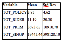
As can be seen see in the above standard deviation table, the TOT_SINGP has a much higher standard deviation as the order of magnitude of its standard deviation is nearly 105 times that of TOT_POLICY. Thus using these values directly will prioritize the variable such as TOT_PREM and TOT_SINGP over TOT_POLICY and TOT_RIDER, when in fact the later could be an equally powerful factor to determine the clusters. On a side note, if a variable is considered to be more important than the other, a priority weighting can be given to it after it’s standardized. Standardization, is thus, a univariate data transformation process in which the field values can be rescaled such that the mean and standard deviation of the values will be fixed across all the variables.
Traditionally, the benchmark values are fixed: for mean at 0 and for standard deviation at 1, but it’s not necessary to employ the same values for clustering. As it’s simply a matter of rescaling, the benchmark values themselves won’t affect the analysis, as long as the scale is identical across the variables. However, for simplicity the traditional benchmarks have been used for standardization of these variables. The following formula was used to rescale the variables:
where, represent the current value of the variable, represents the mean of the variable’s values and equals its standard deviation. The mean is subtracted from the current value and the resulting value is divided with the standard deviation, the value gets rescaled to a z-score such that the sum, and subsequently the mean, of all the resulting z-scores is 0 and the standard deviation is 1.
Variables
There is no direct criterion to determine which variables to use for performing the clustering analysis. This is usually derived from the context and certain indicators. Indicators such as the Variable importance and the Cluster Outputs were used to explore the variables to be selected for the final cluster analysis. Variable importance, an algorithm developed by SAS, is calculated based on how the variables are used in the finished output. The algorithm used to determine variable importance consists of count, surrogate count, RSS and the relative importance. The variable importance ranges from 0 to 1 with 1 being the highest importance.
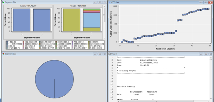
As different sets of the variables were systematically experimented upon, the variable importance led to startling results. First all the 4 behavioural and 4 demographic variables were collectively analysed and it resulted in a skewed up cluster output:
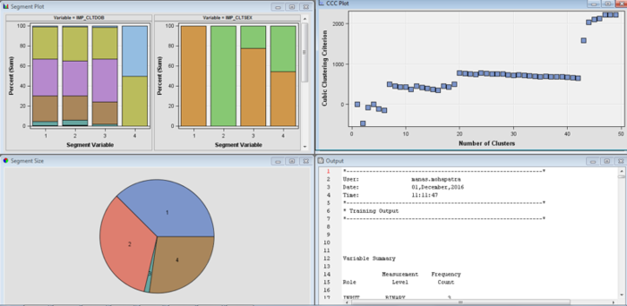
In the above analysis, only the total premium variable was given high importance, while the rest were neglected. Thus, first the product variable was tested and it again led to an output as above. Next, all the 4 demographic variables were clustered which resulted in a healthy cluster breakdown and healthy distribution of variable importance:
Thus, finally after checking the variable importance and the cluster outputs the following variables were chosen: Date of Birth*, Marital Status, Occupation, Gender, Total Premium
- Note: Date of Birth behaves like using Age since while importing the dataset, the date of birth field was set to Date-time attribute. For greater accuracy, the Date of Birth was used directly, although Age was used to profile the segments for simplicity
Analysis
SAS has developed a Clustering Cubic Criterion (CCC) to estimate the optimum number of clusters that a particular dataset should have (How can I tell how many clusters are in my data set, 1983). The algorithm behind CCC is fairly complicated, but idea behind CCC is to compare the R2 calculated for a given set of clusters with the R2 value derived by clustering a uniformly distributed set of points in p dimensional space (Where p is the number of variables). The R2 mentioned here is not the coefficient of determination derived from a regression analysis. It rather deals with calculating the compactness of data points within cluster and between clusters.
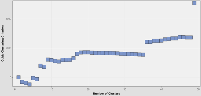
The CCC values can be traced against the number of clusters and its graph can be used to determine the number of clusters. Generally, a positive CCC with a value more than 2 or 3 indicates good clustering, with the local maxima or a peak being an indication for the optimum number.
The following was the graph of the CCC values plotted against the number of clusters:
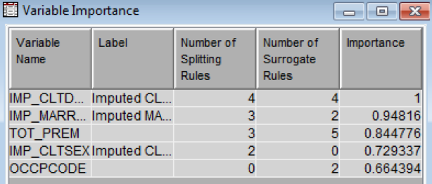
As can be seen in the above graph, the CCC values initially was negative, which indicated an un-optimal number of clusters since the compactness of the cluster is worse than that derived from the reference distribution. But as the number of clusters, increase the values become increasingly positive with maxima peaks at the value of 7, 9, 19 and 45 on the x-axis. This implies that the optimal solutions exist if the number clusters are 7, 9, 19 or 45. The clustering algorithm automatically chooses 7 as the optimal answer, as it’s the local maxima. The variable importance table, as seen below, revealed that all the variables in consideration were given significant importance.
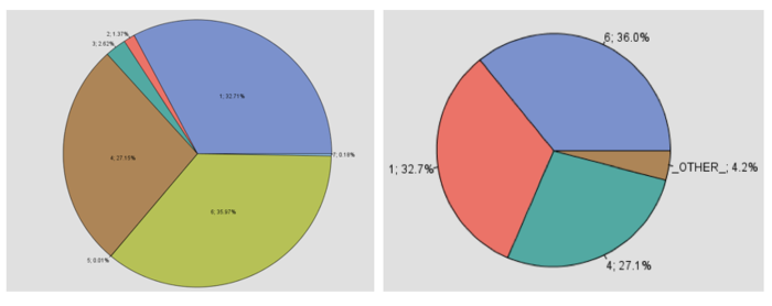
The following screen shows the cluster breakdown computed from the cluster analysis. There are a total of 7 segments, but 3 of those clusters (specifically Cluster 1, 4 & 6) have a nearly equitable distribution of the number of data points. Moreover, as these 3 clusters encompass 96% of the clients, these 3 segments were the point of focus of further analysis. Thus the rest of the segments were grouped as OTHER cluster as seen in the second output screen:
Profiling
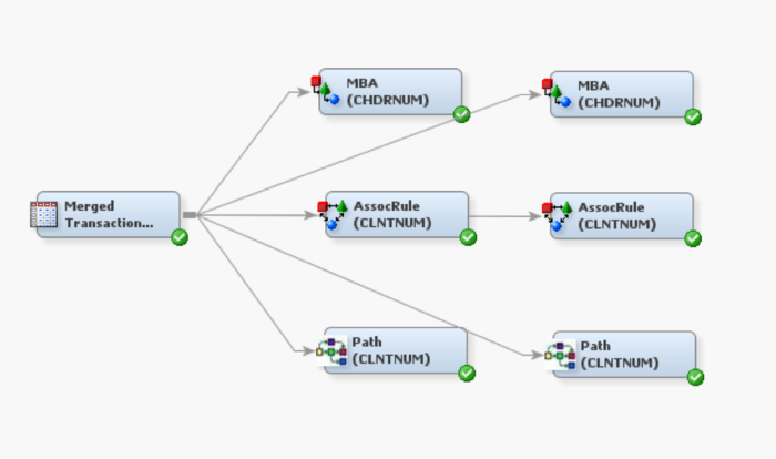
For profiling the clusters, the following Process Flow Diagram was employed:
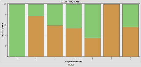
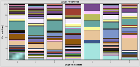
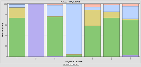
SAS Enterprise Miner automatically calculates the total sum of frequency for all profiles. This can be used to understand the division of the variables such as marital status, gender and occupation as seen below:
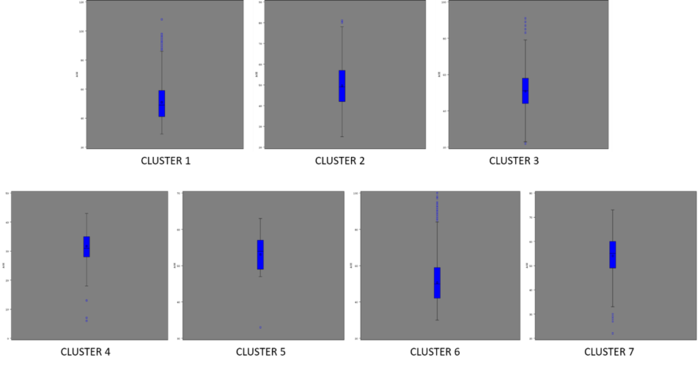
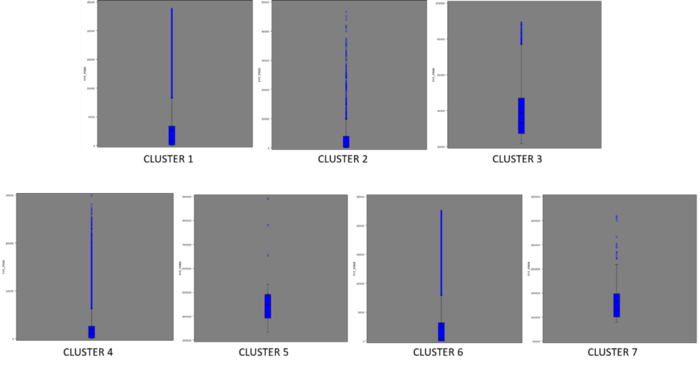
But total sum of frequency cannot be used to understand the profile of each cluster based on Date of Birth and Total Premium, since it merely adds up the values in each cluster without shedding light on the profile itself. Thus instead a box plot analysis was conducted for these 2 variables as seen below:
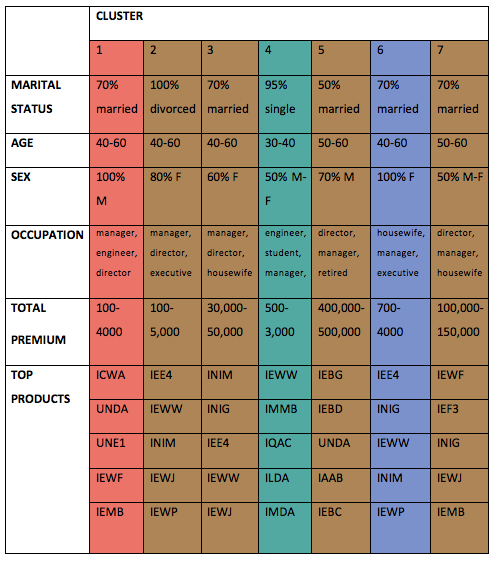
After all this has been done, the profiling was then sorted into a tabular format:
Note: Mean is heavily skewed by outliers, while median doesn’t reflect the distribution. Thus the Profiles of the age and total premium was based on the interquartile range instead of the mean or median.
Finally, considering all the variables, the 3 major clusters (1, 4 & 6) can be profiled as such: • Cluster 1: Married adult male executives • Cluster 4: Single young adult students & engineers • Cluster 6: Married adult female housewives & executives
As can be seen these major profile doesn’t have any significant difference when it comes to the total premium. But, from the OTHER cluster group, cluster 3 & 5 stands out as they have unusually high amount of total premium paid at nearly 10 times for cluster 3 and 100 times for cluster 5 than the average.
Thus it could be substantial to profile these 2 segments as well: • Cluster 3: Married adult housewives & executives • Cluster 5: Retired single & married senior citizens
The top products in each cluster will be linked with the results from the market basket and sequential association analysis to recommend rules for each cluster.
Association Rules Analysis
Rationale
Association rule mining, one of the most important and well-researched techniques of data mining, was first introduced in 1993 (Agrawal, Imieliński, & Swami, 1993) and are used to identify relationships among a set of items in a database. It aims to extract interesting correlations, frequent patterns, associations or casual structures among set of items in the transaction databases or other data repositories.
In order for us to evaluate the interesting rules from the set of all possible rules, constraints on various measures of significance and interest can be used. The best-known constraints are minimum thresholds on support and confidence. Since the database is large and the user concern is on those frequently purchased items, the thresholds of support and confidence can be predefined by users to drop those rules that are not so interesting or useful.
Methodology
Data
Association rule mining, one of the most important and well-researched techniques of data mining, was first introduced in 1993 (Agrawal, Imieliński, & Swami, 1993) and are used to identify relationships among a set of items in a database. It aims to extract interesting correlations, frequent patterns, associations or casual structures among set of items in the transaction databases or other data repositories.
Process
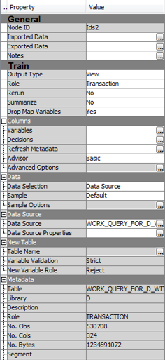
1. Create a Process Flow diagram in SAS Enterprise Miner
2. Import the dataset
3. On the variables tab, set the model role for:
   a.	CHDRNUM to Id (for MBA), and CLNTNUM to Id (for Association and Path)
   b.	CRTABLE to Target
   c.	CURRFROM to Sequence (for Association and Path)
4. Run the nodes
Analysis
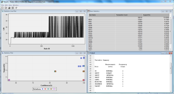
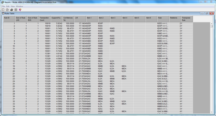
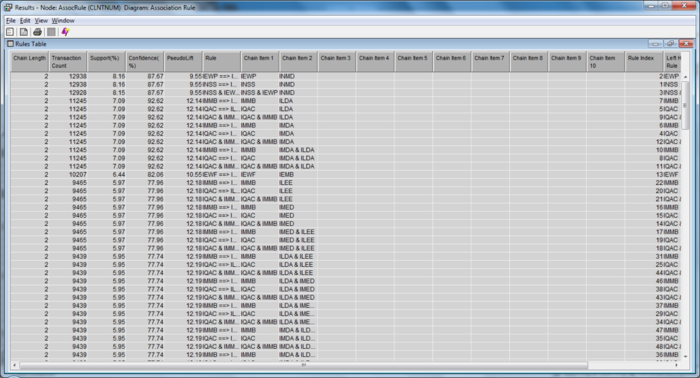
We first ran a market basket analysis on the products which are purchased at the same time, within the same contract. (i.e. which policy rider is most likely to be purchased together at the point of contract signing).
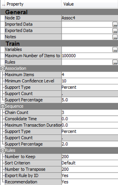
These results have minimally a 50% minimum confidence level, and support of at least 2.5%. It shows the variables and rules that follow the criteria set as above. Within these sets of rules, there are three dominant policy rider which has enough confidence and support to show possibility that clients will purchase them together at the same point in time. These three riders are: • IEWP • INSS • INMD It is common knowledge that the INSS and INMD are likely to be purchased together in the same contract/policy. However, it was refreshing to see how IEWP plans can be bundled together with the other two for increased sales.
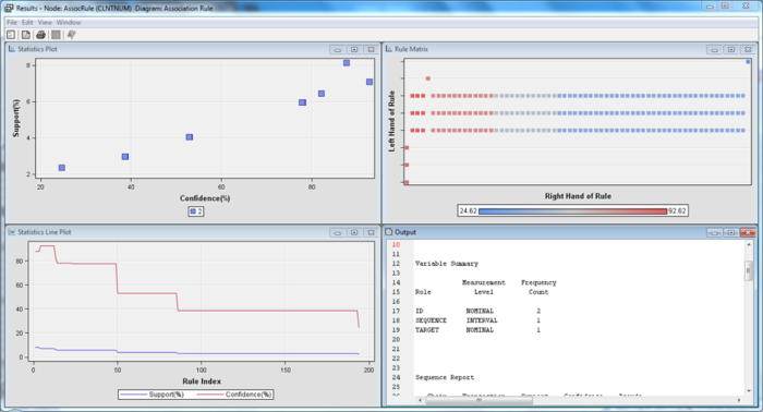
Beyond the market basket analysis, we used the association node in Enterprise Miner to derive an association/sequence analysis to determine the order of the purchases for each client. Therefore, ID is set to CLNTNUM for this analysis. This was to determine what would the clients purchase subsequently after the first product in which they have purchased.
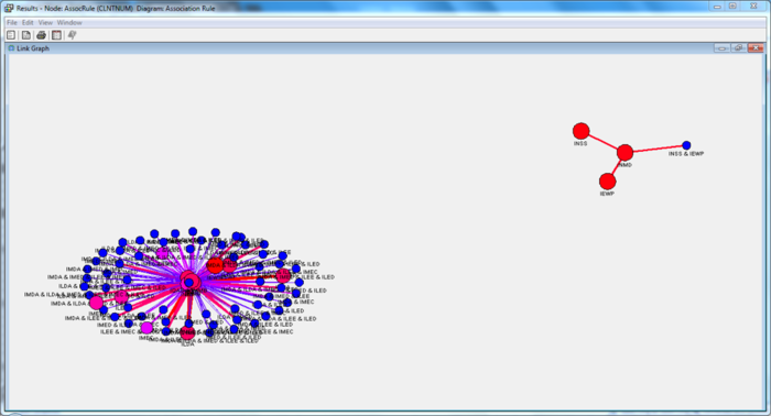
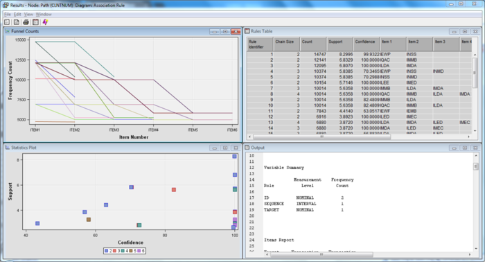
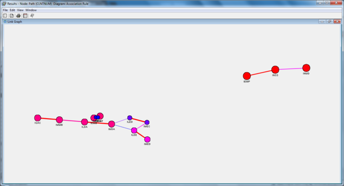
These results have minimally a 50% minimum confidence level, and support of at least 5%. We can tell that there is an automatic clustering of the policies and riders from the link graph, showing a natural tendency to gravitate towards certain plans if one is already on one. This shows that there is expansibility towards 2 different plans, based on the coverage and rider analysis qualitatively. Similarly to what was reflected in the market basket analysis, the three dominant riders have surfaced in the association analysis as well, appearing in a separate cluster from the other policy riders
The support tells us the percentage of the clients who have purchased all the services involved in the rule, while the confidence represents the percentage of the customers who have the right-hand side (RHS) item among those who have the left-hand side (LHS) item. Life, is a ratio of the confidence of a rule to the expected confidence of a rule, that is if the RHS is independent of the LHS. Values that are greater than one represent positive association between the LHS and RHS. Values that equal to one represent independence. Values that are less than one represent a negative association between the LHS and RHS.
While looking for meaningful data in the generated rules, various aspects of the data set were filtered and then further explored. First, only rules which had at least 50% of the support were further explored. This was to ensure that there is sufficient backing behind claims of possible cross-selling.
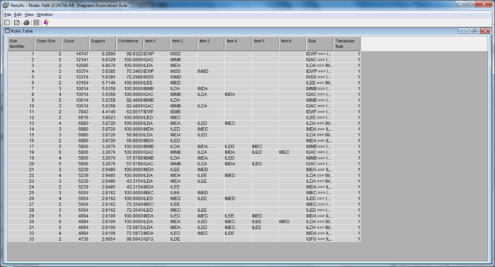
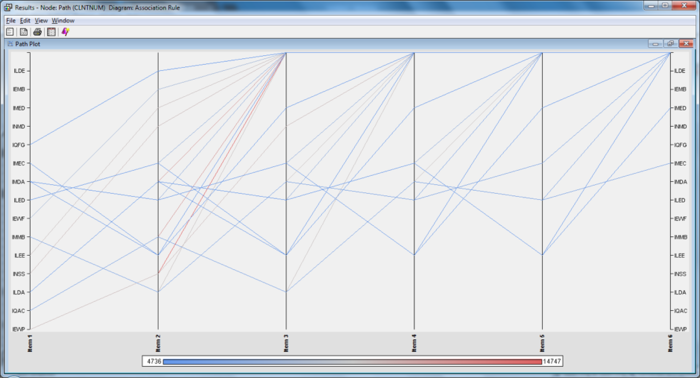
In addition, we also ran the path analysis node for completeness. The node was meant as an extension of the association analysis and is used to visualize the exact paths a client would take the purchase the various products.
These rules are a subset of the rules found within the association analysis. The only difference is that they have been used to visualize appropriately on the correct path patterns.
Similarly, the three dominant riders have also been separated on a different cluster on the link graph. We also see new patterns emerge from other factors on the link graph. In summary, we discovered three types of rules within this dataset. The first time is commonplace knowledge, which our clients are already aware of. The second are undiscovered correlations, but are not applicable to the field because of various reasons such as institutional restrictions. The last set which was discovered is most useful to our client, in the sense that these are the item sets which are not previously known, but now can be used in their day-to-day operations in enabling more policies to be sold.
Recommendations to Clients
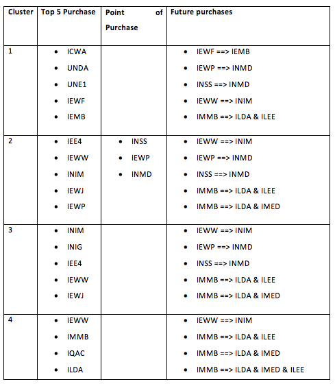
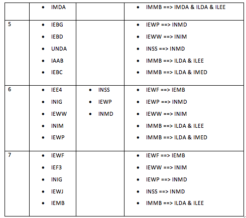
Combining the clustering analysis together with the market basket analysis and the association analysis, we can see the various recommendations for each cluster.
Due to the confidentiality, we are unable to disclose the exact policies, that these refer to. However, if any individual is interested in replicating the study, they can adopt the methods as described above. They can:
• Derive the list of products with highest similarity scores;
• Understand customer profiles and create segments at product category level based on propensity to buy from a specific product category; and
• Suggest ways to optimise cross-selling of insurance products based on existing products in customer portfolio.
Also, in addition to purely data analysis, we have some recommendations for the data collection process.
• Collect unsuccessful sell opportunities to prospective customers and new customers. This will enable predictive modelling in understanding not only the successful attempts, but also when not to sell to the client from the previous data.
These improvements will lead to a stronger and more robust understanding of the client profile, which can be used in different applications further downstream.

