Difference between revisions of "Group01 proposal"
| Line 114: | Line 114: | ||
| <b><i>readr</i></b>||Read Excel Files in R. | | <b><i>readr</i></b>||Read Excel Files in R. | ||
|- | |- | ||
| − | | <b><i>dplyr</i></b>||Tools for Splitting, Applying and Combining Data. | + | | <b><i>dplyr</i></b>||Tools for Cleaning the data such as Splitting, Applying and Combining Data. |
|- | |- | ||
| <b><i>ggplot2</i></b>||Create graphics and charts. | | <b><i>ggplot2</i></b>||Create graphics and charts. | ||
|- | |- | ||
| + | | <b><i>plotly</i></b>||Create interactive graphics and charts. | ||
|} | |} | ||
<br> | <br> | ||
| Line 129: | Line 130: | ||
== References == | == References == | ||
| + | === ShinyApp === | ||
| + | * [https://shiny.rstudio.com/ R Shiny] | ||
| + | |||
| + | === Market Basket Analysis === | ||
* [https://www.datacamp.com/community/tutorials/market-basket-analysis-r Market Basket Analysis using R.] | * [https://www.datacamp.com/community/tutorials/market-basket-analysis-r Market Basket Analysis using R.] | ||
* [https://wiki.smu.edu.sg/1617t3isss608g1/ISSS608_2016-17_T3_Group8_Arules_Project_Proposal A Visual Application for Better Business Decision Making.] | * [https://wiki.smu.edu.sg/1617t3isss608g1/ISSS608_2016-17_T3_Group8_Arules_Project_Proposal A Visual Application for Better Business Decision Making.] | ||
| Line 134: | Line 139: | ||
* [https://blog.revolutionanalytics.com/2019/02/sequential-pattern-mining-in-r.html Tutorial: Sequential Pattern Mining in R for Business Recommendations] | * [https://blog.revolutionanalytics.com/2019/02/sequential-pattern-mining-in-r.html Tutorial: Sequential Pattern Mining in R for Business Recommendations] | ||
* [https://cran.r-project.org/web/packages/arules/index.html arules R package] | * [https://cran.r-project.org/web/packages/arules/index.html arules R package] | ||
| − | |||
* [https://cran.r-project.org/web/packages/arulesSequences/arulesSequences.pdf arulesSequences R package] | * [https://cran.r-project.org/web/packages/arulesSequences/arulesSequences.pdf arulesSequences R package] | ||
* [https://cran.r-project.org/web/packages/arulesViz/arulesViz.pdf arulesViz R package] | * [https://cran.r-project.org/web/packages/arulesViz/arulesViz.pdf arulesViz R package] | ||
| + | |||
| + | === Network visualization === | ||
| + | * [https://idl.cs.washington.edu/files/2012-InteractiveDynamics-CACM.pdf Interactive Dynamics for Visual Analysis] | ||
* [https://cran.r-project.org/web/packages/visNetwork/vignettes/Introduction-to-visNetwork.html visNetwork R package] | * [https://cran.r-project.org/web/packages/visNetwork/vignettes/Introduction-to-visNetwork.html visNetwork R package] | ||
* [https://datavizproject.com/data-type/network-visualisation/ Network Visualization] | * [https://datavizproject.com/data-type/network-visualisation/ Network Visualization] | ||
| Line 143: | Line 150: | ||
* [https://cran.r-project.org/web/packages/visNetwork/vignettes/Introduction-to-visNetwork.html visNetwork R package] | * [https://cran.r-project.org/web/packages/visNetwork/vignettes/Introduction-to-visNetwork.html visNetwork R package] | ||
* [https://www.r-bloggers.com/interactive-network-visualization-with-r/ Interactive Network Visualization with R] | * [https://www.r-bloggers.com/interactive-network-visualization-with-r/ Interactive Network Visualization with R] | ||
| − | |||
Revision as of 21:32, 26 April 2020
Contents
Introduction
As the data becomes easier to collect and computers become more powerful, companies are constantly finding ways to extract values from the data they have. Market basket analysis is widely used by companies in the retail industry. Often these graphs used in illustrating the association rules derived from market basket analysis are static graphs. This could pose an issue when the number of items or rules increases. The traditional way of visualizing the rules also lacks interactivity, which can be hard for the readers to read the graphs when the number of rules is huge.
Besides, the convention interface of the analytical software also lacks interactions between the graphs and the underlying models. The users often need to go back and forth between the model and the relevant graphs if the users would like to change the parameters. In other words, the interface does not allow the users to calibrate the model on the fly. This can pose a challenge to the users especially when the users are required to go through the codes to make necessary changes to the parameters.
To resolve the issues mentioned above, we have explored network visualization and ShinyApp. The purpose of this research is to provide an alternative method to visualize the association rules and provide users more flexibility and control in calibrating the model.
Before jumping right into the case study, let's visit some of the key concepts of the techniques & the relevant R packages will be used in this analysis.
Market Basket Analysis
Market basket analysis is a type of data mining technique to find association rules between different objects in a set, find frequent patterns in a transaction database, relational databases or any other information repository.
Following is an example of the association rules:
The association rules can be split into left hand side (LHS) and right hand side (RHS). So, based on the example provided above, LHS of the rules consists of Organic Fuji Apple and right hand side consists of banana. The rules basically tells us that organic fuji apple is associated with banana. So, if we find the organic fuji apple in the grocery basket, there is a chance we might find banana in the basket as well.
This is often used in retail services to understand the products that are being purchased together. This would help the companies in designing their cross-sell or up-selling strategies. For example, assume product A has a relatively higher profit margin and it is often purchased together with product B. The company could bundle these two products to increase the sales of the products in order to increase its profit margin.
Key Concepts
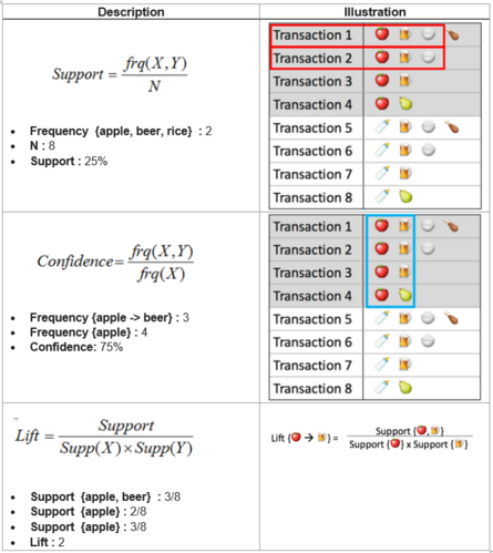
There are a few key measurements under market basket analysis, which are:
- Support: Measure how frequent the item or item set appears in the transactions
- Confidence: Measure the likelihood that customers would buy the products shown in the rules, given that they have the products listed on the left hand side in their basket
- Lift: Co-occurence of products on the left hand side and right hand side exceeds the likelihood of products on left hand side and right hand side are independent
Following are the illustrations of the key concepts mentioned above:
So, we will be using apriori function in arules R packages in finding the underlying association rules. inspectDT function will be used to transform the derived rules into an interactive data table to allow the users to sort and filter on the rules. This is to enhance the user's data exploration experience by implementating two of the taxonomy suggested in the article Interactive Dynamics for Visual Analysis by Jerrrey Heer and Ben Shneiderman.
We will also explore another extension of arules package, which is arulesSequences. The conventional market basket analysis ignores the time effect. There is no differentiation on the transactions occurred at different time periods. This could pose an issue as often the user preference could have changed over time. Hence, we will use cspade function in arulesSequences to transform the data into required format and ruleInduction to find the association rules.
For visualisation, arules has another R package allows users to plot the association rules and the relevant package is called arulesViz. However, this R packages only allows us to create static graph of the network graph. So, to overcome this, we will be using visNetwork. Before jumping into the R packages, let's understand what is network visualisation.
Network Visualization
Network Visualization is a technique often used to show the relationships between the different items. As the name suggested, this technique shows the relationship in network type of format, which is easier for the users to understand how different items are related to one another. Refer to the link for more example of network visualization.
Network visualization can be used in many areas, such as biology, social network, computer science and so on. This has helped the users to uncover the different insights.
In this group project, we have compared igraph and visNetwork to weight pros and cons of both R packages. We have also done some research online to see what others said about these packages. In particular, an article Interactive Network Visualization with R written by Niklas Junker gave us a clear reason why visNetwork is better than igraph.
Case Study: Instacart Grocery Data
To illustrate how the network visualization technique can complement the association rules derived from market basket analysis, we will be using dataset from Instacart.
This data is downloaded from the The Instacart Online Grocery Shopping Dataset 2017 on Feb 2020. The data dictionary can be found this link.
Data Set
Below is the summary of the dataset used:
- There are more than 30 million transactions from about 206,000 unique customers
- The transactions contains the products purchased by the customers under each order
- The sequences of the transactions are also available in the dataset
Storyboard
In this project, we adopted the following principles:
- Design thinking through having periodic check-in with Prof Kam to ensure we are heading the right directions
- Fail early through iterating the prototypes with Prof Kam to land the interface design of the R Shiny
- Overview first, zoom and filter, then details on demands visualization interface design mantra by Ben Shneiderman in his paper 'The Eyes Have It: A Task by Data Type Taxonomy for Information Visualizations'.
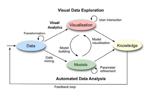
- Interactivity between visualisation and model building as shown in Fig X below.
Prototype
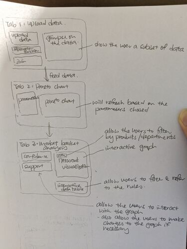
After several rounds of discussions with Prof Kam and several iterations, below is the final prototype for the design apps:
Following are key highlights of designed R Shiny as shown in the prototype:
- Pareto chart is included to help the users in better understanding the various popular products sold by the company
- Parameters such as confidence, support and so on are included in the application to allow the users to calibrate the model
Note that this final prototype has incorporated the feedbacks Prof Kam provided along the way.
Application: R Shiny
R Shiny is a great tool for interactive web application. Hence, it is chosen to build the association model and visualise the underlying association rules.
There are a lot of conventional tools allow us to mine for association rules. However, these tools are often not so flexible when it comes to customization. Often, it takes weeks to months to deploy a customized function the users would like to have. On the other hands, R Shiny is also flexible for the users to make necessary changes to include certain functions or info. For example, parameters and buttons will be added to the application to allow the users to calibrate the model. This is an good example how data scientists could enable the users who may not be proficient in coding to perform analysis jobs.
Following are other R packages used in building the R Shiny:
| Package | Description |
|---|---|
| tidyverse | The tidyverse is an opinionated collection of R packages designed for data science. |
| readr | Read Excel Files in R. |
| dplyr | Tools for Cleaning the data such as Splitting, Applying and Combining Data. |
| ggplot2 | Create graphics and charts. |
| plotly | Create interactive graphics and charts. |
The analysis and case study can be found in the research paper.
Team Members
References
ShinyApp
Market Basket Analysis
- Market Basket Analysis using R.
- A Visual Application for Better Business Decision Making.
- A Gentle Introduction on Market Basket Analysis — Association Rules
- Tutorial: Sequential Pattern Mining in R for Business Recommendations
- arules R package
- arulesSequences R package
- arulesViz R package


