Project Groups
|
|
|
|
|
|
|
Please change Your Team name to your project topic and change student name to your own name
| Project Team | Project Title/Description | Project Artifacts | Project Member |
|---|---|---|---|
|
Grocery - Product Maze: Navigating the Products through the maze by Network Visualization In this era of information explosion, this poses challenges in continuing the current conventional way to analyze association rules. Often these conventional methods do not show the underlying complex relationships between different items. Besides that, the conventional interface of the analytical software lack of interactivity between the graphs and the underlying model. Hence, in this research paper, an alternative way to visualize the association rules is presented. Demonstrations are also included to show interactivity functions are integrated into the application to provide a more seamless process in calibrating the model and visualizing the association rules. The designed application will provide users more control and flexibility. |
| ||
|
A Visual Exploration of Media Consumption in Singapore Government communicators’ real-world experience of using survey data to better understand their audiences falls short of ambition. The analytics practices of market research firms goes some way to explaining why this gap persists. This project aims to provide government communicators with a user-friendly web-enabled application to visually discover the media consumption patterns and behaviours of major audiences in Singapore. Untapped insights from survey data can be revealed by encouraging deeper interaction through this interface. |
| ||
|
Gateway to the Future Libraries have obtained demographic, behaviour and user experience data from users through service quality surveys and with increasing reliance on such survey data for evaluation of library performance, we propose the use of an interactive visual analytics tool to allow library staff and managers to explore and analyze library survey demographics and Likert scale ratings data to get richer and deeper insights through various data visualisation and modelling techniques. With the user journey designed for sequential build up of knowledge from various visualisations and models, we hope to improve knowledge discovery by library managers and analysts. We use Singapore Management University’s February 2018 Library Survey data as a use case for our application to highlight the variety and depth of insights which can be derived, and propose ways our project may be extended upon. |
| ||
| Group 4 |
China Happiness Analysis Happiness is a very important topic all around the world nowadays, especially in China, the country which is becoming more and more focus on people’s happiness because of the development. Happiness can be influenced by a lot of factors, such as health, education and income. Also, happiness can show different features in different regions. Our objective is to get the most important factors to happiness in China. Therefore, we will use several types of graphs such as likert scale, bubble plot and mapping to analyze the result of a survey on Chinese people’s happiness in 2015 and consider different provinces in China. |
| |
| Group 5 |
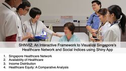
SHNVIZ: An Interactive Framework to Visualize Singapore’s Healthcare Network and Social Indices using Shiny App Our project aims to develop a data-driven decision support tool for policy-makers and analysts to explore relationships pertaining to healthcare equity and availability in Singapore. This includes a geo-spatial break-down of Singapore's income, demographic and healthcare availability indices to draw associative relationships as well as a postal-code based dynamic tool that fetches information on the nearest healthcare facilities. |
| |
| Group 6 |
Interactive Analytical Dashboard for ATM Performance Analysis With the development of digital technology, traditional banking is facing disruptive challenges posed by evolving digital banking. Mobile apps allow consumers to pay without using cash. The demand for cash is reducing, therefore forcing banks like Spar Nord to start considering the operating costs of ATM networks. An Interactive data analysis dashboard may help them to estimate the ATM performance and enhance their business. However, currently there is no proper application that enables users to explore the ATM dataset flexibly and interactively. In this project, an interactive shiny dashboard application has been designed and developed to help banks explore ATMs performances both in failure rate and number of transactions. We demonstrate the potential of the application through the use of interactive maps, time-series heatmaps, funnel plots and time-series forecasting model to explore and analyse around 100 ATMs’ transaction data provided by the bank Spar Nord. |
| |
| Group 7 |
Cryptocurrency Price Analysis and Time Series Forecasting There are approximately 5,392 cryptocurrencies being traded with a total market capitalization of $201bn (as of April 22, 2020). Considerable growing rate is estimated in the following years. With the help of cryptography and a collective booking system called blockchain, cryptocurrencies build a distributed, safe and decentralized payment system, which does not need banks, intermediates, an organization or a central technical infrastructure to work. However, mainly due to lack of regulatory support, Cryptocurrencies are highly volatile, which makes it a risky investment. Therefore, in this project, a Shiny web application is created with the cryptocurrency analysis in mind. It integrates three types of analysis: Time Series Analysis, Correlation Analysis and Portfolio Selection Analysis within one application. This application is made to be informative and allows potential investors of cryptocurrency to interact with the data embedded within the application, view the visualization and generate results based on the selected filters before they make decision on cryptocurrency investment. |
| |
| Group 8 |
Re-imagining Bus Transport Network in Singapore Singapore's public transport use rose to hit a record high in 2018, with a total of 7.54 million trips made on buses or trains each day. Here's what may come across your mind: Do you ever have experiences where a bus ride that is supposed to be short and quick took way longer than expected? Are you frustrated that the bus stops at every stop even though there’s nobody boarding or alighting? And why do we have so many bus stops that almost nobody uses? What if we can reimagine the public bus network in Singapore through data? In this project, we will use data visualization techniques to map out all transportation nodes in Singapore and re-propose a different way of organizing our bus services, which include bus stops, bus routes, and connectivity within region and from regions to regions. |
| |
| Group 9 |
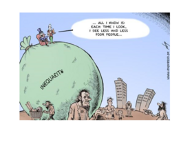
Poor In Wealth , Poor In Health ? Income equility is a hot issue these years,many sub-topics have been derived from this theme.Scholars have studied about the rootcause that result in this situation,the post-impact of income inequility and so on.Our project is to explore the relationship between individual income inequility and health.It will be a extension study of a existing work,published by Bakkeli, N., Income inequality and health in China: A panel data analysis. CHNS(China Health and Nutrition Survey) offer good resource for us to explore the income inequility problem in China,with more than 10 years data.Beyond original work scope,we will involve updated survey data to show the result.Besides,China context-income inequility gap among regions,will also be taken into consideration when conducting the analysis.The final result will be presented in a interactive visualization view. |
| |
| Group 10 |
SPIVA: A Singapore Property Interactive Visual Analytics Dashboard URA has done a great job at providing us with accurate data of all the private properties transaction in Singapore. However, many users use these data at a transactional level and thus does not bring out the full value of what the data tells us. Moreover, user might lack the analytical knowledge or tools to perform in depth analysis on these data. To overcome this issue, we designed and developed SPIVA, Singapore Property Interactive Visual Analytics Dashboard, to democratise data and analytics by allowing property marketplace stakeholders to explore and analyse Singapore private property data to gain valuable insights about Singapore property market price trends and expectations. |
| |
| Group 11 - LRT |
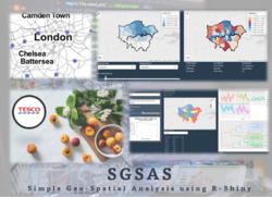
SGSAS: Simple Geo-Spatial Analysis using R-Shiny Geo-spatial analytics is a growing discipline providing important analytics in a wide range of applications. Tesco Grocery 1.0 provided an opportunity to enhance traditional global linear regression and analytics with geographically weighted clustering and regression methods due to the existence of spatial autocorrelation. A R-Shiny application was developed following a data analytics workflow process of exploratory single and bivariate data analysis, exploratory spatial data analysis, geographically weighted multivariate cluster analysis and regression. The extensive use of geo-visualisations and availability of user-selectable options allow users to uncover hidden patterns in an effective and pleasing way. |
| |
| Group 12 |
Global Warming, Global Warning! Global warming is an ongoing problem, and for a long time scientists have sounded the alarm about taking action to slow it down. Meanwhile, the situation continues to deteriorate. Rising temperatures have led to rising sea levels, changing rainfall patterns and more frequent extreme weather. Recent severe fires in Australia and locust plagues in Africa have been linked to droughts caused by warming temperatures. It is well known that the main cause of global warming is the massive use of fossil fuels (such as coal, oil, etc.) for nearly a century, which emits a large amount of CO2 and other greenhouse gases. These greenhouse gases absorb infrared light from the radiation emitted by the earth, causing the earth's temperature to rise. This project aims to let everyone know the trend of global warming and the emission of carbon dioxide in various countries, so that everyone can attach importance to this problem. |
| |
| Group 13 |
Geographical Visualization and Analytical analysis of World Development Level The Human Development Report lays down the important goals achieved by countries that are part of the United Nations Development Programme (UNDP) and come under the United Nations Development Programme. Therefore, the UNDP is committed to quantifying the level of human development. To this end, they have collected a substantial amount of data around the world, including life expectancy, years of education, Gross National Income, and the ratio of men to women, etc.. In the existing reports, indexes are mainly displayed in the form of tables and line charts. But in fact, there are different components behind each index, and there is a mutual relationship between the indexes, which can not be shown through the line graph. To visualize the data proper and more insightful, we build a Shiny website application to facilitate readers to explore the components behind data and the relationship between different data. In the end, the propose of the project is to clarify all indexes related and attempt to make another way to visualize the development situation of each country. |
| |
| Group 14 |
Employee attrition analysis and visualization
Hence, with the goal of improving the control of attrition, we intend to design an application which can help the Human Resource Department to further understand the structure of the employees who choose to leave and who stay, and the attrition patterns regarding all features. From which can help not only to predict unwanted attrition, but to have proven action plans at your fingertips to help you reduce it, based on the organization's unique attributes.
|
| |
| Group 15 |
Dynamic and Interactive Visual Analytical Dashboard for Covid-19 in China Since December 2019, new cases of COVID-19 have been discovered in Wuhan, it has spread to all over China and other countries. As of 2019-03-01, a total of 79,971 cases have been diagnosed and a total of 2,873 deaths have been confirmed in China. The situation in the rest of the world is not optimistic, 7,277 cases have been confirmed and the total 18 deaths occurred in other countries. Its widespread and rapid speed is alarming. The 2019 nCov has caused a certain impact on the economy of China and even countries around the world, even has been taken seriously by WHO. In order to study trends in the number of diagnoses, the number of suspected patients, and deaths over time for different areas, we use the 2019 nCov data for further analysis and visualization. |
| |
| Group 16 |
All about meat Meat is almost on every table across some developing and most developed countries. And it seems that we shall have more meat in the future. But is this true? Our team wish to have a close look to the global meat market, including production, consumption and trade to answer the question. |
| |
| Group 17 : Detectives |
Geospatial Visual Analytics Tool for Exploring and Analyzing Armed Conflicts in South Asia In this age of growing socio-political and cultural dissimilarities, the occurrences of armed conflicts have risen. This has been observed especially in nations that are in proximity to each other and those who share borders. Non-profit organizations like ACLED have been collating the data of such conflicts in a tabular form, analyzing such data and mapping the crisis of these events. By leveraging this data, which entails the conflict occurrences, date of conflicts, fatalities, types of conflicts, among other factors, we contribute a geo-spatial analytics tool to allow users to visualize the data for South Asian countries and garner insights with respect to conflict occurrences with great user experience. We demonstrate the potential of our application through interactive visualizations to explore the data alongside statistical analysis such as, spatio-temporal analysis and multitype point pattern analysis. |
|


