IS428 AY2019-20T1 Assign Ngoh Yi Long Dashboard
MC2: St. HiMark Radiation Monitor System
|
|
|
|
|
|
Pre-Dashboard
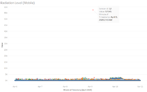
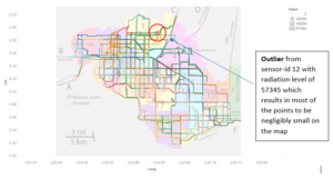
Before I start working on the interactive dashboard, I was trying around with the dataset. I plotted the scatterplot of the radiation level of all the mobile sensor readings through the timestamp and found out there seems to be an outlier on the reading. Sensor-id 12 is showing an extraordinary huge radiation level of 57,345 where the rest of the scatter points are only just below 5,000. Therefore, I took note of this point and excluded this point from the rest of my dashboard when it was using mobile sensor readings.
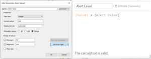
To improve on the mapping visualization, I had created a parameter called “Alert Value” which represents the point in which cpm is deemed to be unsafe and also another calculated field called “Alert Level” to filter the points on the map when it is above the “Alert Value” which the user using the dashboard can set within a range of 75 to 250. This would allow me to filter the points that are only higher than the “Alert Value” set.


