MC2: St. HiMark Radiation Monitor System
1. Visualize radiation measurements over time from both static and mobile sensors to identify areas where radiation over background is detected. Characterize changes over time.
 |
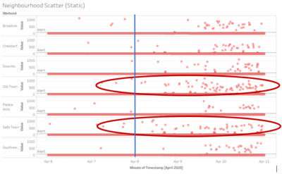
For the 9 static sensors, its readings are only found in 7 neighbourhoods. A scatterplot is created for all its reading from the 5 days of dataset given split into its respective neighbourhoods. As we can see, as the timeframe passes, the static readings are showing increasing higher points of recorded radiation level. In addition, we can see that particularly 2 neighbourhoods – Old Town and Safe Town are showing more results that are having higher radiation levels. This could be because these 2 towns are the closest in proximity from the nuclear power plant.
|
 |
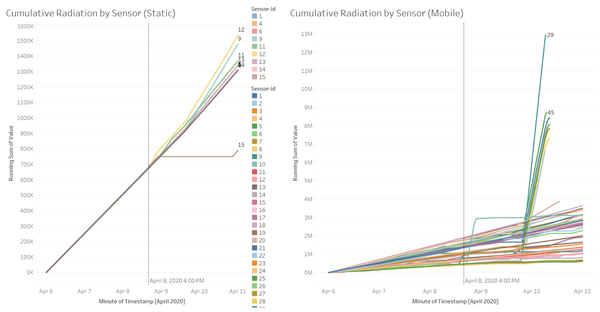
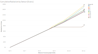
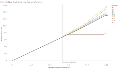
Using this cumulative radiation readings by each sensor would show the increased in the difference of recording levels over time. As we can see from the line graph, sensor-id 12 and 9 are having one of the highest cumulative radiation readings over time. Both the sensors are in Old Town which is the neighbourhood beside Safe Town where the nuclear power plant is located.
Therefore, based on the static readings that we have, we can show that Safe Town and Old Town might be the more prominent areas of radiation.
|
 |
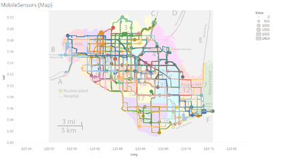
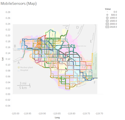
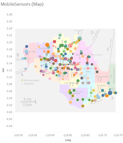
This are all the plotting of the mobile sensors over the 5 days of data provided. With this information, it is still relatively difficult to identify the areas where there might be radiation over the background. The neighbourhoods with more larger circles would mean that there are higher values being recorded over the time frame.
|
 |
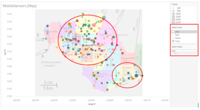
I introduced a new variable Alert Value to set unsafe cpm level and using a calculated field of Alert Level to only show those points which are above the Alert Value. From the improved visualization we can see that most of the radiation level which are above 100 are in the central, north and south-east of the town. This diagram can help to recognise area of radiation found above a certain threshold and allow the relevant authority to check on the actual radiation level on the ground.
|
 |
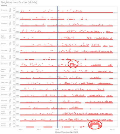
With the addition of the scatter plot of the mobile sensor readings mapped by its respective neighbourhood along the time frame, we can see certain areas and time which has an increase in radiation level. We can identify some of the pocket of high recorded readings such as Old Town around the start of April 9 and Wilson Forest around the start of April 10 (which is the central and south-east of the city).
From both the static and mobile sensor readings, we can also definitely see an increase in radiation level after April 8 (shown by the blue line on the graphs) which could be the cause of the earthquake which may have affected the nuclear power plant to suffer damage and causing an increase in radiation level throughout the city.
|
2. Use visual analytics to represent and analyze uncertainty in the measurement of radiation across the city.
a. Compare uncertainty of the static sensors to the mobile sensors. What anomalies can you see? Are there sensors that are too uncertain to trust?
b. Which regions of the city have greater uncertainty of radiation measurement? Use visual analytics to explain your rationale.
c. What effects do you see in the sensor readings after the earthquake and other major events? What effect do these events have on uncertainty?

Static Sensors |
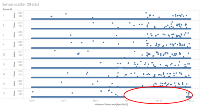
The scatter plot shows the points of each recording over the 5-day time frame. As we can see from the plot above, for sensor-id 15 which is found at the nuclear power plant, there was a time from around April 9 to April 11 there was no radiation level recorded. This could show some uncertainty on the sensor where it was not able to detect any readings for a 2-day period.
|

Mobile Sensors |
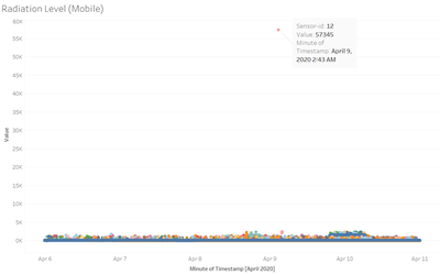
We have outliers like this for mobile sensor-id 12 with such a high value of 57,345. It is difficult for us not to dismiss the sensor when it returns such an abnormal large value.
|
 |
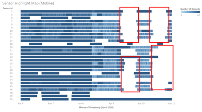
This diagram shows the number of recorded readings for some of the mobile sensors which I have picked out. These 28 mobile sensors have pockets of missing readings along the 5-day period, which creates uncertainty on these sensors to whether are they working in good condition.
Static sensors are having 1 out of 9 with missing recorded values whereas mobile sensors have 28 out of 50 mobile sensors with missing recorded values. Mobile sensors have more than half of its total sensors with missing values which shows more uncertainties over the mobile than the static sensors. It might be due to the data connectivity of the user who are uploading the data. However, this would just cause pour more uncertainty over data being uploaded by users themselves.
|
 |
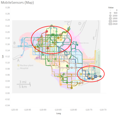
From the above mobile sensors, I have filtered out the respective sensors where its radiation level has been recorded over these time frame. As we can see, a lot of the sensors are moving across the city. Many of the high radiation level recorded are by these sensors in the north and south-east of the city.
Although the static sensors only have one sensor which is uncertain, mobile sensors itself can be seen above might be proving uncertainty over the north and south-east area where majority of the large radiation level readings were being recorded.
|

 |
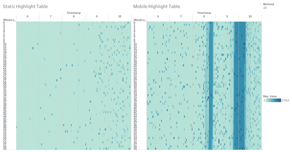
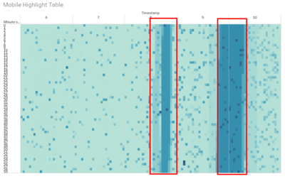
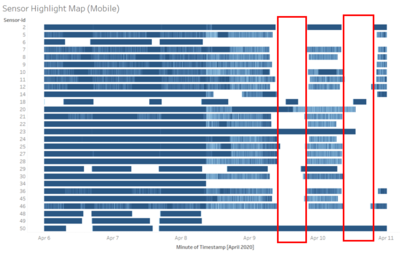
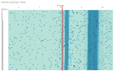
Comparing the 2 graphs, the highlight table depicts the maximum value recorded for each minute over the time frame for all mobile sensors. As we can see there is 2 regions of high readings which could show the earthquake and other major events. The event happening right before April 9 has caused many mobile sensors to not be able to properly have their readings recorded at the later part of the day on April 9. Similar for the event happening around April 10, which caused the mobile sensors to not have their readings recorded at the later part in the day. This might show a relationship over major events occurring and the uncertainty on the sensors, where some of the sensors would not be working or unable to retrieve data after the event has happened.
|
3. Given the uncertainty you observed in question 2, are the radiation measurements reliable enough to locate areas of concern?
a. Highlight potential locations of contamination, including the locations of contaminated cars. Should St. Himark officials be worried about contaminated cars moving around the city?
b. Estimate how many cars may have been contaminated when coolant leaked from the Always Safe plant. Use visual analysis of radiation measurements to determine if any have left the area.
c. Indicated where you would deploy more sensors to improve radiation monitoring in the city. Would you recommend more static sensors or more mobile sensors or both? Use your visualization of radiation measurement uncertainty to justify your recommendation.
 |
This diagram is a filtered to show only those mobile sensors reading below 100 (safe radiation level). The readings over the time frame is mostly showing the roads where the car is on the move, moving from cities to cities too.
|
 |
On the other hand, these are the mobile sensor readings which are above 100 (unsafe radiation level). The points on this graph are mostly on its own and no relationship except for higher radiation level in the central, north, and south-east part of the city. This would show that despite the places which might be contaminated, the cars are still safe to roam around and not affecting the locations’ radiation level.
|

 |
According to the cumulative radiation by the static sensor, at around April 8, 4pm, is when the recorded readings started to split which means more radiation recorded due to the earthquake happening. While the highlight table showed increasing radiation level pickup on the sensors around April 8, 2pm. So that would mean that the earthquake occurred around April 8, 2-4pm.
|
 |
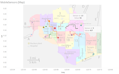
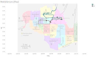
Using that time frame, I filtered out the mobile sensor to show all the points of the mobile sensors recording during that period. There is only one vehicle with sensor-id 9 that is inside the nuclear power plant in that period. Around the vicinity of the nuclear powerplant there was the vehicle with sensor-id 13. If the coolant leakage might contaminate the vehicles, these 2 vehicles with sensor-id 9 and 13 might have been exposed.
|
 |
After the earthquake period, both vehicles did leave the area and roamed around the north part of the city which includes Old Town, Easton, Weston and Downtown areas.
Seeing how the earthquake can affect the mobile sensors recordings, in my opinion I would recommend to put more static sensors as it seems to be more trusted as compared to the mobile sensors.
|
 |
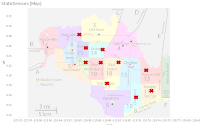
With the current static sensor locations placed already, I would put at least one static sensor in every other neighbourhood that currently do not have one. This would help the uncertainties in mobile sensors for each neighbourhood. It would also help the relevant authority to have a better grasp of each neighbourhood on the ground and can respond to the respective neighbourhood when an emergency has occurred.
However, we should not put down the effort of the mobile sensors. Mobile sensors although if the car is moving usually would not be able to detect much radiation, however at park locations like over the night or stationary in the morning at work would allow the radiation level at that spot to be picked up which the static sensors are not there to pick up. At the same time, the mobile sensors are able to track the vehicles moving in and out of the city by the highway which could show signs of possible contaminated cars going out of the city as well.
|
4. Summarize the state of radiation measurements at the end of the available period. Use your novel visualizations and analysis approaches to suggest a course of action for the city. Use visual analytics to compare the static sensor network to the mobile sensor network. What are the strengths and weaknesses of each approach? How do they support each other?

These are highlight tables for both the static and mobile sensors. It shows the maximum value recorded over each minute. As we can see from the whole duration of the data of the given period, we can see the increase in the maximum value of the recorded readings. With the mobile sensor’s highlight table with 2 significant period with high volume of maximum recordings measured. I would say that every time an event occurs, the mobile sensors will be more prompt to pick up the changes in radiation level. However, this might be because we are looking at only 9 static sensors to 50 mobile sensors.
Comparison of static and mobile sensor

- Static locations are fixed to one location and might lack to detect radiation over large areas
- Mobile sensors are attached to vehicle which can detect the radiation level of the location as it moves from place to place, allowing it to cover more areas over time
- Mobile sensors can also be submitted by different users which increase the number of readings submitted to people who care about this issue

- Static sensors are seen to have better results over time despite of major events occurring
- Mobile sensors are seen to have missing values which results in block of time frame of missing data which might be crucial to be analysed
Usage of both static and mobile sensors
- For mobility wise, the mobile sensor can support the static sensors to cover more areas to detect for radiation
- For durability wise, the static sensors would still return more fruitful readings as compared to the mobile sensors where at least more than half of them have missing periods of data in them
- Having mobile sensors, we can look at vehicles moving along the roads and in case they detect a contaminated car, they are able to detect it earlier
5. The data for this challenge can be analyzed either as a static collection or as a dynamic stream of data, as it would occur in a real emergency. Describe how you analyzed the data - as a static collection or a stream. How do you think this choice affected your analysis? Limit your response to 200 words and 3 images.

From the diagram above, it would have seemed as I analysed the data as in dynamic stream of data. In any event that occurs, the additional data input would have changed how the graph is populated and allowing the relevant authority to make fast and sensible responds based on the input data coming in. Like the cumulative radiation readings of both static and mobile sensors, when there is a sudden increase or jump in the reading, that would mean that something might have been detected by the respective sensor and the authority can immediately go on the ground to confirm it. This direction that I have analysed the data would not have affected my analysis, in my opinion, I think it was a better way to analyse a stream of data which would allow better detection of anomalies to allow relevant authorities to act on it as quickly as they can.
