IS428 AY2019-20T1 Assign Ngoh Yi Long Dashboard
MC2: St. HiMark Radiation Monitor System
|
|
|
|
|
|
Pre-Dashboard
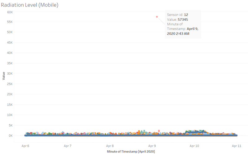
Before I start working on the interactive dashboard, I was trying around with the dataset. I plotted the scatterplot of the radiation level of all the mobile sensor readings through the timestamp and found out there seems to be an outlier on the reading. Sensor-id 12 is showing an extraordinary huge radiation level of 57,345 where the rest of the scatter points are only just below 5,000. Therefore, I took note of this point and excluded this point from the rest of my dashboard when it was using mobile sensor readings.
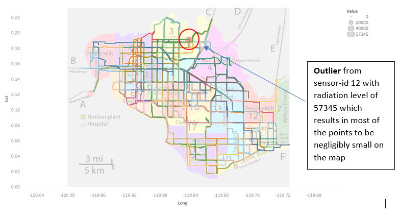
Removing Outlier
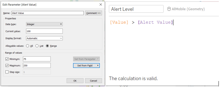
Creating New Parameter and Calculated Field
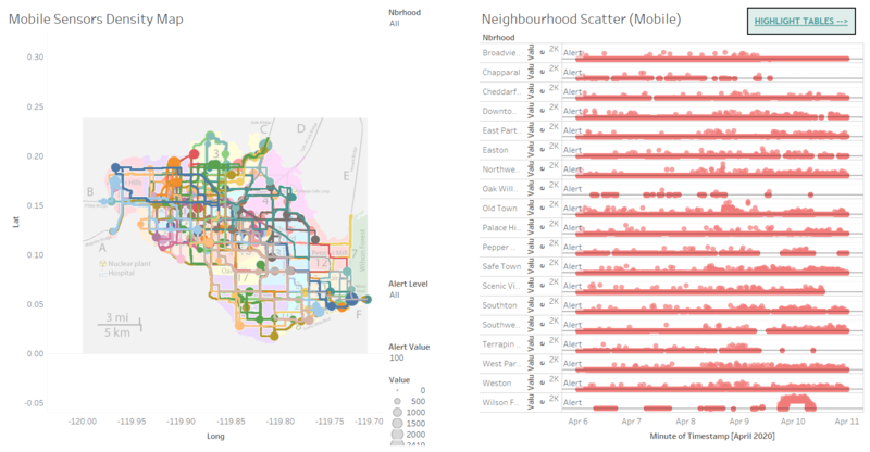
To improve on the mapping visualization, I had created a parameter called “Alert Value” which represents the point in which cpm is deemed to be unsafe and also another calculated field called “Alert Level” to filter the points on the map when it is above the “Alert Value” which the user using the dashboard can set within a range of 75 to 250. This would allow me to filter the points that are only higher than the “Alert Value” set.
Dashboard
The interactive visualization can be accessed here: https://public.tableau.com/profile/yi.long#!/vizhome/St_HimarkRadiationMonitorSystem/HomePage
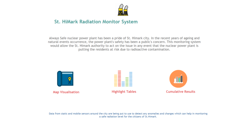
I have created a simple home page where it has a short background on what my dashboard intends to do and achieve. It has 3 buttons - Map Visualisation, Highlight Tables and Cumulative Results, these 3 are what comprises of my dashboard. The buttons allow users to navigate through the dashboard to use whichever data visualisation would be important to them, resulting a smoother flow of using the dashboard.
| Tools used | Description |
|---|---|
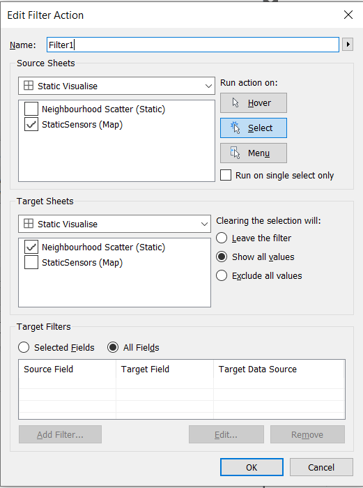 |
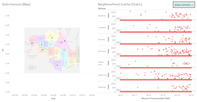
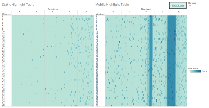
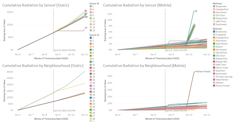
I have enabled the user to use the filtering action where they clicked on any of the sensors, it will show the users the radiation level in that neighbourhood |
Lesson Learnt
- I learnt the importance of using highlight table
- The interactive panel actions which allow different sheets of graphs to interact with each other when the user interacts with the graphs.
