IS428 AY2019-20T1 Assign Victor Lin Findings2
|
|
|
|
|
|
Contents
- 1 Q2. Use visual analytics to represent and analyze uncertainty in the measurement of radiation across the city.
- 1.1 a. Compare uncertainty of the static sensors to the mobile sensors. What anomalies can you see? Are there sensors that are too uncertain to trust?
- 1.2 b. Which regions of the city have greater uncertainty of radiation measurement? Use visual analytics to explain your rationale.
- 1.3 c. What effects do you see in the sensor readings after the earthquake and other major events? What effect do these events have on uncertainty?
Q2. Use visual analytics to represent and analyze uncertainty in the measurement of radiation across the city.
a. Compare uncertainty of the static sensors to the mobile sensors. What anomalies can you see? Are there sensors that are too uncertain to trust?
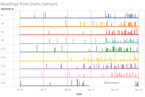
When looking at the static sensor readings across the 5 days, we see that occasional spikes in readings (anomalies) occur consistently throughout the period. However, these anomalies occur more frequently with higher intensity starting from the second half of April 8, which could have been when the first earthquake occurred. While most of the static sensors’ readings seem to be reliable, there is uncertainty in the readings of sensors 13 and 15. This is due to a lack of increase in radiation readings from the 2 sensors, which are located in close proximity to the nuclear plant. Both sensors should have detected a rise in radiation levels caused by a leak in radioactive contamination resulting from the earthquake damaging the power plant. However, sensor 15 went offline and stopped transmitting data from 10:06pm on April 8 till 8:45pm on April 9. Sensor 13 continued to display readings within the safe range, which should not have been the case if there were a radioactive contamination leak.
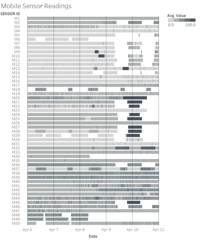
Referring to the mobile sensor readings, we see that every sensor has occasional spikes in radiation readings as well, observed by drastic changes in colour within each sensor’s bar in the chart above. The mobile sensors rely on the user’s cell phone to upload collected data onto the web. In instances where the user’s cell phone has poor data connectivity, data upload to the web is interrupted, resulting in missing data, represented by the white spaces in each sensor’s bar in the chart. However, in a scenario such as an earthquake, it is not uncommon for cell phone services to be affected. This was the case for Apr 9, between 12pm to 6pm, where half the mobile sensors went offline and stopped transmitting data. As a result, there is incomplete data with regards to radiation levels in areas where these sensors are.
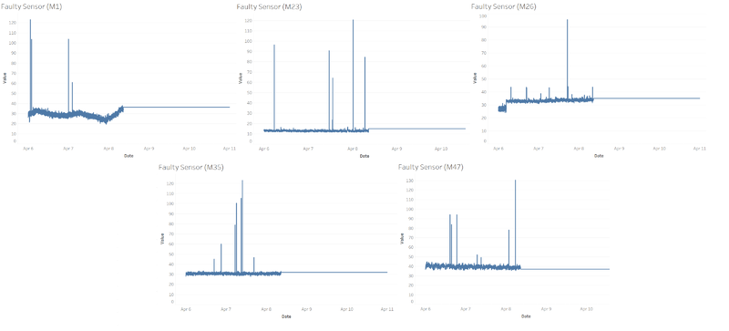
Additionally, there are 5 mobile sensors (sensors 1, 23, 26, 35, 47) that malfunctioned after 8:36 AM on 8 April, suggesting that this is the timing the first earthquake occurred. Prior to malfunctioning, the 5 sensors had readings that fluctuated within the safe range and had occasional spikes in data similar to the other mobile sensors. However, after 8:36 AM on 8 April, the readings from these 5 sensors flatlined for the rest of the period. Given how readings from the sensors usually fluctuate, a fixed reading output suggests that the sensor has become faulty and is no longer reliable.
b. Which regions of the city have greater uncertainty of radiation measurement? Use visual analytics to explain your rationale.
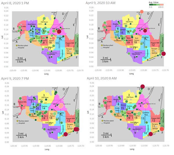
Looking at snapshots of the various sensor readings across the 5 days, there were discrepancies between sensor readings that were located in the same region. Across the 4 snapshots taken, we see that in regions such as Old Town, Safe Town, Jade Bridge, and Scenic Vista, there are notable differences in the magnitude of the sensor readings. In these regions, there are sensors that display readings below 25cpm, but yet there are also readings that are above 100cpm. Uncertainty arises as the accuracy of these sensors are questioned, with no immediate way to determine which of these sensors are faulty and which are the ones providing accurate readings.
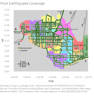
Apart from regions with conflicting readings, there is also uncertainty in regions like Pepper Mill and Wilson Forest, arising from the lack of radiation readings data available. In the chart above, readings collected since the first earthquake have been plotted alongside their coordinates. As seen from the chart, Pepper Mill and Wilson Forest have little to no readings throughout the entire period, which means that any possible radioactive contamination leakage could have been missed from the lack of data.
c. What effects do you see in the sensor readings after the earthquake and other major events? What effect do these events have on uncertainty?
The static sensor readings started having more frequent spikes in readings, as mentioned part a. This increases uncertainty on the accuracy of the readings from the sensors, as elevated readings could mean either an anomaly in reading or an actual increase in radiation levels. Aside from that, 5 of the mobile sensors malfunctioned and ceased to operate, specifically after 8:36 AM on 8 April. This reduces the number of reliable sensors, which increases uncertainty as there is now lesser data available for analysis. Data from MC1 confirms that the first earthquake did indeed occur at that time, through analysis of the shake intensity data.
