MC2: St. HiMark Radiation Monitor System
1. Visualize radiation measurements over time from both static and mobile sensors to identify areas where radiation over background is detected. Characterize changes over time.
 |
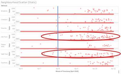
For the 9 static sensors, its readings are only found in 7 neighbourhoods. A scatterplot is created for all its reading from the 5 days of dataset given split into its respective neighbourhoods. As we can see, as the timeframe passes, the static readings are showing increasing higher points of recorded radiation level. In addition, we can see that particularly 2 neighbourhoods – Old Town and Safe Town are showing more results that are having higher radiation levels. This could be because these 2 towns are the closest in proximity from the nuclear power plant.
|
 |
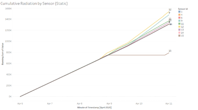
Using this cumulative radiation readings by each sensor would show the increased in the difference of recording levels over time. As we can see from the line graph, sensor-id 12 and 9 are having one of the highest cumulative radiation readings over time. Both the sensors are in Old Town which is the neighbourhood beside Safe Town where the nuclear power plant is located.
Therefore, based on the static readings that we have, we can show that Safe Town and Old Town might be the more prominent areas of radiation.
|
 |
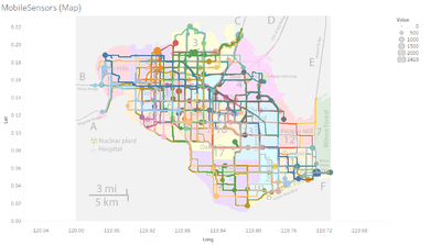
This are all the plotting of the mobile sensors over the 5 days of data provided. With this information, it is still relatively difficult to identify the areas where there might be radiation over the background. The neighbourhoods with more larger circles would mean that there are higher values being recorded over the time frame.
|
 |
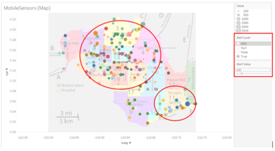
I introduced a new variable Alert Value to set unsafe cpm level and using a calculated field of Alert Level to only show those points which are above the Alert Value. From the improved visualization we can see that most of the radiation level which are above 100 are in the central, north and south-east of the town. This diagram can help to recognise area of radiation found above a certain threshold and allow the relevant authority to check on the actual radiation level on the ground.
|
 |
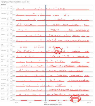
With the addition of the scatter plot of the mobile sensor readings mapped by its respective neighbourhood along the time frame, we can see certain areas and time which has an increase in radiation level. We can identify some of the pocket of high recorded readings such as Old Town around the start of April 9 and Wilson Forest around the start of April 10 (which is the central and south-east of the city).
From both the static and mobile sensor readings, we can also definitely see an increase in radiation level after April 8 (shown by the blue line on the graphs) which could be the cause of the earthquake which may have affected the nuclear power plant to suffer damage and causing an increase in radiation level throughout the city.
|
