IS428 AY2019-20T1 Assign Wei Ming Questions
Question 1
Question: Emergency responders will base their initial response on the earthquake shake map. Use visual analytics to determine how their response should change based on damage reports from citizens on the ground. How would you prioritize neighborhoods for response? Which parts of the city are hardest hit?
Answer:
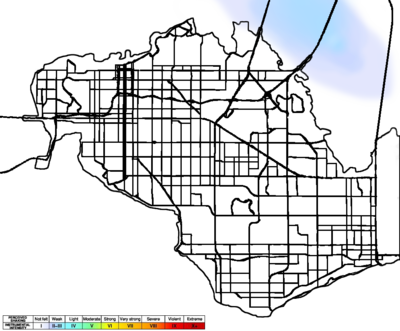
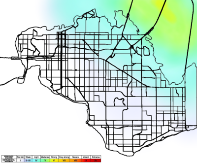
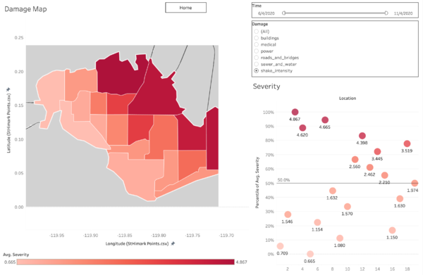
Based on the two shake maps provided and the shake intensity visualization from the report data, it is easy to identify that the northeast part of the city is hardest hit, namely location 3, 7, 4, 12. The average severity of these areas are above 80% percentile. So these neighborhoods should be prioritized for response
By changing the filter in the Damage Map Dashboard, highly damaged locations for each category can be found:
| Damage Type | Most damaged locations |
|---|---|
| Water & Sewer | location 3, 7, 8, 9 |
| Roads & Bridges | location 3, 8, 9, 14 |
| Power | location 3,7,10,11 |
| Medical | location 3,4,7,15 |
| Building | location 3,8,9,10 |
Apparently, Location 3 is the most damaged neighborhood of all, so it should be the first priority for rescue and other emergency response.
Besides, roads and bridges are very important for the rescue and recovery team to move around, the repairing of roads and bridges should be prioritized.
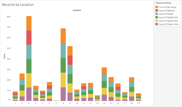
According to the number of report records for each location, location 3, 8, 9 are submitting most reports while location 7 is submitting least. From this we can interpret that at location 3, 8, 9, there are more people who need help. And although location 7 suffered from more intense shake, there are fewer people living there and submitting report, so location 3, 8, 9 should be paid more attention than location 7 given limited resources.
Question 2
Question: Use visual analytics to show uncertainty in the data. Compare the reliability of neighborhood reports. Which neighborhoods are providing reliable reports? Provide a rationale for your response.
Answer:
The larger the amount of data, the more stable the data is, the more reliable and certain the data will be. Therefore, if a neighborhood is providing relatively fewer reports and higher variance, then it is a less reliable source of information.
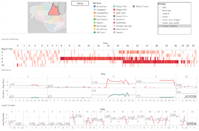
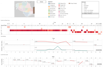
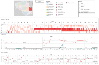
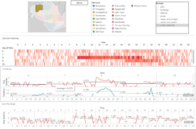
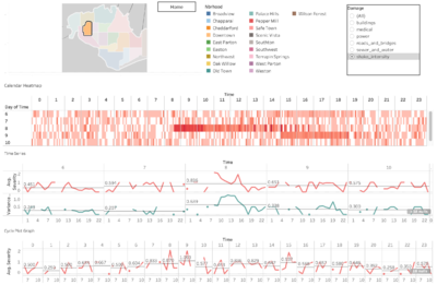
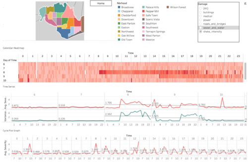
By selecting neighborhoods individually in “Change Over Time” dashboard, the southeast part of the city is basically providing less reliable reports, including location 7, 12, 13, 18. And location 4 is also providing uncertain data.
In report data from these locations, there are certain amount of missing data for many time periods in the five days, and the variance of the report data is seemed to be relatively higher (shown in the second panel in the time series chart)
The least reliable reports are from location 4 and 7, and the impact from these unreliable data sources is the biggest since these two are actually deeply affected by the earthquake.
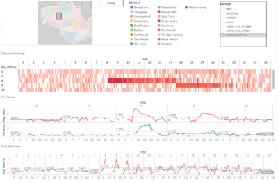
In contrast, neighborhood located at the heart area of the city is providing more reliable data, with data covering most of the time periods and lower variance, including location 2, 6, 15.
note: The screenshot used in this section is using the data for shake intensity as an example.
Question 3
Question: How do conditions change over time? How does uncertainty in change over time? Describe the key changes you see.
Answer:
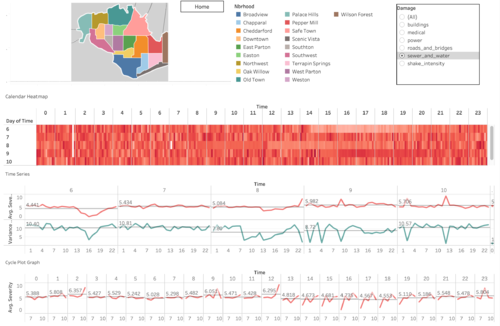
From the number of records change over time, it is obvious that there is a major peak of reporting on the morning of April 8th and several small peaks on 9th and 10th. From the “change over time” dashboard, we can find that the infrastructure damage reporting (e.g. water & sewer, power) is relatively even through the five days, but shake intensity reporting has a major peak on 8th. This is correlated with the total reporting number, which means there might be a major earthquake on April 8th and several afterquakes on 9th and 10th .
Comparison between infrastructure damage and shake intensity:
