IS428 AY2019-20T1 Assign Wei Ming InteractiveVisualization
Check full visualization here
Contents
Overview
This visualization consists of three part, Preliminary Analysis, Damage Map and Change Over Time, which can be navigated from the home page. It can helps the audience to have a basic understanding of the report data from the damage reporting mobile application, to be able to view a damage map for different categories of infrastructure and shake intensity, and also to get information of condition changes over time.
Part 1: Preliminary Analysis
Refer to Preliminary Analysis in "Data Analysis & Transformation" section.
Part 2: Damage Map
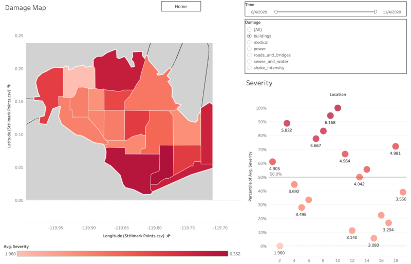
In "Damage Map" Dashboard, you can select the damage category including water & sewer, roads & bridges, power, medical and building, as well as shake intensity for a certain period of time to be displayed on St. Himark's city map, with the shade of the color representing the average severity of damage. Beside the main map, a scatter chart is used to indicate the percentile of each location under specific filters, so that we can tell the relative severity of a neighborhood compared to others.
Part 3: Change Over Time
There are three sub-parts in this dashboard, the location selector map, the calendar heatmap, the time series severity and variance and the cycle plot graph.
The upper map is used as a filter to show data for selected neighborhood. I didn't use a normal filter because with a map, it is clearer for us to identify the position of a neighborhood in the city than merely using IDs or names.
The calendar map helps the audience to identify the average severity for selected neighborhood and damage type intuitively by the shade of the color. Darker area represents higher severity while lighter area represents lower. When a block is white, it means there's missing data. Therefore, it also helps with representing the amount of missing data.
This time series chart is used to indicate trend (upper panel) and the variance (lower panel) of severity over this five day period. Variance is related to uncertainty because it represents the fluctuation of the data. The top axis stands for date (i.e. April 8) and the bottom axis stands for time of a day (i.e. 4am). There is a reference line for each panel marking the average value.
The cycle plot graph is used to check if there is any pattern of shake/damage in time of a day. The top axis stands for time of a day (i.e. 4am) and the bottom axis stands for date (i.e. April 8).


