IS428 AY2019-20T1 Assign Wei Ming DataTransformationAnalysis
Contents
Preliminary Data Analysis
Geographic Information
St. Himark is subdivided into 19 neighborhoods. Infrastructure provided includes sewer & water, roads & bridges, gas, garbage, healthcare and power, of which 72% is provided by the Always Safe Nuclear Power Plant located at SAFE TOWN (Neighborhood 4).
St. Himark has an exceptional network of 8 hospitals, located at PALACE HILLS (Neighborhood 1), OLD TOWN (Neighborhood 3), SOUTHWEST (Neighborhood 5), 2 of them at DOWNTOWN (Neighborhood 6), BROADVIEW (Neighborhood 9), TERRAPIN SPRINGS (Neighborhood 11), SOUTHTON (Neighborhood 16).
Report Data
Data Description
The data for MC1 includes one (CSV) file spanning the entire length of the event, containing (categorical) individual reports of shaking/damage by neighborhood over time. Reports are made by citizens at any time, however, they are only recorded in 5-minute batches/increments due to the server configuration. Furthermore, delays in the receipt of reports may occur during power outages.
mc1-reports-data.csv fields:
- time: timestamp of incoming report/record, in the format YYYY-MM-DD hh:mm:ss
- location: id of neighborhood where person reporting is feeling the shaking and/or seeing the damage
- {shake_intensity, sewer_and_water, power, roads_and_bridges, medical, buildings}: reported categorical value of how violent the shaking was/how bad the damage was (0 - lowest, 10 - highest; missing data allowed)
Exploratory Data Analysis
There are 83070 report records in this file, covering five days from April 6 to April 10. For every point-in-time at each location, there can be multiple records, one record or zero record.
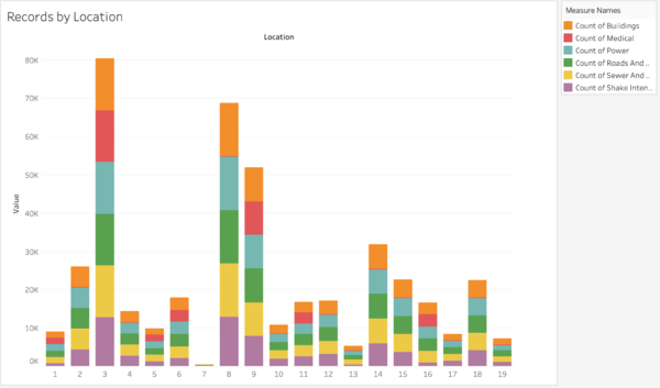
1. Number of Records by Location
Finding 1: According to the stacked bar chart, Location 3 (OLD TOWN), 8 (SCENIC VISTA) and 9 (BROADVIEW) received most reports, while Location 7 (WILSON FOREST) received very few reports. Referring to the shake map, location 3 is one of the most affected areas. And location 7 is actually a developing area where not many people live.
Finding 2: Breaking down to each damage category, the proportion of all the damages for each location is pretty even except "medical damage", which is the red part in the chart. At location 2, 4, 7, 8, 10, 12, 13, 14, 15, 17, 18, 19, there are very few report about medical damage. This is because there are no hospitals in those areas.
2. Number of Records by Time
Finding 1: There are very few records from April 6 to around 7am in April 8, but a sharp increase after 7am. We can interpret that there may be a major shake in April 8.
Finding 2: There are several peaks in April 9 and 10, indicating there might be several aftershocks in these two days.
Data Preparation
Report Data Transformation
The original dataset is not tidy enough for visualization. Therefore, we need to tidy up it first so that every record is an observation and every field is a variable.
Pivot data using Tableau Prep
In the original dataset, every type of damage is in one field. So we need to merge them into one field, named as “damage”, and map their values to another field “severity”.
Issue: Should I define “shake_intensity” as one type of damage here?
Trade-off:
Even if “shake_intensity” doesn’t mean a kind of infrastructure damage, if “shake_intensity” is separated as one field, there is going to be more redundant data since one “shake_intensity” needs to be mapped to multiple records in the tidy version of data. And also, if “shake_intensity” is missing for one report (in original data), then there will be more missing data in the tidy version as well.
Conclusion: To put “shake_intensity” under damage
Map Setup
Now that the report data is ready for use, we need to implement map to the visualization as a base. In order to arrange neighborhood shapes into the blank background map, we need to break down into the details of the shapes and arrange the position of the border points to the background. To achieve that, two generated files is needed:
In Tableau, we can import these two sets of data, join them by "StHimark_ID", set "Marks" as "Polygon", put "Point Order" into "Path", and "StHimark_ID" and "Sub Polygon_Id" into "Detail", finally put "longitude" and "latitude" in, then we can get a map like this:


