IS428 AY2019-20T1 Assign Christine Anomalies Observation
Contents
- 1 Q1. Visualize radiation measurements over time from both static and mobile sensors to identify areas where radiation over background is detected. Characterize changes over time.
- 2 Q2. Use visual analytics to represent and analyze uncertainty in the measurement of radiation across the city.
- 2.1 Q2a. Compare uncertainty of the static sensors to the mobile sensors. What anomalies can you see? Are there sensors that are too uncertain to trust?
- 2.2 Q2b. Which regions of the city have greater uncertainty of radiation measurement? Use visual analytics to explain your rationale.
- 2.3 Q2c. What effects do you see in the sensor readings after the earthquake and other major events? What effect do these events have on uncertainty?
- 3 Q3. Given the uncertainty you observed in question 2, are the radiation measurements reliable enough to locate areas of concern?
- 3.1 Q3a. Highlight potential locations of contamination, including the locations of contaminated cars. Should St. Himark officials be worried about contaminated cars moving around the city?
- 3.2 Q3b. Estimate how many cars may have been contaminated when coolant leaked from the Always Safe plant. Use visual analysis of radiation measurements to determine if any have left the area.
- 3.3 Q3c. Indicated where you would deploy more sensors to improve radiation monitoring in the city. Would you recommend more static sensors or more mobile sensors or both? Use your visualization of radiation measurement uncertainty to justify your recommendation.
- 4 Q4. Summarize the state of radiation measurements at the end of the available period. Use your novel visualizations and analysis approaches to suggest a course of action for the city. Use visual analytics to compare the static sensor network to the mobile sensor network. What are the strengths and weaknesses of each approach? How do they support each other?
- 5 Q5. The data for this challenge can be analyzed either as a static collection or as a dynamic stream of data, as it would occur in a real emergency. Describe how you analyzed the data - as a static collection or a stream. How do you think this choice affected your analysis?
Q1. Visualize radiation measurements over time from both static and mobile sensors to identify areas where radiation over background is detected. Characterize changes over time.
STATIC SENSOR READINGS
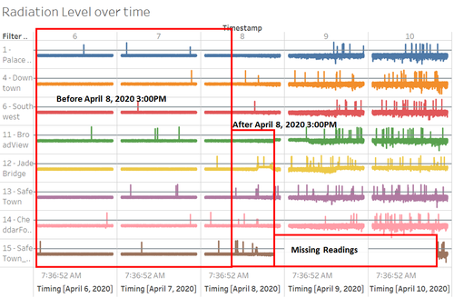
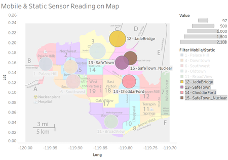
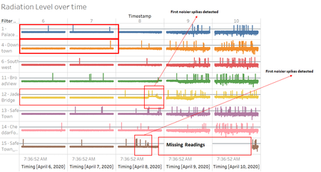
In terms of radiation level, healthy reading level was set at 75cpm (Watts, A. et al., 2011), when any sensor readings that exceed this healthy level; attention need to be given to the respective sensor before it reaches warning level at 100cpm. Based on the readings, before 8 April 2020 03:00PM, radiation level shows minor fluctuation (relatively stable in terms of changes in reading); however, after 8 April 2020 03:00PM, there are significant spikes of radiation readings spotted across all sensors but especially sensor 12-JadeBridge, 13-SafeTown, 14-CheddarFord, and 15-SafeTown_Nuclear have the noisiest spikes among other sensors on this day. This was possibly due to these sensors are located nearest to the power plant especially sensor 13-SafeTown and 15-SafeTown_Nuclear located in the region of Safe Town – location of Always Safe Nuclear power plant. So that when earthquake is happening, those sensors are affected the most.
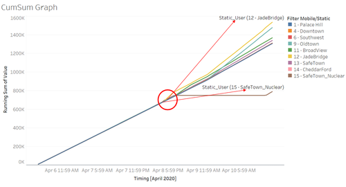
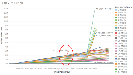
Additionally, from Cumulative Sum of radiation readings, we can clearly identify the first few sensors that show abnormal spikes in radiation readings are sensor 12-JadeBridge at 8 April 2020 3:00PM and 15-Safe Town_Nuclear at 8 April 2020 4PM.
MOBILE SENSOR READINGS
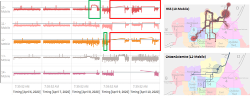
As compared to static sensor, mobile sensor HSS(10-Mobile) show high spike above healthy level (75cpm) between 8 April 2020 4:37PM until 10:00PM where at this period the sensor’s trail passed Jade Bridge (Green box on Figure 1.4) and based on Figure 1.5, HSS(10-Mobile) is the first sensor that show high spike of radiation reading. Aside from HSS (10-Mobile), there is another sensor that pass Jade Bridge at this period, CitizenScientist(12-Mobile) also show similar pattern in radiation readings which shows that there are contaminations at Jade Bridge. On top of that, CitizenScientist(12-Mobile) show short period highest spike of radiation reading on 9 April 2020 02:43AM (Green box on Figure 1.4). Aside from these findings, both HSS(10-Mobile) and CitizenScientist(12-Mobile) located at Old Town, then travelled to Jade Bridge and surrounding. At the end of readings, both sensors come back to Old Town; this suggest that there are contaminations at Jade Bridge.
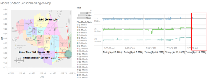
However, on 9 April 2020 08:02PM; readings show high readings for CitizenScientist(21-Mobile), CitizenScientist(25-Mobile), and AS-2(29-Mobile) with AS-2(29-Mobile) is the highest; but after 10 April 2020 06:35:35PM, all three sensors’ readings are starting to disappear sequentially from AS-2(29-Mobile), CitizenScientist(25-Mobile), and CitizenScientist(21-Mobile).
Q2. Use visual analytics to represent and analyze uncertainty in the measurement of radiation across the city.
Q2a. Compare uncertainty of the static sensors to the mobile sensors. What anomalies can you see? Are there sensors that are too uncertain to trust?
Q2b. Which regions of the city have greater uncertainty of radiation measurement? Use visual analytics to explain your rationale.
Q2c. What effects do you see in the sensor readings after the earthquake and other major events? What effect do these events have on uncertainty?
Q3. Given the uncertainty you observed in question 2, are the radiation measurements reliable enough to locate areas of concern?
Q3a. Highlight potential locations of contamination, including the locations of contaminated cars. Should St. Himark officials be worried about contaminated cars moving around the city?
Q3b. Estimate how many cars may have been contaminated when coolant leaked from the Always Safe plant. Use visual analysis of radiation measurements to determine if any have left the area.
Q3c. Indicated where you would deploy more sensors to improve radiation monitoring in the city. Would you recommend more static sensors or more mobile sensors or both? Use your visualization of radiation measurement uncertainty to justify your recommendation.
Q4. Summarize the state of radiation measurements at the end of the available period. Use your novel visualizations and analysis approaches to suggest a course of action for the city. Use visual analytics to compare the static sensor network to the mobile sensor network. What are the strengths and weaknesses of each approach? How do they support each other?
Q5. The data for this challenge can be analyzed either as a static collection or as a dynamic stream of data, as it would occur in a real emergency. Describe how you analyzed the data - as a static collection or a stream. How do you think this choice affected your analysis?
